How to Design a Photography Logo and Watermark That Actually Looks Like Yours

How to Design a Photography Logo and Watermark That Actually Looks Like Yours

For years I resisted watermarking my photos. Partly stubbornness, partly the fear of slapping something ugly over an image I’d worked hard to get. But when you’re sharing work online consistently, especially across Instagram and client galleries, having a clean, professional mark starts to matter. The problem isn’t the watermark concept itself. The problem is that most photographers end up with something that looks like it came from a free online generator circa 2009.
PPI vs. DPI: What Actually Matters When You Print Your Photos

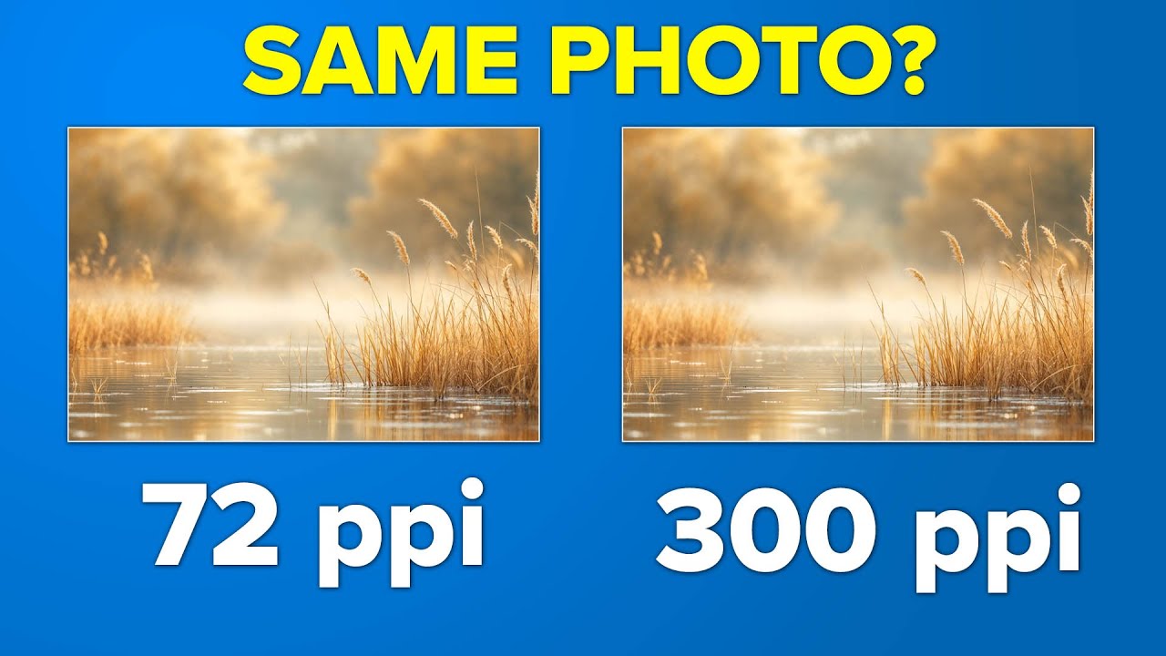
PPI vs. DPI: What Actually Matters When You Print Your Photos

I used to freeze every time I saw the resolution dialog in Photoshop. PPI, DPI, pixel dimensions — the numbers would stare back at me and I’d just… guess. Usually 300, because someone on a forum once said 300 is “the printing standard,” and I accepted that as gospel without really understanding what I was agreeing to. If you’ve ever felt that same low-grade anxiety about resolution settings, you’re not alone, and this is the article I wish I’d had years ago.

Can You Spot What AI Changed? Using Photoshop Generative Fill to Rescue a Throwaway Shot

Can You Spot What AI Changed? Using Photoshop Generative Fill to Rescue a Throwaway Shot

I have a folder on my hard drive called “almost.” It’s full of shots I couldn’t delete but couldn’t post either — photos where the light was right, the subject was interesting, and something annoying ruined the whole frame. A car bumper in the corner. A stranger mid-blink. A door frame cutting through the edge of a composition I actually loved. For years, those photos just sat there. Now, with Photoshop’s generative fill, some of them are finally usable.

From Flat to Striking: How to Replace Skies and Fix Lighting in Photoshop

From Flat to Striking: How to Replace Skies and Fix Lighting in Photoshop

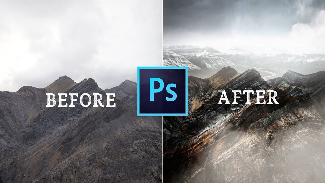
There’s a specific kind of frustration that comes from shooting in beautiful conditions and still ending up with a flat image. You were there. The mountains were massive. The light felt cinematic. And then you open the file and the sky is a washed-out grey blob that flattens the whole frame. I’ve been there more times than I’d like to admit, usually on a Sunday morning walk when the foreground is perfect and the sky just isn’t cooperating.

Giant Heads, Birthday Cakes, and the Photoshop Skills Behind a Viral Promo Photo

Giant Heads, Birthday Cakes, and the Photoshop Skills Behind a Viral Promo Photo

Every so often a photo stops people mid-scroll. You know the kind. Someone posts it, the comments flood in, and half of them are just “wait, how?” That’s exactly what happened when the team at PHLEARN put out their fifth anniversary promo image - a surreal, oversized-head-meets-giant-birthday-cake composite that looked equal parts chaotic and polished. The requests for a breakdown came pouring in, so Aaron Nace did what he does best and made a tutorial out of it.

The Floating Object Photo Trick: A Complete Beginner's Guide (No Magic Needed)

The Floating Object Photo Trick: A Complete Beginner's Guide (No Magic Needed)

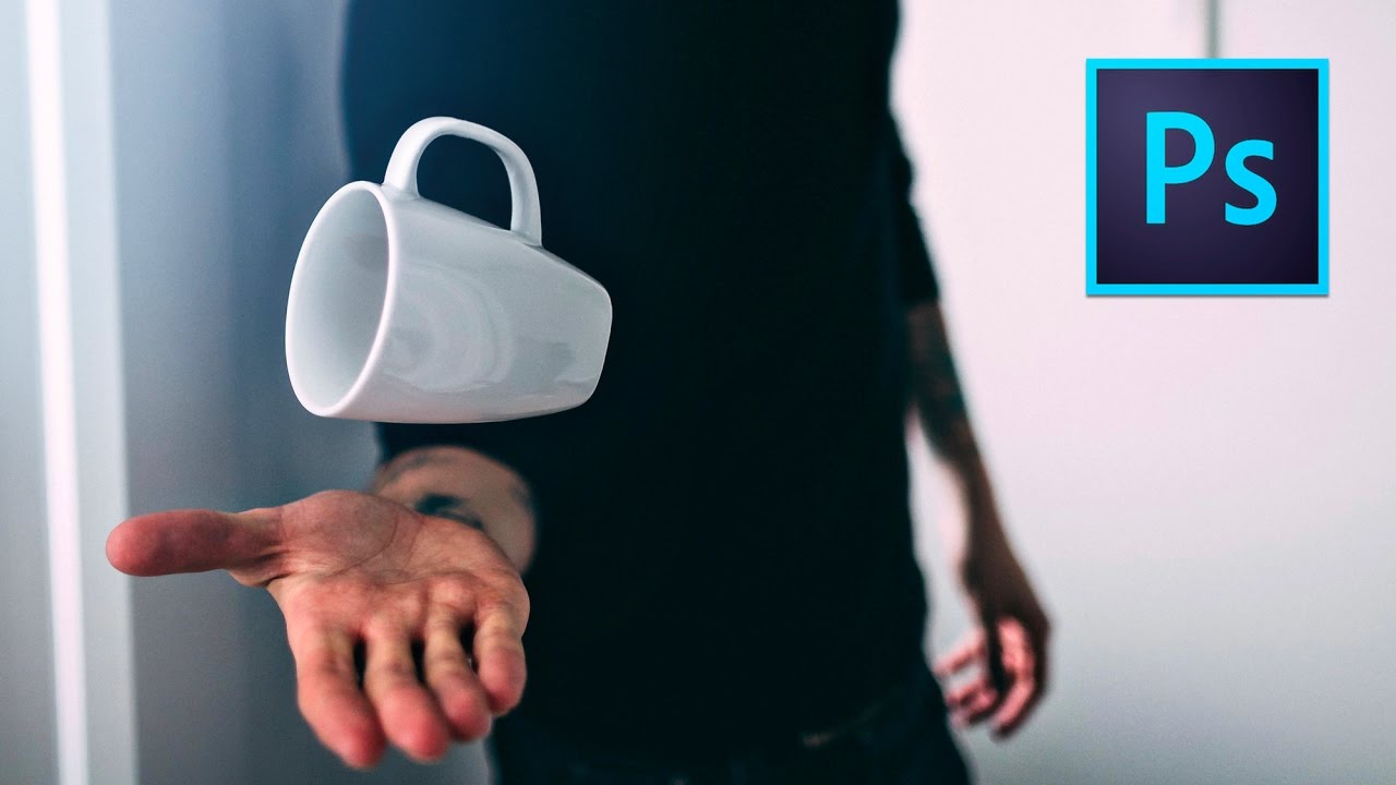
There’s a category of photo that stops thumbs mid-scroll. You’ve seen them: a coffee mug hovering in mid-air, a book suspended at a perfect angle, a jacket floating like its owner just vanished. I used to assume those shots required a full studio setup, an assistant, and some proprietary knowledge I hadn’t earned yet. Turns out the whole trick fits in a grocery bag and takes about an hour from setup to finished file.

Three Things I Do in Photoshop Before Every Print Order (Based on William Patino's Workflow)

Three Things I Do in Photoshop Before Every Print Order (Based on William Patino's Workflow)

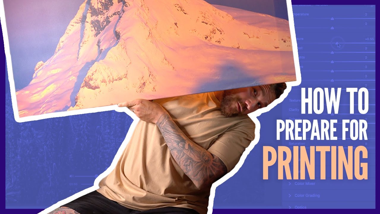
Getting a photo printed should feel exciting. In practice, it often feels like a gamble. I’ve opened print orders and spotted a dust spot dead-center in a clear sky, visible from across the room. I’ve had colors look muddy compared to what I saw on my monitor. I’ve exported the wrong file version entirely. None of those mistakes are expensive to fix once you know what to look for before you send anything to the lab.

How to Make Your Photos Look Genuinely Old (Not Just Filtered)

How to Make Your Photos Look Genuinely Old (Not Just Filtered)

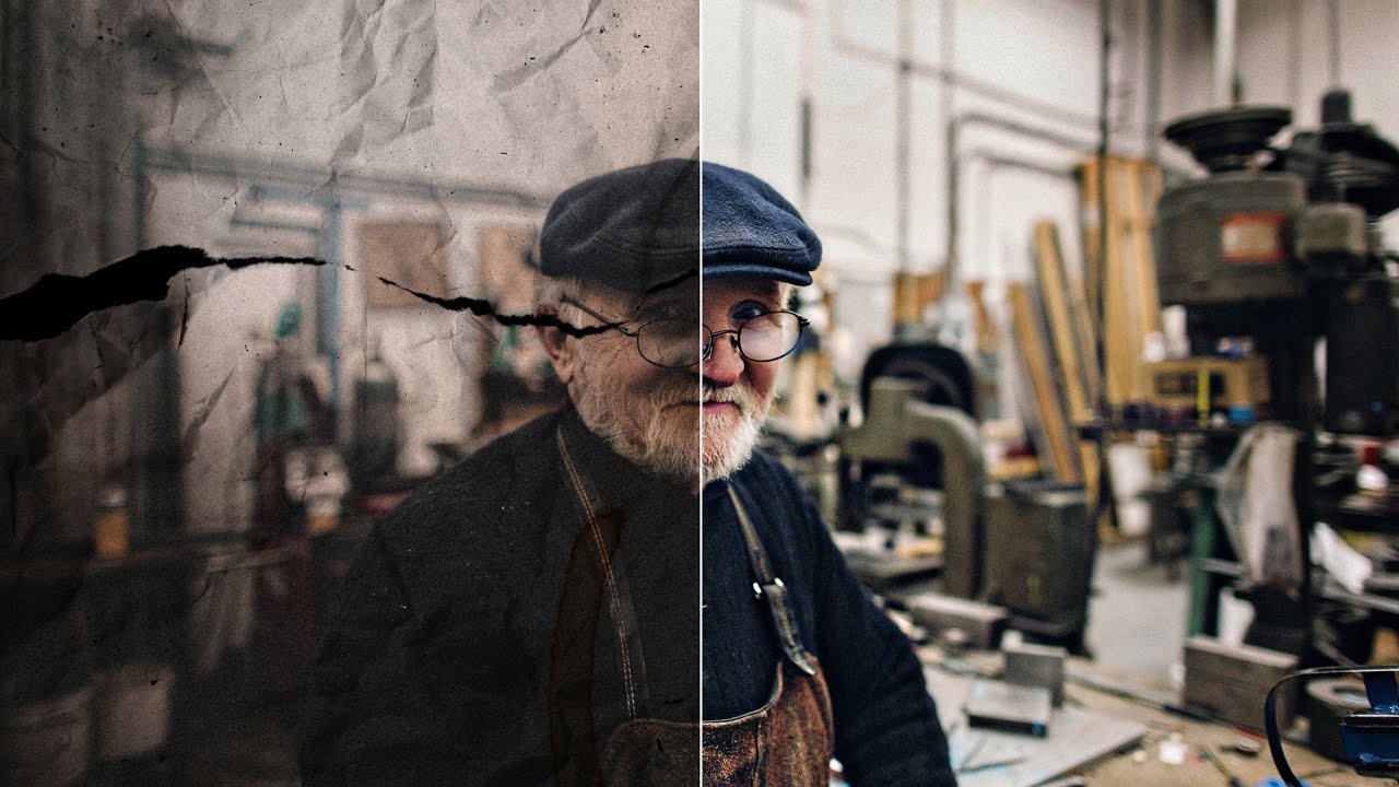
There’s a difference between a photo that looks old and a photo that looks fake old. You know the one I mean. The sepia slider gets cranked, maybe a vignette gets slapped on, and suddenly it looks like a Instagram filter from 2012 rather than something that’s actually been sitting in a shoebox for fifty years. I’ve been guilty of this. For a long time I thought aging a photo was purely a post-processing game, something you handled entirely on screen.

How to Composite Fake Backgrounds Into Your Photos Using Photoshop (And Why You Shouldn't Feel Guilty About It)

How to Composite Fake Backgrounds Into Your Photos Using Photoshop (And Why You Shouldn't Feel Guilty About It)

Every Sunday morning I do a photo walk around Seattle, and I come back with about two hundred shots. Maybe ten of them are genuinely interesting. A handful have great light but a cluttered background. A few have a compelling subject and a completely dead sky. For years I either published the mediocre version or deleted the file entirely. It took watching other photographers talk openly about compositing for me to realize there was a third option.

sRGB, Adobe RGB, or ProPhoto RGB? Here's How to Actually Choose the Right Color Space

sRGB, Adobe RGB, or ProPhoto RGB? Here's How to Actually Choose the Right Color Space

I used to export photos straight from Lightroom without giving color spaces a second thought. The images looked fine on my monitor, I’d post them, and then wonder why they looked slightly dull or weirdly shifted on my phone or a friend’s laptop. It wasn’t until I started digging into color management that I realized I had been skipping one of the most consequential settings in my entire workflow. This is one of those invisible problems that affects every single image you share, and most photographers don’t even know it’s happening.

How to Brighten Your Photos for Print (Without Blowing Out Your Edits)

How to Brighten Your Photos for Print (Without Blowing Out Your Edits)

There is a specific kind of disappointment that hits when you pick up a print order and the image looks like it was shot in a cave. You edited it perfectly on your monitor. It looked rich and moody and exactly right. Then it came back from the lab dark, flat, and missing half the shadow detail you spent an hour coaxing out in post. I have been there more than once, and for a long time I chalked it up to “the lab” as if it were some mysterious force beyond my control.

One Backdrop, Infinite Looks: How to Add Texture and Color to Portrait Backgrounds in Photoshop

One Backdrop, Infinite Looks: How to Add Texture and Color to Portrait Backgrounds in Photoshop

Most of us aren’t running a studio with a wall of seamless paper rolls in every color. I shoot out of a converted spare bedroom in Seattle, and for the longest time I felt limited by the single gray backdrop I owned. Every portrait session started to look like it came from the same universe, which is fine, but it’s not exactly inspiring for clients or for me. What changed things for me was watching Sean Tucker work through this exact problem.