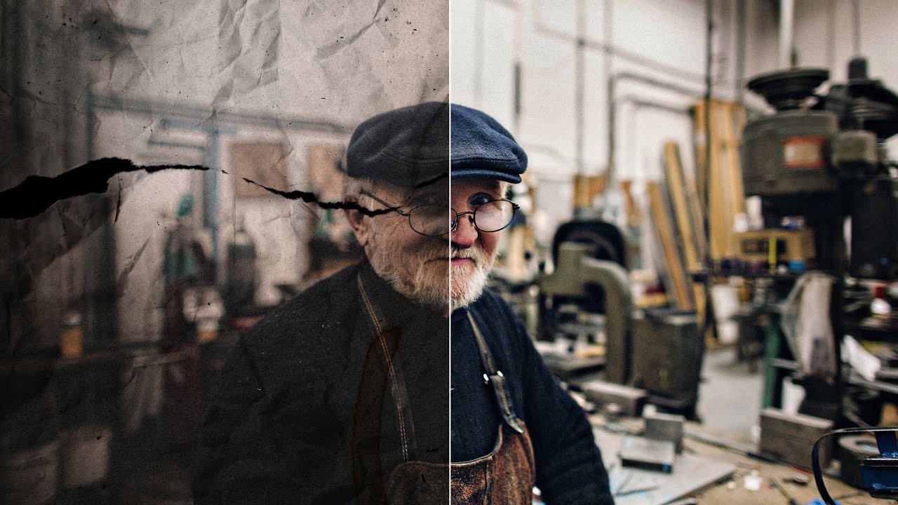
There’s a difference between a photo that looks old and a photo that looks fake old. You know the one I mean. The sepia slider gets cranked, maybe a vignette gets slapped on, and suddenly it looks like a Instagram filter from 2012 rather than something that’s actually been sitting in a shoebox for fifty years. I’ve been guilty of this. For a long time I thought aging a photo was purely a post-processing game, something you handled entirely on screen. Then I came across a technique that involves getting the photo off the screen entirely, and it changed how I think about the whole process.
Watch the full tutorial on YouTube
In this Peter McKinnon tutorial, the approach is refreshingly physical. The idea is to print your photo, actually handle it, damage it a little, and then bring it back into Photoshop to composite the real-world wear with your digital edits. The result is aging that has texture and randomness you simply cannot fake with a filter. It looks convincing because part of it is real. Here’s how the whole process works, start to finish.
Step 1: Choose the Right Source Photo
 Opening shot of aged photo result on screen
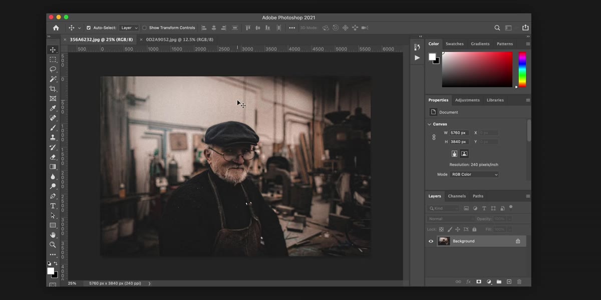
Not every image is a good candidate for this technique. Photos with clean, graphic compositions tend to read as intentionally retro rather than genuinely aged. What works best are portraits, documentary-style street shots, or any image with natural grain and uneven lighting already baked in. If your photo looks too polished, the aging will fight the image rather than enhance it. Before you do anything else, ask yourself: does this picture feel like it could have existed in 1955? If the answer is yes, you’re starting in the right place.
Opening shot of aged photo result on screen
Not every image is a good candidate for this technique. Photos with clean, graphic compositions tend to read as intentionally retro rather than genuinely aged. What works best are portraits, documentary-style street shots, or any image with natural grain and uneven lighting already baked in. If your photo looks too polished, the aging will fight the image rather than enhance it. Before you do anything else, ask yourself: does this picture feel like it could have existed in 1955? If the answer is yes, you’re starting in the right place.
Step 2: Print the Photo on Standard Paper
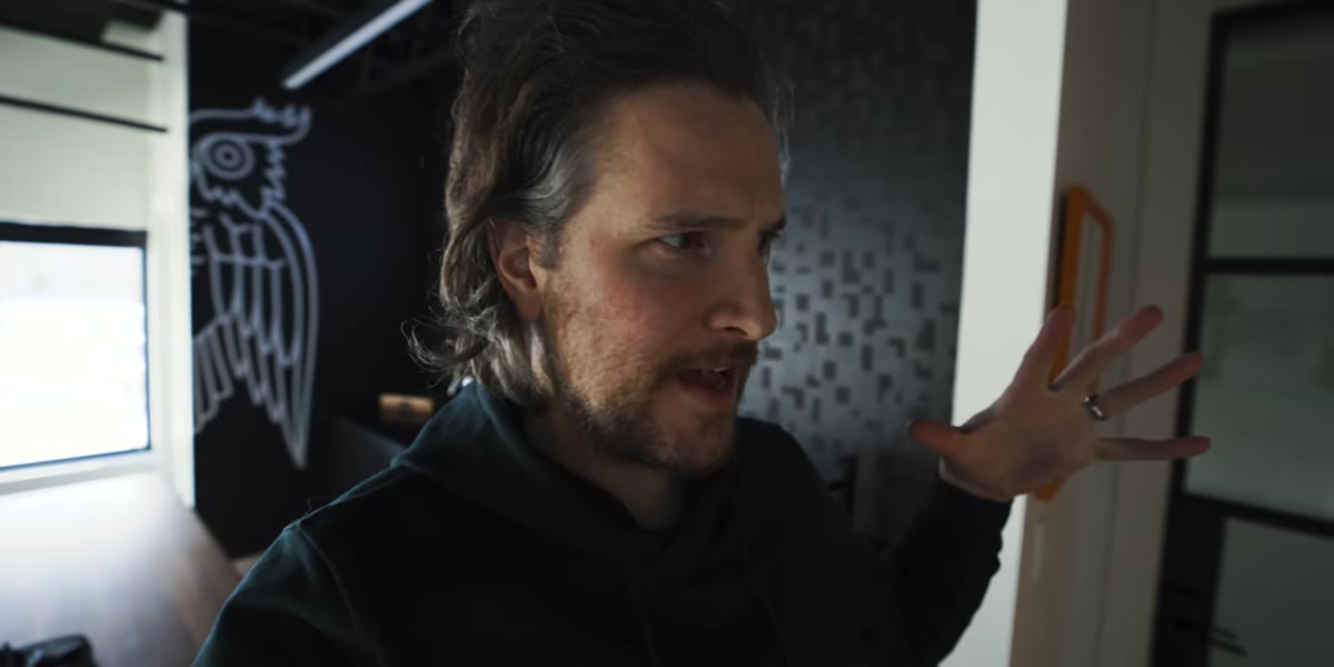 Printed photo being held or laid on surface
This is the step that surprises most people. You print the photo out, nothing fancy, standard printer paper works perfectly because its texture and absorbency are closer to old photographic paper than glossy stock is. Don’t overthink the print quality here. The goal is not a beautiful print. The goal is a physical object you can manipulate. Print it at a size large enough to work with comfortably, letter size is fine, and keep the color profile neutral so you’re not fighting a color cast later when you scan it back in.
Printed photo being held or laid on surface
This is the step that surprises most people. You print the photo out, nothing fancy, standard printer paper works perfectly because its texture and absorbency are closer to old photographic paper than glossy stock is. Don’t overthink the print quality here. The goal is not a beautiful print. The goal is a physical object you can manipulate. Print it at a size large enough to work with comfortably, letter size is fine, and keep the color profile neutral so you’re not fighting a color cast later when you scan it back in.
Step 3: Age the Print Physically
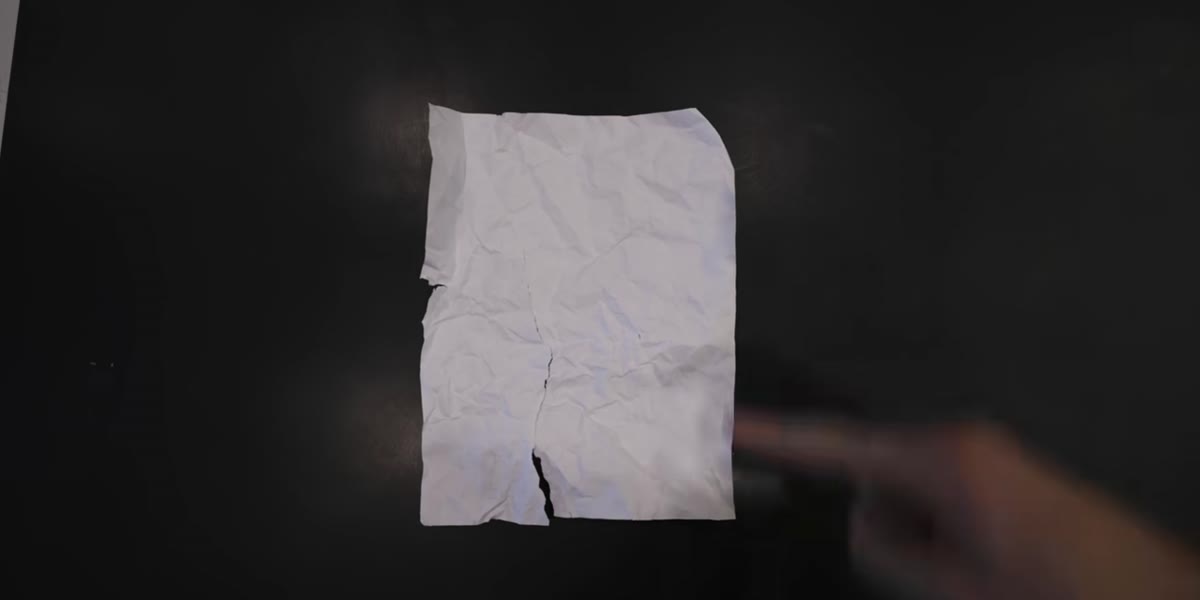 Coffee or tea being applied to printed photo
Here is where it gets fun, and also where most tutorials skip to the digital side too quickly. To get realistic aging, you work the physical print directly. Coffee or tea staining is the most effective method. Brew something strong, let it cool slightly, and apply it unevenly to the paper with a brush or by dipping. You want blotchy, organic marks, not an even wash. Let it dry completely. Then crumple the paper gently, not aggressively, so you get soft creases rather than sharp tears. Run your thumb along the edges to create natural fraying. The imperfections you create here are the ones that will make the final composite look like it survived decades in a drawer rather than ten minutes in Photoshop.
Coffee or tea being applied to printed photo
Here is where it gets fun, and also where most tutorials skip to the digital side too quickly. To get realistic aging, you work the physical print directly. Coffee or tea staining is the most effective method. Brew something strong, let it cool slightly, and apply it unevenly to the paper with a brush or by dipping. You want blotchy, organic marks, not an even wash. Let it dry completely. Then crumple the paper gently, not aggressively, so you get soft creases rather than sharp tears. Run your thumb along the edges to create natural fraying. The imperfections you create here are the ones that will make the final composite look like it survived decades in a drawer rather than ten minutes in Photoshop.
Step 4: Scan the Aged Print Back In
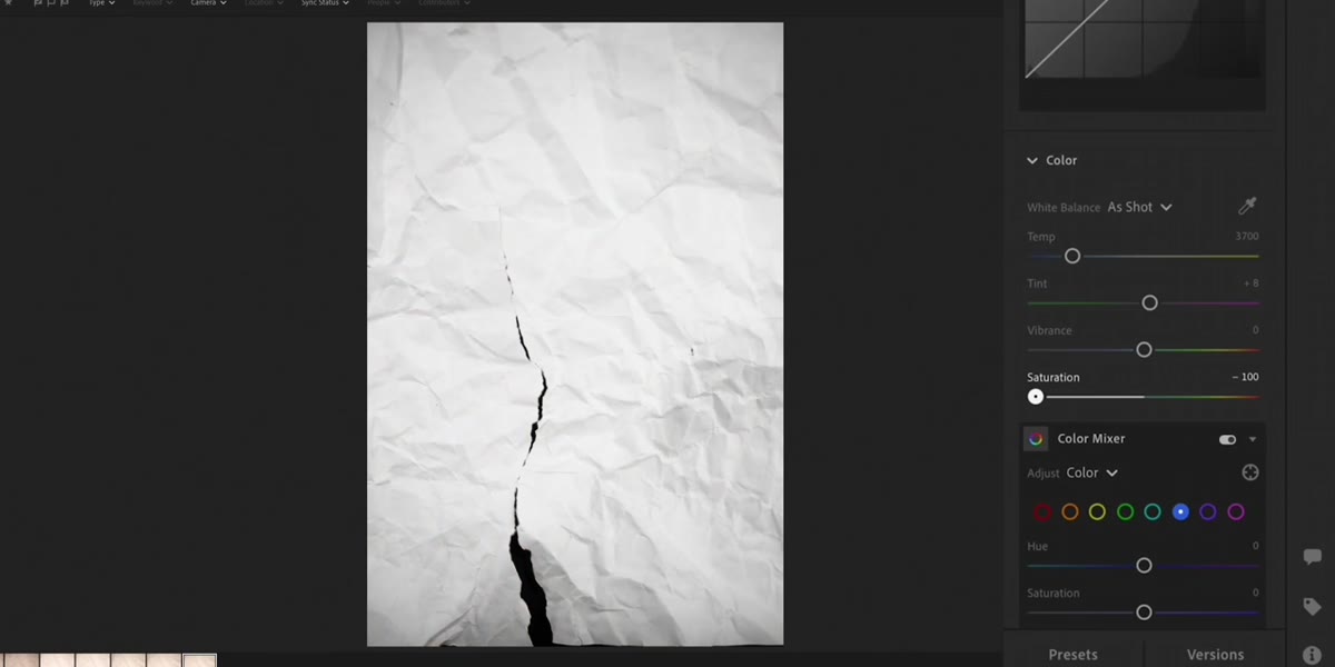 Aged physical print being placed on scanner
Once the print is dry and physically distressed, scan it back into your computer at a high resolution, 600 DPI minimum. Higher is better because you want the texture detail to hold up when you scale and position layers. Scan it flat against the glass so you capture the full surface evenly. If you don’t have a scanner, photographing it under soft, even natural light with your camera works too, just avoid harsh shadows from the shooting angle that might compete with the texture you’ve already created.
Aged physical print being placed on scanner
Once the print is dry and physically distressed, scan it back into your computer at a high resolution, 600 DPI minimum. Higher is better because you want the texture detail to hold up when you scale and position layers. Scan it flat against the glass so you capture the full surface evenly. If you don’t have a scanner, photographing it under soft, even natural light with your camera works too, just avoid harsh shadows from the shooting angle that might compete with the texture you’ve already created.
Step 5: Layer the Scan Over the Original in Photoshop
 Photoshop layers panel showing scan over original photo
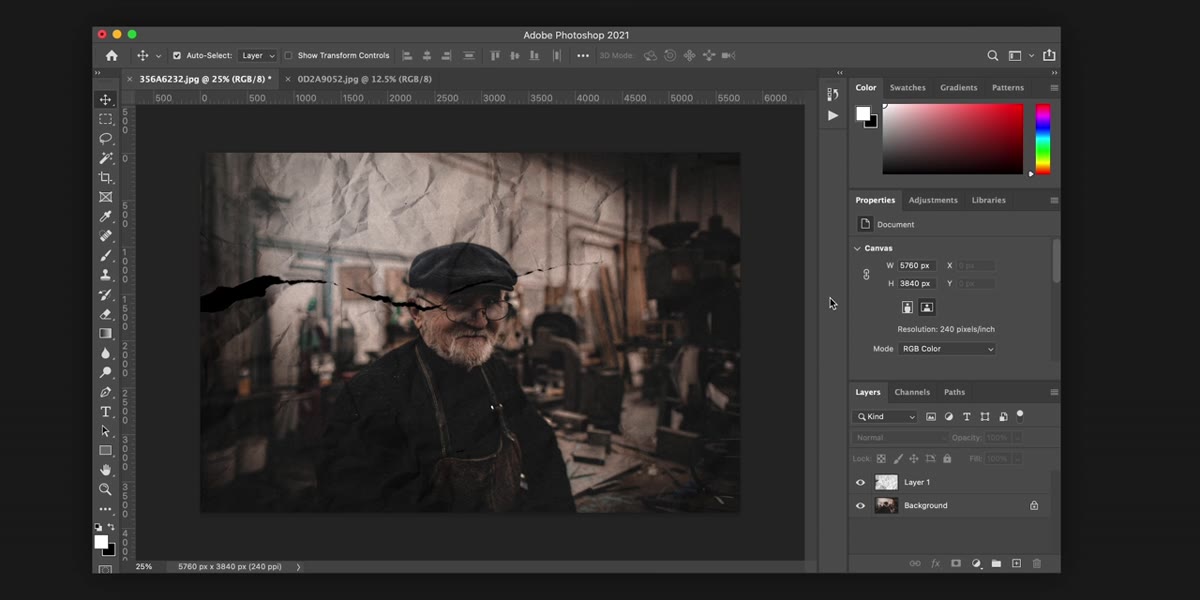
Open both your original image and the scanned aged version in Photoshop. Place the scan as a layer on top of the original and set the blend mode to Multiply. This drops out the white paper and lets the stains, creases, and texture map directly onto the image beneath. Adjust opacity to taste, somewhere between 60 and 85 percent usually hits the right balance between visible texture and a readable photo underneath. If the aging looks too heavy in specific areas, add a layer mask and brush those spots back gently with a low-opacity black brush. You’re not erasing the effect, just managing where it lands most aggressively.
Photoshop layers panel showing scan over original photo
Open both your original image and the scanned aged version in Photoshop. Place the scan as a layer on top of the original and set the blend mode to Multiply. This drops out the white paper and lets the stains, creases, and texture map directly onto the image beneath. Adjust opacity to taste, somewhere between 60 and 85 percent usually hits the right balance between visible texture and a readable photo underneath. If the aging looks too heavy in specific areas, add a layer mask and brush those spots back gently with a low-opacity black brush. You’re not erasing the effect, just managing where it lands most aggressively.
Step 6: Adjust Color and Tone to Match the Era
 Color grading adjustments being made in Photoshop
The physical aging handles texture, but your color grading needs to carry the tonal story. Add a Hue/Saturation adjustment layer and desaturate the image significantly, but not all the way to black and white. Leaving about 15 to 25 percent saturation keeps a faint warmth that reads as faded rather than converted. Then add a Curves adjustment layer and lift the blacks slightly by pulling the bottom-left anchor point upward. Old photos lose their deepest shadows over time, they never go full black anymore. That lifted shadow is one of the most overlooked details in aged photo work, and it’s often what separates convincing from almost convincing.
Color grading adjustments being made in Photoshop
The physical aging handles texture, but your color grading needs to carry the tonal story. Add a Hue/Saturation adjustment layer and desaturate the image significantly, but not all the way to black and white. Leaving about 15 to 25 percent saturation keeps a faint warmth that reads as faded rather than converted. Then add a Curves adjustment layer and lift the blacks slightly by pulling the bottom-left anchor point upward. Old photos lose their deepest shadows over time, they never go full black anymore. That lifted shadow is one of the most overlooked details in aged photo work, and it’s often what separates convincing from almost convincing.
Step 7: Add Final Grain and a Subtle Vignette
 Grain and vignette being added as final adjustments
Create a new layer filled with 50% gray, set it to Overlay blend mode, and apply Filter - Noise - Add Noise with Gaussian distribution. Between 8 and 15 percent is usually enough to unify the grain across the whole image without making it look like a noise test. Then add a soft vignette using a Curves layer with an elliptical mask, feathered generously, that darkens the corners and edges. Old prints often have edge darkening from the development process. Keep this subtle, a heavy vignette will immediately read as digital, which is the one thing you’re working against.
Grain and vignette being added as final adjustments
Create a new layer filled with 50% gray, set it to Overlay blend mode, and apply Filter - Noise - Add Noise with Gaussian distribution. Between 8 and 15 percent is usually enough to unify the grain across the whole image without making it look like a noise test. Then add a soft vignette using a Curves layer with an elliptical mask, feathered generously, that darkens the corners and edges. Old prints often have edge darkening from the development process. Keep this subtle, a heavy vignette will immediately read as digital, which is the one thing you’re working against.
One More Thing: Don’t Skip the Physical Step
I’ve tested this technique both ways, with and without the actual print-and-stain process, and the difference is significant. When everything is done digitally, you can always tell. The texture has a symmetry and a cleanliness to it that real aging doesn’t have. The coffee stains, the paper creases, the edge wear - those are random in a way that no Photoshop brush quite replicates. I still shoot with my phone sometimes just to prove that gear isn’t the point, and this technique is the same idea. Doing something analog inside an otherwise digital process is almost always worth the extra step.
The most important thing I took from this tutorial is the principle behind it: when you want something to look real, make part of it real. The digital tools do the compositing and color work, but the believability comes from the physical layer. Start there.
Watch the full tutorial on YouTube to see Peter walk through his own version of the technique with his specific settings and project files.
Comments
Leave a Comment