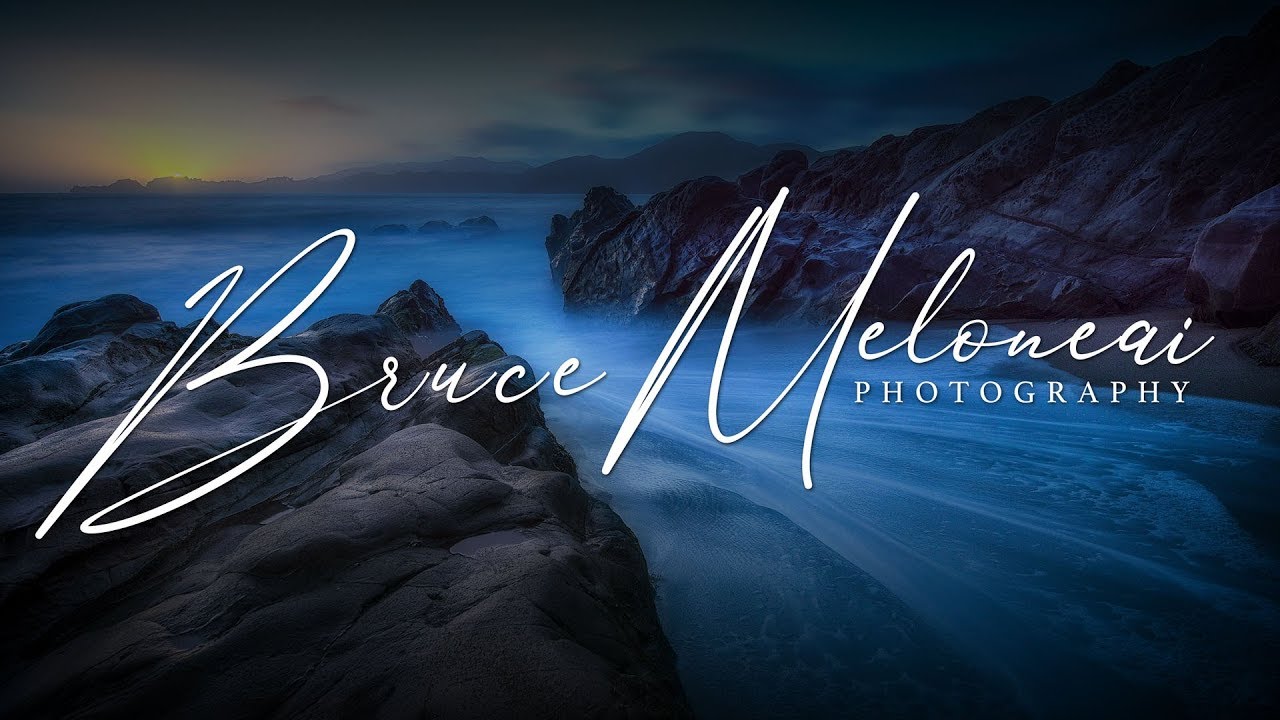
For years I resisted watermarking my photos. Partly stubbornness, partly the fear of slapping something ugly over an image I’d worked hard to get. But when you’re sharing work online consistently, especially across Instagram and client galleries, having a clean, professional mark starts to matter. The problem isn’t the watermark concept itself. The problem is that most photographers end up with something that looks like it came from a free online generator circa 2009.
That changed for me when I watched this tutorial from Matt Kloskowski, where he walks through building a watermark logo directly in Photoshop, with some genuinely clever techniques for making it look unique even if you pick a popular font. Watch the full tutorial on YouTube before or after reading this breakdown. What I’m laying out below is my own working version of his process, with enough detail that you can follow along without pausing the video every thirty seconds.
The goal here isn’t just slapping your name on a photo. It’s building a reusable asset, something that looks intentional and polished, that you can drop onto any image at any size.
Step 1: Create a New Document at the Right Size
 Blank Photoshop document creation dialog with pixel settings
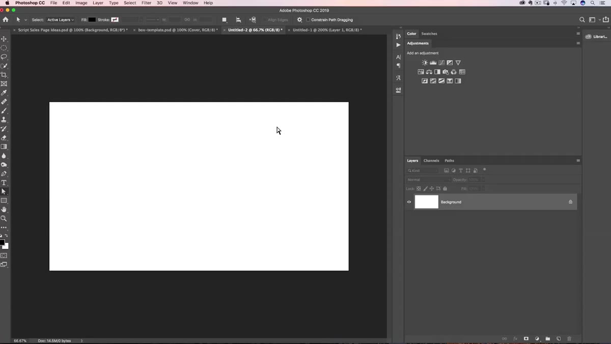
Open Photoshop and create a new blank document. The key decision here is width. Matt recommends going large, around 3,000 pixels wide, because watermarks are always easier to scale down than to scale up. If you build this at 800 pixels and then want to use it on a large print or high-res web image, you’re going to run into quality issues fast.
Blank Photoshop document creation dialog with pixel settings
Open Photoshop and create a new blank document. The key decision here is width. Matt recommends going large, around 3,000 pixels wide, because watermarks are always easier to scale down than to scale up. If you build this at 800 pixels and then want to use it on a large print or high-res web image, you’re going to run into quality issues fast.
Height doesn’t need to be precise. Give yourself plenty of vertical room to work. Resolution at 300 dpi is a safe choice if you ever plan to use this for print purposes. Keep the background white for now so you can see what you’re doing. You’ll make it transparent later.
Step 2: Find and Activate a Font Worth Using
 Adobe Fonts website showing script font browsing interface
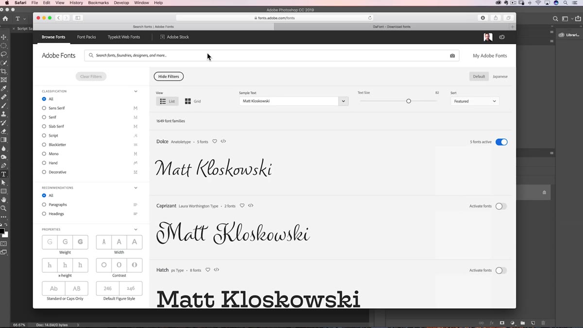
This is where a lot of DIY watermarks go wrong. People grab whatever font is already installed and end up with something generic. Matt points to two reliable sources. If you’re a Creative Cloud subscriber, go to fonts.adobe.com. You’ll have access to thousands of fonts that sync directly to Photoshop the moment you activate them on the website. No downloading, no installing manually. Just click to activate and the font appears in your Photoshop font menu within seconds.
Adobe Fonts website showing script font browsing interface
This is where a lot of DIY watermarks go wrong. People grab whatever font is already installed and end up with something generic. Matt points to two reliable sources. If you’re a Creative Cloud subscriber, go to fonts.adobe.com. You’ll have access to thousands of fonts that sync directly to Photoshop the moment you activate them on the website. No downloading, no installing manually. Just click to activate and the font appears in your Photoshop font menu within seconds.
If you’re not on Creative Cloud, or you want to explore beyond Adobe’s library, dafont.com is a solid free alternative with a huge catalog of script and signature-style fonts. You will need to download and install these manually. The installation process varies slightly between Mac and Windows, so a quick search for “how to install fonts on [your OS]” will get you there in two minutes. Matt used a font called Anthony Signature for his demo, which has that handwritten, personal feel that works well for photography branding.
Step 3: Type Your Name or Logo Text
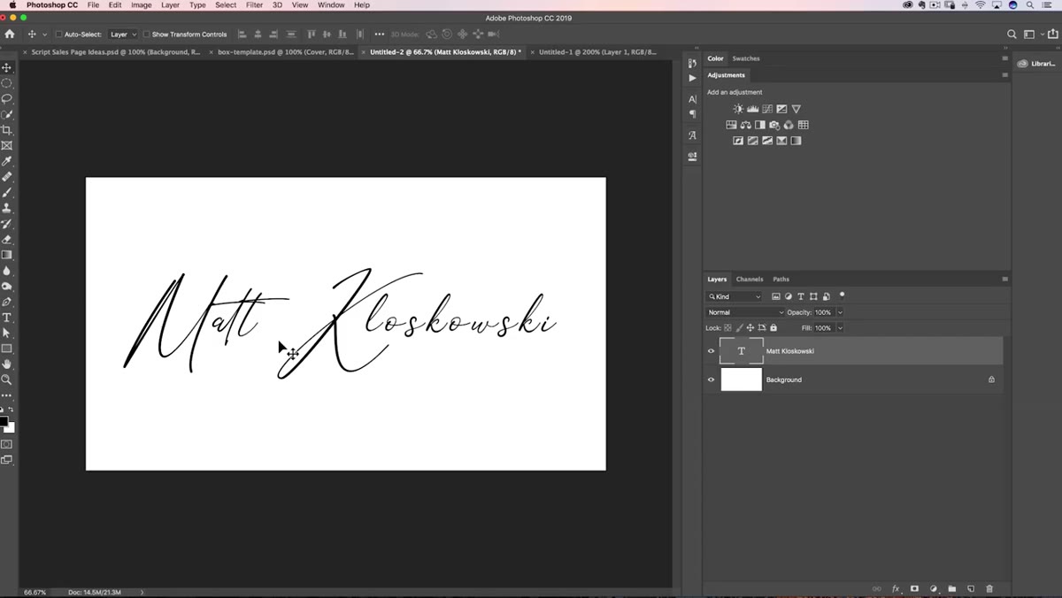
 Type tool active with signature font text on canvas
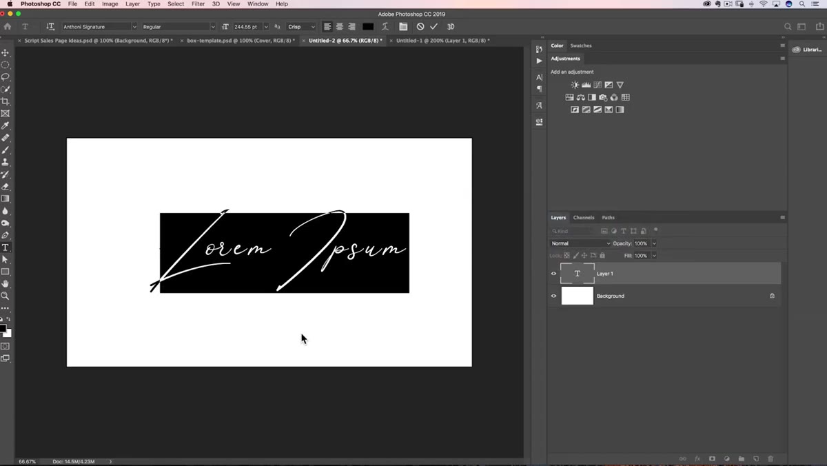
Select the Type tool from the toolbar, or just press T. Click on your canvas and start typing your name. Depending on your version of Photoshop, clicking may generate placeholder lorem ipsum text first. Don’t click again. Just start typing and it replaces automatically.
Type tool active with signature font text on canvas
Select the Type tool from the toolbar, or just press T. Click on your canvas and start typing your name. Depending on your version of Photoshop, clicking may generate placeholder lorem ipsum text first. Don’t click again. Just start typing and it replaces automatically.
When you’re done, hit the checkmark in the top options bar to commit the text. Then grab the Move tool and position the text roughly where you want it on the canvas. Don’t worry about precision yet. At this stage you’re just getting the raw material on screen.
Step 4: Customize the Letterforms to Make It Yours
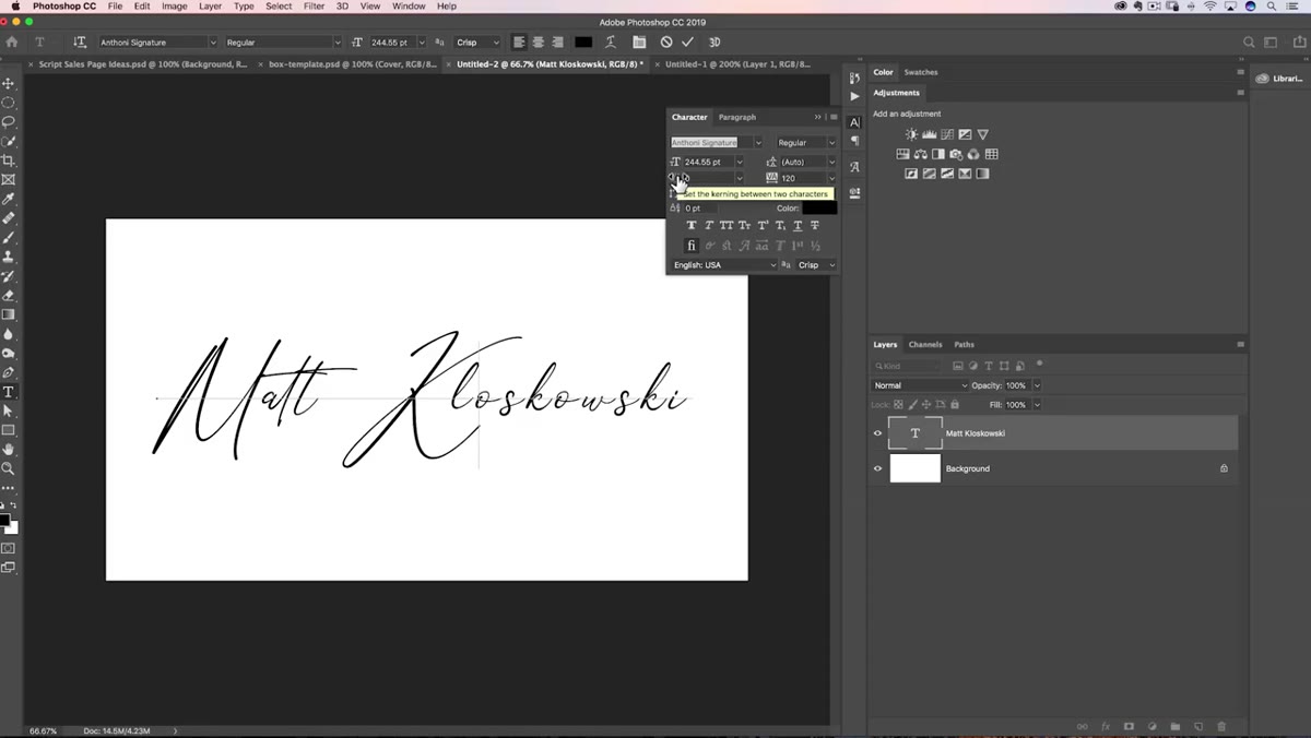
 Character panel open with individual letter spacing adjustments
This is the step that separates a thoughtful watermark from a forgettable one. Even if two photographers use the exact same font, you can make your version look completely different by adjusting individual letters. Highlight specific characters using the Type tool and adjust their size, baseline shift, or tracking through the Character panel (Window > Character).
Character panel open with individual letter spacing adjustments
This is the step that separates a thoughtful watermark from a forgettable one. Even if two photographers use the exact same font, you can make your version look completely different by adjusting individual letters. Highlight specific characters using the Type tool and adjust their size, baseline shift, or tracking through the Character panel (Window > Character).
For example, you might make one letter slightly larger, or drop a letter below the baseline to create a more dynamic, custom feel. Playing with the spacing between specific letter pairs, called kerning, can also change the visual rhythm dramatically. These micro-adjustments take maybe ten minutes but they create something that reads as designed rather than defaulted.
Step 5: Convert to a Transparent Background and Export
 Layers panel showing background layer deleted, transparent canvas visible
Once your text looks the way you want, you need to remove the white background so the watermark can sit cleanly over any photo. In the Layers panel, click on the background layer and delete it. You’ll see the familiar gray checkerboard pattern, which means the background is now transparent.
Layers panel showing background layer deleted, transparent canvas visible
Once your text looks the way you want, you need to remove the white background so the watermark can sit cleanly over any photo. In the Layers panel, click on the background layer and delete it. You’ll see the familiar gray checkerboard pattern, which means the background is now transparent.
Export the file as a PNG. Go to File > Export > Export As, choose PNG from the format dropdown, and make sure “Transparency” is checked. Save it somewhere you’ll actually remember, like a dedicated “Assets” folder in your working photography directory. This PNG is your master watermark file. Keep it at full size and scale it down when you apply it to specific images.
A Note on Placement and Visibility
One thing the tutorial touches on but is worth expanding: where you put a watermark matters as much as how it looks. I’ve tested this a lot on my own work. A watermark that sits in a corner is easy to crop out. A watermark that sits across a meaningful part of the image is protected but annoying to look at.
My current approach is to place it along a neutral edge of the image, like a sky or a shadowy foreground, in a low-opacity white or light gray. It’s visible if someone looks for it, but it doesn’t fight with the photograph. Opacity around 30 to 50 percent usually hits that balance. You can set this when you drag the watermark layer onto a photo in Photoshop, or build it into a Photoshop Action to automate the whole thing for batch processing.
The biggest takeaway from Matt’s tutorial is this: the font is a starting point, not the destination. The real work is in the fine-tuning, adjusting individual letters, playing with size relationships, and making small decisions that add up to something that feels distinctly yours. A watermark that looks custom builds trust. A watermark that looks thrown together does the opposite.
Watch the full tutorial on YouTube to see Matt walk through every click in real time. It’s worth watching even if you’ve read every word here, because seeing the Character panel adjustments in motion makes the technique click in a way that text alone can’t quite replicate.
Comments (4)
Great breakdown. The step-by-step approach really helps.
The before and after really sells it. Incredible difference.
Couldn't agree more. I've seen this make a huge difference in gear work specifically.
Would love to see a follow-up going deeper into this topic.
Leave a Comment