I used to export photos straight from Lightroom without giving color spaces a second thought. The images looked fine on my monitor, I’d post them, and then wonder why they looked slightly dull or weirdly shifted on my phone or a friend’s laptop. It wasn’t until I started digging into color management that I realized I had been skipping one of the most consequential settings in my entire workflow. This is one of those invisible problems that affects every single image you share, and most photographers don’t even know it’s happening.
In this Aaron Nace (PHLEARN) tutorial, the whole color space puzzle finally gets laid out in plain language. Watch the full tutorial on YouTube – it’s worth your time even if you think you already know this stuff. I found myself nodding along and then immediately going back to audit my own Photoshop settings. What follows is my own walkthrough of the concepts and steps, written so you can follow along without pausing the video every thirty seconds.
Step 1: Understand What a Color Space Actually Is
 Diagram showing LAB color model and smaller color profiles beneath it
Before you touch any settings, it helps to understand what you’re actually choosing between. Human eyes can distinguish somewhere between two and eight million colors. The full mathematical model that maps all of those visible colors is called the LAB model (Lightness, A, and B channels). Think of LAB as the master blueprint.
Diagram showing LAB color model and smaller color profiles beneath it
Before you touch any settings, it helps to understand what you’re actually choosing between. Human eyes can distinguish somewhere between two and eight million colors. The full mathematical model that maps all of those visible colors is called the LAB model (Lightness, A, and B channels). Think of LAB as the master blueprint.
Color spaces like sRGB, Adobe RGB (1998), and ProPhoto RGB are smaller subsets carved out of that master blueprint. Each one captures a different range of colors, and each was designed with specific devices and use cases in mind. sRGB is the smallest, Adobe RGB sits in the middle, and ProPhoto RGB is the largest of the three. The one you choose shapes how much color information you’re working with at every stage of your edit.
Step 2: Learn What Each Color Space Is Actually For
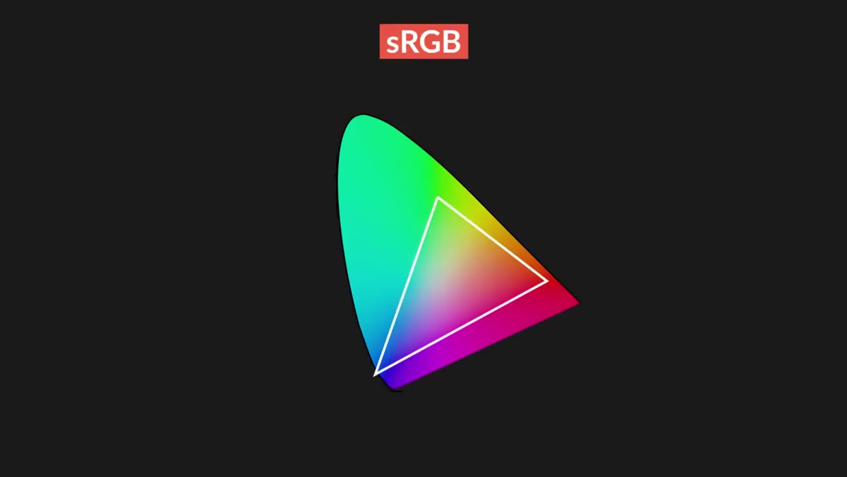 Side-by-side comparison of sRGB, Adobe RGB, and ProPhoto RGB gamut sizes
sRGB exists because screens, browsers, phones, and most consumer devices needed a common standard. Since older and lower-end devices can’t display every color equally well, sRGB uses a conservative range that nearly any device can reproduce accurately. That’s its superpower: consistency across unpredictable viewing environments.
Side-by-side comparison of sRGB, Adobe RGB, and ProPhoto RGB gamut sizes
sRGB exists because screens, browsers, phones, and most consumer devices needed a common standard. Since older and lower-end devices can’t display every color equally well, sRGB uses a conservative range that nearly any device can reproduce accurately. That’s its superpower: consistency across unpredictable viewing environments.
Adobe RGB (1998) was designed with professional printing in mind. It captures a noticeably wider range of colors, particularly in the greens and cyans, which makes it a solid middle-ground choice for photographers who output to print. ProPhoto RGB is the widest of the three and holds color information that goes beyond what most monitors can even display right now. That might sound pointless, but it makes a real difference during heavy editing, which is exactly what the next step covers.
Step 3: Choose Your Working Color Space Based on Your Edit
 Adobe Camera Raw color space dropdown showing ProPhoto RGB selected
Here’s the part that trips most people up. The color space you edit in and the color space you export in do not have to be the same – and for most serious edits, they shouldn’t be. When you’re making adjustments to exposure, white balance, color grading, or saturation, you’re essentially compressing and manipulating data. The more data you start with, the more room you have to work without degrading the image.
Adobe Camera Raw color space dropdown showing ProPhoto RGB selected
Here’s the part that trips most people up. The color space you edit in and the color space you export in do not have to be the same – and for most serious edits, they shouldn’t be. When you’re making adjustments to exposure, white balance, color grading, or saturation, you’re essentially compressing and manipulating data. The more data you start with, the more room you have to work without degrading the image.
For any image where you plan to do significant editing, especially if it involves saturated colors, start in ProPhoto RGB. The difference between color spaces shows up most dramatically in highly saturated hues. Desaturated or neutral tones look similar across all three profiles, but a vivid red or a deep teal can shift noticeably when you’re working in a smaller space. If your photo has rich color and you care about preserving it through your edits, ProPhoto RGB is where you want to be.
Step 4: Set Your Color Space in Adobe Camera Raw
 Adobe Camera Raw workflow options panel with color space and bit depth settings
When you open a raw file in Adobe Camera Raw, look for the workflow options link at the bottom of the screen. Clicking it opens a panel where you can choose your color space before the image even lands in Photoshop. Set this to ProPhoto RGB if you’re doing a detailed edit. You can also set bit depth here – 16-bit will give you even more data to work with and pairs well with a larger color space.
Adobe Camera Raw workflow options panel with color space and bit depth settings
When you open a raw file in Adobe Camera Raw, look for the workflow options link at the bottom of the screen. Clicking it opens a panel where you can choose your color space before the image even lands in Photoshop. Set this to ProPhoto RGB if you’re doing a detailed edit. You can also set bit depth here – 16-bit will give you even more data to work with and pairs well with a larger color space.
This step matters because it’s the entry point for your image. Getting the color space right here means you’re not trying to recover information that was already discarded before you made your first adjustment.
Step 5: Configure Color Settings Inside Photoshop
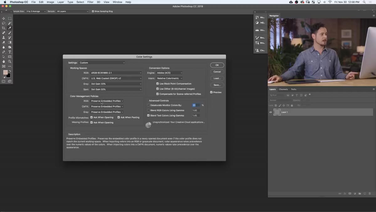 Photoshop Edit menu open with Color Settings dialog box visible
Inside Photoshop, go to Edit and then Color Settings. This is where Photoshop’s default behavior lives. You can choose which color profile Photoshop assumes when opening files and what it should do when it encounters a file that doesn’t match your current settings. For a workflow centered on quality editing, set your RGB working space to ProPhoto RGB here as well.
Photoshop Edit menu open with Color Settings dialog box visible
Inside Photoshop, go to Edit and then Color Settings. This is where Photoshop’s default behavior lives. You can choose which color profile Photoshop assumes when opening files and what it should do when it encounters a file that doesn’t match your current settings. For a workflow centered on quality editing, set your RGB working space to ProPhoto RGB here as well.
Pay attention to the Color Management Policies section. Setting it to “Preserve Embedded Profiles” means Photoshop will respect whatever profile is already attached to a file rather than silently converting it, which prevents unexpected color shifts when you open images from different sources.
Step 6: Export for Web Using sRGB
 Export or Save for Web dialog with sRGB color space option highlighted
This is the step that solves the problem I described at the beginning. No matter what color space you edit in, when you export an image for web use, convert it to sRGB. Web browsers do not interpret ProPhoto RGB or Adobe RGB – they’re built to read sRGB. If you export in a larger profile without converting, the browser strips the color profile information and reinterprets those colors through sRGB anyway, often with ugly results.
Export or Save for Web dialog with sRGB color space option highlighted
This is the step that solves the problem I described at the beginning. No matter what color space you edit in, when you export an image for web use, convert it to sRGB. Web browsers do not interpret ProPhoto RGB or Adobe RGB – they’re built to read sRGB. If you export in a larger profile without converting, the browser strips the color profile information and reinterprets those colors through sRGB anyway, often with ugly results.
When saving for web in Photoshop, or exporting from Lightroom, check the box that converts the color profile to sRGB. It takes two seconds and it’s the difference between your photo looking the way you intended and looking flat or oversaturated on someone else’s screen.
A Note From My Own Workflow
The piece of this I wish someone had told me earlier is that the edit-in-ProPhoto, export-in-sRGB approach is not complicated once it’s a habit. I set ProPhoto RGB as my default in both Camera Raw and Photoshop’s Color Settings, and I added sRGB conversion as a permanent checkbox in my Lightroom export presets. It’s one of those settings you configure once and then it just runs in the background protecting your work.
One place I’d add to what the tutorial covers: if you’re sending files to a print lab, ask them what profile they prefer. Many professional labs want Adobe RGB (1998) rather than sRGB because their printers can actually output that wider gamut. Knowing the destination before you export is the whole game.
The single most important thing to take away from all of this is that color spaces are not a “set it and forget it” choice – they’re a workflow decision you make at multiple points, from opening a raw file to hitting export. Edit in a space wide enough to hold your colors, and deliver in the space your destination is built to read.
Watch the full tutorial on YouTube to see Aaron walk through each of these settings inside Photoshop and Lightroom in real time.
Comments
Leave a Comment