There is a specific kind of disappointment that hits when you pick up a print order and the image looks like it was shot in a cave. You edited it perfectly on your monitor. It looked rich and moody and exactly right. Then it came back from the lab dark, flat, and missing half the shadow detail you spent an hour coaxing out in post. I have been there more than once, and for a long time I chalked it up to “the lab” as if it were some mysterious force beyond my control.
It is not. The issue is almost always the same thing: a backlit screen makes your image look brighter than it actually is on paper, and if you do not compensate before you send the file, you will keep getting dark prints. In this William Patino tutorial (Watch the full tutorial on YouTube), William walks through a clear, repeatable Photoshop workflow that solves exactly this problem. I have added a few notes from my own print experience along the way.
Step 1: Start With the Right File Format
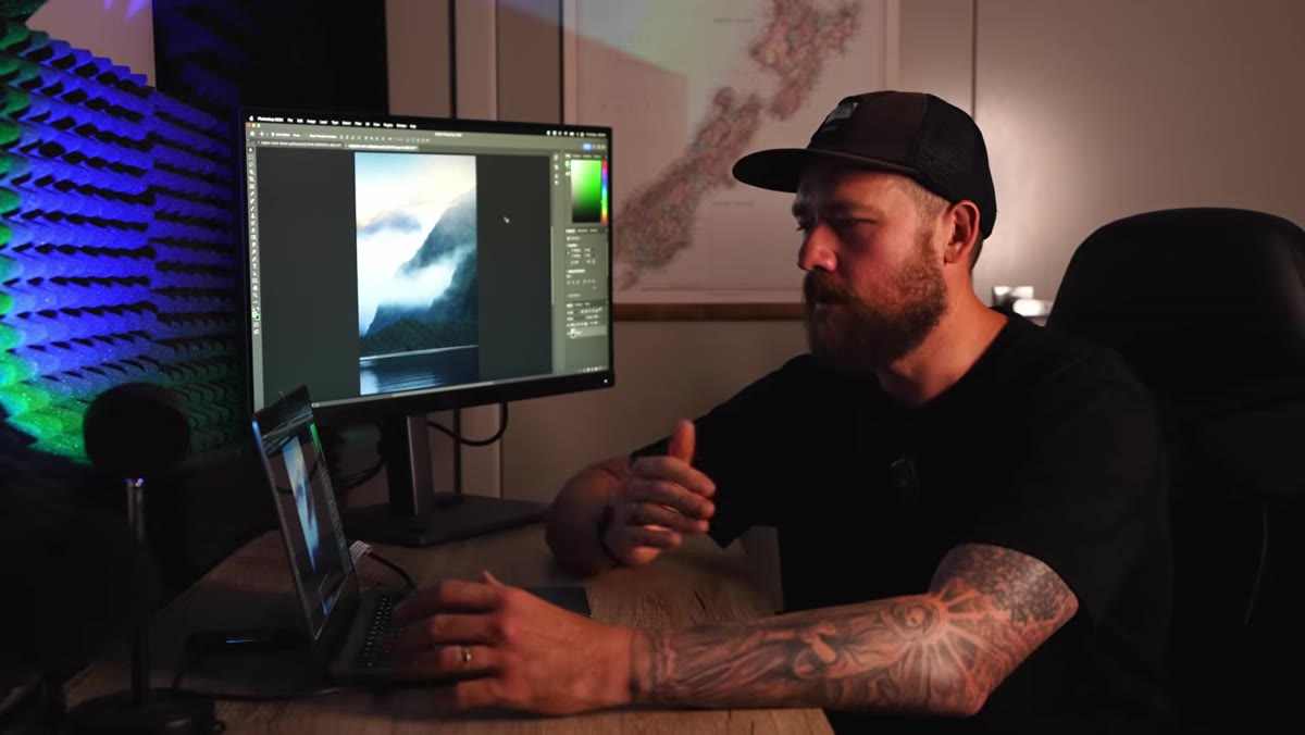 PSD file open in Photoshop workspace
Before you touch a single slider, you need to make sure you are working with the right kind of file. William starts with a PSD, which is a Photoshop document converted from the original raw file. The key qualities you want are high resolution and no compression. If you are a Lightroom user, exporting as a TIFF gets you the same result. Either format preserves all the tonal information your camera captured, which matters a lot when you are printing at large sizes. Do not use a JPEG for your print master file. The compression artifacts that are invisible on screen will show up on paper, especially in smooth gradients like skies.
PSD file open in Photoshop workspace
Before you touch a single slider, you need to make sure you are working with the right kind of file. William starts with a PSD, which is a Photoshop document converted from the original raw file. The key qualities you want are high resolution and no compression. If you are a Lightroom user, exporting as a TIFF gets you the same result. Either format preserves all the tonal information your camera captured, which matters a lot when you are printing at large sizes. Do not use a JPEG for your print master file. The compression artifacts that are invisible on screen will show up on paper, especially in smooth gradients like skies.
Step 2: Resize the Image to Your Print Dimensions
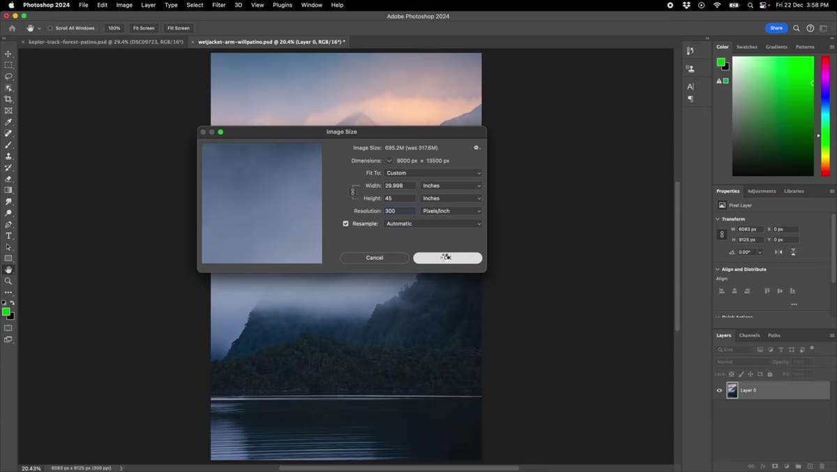
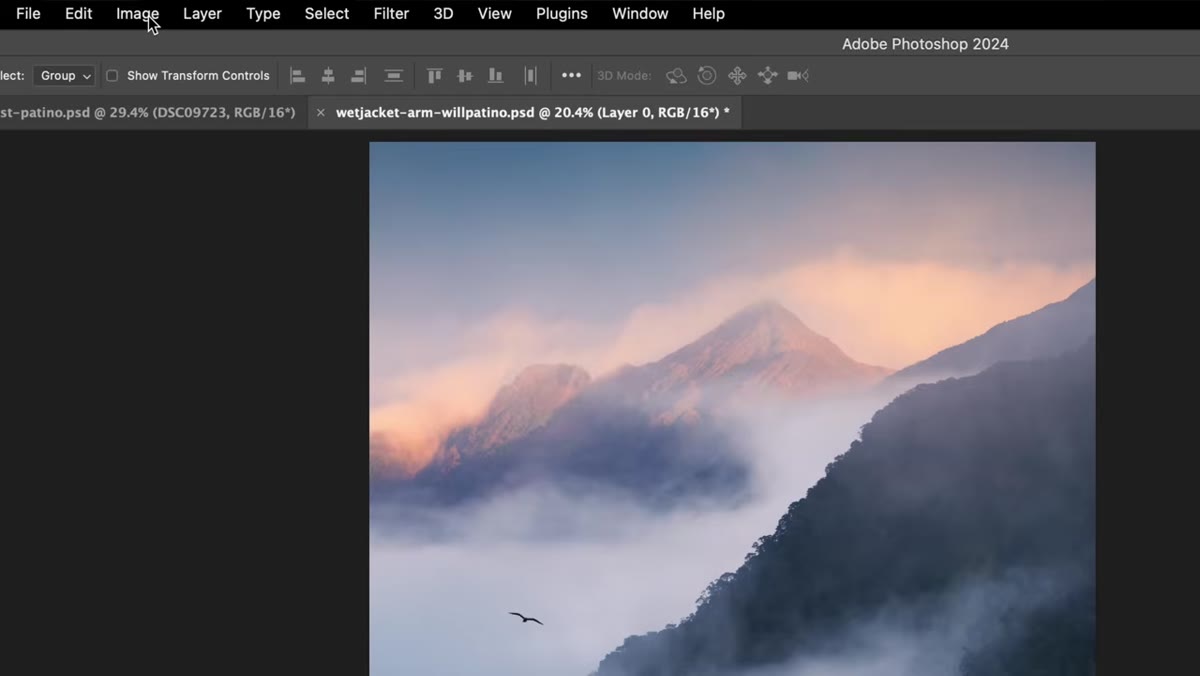 Photoshop Image Size dialog with inch measurements
Go to Image, then Image Size in Photoshop. Switch the units to inches if they are not already set that way. Then change the longest edge of your image to match your target print size. William is printing at 45 inches on the long side for a 30x45 print, so he types 45 into the height field (which is the longer dimension in his image). Photoshop maintains the aspect ratio automatically, so the width adjusts to match. Do not try to set both dimensions manually unless you want to distort the image.
Photoshop Image Size dialog with inch measurements
Go to Image, then Image Size in Photoshop. Switch the units to inches if they are not already set that way. Then change the longest edge of your image to match your target print size. William is printing at 45 inches on the long side for a 30x45 print, so he types 45 into the height field (which is the longer dimension in his image). Photoshop maintains the aspect ratio automatically, so the width adjusts to match. Do not try to set both dimensions manually unless you want to distort the image.
Leave the resolution at 300 PPI. That is the standard for print quality, and there is no reason to change it for lab orders. The only time you would drop the PPI is when preparing images for the web, where large file sizes slow load times and screen resolution caps out much lower anyway.
Step 3: Duplicate the Layer Before Making Any Changes
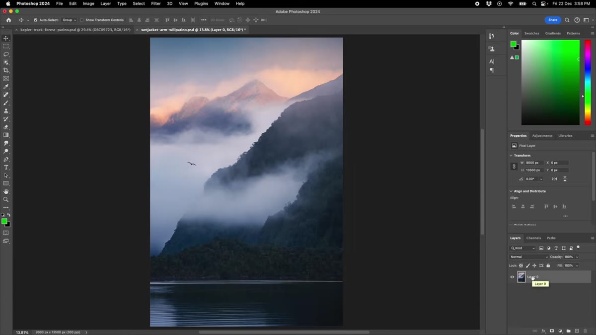 Layers panel showing duplicated layer above background
Once the image is resized, duplicate your working layer before you do anything else. In Photoshop, that is Command+J on a Mac (Ctrl+J on Windows). This gives you a fresh copy of the image sitting above your original, and it means your base edit stays completely untouched. All the print-specific adjustments go on this duplicate. It is a small habit that saves a lot of backtracking if you decide the adjustments are too heavy or you need to tweak them later.
Layers panel showing duplicated layer above background
Once the image is resized, duplicate your working layer before you do anything else. In Photoshop, that is Command+J on a Mac (Ctrl+J on Windows). This gives you a fresh copy of the image sitting above your original, and it means your base edit stays completely untouched. All the print-specific adjustments go on this duplicate. It is a small habit that saves a lot of backtracking if you decide the adjustments are too heavy or you need to tweak them later.
Step 4: Understand Why Prints Come Back Dark
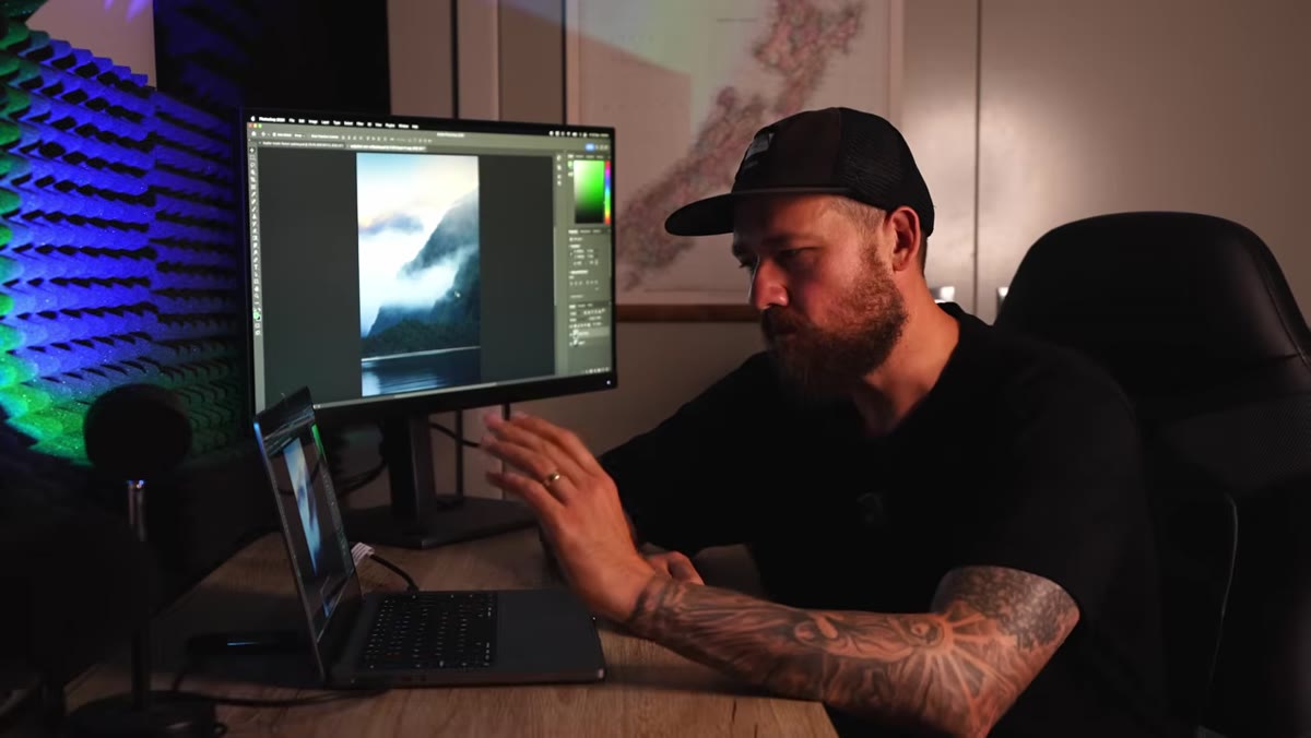 Original dark image displayed on screen with shadow detail visible
This step is less about a button you click and more about a concept you need to internalize, because it explains every adjustment that follows. Your monitor is backlit. It is actively projecting light at your eyes, which makes images appear brighter and more open than they will look on a physical surface reflecting ambient light. Shadow areas especially get crushed in print. Fine detail in trees, hair, fabric textures, anything in the mid-to-dark range will go flat or disappear entirely if you send the file as-is. William points to some tree detail in his landscape image as a perfect example. It reads clearly on screen and vanishes in print. The fix is deliberate brightening, applied only to the duplicate layer, before you export.
Original dark image displayed on screen with shadow detail visible
This step is less about a button you click and more about a concept you need to internalize, because it explains every adjustment that follows. Your monitor is backlit. It is actively projecting light at your eyes, which makes images appear brighter and more open than they will look on a physical surface reflecting ambient light. Shadow areas especially get crushed in print. Fine detail in trees, hair, fabric textures, anything in the mid-to-dark range will go flat or disappear entirely if you send the file as-is. William points to some tree detail in his landscape image as a perfect example. It reads clearly on screen and vanishes in print. The fix is deliberate brightening, applied only to the duplicate layer, before you export.
Step 5: Open Camera Raw Filter and Lift the Dark Tones
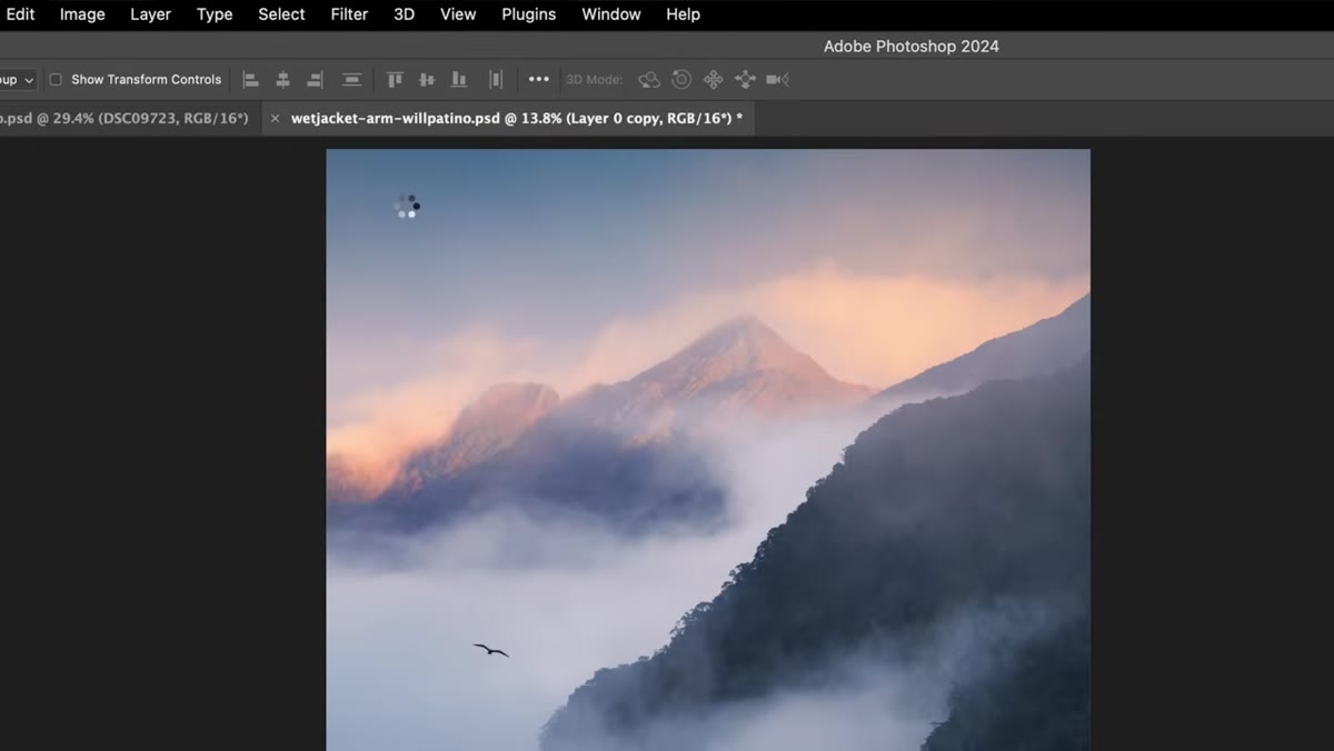 Adobe Camera Raw filter open with histogram visible
With the duplicate layer selected, go to Filter and then Camera Raw Filter. This opens the image in Adobe Camera Raw (ACR), which gives you the same sliders you would have used in your original raw processing. If you use Lightroom, you can do this same work there before exporting your print file.
Adobe Camera Raw filter open with histogram visible
With the duplicate layer selected, go to Filter and then Camera Raw Filter. This opens the image in Adobe Camera Raw (ACR), which gives you the same sliders you would have used in your original raw processing. If you use Lightroom, you can do this same work there before exporting your print file.
The histogram is your guide here. William focuses on the left side of the histogram, which represents the dark and shadow tones. Those are the values that disappear in print. Bring up the Shadows slider to recover detail in the darkest areas. Then nudge the Exposure or the Blacks depending on how dense your midtones are sitting. You are not trying to make the image look correct on your screen, you are making it look slightly too bright on your screen so that it lands correctly on paper. That mental shift is important. If your print edit looks a little washed out on your monitor, you are probably on the right track.
Step 6: Export and Send to Your Lab
 Photoshop file after upscaling showing increased file size
Once you are happy with the brightness adjustments in Camera Raw, hit OK and flatten or save the file according to your lab’s requirements. Most professional print labs accept TIFF or JPEG at a specific DPI. Check your lab’s submission guidelines before exporting because some have specific color profile requirements (sRGB vs. Adobe RGB) that affect how colors render in print. Save this brightened version as a separate file so your original edit remains intact for screen use and social sharing.
Photoshop file after upscaling showing increased file size
Once you are happy with the brightness adjustments in Camera Raw, hit OK and flatten or save the file according to your lab’s requirements. Most professional print labs accept TIFF or JPEG at a specific DPI. Check your lab’s submission guidelines before exporting because some have specific color profile requirements (sRGB vs. Adobe RGB) that affect how colors render in print. Save this brightened version as a separate file so your original edit remains intact for screen use and social sharing.
One Thing I Would Add: Order a Small Test Print First
I have started ordering a small proof print, usually an 8x10 or a 5x7, before committing to a large format order. It costs a few dollars and saves the frustration of getting a 30x45 back and realizing your brightness compensation was slightly off. Once you have done this workflow a few times with the same lab, you will develop a feel for exactly how much to push the shadows and exposure for their specific paper and process. Every lab prints a little differently, and a test print gives you a calibration reference you can keep going back to.
The single most important thing to take away from William’s workflow is this: editing for screen and editing for print are two different jobs, and treating them the same way is what causes most print disappointments. Make it a habit to create a print-specific version of every image you plan to order, and your results will get dramatically more consistent.
Watch the full tutorial on YouTube to see William walk through the complete process in real time, including how he navigates the Image Size dialog and reads the histogram in Camera Raw.
Comments
Leave a Comment