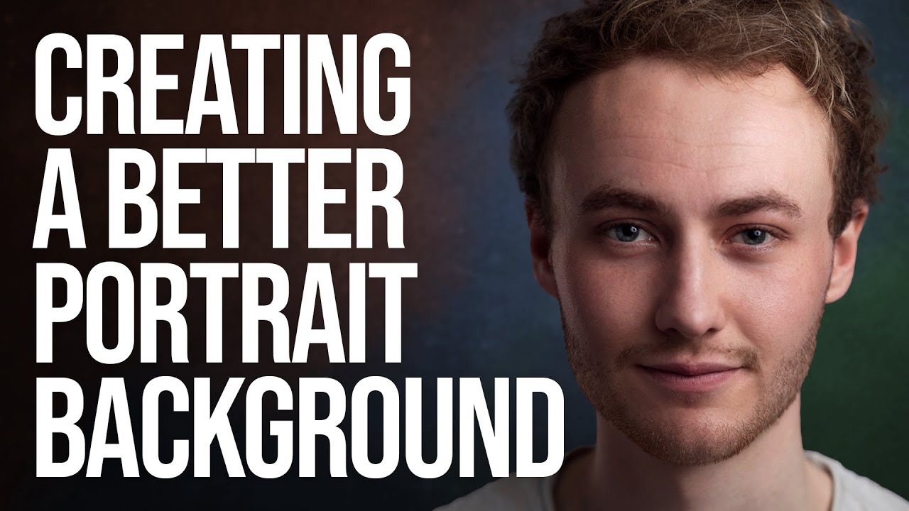
Most of us aren’t running a studio with a wall of seamless paper rolls in every color. I shoot out of a converted spare bedroom in Seattle, and for the longest time I felt limited by the single gray backdrop I owned. Every portrait session started to look like it came from the same universe, which is fine, but it’s not exactly inspiring for clients or for me.
What changed things for me was watching Sean Tucker work through this exact problem. In this tutorial on adding texture and color to portrait backgrounds, he demonstrates how to take one neutral backdrop and use Photoshop to shift it into something completely different, with realistic texture and a color palette that actually flatters your subject. The technique sits in that sweet spot between simple and genuinely useful. It’s not a five-minute trick, but it’s not a week-long project either.
The core idea is this: you shoot your subject against a neutral mid-tone background, then in post you separate the subject from the background using a mask, drop a texture image underneath, and blend everything together to make it look like your subject was always standing in front of something richer. Done well, it looks convincing. Done badly, it looks like a bad composite. Tucker walks you through exactly how to keep it in the “convincing” category.
Step 1: Duplicate the Background Layer
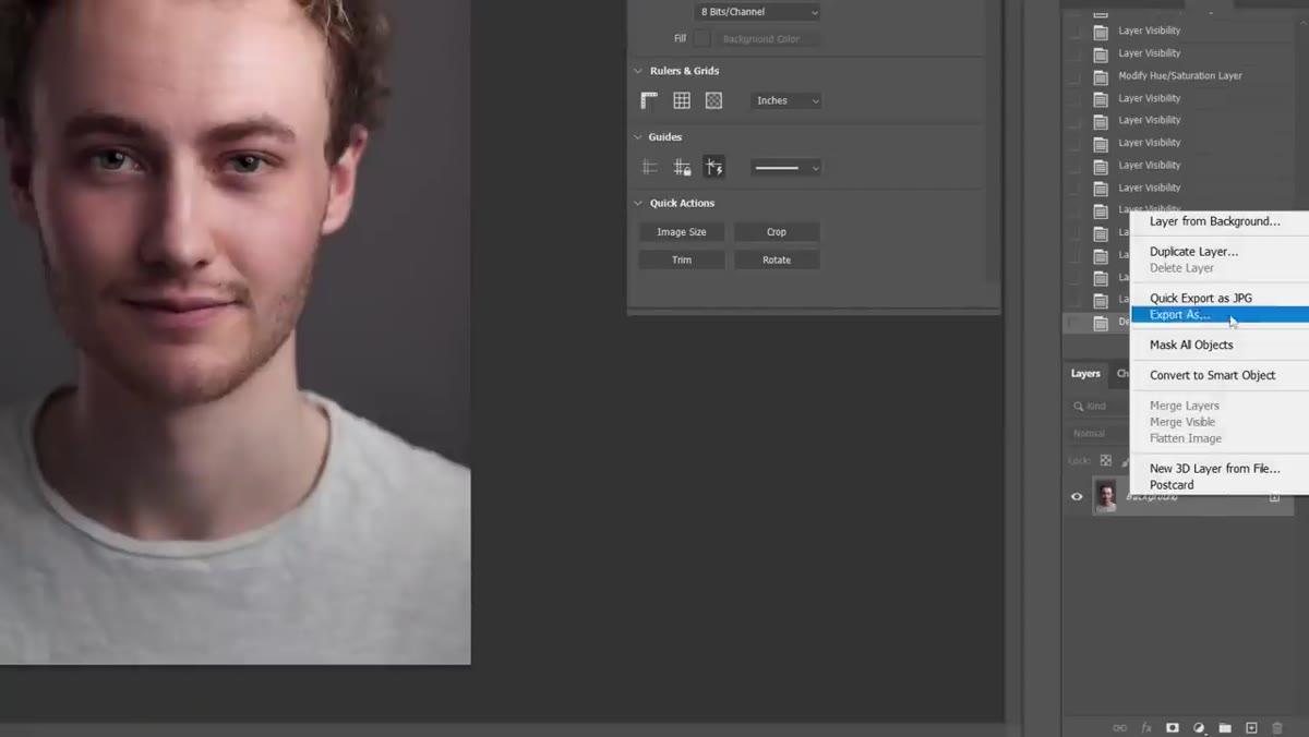 Duplicate layer dialog box open in Photoshop
Before touching anything, duplicate your base image layer. Right-click on the background layer in the Layers panel and choose “Duplicate Layer.” This gives you a working copy sitting above the original, which you’ll need because the two layers will serve different jobs before the process is finished. It’s a small habit that protects you from painting yourself into a corner later.
Duplicate layer dialog box open in Photoshop
Before touching anything, duplicate your base image layer. Right-click on the background layer in the Layers panel and choose “Duplicate Layer.” This gives you a working copy sitting above the original, which you’ll need because the two layers will serve different jobs before the process is finished. It’s a small habit that protects you from painting yourself into a corner later.
Step 2: Select Your Subject with “Select Subject”
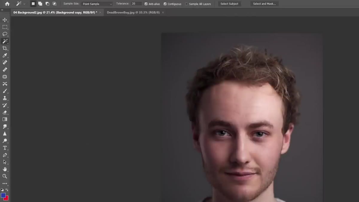 Magic Wand tool active with Select Subject button highlighted
Grab the Magic Wand tool from your toolbar. As soon as you do, you’ll see a “Select Subject” button appear in the options bar at the top of the screen. Click it and let Photoshop’s AI do its work. In recent versions of Photoshop, this selection is genuinely impressive. It reads the subject cleanly in most portrait situations and gives you a marching-ants selection you can actually use without spending 20 minutes on manual masking.
Magic Wand tool active with Select Subject button highlighted
Grab the Magic Wand tool from your toolbar. As soon as you do, you’ll see a “Select Subject” button appear in the options bar at the top of the screen. Click it and let Photoshop’s AI do its work. In recent versions of Photoshop, this selection is genuinely impressive. It reads the subject cleanly in most portrait situations and gives you a marching-ants selection you can actually use without spending 20 minutes on manual masking.
Tucker makes a point here that I think is worth sitting with: you don’t need a perfect selection for this technique. Because you’re shifting a gray background to another mid-tone with texture, rather than swapping white for black, any minor fringing around hair or shoulders will be almost invisible in the final image. Perfectionism at this stage is mostly wasted effort.
Step 3: Add a Layer Mask and Refine the Hair
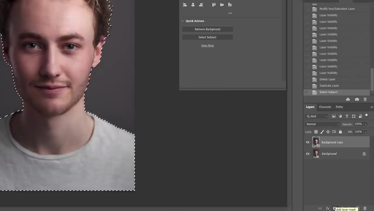 Layer mask added to duplicated layer in Layers panel
With your selection active, click the “Add Layer Mask” button at the bottom of the Layers panel. The icon looks like a rectangle with a circle cut out of it. This applies your selection as a mask to the duplicated layer, hiding the background from that layer and revealing the original below.
Layer mask added to duplicated layer in Layers panel
With your selection active, click the “Add Layer Mask” button at the bottom of the Layers panel. The icon looks like a rectangle with a circle cut out of it. This applies your selection as a mask to the duplicated layer, hiding the background from that layer and revealing the original below.
Now go to Select and Mask at the top of the screen. Inside that workspace, click “Refine Hair.” This is a one-click improvement that does a surprisingly good job tightening up the selection around flyaways and soft edges. After running it, look closely at your mask and use a white-painted brush to fill in any areas where the mask has accidentally eaten into your subject. Keep the brush soft and your opacity low, and just restore what belongs to the person in the frame.
Step 4: Bring in Your Texture Image
 Texture image dragged onto canvas above background layer
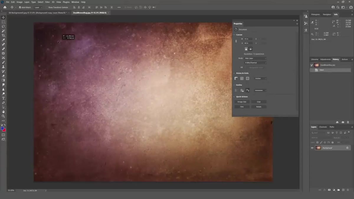
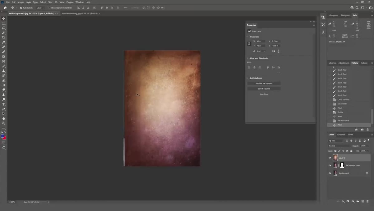
Now you need a texture file. Tucker uses a physical texture photograph, something with interesting tone and surface variation. Good sources for this include your own photos of walls, fabric, paper, or stone, or any number of free texture libraries online. Drag your texture file onto the canvas and position it between the two layers you already have: below the masked portrait layer, above the original background.
Texture image dragged onto canvas above background layer
Now you need a texture file. Tucker uses a physical texture photograph, something with interesting tone and surface variation. Good sources for this include your own photos of walls, fabric, paper, or stone, or any number of free texture libraries online. Drag your texture file onto the canvas and position it between the two layers you already have: below the masked portrait layer, above the original background.
Scale and position the texture so it fills the frame. At this stage it will look completely wrong, and that’s fine. The texture is probably far too contrasty and the colors are fighting with your subject. The next step handles all of that.
Step 5: Blend the Texture Using Luminosity Mode
 Blend mode dropdown showing Luminosity selected on texture layer
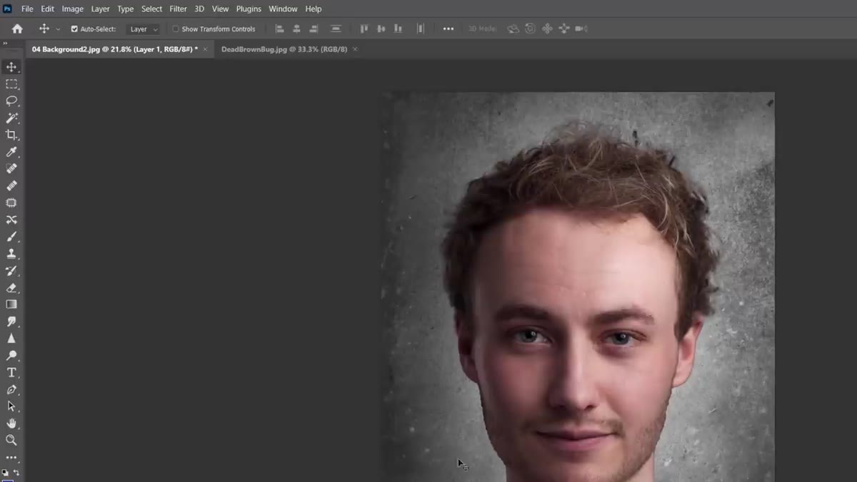
With the texture layer selected, open the blend mode dropdown at the top of the Layers panel. It defaults to “Normal.” Change it to “Luminosity.” This tells Photoshop to apply only the brightness information from the texture, not its color. The effect is immediate: the texture starts reading as subtle variation in the background rather than a competing visual element. Reduce the layer opacity until the texture feels present but not distracting. Tucker typically lands somewhere in the 50-70% range depending on the specific image, but trust your eye on this one.
Blend mode dropdown showing Luminosity selected on texture layer
With the texture layer selected, open the blend mode dropdown at the top of the Layers panel. It defaults to “Normal.” Change it to “Luminosity.” This tells Photoshop to apply only the brightness information from the texture, not its color. The effect is immediate: the texture starts reading as subtle variation in the background rather than a competing visual element. Reduce the layer opacity until the texture feels present but not distracting. Tucker typically lands somewhere in the 50-70% range depending on the specific image, but trust your eye on this one.
Step 6: Shift the Background Color with a Hue/Saturation Adjustment
 Hue/Saturation adjustment layer properties panel open
Add a Hue/Saturation adjustment layer above the texture layer but below the masked portrait layer. Clip it to the texture layer if you want to keep things tidy, or let it affect everything beneath your subject. From here you have real freedom: dial in a color shift that complements your subject’s skin tone, clothing, or the overall mood you’re going for. Tucker demonstrates moving toward cooler blue-gray tones for a clean, editorial feel. Warmer amber-browns can push a portrait toward something more organic and moody. The saturation slider lets you keep the color hint subtle, which is almost always the right call.
Hue/Saturation adjustment layer properties panel open
Add a Hue/Saturation adjustment layer above the texture layer but below the masked portrait layer. Clip it to the texture layer if you want to keep things tidy, or let it affect everything beneath your subject. From here you have real freedom: dial in a color shift that complements your subject’s skin tone, clothing, or the overall mood you’re going for. Tucker demonstrates moving toward cooler blue-gray tones for a clean, editorial feel. Warmer amber-browns can push a portrait toward something more organic and moody. The saturation slider lets you keep the color hint subtle, which is almost always the right call.
What I’d Add From My Own Work
The technique Tucker teaches here is solid as-is, but I’ve found one extra step makes a meaningful difference: adding a subtle vignette to the background texture layer after blending. A gentle darkening around the edges of the frame naturally draws attention toward the center where your subject lives, and it also helps disguise any slight inconsistencies in how the texture meets the subject at the edges of the mask. I use a radial gradient on a curves adjustment layer, set to darken, with a very long feather. It takes 30 seconds and it quietly does a lot of heavy lifting.
I’d also encourage you to build a small folder of go-to textures you like. After a few sessions using this workflow, you’ll start to develop a feel for which textures blend smoothly (fine grain, subtle tonal variation) versus which ones fight the subject (high contrast, strong directional light baked in). That folder becomes its own creative resource over time.
The single most important idea here is that your background is part of your portrait’s design, not just what happens to be behind your subject. A flat gray might be neutral, but “neutral” isn’t the same as “intentional.” This workflow gives you a way to be deliberate about that background at the editing stage, which means more creative control without needing a bigger studio or a larger gear budget.
Watch the full tutorial on YouTube to see Tucker walk through each step on a real portrait from start to finish.
Comments (5)
Bookmarked. Coming back to this one for sure.
Simple but effective. Sometimes that's all you need.
I've watched a dozen tutorials on this and yours is the clearest by far.
Finally someone explains this in a way that actually makes sense.
Great article! I actually covered something related on my site — the landscape angle is really complementary to this.
Leave a Comment