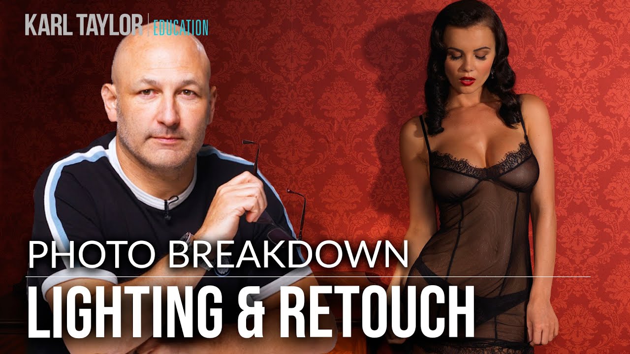
There’s a specific kind of regret that hits you when you’re culling a shoot and you realize the light was almost perfect. Not bad enough to scrap the image, just not quite what you had in your head. I’ve been there more times than I want to admit, staring at a technically solid photo and thinking, “if only there had been a little more atmosphere.” That’s exactly the problem Carl Taylor from Visual Education walks through in Watch the full tutorial on YouTube. He shot a lingerie campaign with a French Moulin Rouge aesthetic and nailed the composition, the mood, the whole vibe. But looking back at the raw files, he felt the light was too clean, too even. It needed that soft, dappled quality, like sunlight pushing through sheer curtains or filtering through leaves outside a window.
What I love about this breakdown is that Carl is upfront about preferring to solve this problem in-camera, using a gobo or textured modifier in front of a light source to cast natural-looking patterns. That’s the right instinct. But he didn’t get the shot that way, so he built the effect in Photoshop instead. And honestly, the result is convincing enough that knowing this technique is useful even when you do plan ahead. Sometimes the light shifts, the curtain isn’t where you need it, or you just want more control in post. Here’s how he did it, broken down into steps you can follow on your own files.
Step 1: Start With Your Base Image on Its Own Layer
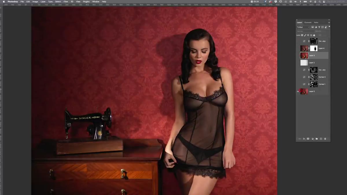 Original flat raw image open in Photoshop layers panel
Before anything else, make sure your retouched or processed base image is sitting as a flattened layer in Photoshop. Carl works with a single background layer as his starting point, then builds everything on top. Keep this layer locked or clearly labeled so you don’t accidentally paint or adjust it directly. All the atmospheric work happens above it.
Step 2: Create a New Layer Filled with Black
 New black-filled layer added above the base image
Add a new layer above your base image and fill it entirely with black. This becomes the foundation of your mask. Think of it as a blackout curtain. Right now it covers everything, but you’re about to cut holes in it to let controlled light bleed through. The black fill is what makes the technique work, because Photoshop reveals what’s underneath wherever the mask is white, and hides it wherever the mask is black.
Step 3: Paint Irregular White Shapes on the Mask
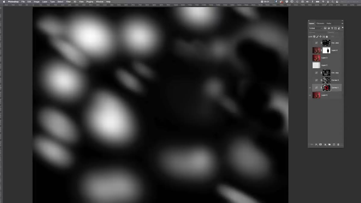 Speckled white blobs painted onto black layer mask
This is the most hands-on part of the process. Using a small, hard-edged brush set to white, paint irregular blobs and specks across the black layer. Don’t try to make them look like anything specific yet. Carl describes them as random spotty shapes, and that randomness is exactly what you want. Real dappled light is organic and uneven. Vary the size of your marks. Some should be small and tight, others wider and more spread out. The goal is something that looks like light peeking through irregular gaps, not a stencil pattern.
Step 4: Blur Each Shape Individually with Gaussian Blur
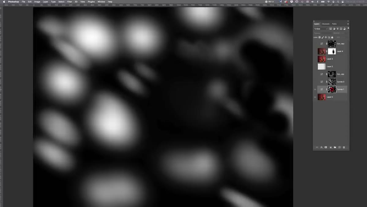 Gaussian blur applied to individual white selections on mask
Here’s where the light starts to feel real. Select each white shape individually (using the lasso tool works fine here) and apply a Gaussian Blur to it. The key is that you vary the blur radius for each shape. Some get a heavy blur that makes them soft and glowing. Others get almost none, so they stay crisper and brighter at the center. Carl also recommends smudging and stretching some shapes slightly before blurring to make them feel even more natural. No two spots of dappled light are identical in real life, and your mask should reflect that.
Step 5: Adjust Blend Mode and Position the Light Layer
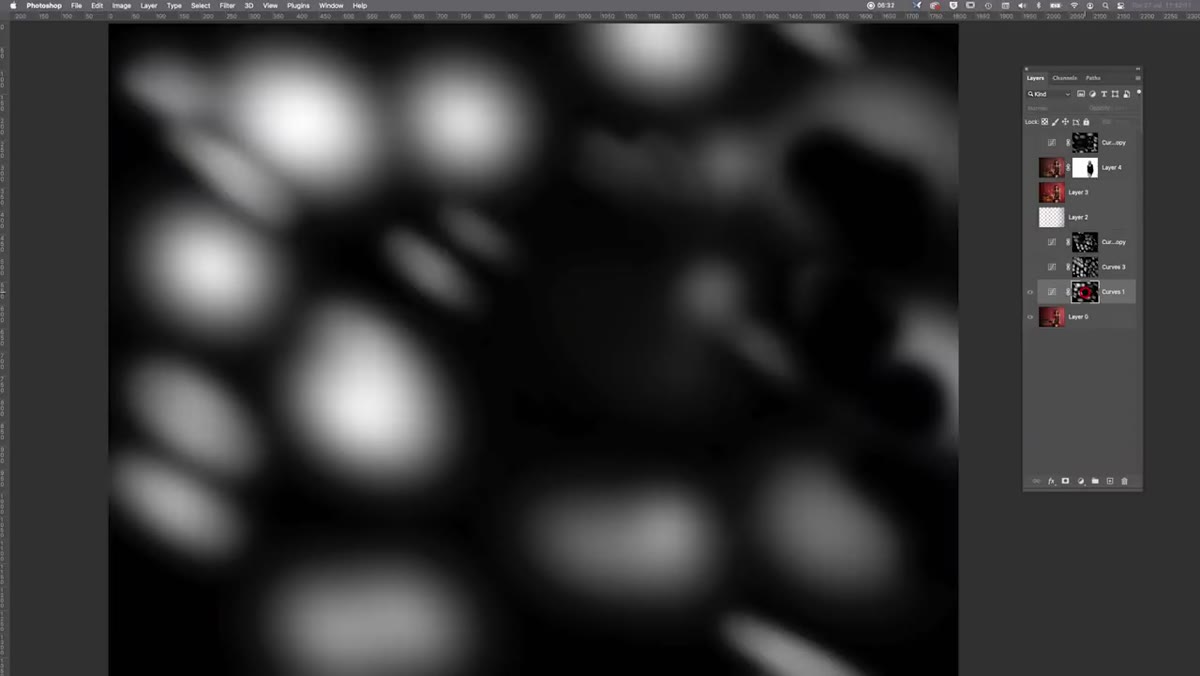 Random spotty mask layer positioned over the subject
Once your mask is built, check how it’s sitting relative to your subject. The light pattern should fall across the skin, the fabric, and the background in a way that makes visual sense, as if a real light source were casting it from one direction. You may want to rotate or skew the entire layer slightly so the spots follow a diagonal that reads as sunlight coming through a window at an angle. This directional logic is what separates convincing from fake.
Step 6: Add a Curves Adjustment Clipped to the Light Layer
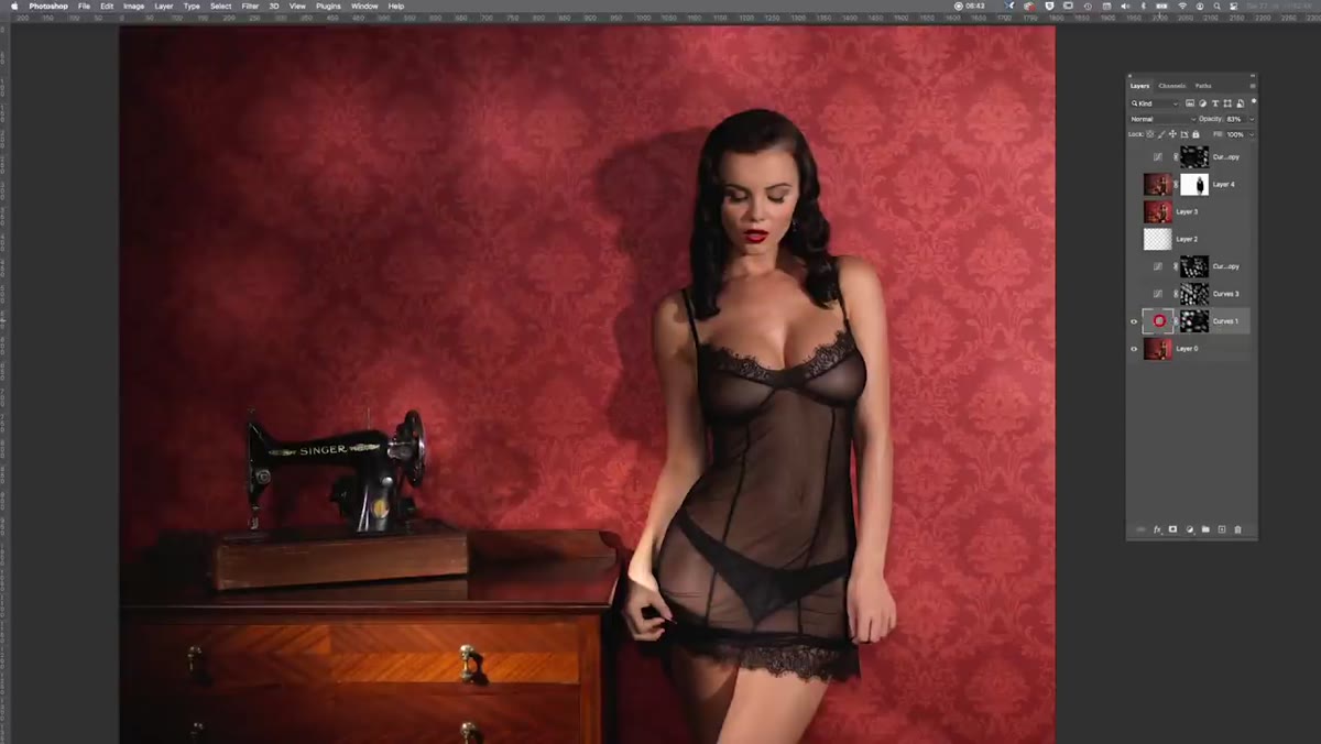 Curves adjustment panel showing RGB and red channel edits
This step is what gives the light its warmth and glow. Add a Curves adjustment layer and clip it to your light layer so it only affects the spots you’ve created. In the master RGB curve, pull the midpoint upward to brighten the light effect overall. Then switch to the Red channel and lift the highlights end of the curve. Carl leaves the Green channel mostly neutral and pulls the Blue channel down slightly. The result is a warm, slightly amber quality to the light, which mimics the color temperature of real sunlight rather than a neutral studio strobe. That color shift is subtle but it matters enormously for believability.
Step 7: Refine the Intensity and Placement
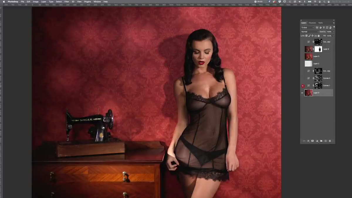
 Final composite showing dappled warm light across the full image
Step back and look at the full image. Reduce the opacity of your light layer if the effect feels too heavy. You can also paint directly on the black base of the mask (using black paint) to erase any spots that land in visually distracting places, like directly on the subject’s face in a way that competes with the main lighting. The goal is enhancement, not distraction. The dappled light should make the image feel more alive, not call attention to itself.
A Note on Getting This Right In-Camera
Carl mentions this himself, and I want to second it strongly: if you can create this effect with physical light, do it. A piece of mesh fabric, a lace panel, or even a plant held between your strobe and your subject will give you something that no layer mask can fully replicate. The way real light wraps, scatters, and interacts with skin has a quality that post-processing approximates but doesn’t quite match.
That said, knowing the Photoshop version means you have a safety net. I’ve used a similar masking approach on travel portraits where the light was beautiful but just slightly too flat, and being able to introduce a suggestion of texture after the fact saved images I would have otherwise left in the archive. It’s also a great way to prototype an idea before you go through the trouble of building a physical gobo setup on your next shoot.
The single most important thing Carl’s tutorial teaches isn’t a specific slider value or tool. It’s the habit of looking back at your work and asking what the light needed, even when you thought you were done. That reflective loop, where you compare what you got against what the image was asking for, is what actually makes you better over time.
Watch the full tutorial on YouTube to see Carl walk through the layers panel in real time, including the second lighting setup from the same shoot that he covers in a separate breakdown.
Comments (2)
My workflow just got 10x faster. Not even kidding.
This is fantastic. I've been recommending this approach to my readers too.
Leave a Comment