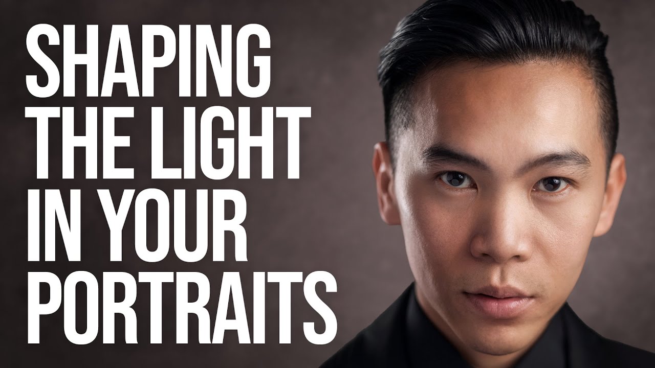
You know that sinking feeling when you load a portrait onto your computer and the light that looked so gorgeous on location just… disappears? I’ve been there more times than I’d like to admit. You place your subject perfectly, the shadows are sculpting the face exactly right, you’re almost giddy pressing the shutter. Then you get home, open the raw file, and the whole thing looks like a flat, lifeless scan of a bad print. The contrast is gone. The dimension is gone. It’s deeply discouraging.
The good news is that this is a known problem with a real, learnable solution. In this Sean Tucker tutorial, Watch the full tutorial on YouTube, Tucker walks through how to use dodging and burning to restore and accentuate the light you actually captured in camera. This isn’t about faking a lighting setup in post or doing anything dramatic. It’s about finishing the image so that your viewer sees what your eye saw on the day. I’ve folded these ideas into my own portrait editing workflow, and the results are subtle in the best possible way.
One thing Tucker emphasizes right away, and I think it’s worth repeating loudly: this technique is not a rescue operation. It will not save a poorly lit photo. Your job as a photographer is still to capture good light in camera, whether you’re working with strobes in a studio or chasing window light in a coffee shop. What these techniques do is close the gap between what the raw file shows and what you actually witnessed.
Step 1: Understand Why Raw Files Look Flat
 Raw portrait file looking flat and dull on screen
Before you touch a single slider, it helps to know why the problem exists in the first place. Raw files are engineered to retain as much information as possible across the entire dynamic range, from the darkest shadows to the brightest highlights. That’s genuinely useful for editing flexibility, but it means the file that lands on your screen often looks compressed and low-contrast. The “juice” in the lighting, to borrow Tucker’s word, gets flattened out in the process. Knowing this stops you from panicking and also stops you from reaching straight for the contrast slider as a blunt fix.
Raw portrait file looking flat and dull on screen
Before you touch a single slider, it helps to know why the problem exists in the first place. Raw files are engineered to retain as much information as possible across the entire dynamic range, from the darkest shadows to the brightest highlights. That’s genuinely useful for editing flexibility, but it means the file that lands on your screen often looks compressed and low-contrast. The “juice” in the lighting, to borrow Tucker’s word, gets flattened out in the process. Knowing this stops you from panicking and also stops you from reaching straight for the contrast slider as a blunt fix.
Step 2: Read the Light in the Eye Catchlights
 Zoomed-in view of eye showing catchlight reflections
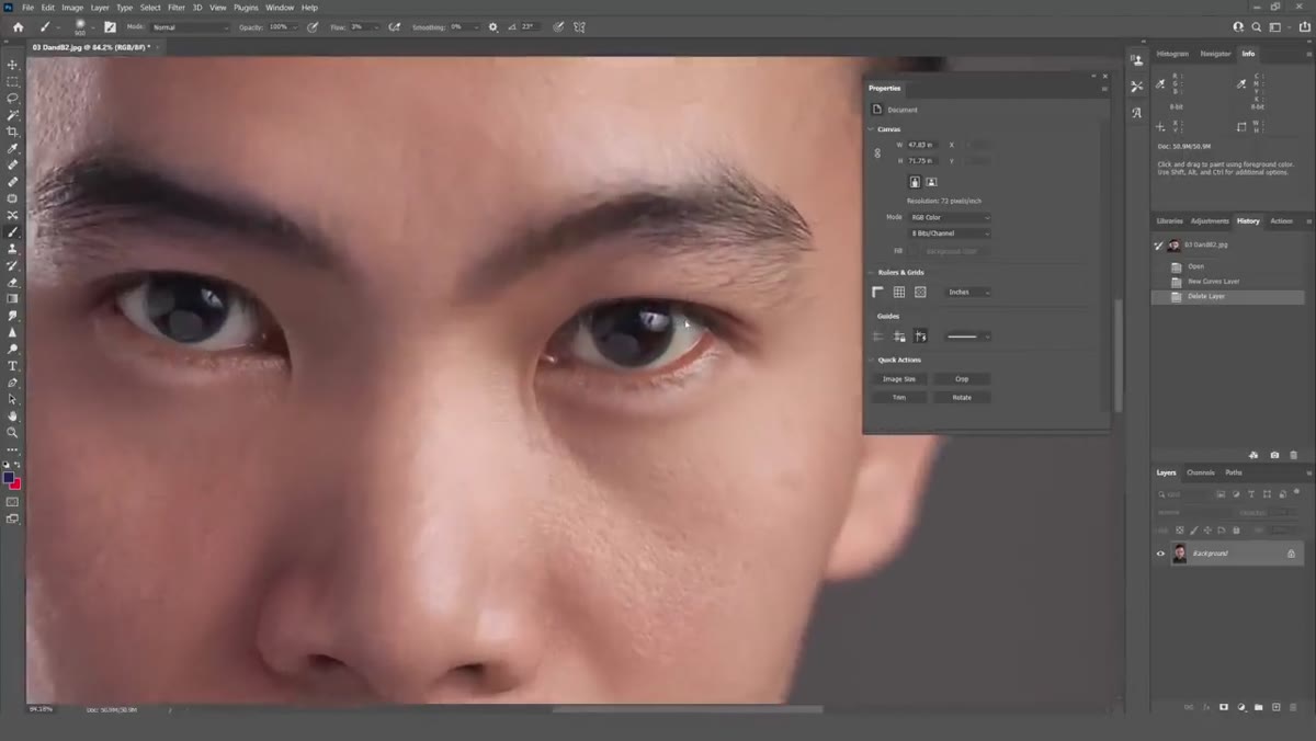
Before you start editing, zoom into your subject’s eye and look at the catchlights. The reflections in the eye act like a tiny map of your entire lighting setup. Tucker demonstrates this clearly: you can see the main softbox on one side, a reflector below the eye bouncing fill light upward, and a second reflector off to the side. Even if you didn’t set up the lights yourself, or you’re working with natural light and reflectors, the catchlights will tell you where the key light is coming from and which areas of the face should be bright versus in shadow. This information guides every dodge-and-burn decision you make from here.
Zoomed-in view of eye showing catchlight reflections
Before you start editing, zoom into your subject’s eye and look at the catchlights. The reflections in the eye act like a tiny map of your entire lighting setup. Tucker demonstrates this clearly: you can see the main softbox on one side, a reflector below the eye bouncing fill light upward, and a second reflector off to the side. Even if you didn’t set up the lights yourself, or you’re working with natural light and reflectors, the catchlights will tell you where the key light is coming from and which areas of the face should be bright versus in shadow. This information guides every dodge-and-burn decision you make from here.
Step 3: Identify the Key Light and Shadow Zones
 Annotated portrait showing key light direction on face
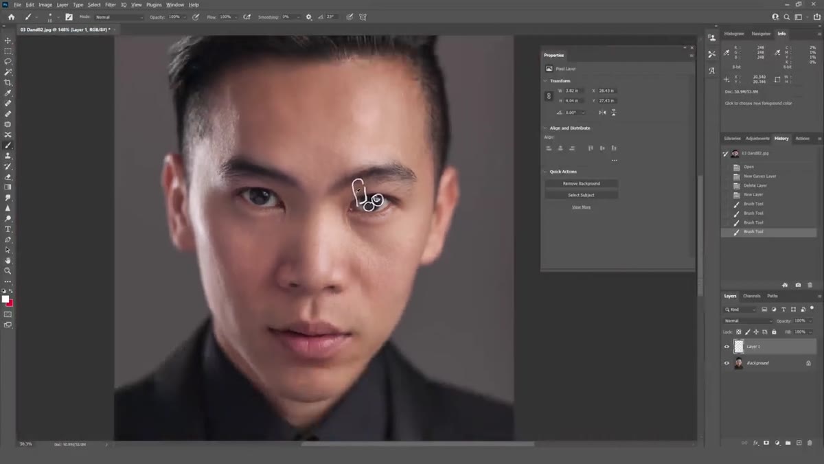
Once you understand the lighting, map it onto the face. Tucker identifies the main (key) light source coming from one side, with fill and separation lights doing supporting work. On your own portraits, trace where the light falls and where it falls off. Which side of the nose? Under the chin? Along the cheekbones? These aren’t just aesthetic observations. They’re your editing roadmap. The areas the key light hits are candidates for subtle dodging (brightening), and the shadow areas that feel too muddy after the raw conversion are candidates for careful burning (darkening). Do this mapping step before you open a single adjustment tool.
Annotated portrait showing key light direction on face
Once you understand the lighting, map it onto the face. Tucker identifies the main (key) light source coming from one side, with fill and separation lights doing supporting work. On your own portraits, trace where the light falls and where it falls off. Which side of the nose? Under the chin? Along the cheekbones? These aren’t just aesthetic observations. They’re your editing roadmap. The areas the key light hits are candidates for subtle dodging (brightening), and the shadow areas that feel too muddy after the raw conversion are candidates for careful burning (darkening). Do this mapping step before you open a single adjustment tool.
Step 4: Use Curves or a Dodge Layer, Not the Contrast Slider
 Lightroom panel showing curves versus contrast slider options
The instinct when a portrait looks flat is to drag the Contrast slider up. Resist it. A global contrast boost treats every part of the image equally, which is rarely what you want. Instead, work with targeted adjustments. In Lightroom, that means using the Tone Curve panel and, more importantly, using the Radial or Graduated Filter tools with exposure adjustments to target specific regions of the face. In Photoshop, you’d create separate Curves adjustment layers set to Multiply (for burning) and Screen (for dodging), then paint with a low-opacity brush on a black mask to reveal the effect only where you want it. The key in both cases is precision and subtlety.
Lightroom panel showing curves versus contrast slider options
The instinct when a portrait looks flat is to drag the Contrast slider up. Resist it. A global contrast boost treats every part of the image equally, which is rarely what you want. Instead, work with targeted adjustments. In Lightroom, that means using the Tone Curve panel and, more importantly, using the Radial or Graduated Filter tools with exposure adjustments to target specific regions of the face. In Photoshop, you’d create separate Curves adjustment layers set to Multiply (for burning) and Screen (for dodging), then paint with a low-opacity brush on a black mask to reveal the effect only where you want it. The key in both cases is precision and subtlety.
Step 5: Accentuate, Don’t Reinvent
 Before and after showing subtle light enhancement on portrait
Tucker’s core warning here is one I want to underline from my own experience: you are accentuating the light you captured, not inventing new light. If the shadow falls on the left side of the face, you deepen it slightly on the left. You do not move it to the right. If the key light makes the right cheekbone glow, you enhance that glow by a hair. You do not add a glow to a cheekbone that was never lit. The moment you start painting light onto areas that were genuinely in shadow, the portrait starts to look odd in a way that’s hard to name but impossible to miss. People sense it even when they can’t articulate why.
Before and after showing subtle light enhancement on portrait
Tucker’s core warning here is one I want to underline from my own experience: you are accentuating the light you captured, not inventing new light. If the shadow falls on the left side of the face, you deepen it slightly on the left. You do not move it to the right. If the key light makes the right cheekbone glow, you enhance that glow by a hair. You do not add a glow to a cheekbone that was never lit. The moment you start painting light onto areas that were genuinely in shadow, the portrait starts to look odd in a way that’s hard to name but impossible to miss. People sense it even when they can’t articulate why.
Step 6: Work at Low Opacity and Check Your Work
 Brush opacity settings and toggle showing edit effect
Whatever tool you’re using, keep your brush or adjustment strength low. Tucker talks about the temptation to push these techniques too far, especially when you’re new to them. I cringe thinking about some of my early portraits where I basically sculpted an entirely different face in post because I got carried away. A good working habit: toggle your edits on and off frequently to compare against the original. If the before and after look dramatically different, you’ve gone too far. The goal is to feel a difference rather than see a big obvious one.
Brush opacity settings and toggle showing edit effect
Whatever tool you’re using, keep your brush or adjustment strength low. Tucker talks about the temptation to push these techniques too far, especially when you’re new to them. I cringe thinking about some of my early portraits where I basically sculpted an entirely different face in post because I got carried away. A good working habit: toggle your edits on and off frequently to compare against the original. If the before and after look dramatically different, you’ve gone too far. The goal is to feel a difference rather than see a big obvious one.
My Own Caveat: Phone Portraits Benefit From This Too
I started thinking about dodging and burning as a “serious camera” technique, something for studio work or expensive gear. Then one of my most-engaged Instagram portraits was shot on my phone, and it still needed exactly this kind of attention in editing. The raw files from modern phones suffer from the same flattening problem, sometimes worse because the computational processing has already made aggressive choices before you even open the file. If you’re using a phone, work in an app like Lightroom Mobile that gives you curve control. The same principles apply: find the light, understand it, then nudge it back to life gently.
The single most important idea to take away from Tucker’s approach is that post-processing for portraits is not about transformation. It’s about translation. You’re translating what you experienced in the room, or out in that golden afternoon light, into what your viewer sees on screen. Raw files are a starting point, not a finished image, and learning to close that gap with a light touch is what separates portraits that feel alive from ones that just feel documented.
Watch the full tutorial on YouTube to see Tucker demonstrate the catchlight analysis and dodging techniques on an actual image. Watching him work in real time adds a lot of context that’s hard to fully convey in words alone.
Comments
Leave a Comment