
Every Sunday morning I take a photo walk through whatever neighborhood I happen to be in. No agenda, no client, no brief. Just me and whatever camera I grabbed on the way out the door. And almost every single time I come home with at least one shot that frustrates me, not because the light was wrong or the gear failed, but because I can tell something is slightly off and I can’t name it fast enough to fix it in the field. That feeling, of knowing a frame is almost right but not quite, is exactly what William Patino’s photo critique session addresses head-on.
In this William Patino tutorial, he works through a set of real images submitted by members of his photography community and gives honest, constructive feedback on each one. What makes it genuinely useful is that his critiques are not sweeping overhauls. They are small, targeted adjustments, a tighter crop here, a stronger focal point there, and watching him articulate those adjustments out loud is like having a mentor stand behind you and say “see that? that’s the thing.” I’ve watched a lot of critique videos. This one stuck.
Here’s what I pulled from it, broken into the decisions you can actually apply the next time you are out shooting.
Step 1: Check Whether Your Composition Leans INTO the Frame
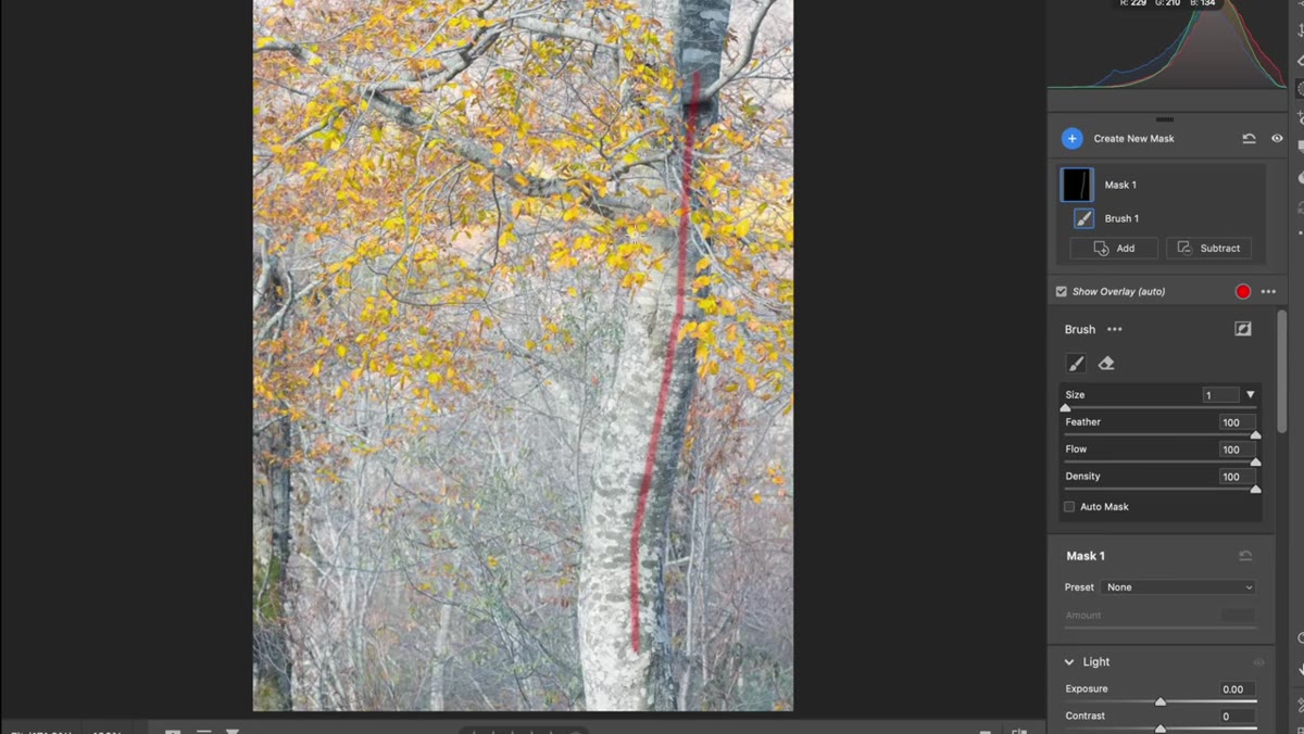 Tree positioned right of center, leaning left into frame
When Will looks at the first image, a quiet scene with a large leaning tree, he immediately notices that the photographer made a smart instinctive call: the tree is positioned to the right of center, and because it leans left, it naturally draws the eye back into the middle of the frame. That is not an accident. That is balance.
Tree positioned right of center, leaning left into frame
When Will looks at the first image, a quiet scene with a large leaning tree, he immediately notices that the photographer made a smart instinctive call: the tree is positioned to the right of center, and because it leans left, it naturally draws the eye back into the middle of the frame. That is not an accident. That is balance.
The practical lesson here is to look at your main subject’s direction of movement or lean before you lock in your composition. If your subject has a directional pull, give it space to pull into. A tree leaning left has energy moving left, so placing it on the right gives that energy somewhere to travel. The same logic applies to a person looking sideways, a bird in flight, or a road curving through a landscape.
Step 2: Audit Your Empty Space Before You Walk Away From a Shot
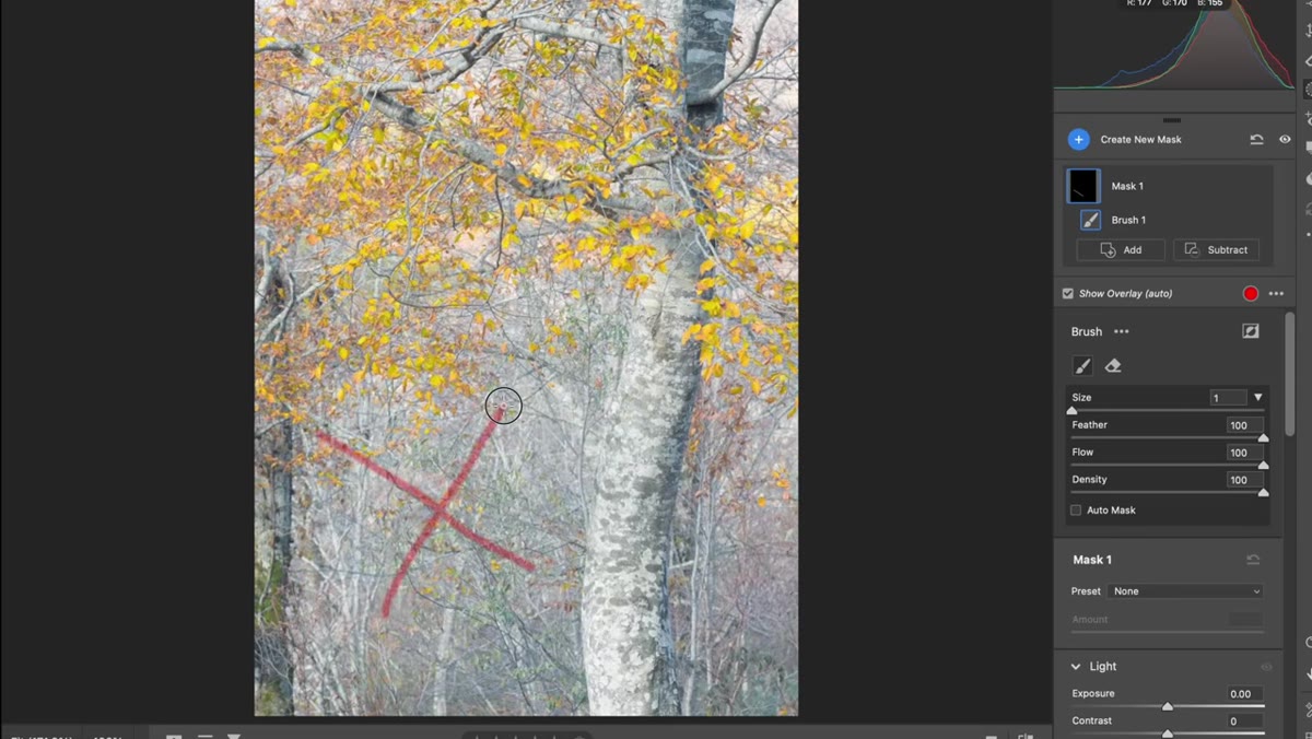 Lower half of image with open, featureless ground taking up 50% of frame
The one critique Will does flag on that first image is the lower half of the frame. It occupies roughly 50% of the image and contains very little visual information. His point is not that empty space is bad. Breathing room matters. But there is a threshold where empty space stops feeling intentional and starts feeling like you just didn’t step forward.
Lower half of image with open, featureless ground taking up 50% of frame
The one critique Will does flag on that first image is the lower half of the frame. It occupies roughly 50% of the image and contains very little visual information. His point is not that empty space is bad. Breathing room matters. But there is a threshold where empty space stops feeling intentional and starts feeling like you just didn’t step forward.
His suggestion: if you notice a large portion of your frame is doing almost nothing, try tightening your shot in the field rather than relying on a crop later. Cropping post-process works, but shooting tighter forces you to be deliberate about what earns space in the frame. When I am reviewing a scene, I now ask: if I removed the bottom third of this frame entirely, would the image feel incomplete or would it actually improve? That one question has saved me from a lot of flat foregrounds.
Step 3: Use Layering to Build Depth Into Your Scene
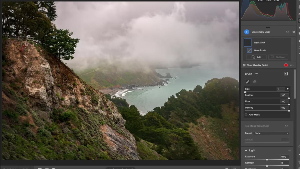 Landscape with foreground ridge, bay in middle distance, land on horizon
Moving to the second image, Will highlights something the photographer did really well: layering. The shot includes a foreground ridge, a middle-distance bay, and a faint landmass on the horizon. Each element sits progressively further back in the frame, and together they create a genuine sense of three-dimensional space in a two-dimensional image.
Landscape with foreground ridge, bay in middle distance, land on horizon
Moving to the second image, Will highlights something the photographer did really well: layering. The shot includes a foreground ridge, a middle-distance bay, and a faint landmass on the horizon. Each element sits progressively further back in the frame, and together they create a genuine sense of three-dimensional space in a two-dimensional image.
This is one of the most reliable depth-building techniques in landscape photography. You don’t need dramatic elements at every layer. The layers just need to exist and to be visually distinct from each other. Next time you’re scouting a scene, try to identify at least three depth zones before you press the shutter: something close, something mid-range, and something far. If you can only find two, consider changing your position until a third appears.
Step 4: Ask Where Your Eye Is Supposed to Land, and Whether It Gets There
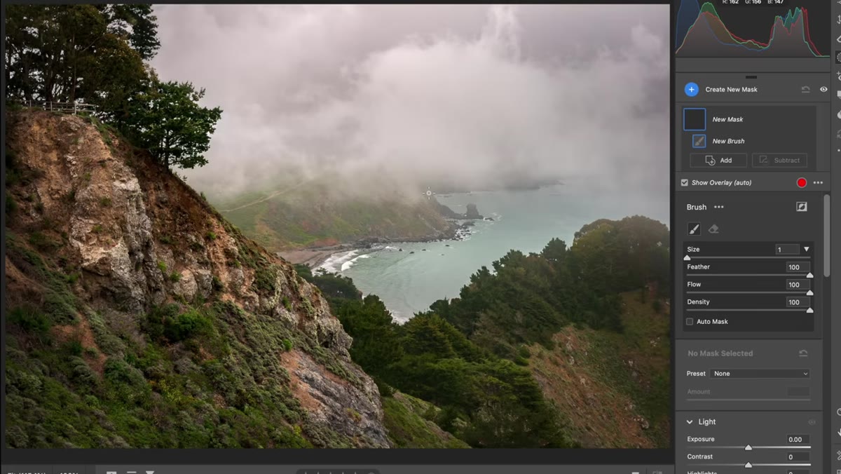 Bay as final focal point, sea stack partially visible but small in frame
Will’s main critique of the second image is a question: where is the eye supposed to finish? He can see that the composition leads the viewer down toward the bay, which is a reasonable endpoint, but once the eye arrives there, there isn’t quite enough to hold it. There’s a sea stack in the scene, but it’s small enough that it gets lost rather than acting as a true anchor.
Bay as final focal point, sea stack partially visible but small in frame
Will’s main critique of the second image is a question: where is the eye supposed to finish? He can see that the composition leads the viewer down toward the bay, which is a reasonable endpoint, but once the eye arrives there, there isn’t quite enough to hold it. There’s a sea stack in the scene, but it’s small enough that it gets lost rather than acting as a true anchor.
This is about intentional focal points. A composition can guide the eye beautifully and still feel unsatisfying if the destination doesn’t deliver. Before you shoot, name your focal point out loud if you have to. “The eye will land on the lighthouse.” “The eye will land on that rock formation.” If you can’t name it, you probably haven’t found it yet. Will references a framework he calls the four pillars: location, composition, light, and processing. A weak focal point is usually a composition problem, and it is almost always fixable in the field if you catch it early.
Step 5: Consider the Aspect Ratio as Part of Your Composition Decision
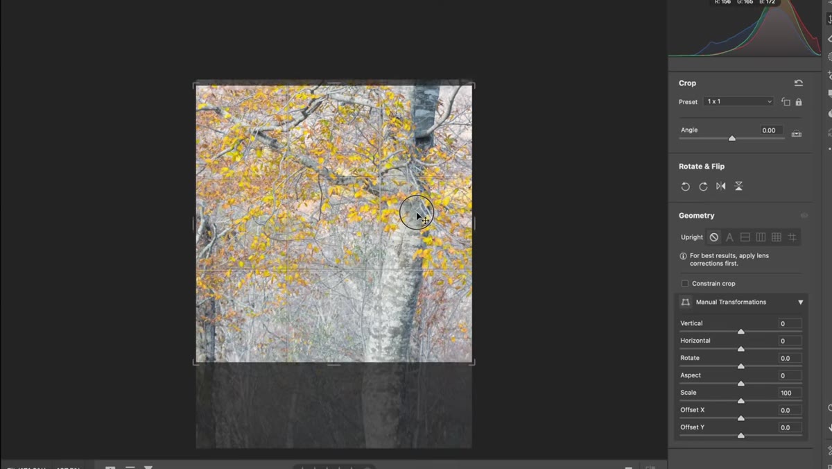 Crop demonstration showing square and 2:3 ratio options on the tree image
When Will demonstrates how tightening the first image would improve it, he tries both a square crop and a standard 2:3 ratio. His point is not that one ratio is better universally, but that your ratio choice affects how much of that problematic empty space you are locked into keeping.
Crop demonstration showing square and 2:3 ratio options on the tree image
When Will demonstrates how tightening the first image would improve it, he tries both a square crop and a standard 2:3 ratio. His point is not that one ratio is better universally, but that your ratio choice affects how much of that problematic empty space you are locked into keeping.
Most cameras default to 3:2. Some photographers never question it. But if you know before you shoot that a tighter, squarer composition serves the scene better, you can frame for that intentionally rather than trying to fix it in Lightroom. Some cameras let you set a crop overlay in the viewfinder so you can see a 4:5 or 1:1 frame as you compose. It is worth using that feature when the scene calls for it.
What I’d Add From My Own Experience
Will’s critique session focuses almost entirely on in-field decisions, and that is correct, because the best version of any photo starts before you press the shutter. But I want to add one thing: give yourself permission to take the “wrong” shot first.
When I’m at a location, I usually fire off the obvious composition immediately just to get it out of my system. Then I step back, apply questions like the ones Will is asking, and shoot again with more intention. The first frame is a draft. The fifth frame is where the composition usually clicks. You don’t have to get it right immediately. You just have to notice what isn’t working and adjust.
The single most important idea in this entire critique session is also the simplest one: small adjustments compound. A slightly tighter crop, a more deliberate focal point, a frame that leans into itself rather than out of it, none of these feel dramatic on their own. Together they are the difference between a photo that almost works and one that actually does.
Watch the full tutorial on YouTube to see Will work through the full image set. The images he critiques are real community submissions, which makes the feedback feel more honest and applicable than anything staged.
Comments
Leave a Comment