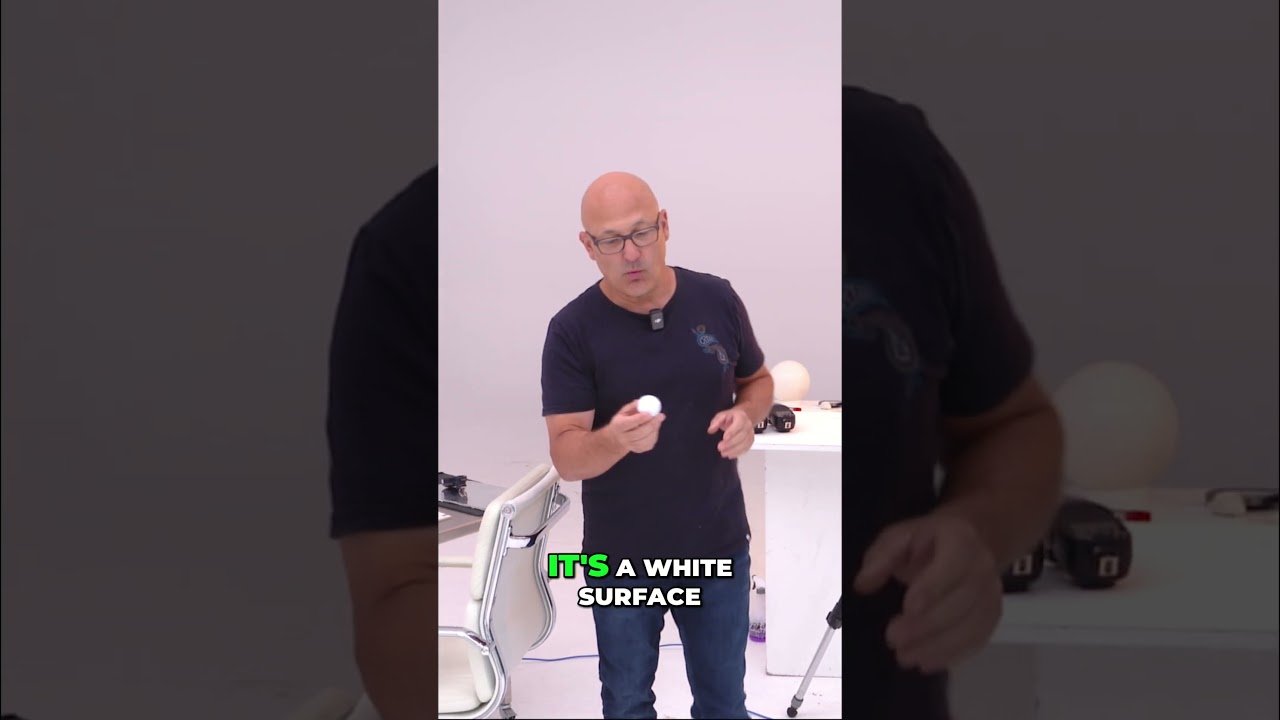
I’ve been photographing products on and off for years, mostly to supplement travel work during slow seasons. And the thing that tripped me up the longest wasn’t gear or editing. It was learning to read light before I set anything up. I’d arrange my softbox, place the subject, take a test shot, and then spend twenty minutes moving things two inches at a time wondering why it still looked flat. What I was missing was a simple, unforgiving subject that would show me exactly what the light was doing. Turns out, that subject has been sitting in the garage the whole time.
In this Visual Education tutorial, the photographer uses a golf ball as a teaching prop, and it’s genuinely clever. Watch the full tutorial on YouTube before or after reading this breakdown. The ball is spherical, so every angle of the light wraps around it and becomes visible at once. The dimples give texture that reveals the direction and quality of light with zero ambiguity. And the fact that it’s a white object on a white background forces you to solve one of product photography’s most common and frustrating problems. This is the kind of subject that exposes every mistake clearly, which makes it the best possible thing to practice with.
Step 1: Choose Your Subject Intentionally
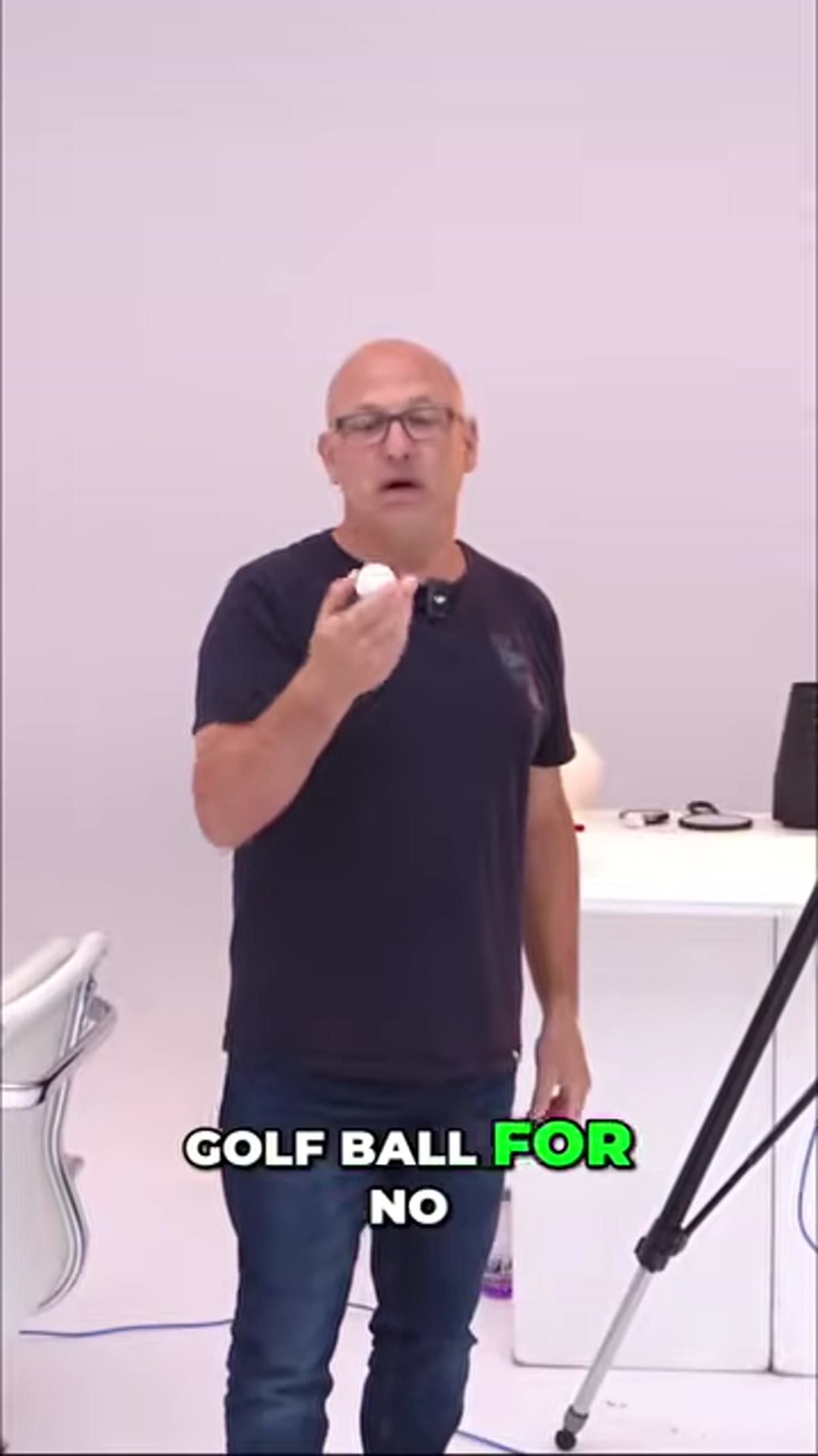 Golf ball centered on white background, unlit
Before you touch a light, think about why you’re choosing your subject. The golf ball works here because its geometry is honest. A sphere will catch and show light from every direction simultaneously, meaning one shot tells you a complete story about your lighting setup. When you’re learning, avoid subjects that hide your mistakes, and instead reach for something that makes the feedback immediate. Pick objects with clear texture and a consistent surface so you can compare shots accurately as you adjust.
Golf ball centered on white background, unlit
Before you touch a light, think about why you’re choosing your subject. The golf ball works here because its geometry is honest. A sphere will catch and show light from every direction simultaneously, meaning one shot tells you a complete story about your lighting setup. When you’re learning, avoid subjects that hide your mistakes, and instead reach for something that makes the feedback immediate. Pick objects with clear texture and a consistent surface so you can compare shots accurately as you adjust.
Step 2: Set Up a White-on-White Scene
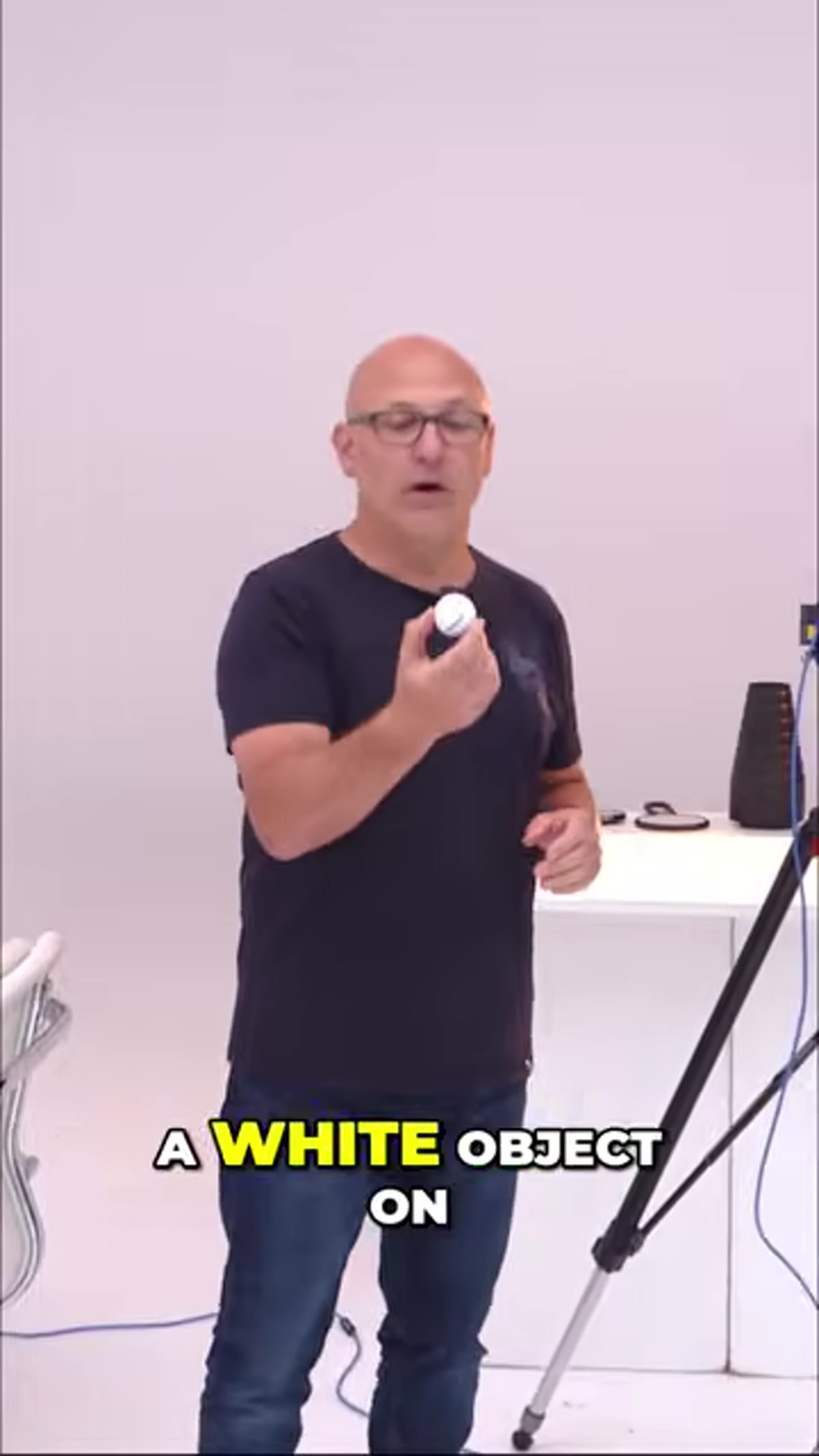 White golf ball placed on white surface, minimal setup
White on white sounds simple, but it’s one of the most technically demanding combinations in product photography. The challenge is keeping both the subject and the background white without letting either one blow out to pure featureless brightness, or worse, letting the background go gray because it’s underlit. Start by placing your subject on a white seamless or white card. Don’t light it yet. Just observe how the ambient light in the room naturally separates, or fails to separate, the object from its background. That baseline observation matters before you introduce any additional light source.
White golf ball placed on white surface, minimal setup
White on white sounds simple, but it’s one of the most technically demanding combinations in product photography. The challenge is keeping both the subject and the background white without letting either one blow out to pure featureless brightness, or worse, letting the background go gray because it’s underlit. Start by placing your subject on a white seamless or white card. Don’t light it yet. Just observe how the ambient light in the room naturally separates, or fails to separate, the object from its background. That baseline observation matters before you introduce any additional light source.
Step 3: Introduce a Single Light Source First
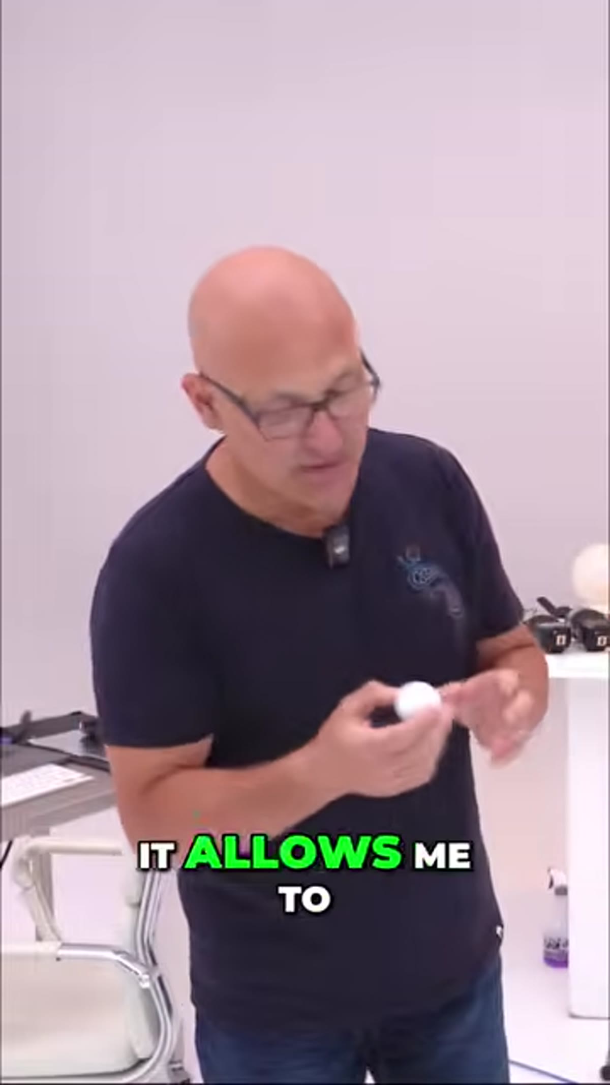 Single light source illuminating one side of the golf ball
Resist the urge to use multiple lights from the start. Bring in one light, position it to the side of your subject, and take a shot. On a golf ball, you’ll immediately see the transition from highlight to shadow across the dimpled surface. This is called the terminator line, the boundary between lit and unlit areas, and its softness or harshness tells you everything about your light source. A large softbox close to the subject creates a wide, gradual transition. A small bare strobe or speedlight from a distance creates a sharp, abrupt one. Neither is wrong, but you need to be able to see the difference before you can choose intentionally.
Single light source illuminating one side of the golf ball
Resist the urge to use multiple lights from the start. Bring in one light, position it to the side of your subject, and take a shot. On a golf ball, you’ll immediately see the transition from highlight to shadow across the dimpled surface. This is called the terminator line, the boundary between lit and unlit areas, and its softness or harshness tells you everything about your light source. A large softbox close to the subject creates a wide, gradual transition. A small bare strobe or speedlight from a distance creates a sharp, abrupt one. Neither is wrong, but you need to be able to see the difference before you can choose intentionally.
Step 4: Observe What the Dimples Tell You
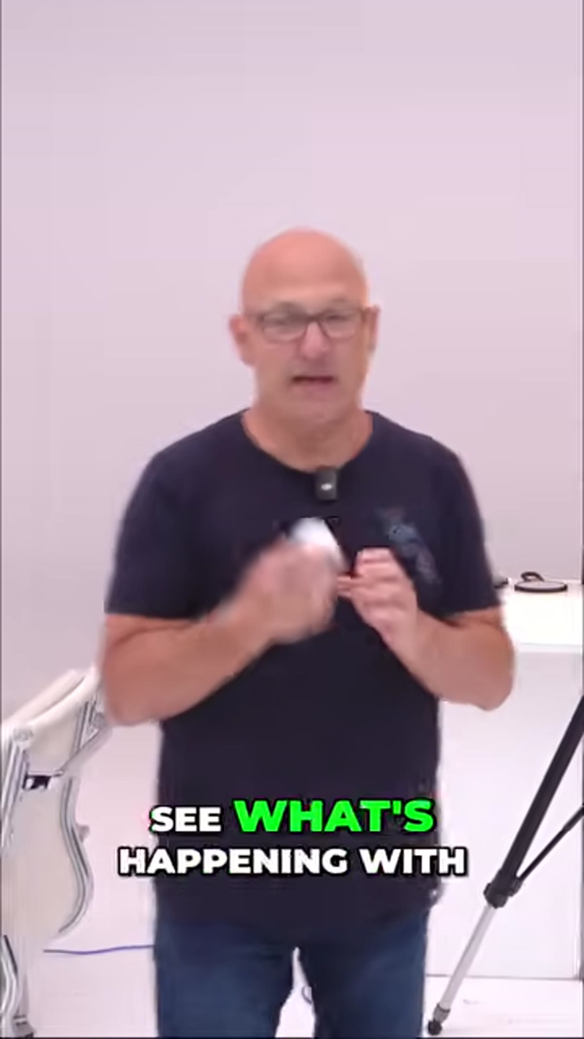 Close-up showing dimple texture under directional light
This is the part I wish someone had explained to me earlier. The dimples on a golf ball aren’t just texture, they’re a map. Each small indentation catches shadow on one side and highlight on the other, and the direction those micro-shadows fall tells you exactly where your light is coming from. If you can read the dimples, you can diagnose your lighting without second-guessing. Apply this thinking to any textured surface: fabric, wood grain, skin, leather. The texture is always communicating. Learning to read it on a golf ball trains your eye to read it everywhere else.
Close-up showing dimple texture under directional light
This is the part I wish someone had explained to me earlier. The dimples on a golf ball aren’t just texture, they’re a map. Each small indentation catches shadow on one side and highlight on the other, and the direction those micro-shadows fall tells you exactly where your light is coming from. If you can read the dimples, you can diagnose your lighting without second-guessing. Apply this thinking to any textured surface: fabric, wood grain, skin, leather. The texture is always communicating. Learning to read it on a golf ball trains your eye to read it everywhere else.
Step 5: Adjust Light Position to Control Separation
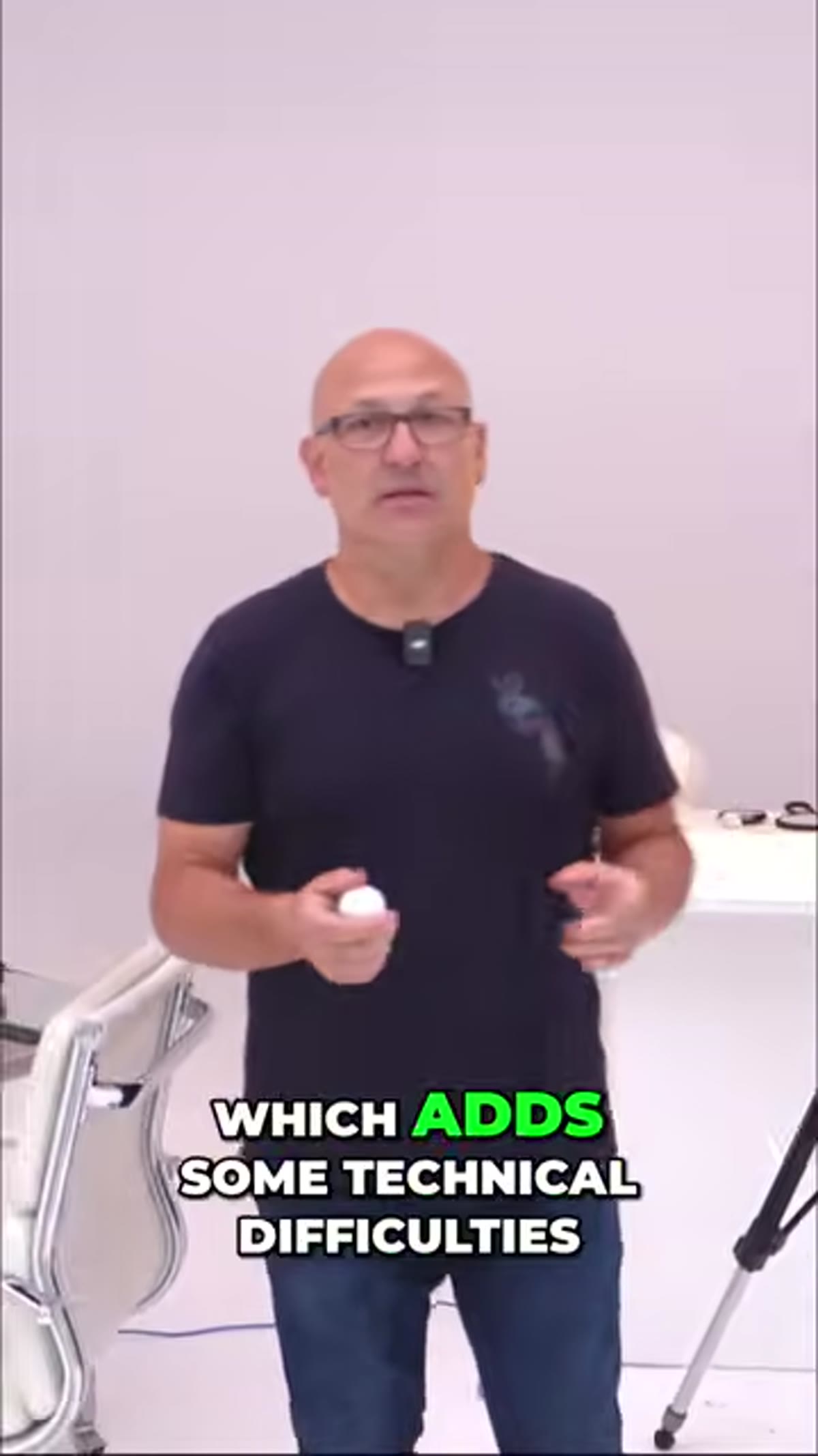 Light adjusted to separate white ball from white background
White on white falls apart when the subject and background merge into the same tone. The fix is almost always light placement, not power. Try moving your main light behind and slightly above the subject to create a rim of light along the edge of the ball. This edge separation is what makes a white object read as three-dimensional against a white surface. Alternatively, you can light the background independently with a second source, keeping it slightly brighter than the subject so the subject reads darker by contrast. Test both approaches and compare the results side by side.
Light adjusted to separate white ball from white background
White on white falls apart when the subject and background merge into the same tone. The fix is almost always light placement, not power. Try moving your main light behind and slightly above the subject to create a rim of light along the edge of the ball. This edge separation is what makes a white object read as three-dimensional against a white surface. Alternatively, you can light the background independently with a second source, keeping it slightly brighter than the subject so the subject reads darker by contrast. Test both approaches and compare the results side by side.
Step 6: Use the Sphere to Test Every Lighting Ratio
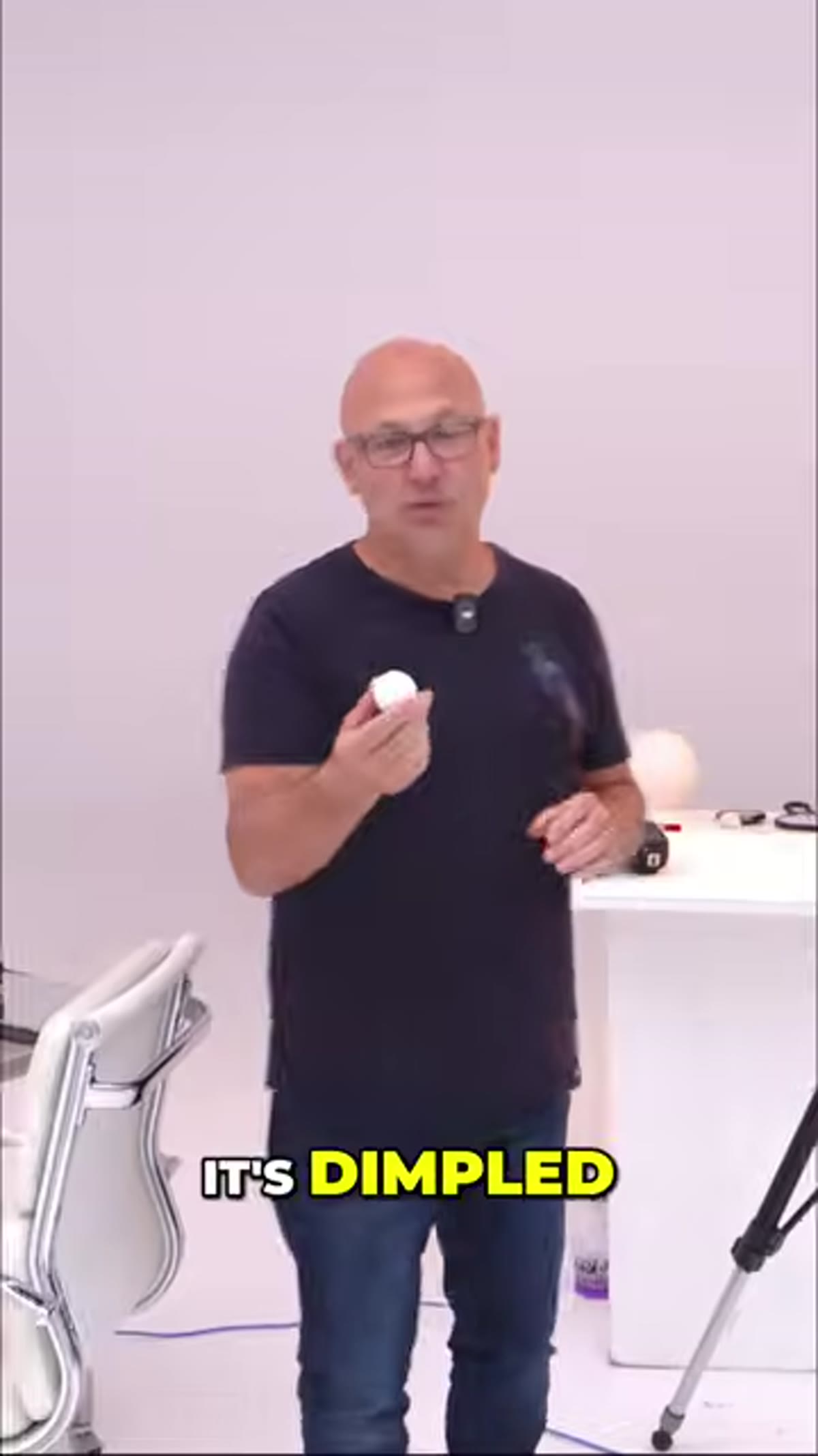 Golf ball showing highlight and shadow ratio under adjusted lighting
Once you have a workable setup, start changing your lighting ratio deliberately. Move your light closer and watch how the highlight on the ball blooms and the shadow gets more contrast. Move it farther away and notice how the light becomes more even across the whole surface. Raise it higher and see the shadow drop below the ball. Every movement produces a visible, readable change on that sphere. This is why the golf ball is such a good teacher. You can run through a dozen lighting positions in ten minutes and come away with a real intuition for what each adjustment does, rather than just knowing it theoretically.
Golf ball showing highlight and shadow ratio under adjusted lighting
Once you have a workable setup, start changing your lighting ratio deliberately. Move your light closer and watch how the highlight on the ball blooms and the shadow gets more contrast. Move it farther away and notice how the light becomes more even across the whole surface. Raise it higher and see the shadow drop below the ball. Every movement produces a visible, readable change on that sphere. This is why the golf ball is such a good teacher. You can run through a dozen lighting positions in ten minutes and come away with a real intuition for what each adjustment does, rather than just knowing it theoretically.
Step 7: Review Shots for Tone, Not Just Exposure
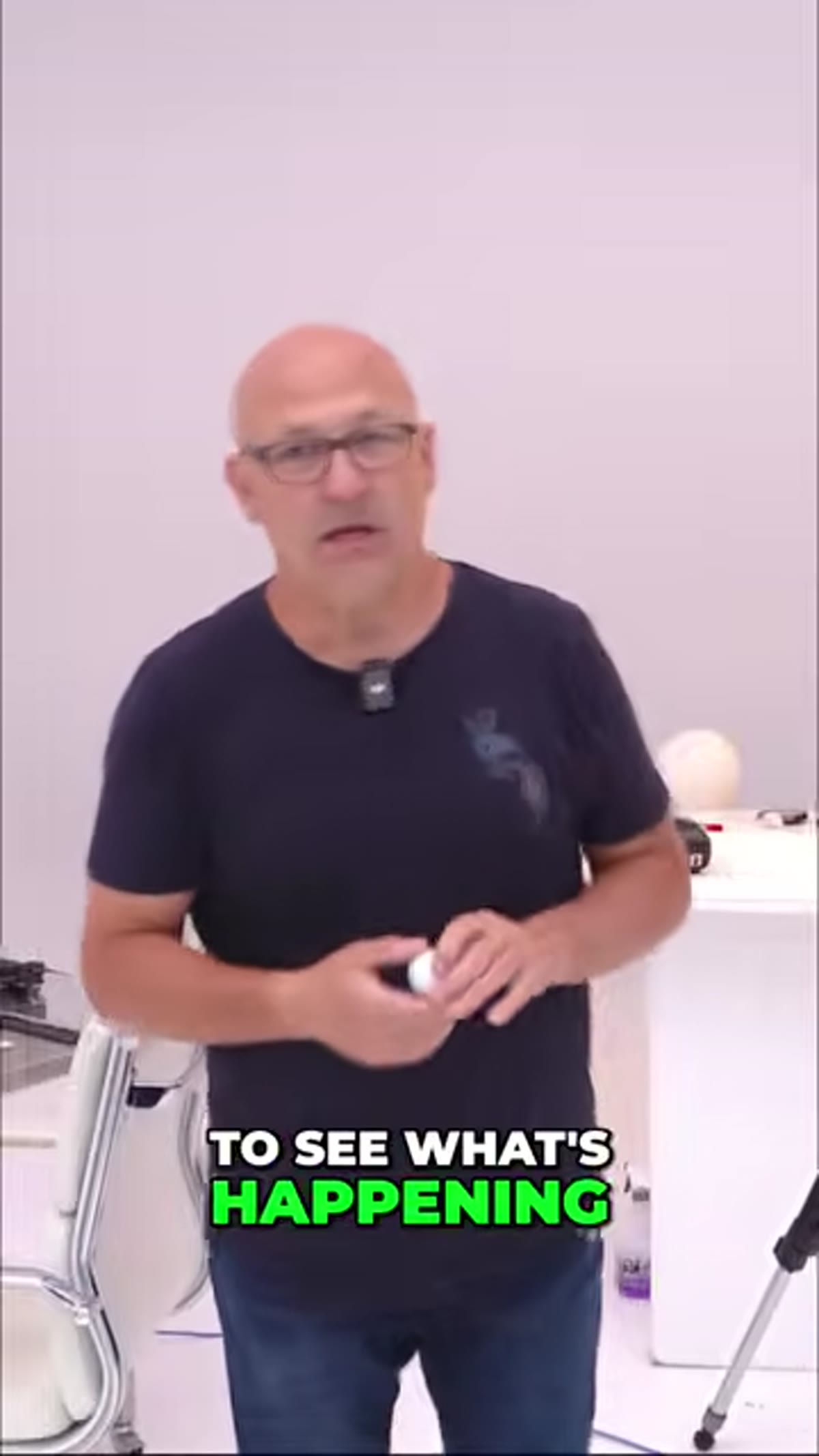 Reviewing test shots showing tonal separation on white subject
When you’re checking your results, don’t just look at the histogram and declare success because nothing is clipped. Look at the tonal relationships. Is the ball warmer or cooler than the background? Is the shadow side going gray or staying white? Does the object feel like it’s floating on the background, or sitting on it? These are qualitative calls that no meter can make for you. The golf ball, because it’s such a neutral subject, forces you to develop that eye rather than relying on color or pattern to carry the image.
Reviewing test shots showing tonal separation on white subject
When you’re checking your results, don’t just look at the histogram and declare success because nothing is clipped. Look at the tonal relationships. Is the ball warmer or cooler than the background? Is the shadow side going gray or staying white? Does the object feel like it’s floating on the background, or sitting on it? These are qualitative calls that no meter can make for you. The golf ball, because it’s such a neutral subject, forces you to develop that eye rather than relying on color or pattern to carry the image.
What I’d Add From My Own Experience
White balance is the variable this tutorial doesn’t have time to get into, and it matters more than people expect when shooting white on white. Even a slight mismatch between your light source and your camera’s white balance setting will make your white background go slightly blue or yellow, and your subject will look like a different shade of white altogether. I’ve started shooting a gray card reference frame at the beginning of every product session so I can correct in Lightroom without guessing. It adds maybe thirty seconds to setup and has saved me hours of frustrating color correction.
The golf ball exercise is one of those things that sounds almost too simple to bother with, until you actually do it and realize how much you didn’t know about your own lighting instincts. Give yourself one session with an unforgiving white subject before your next product shoot. You’ll be surprised what it shows you. Watch the full tutorial on YouTube to see every adjustment demonstrated in real time.
Comments (3)
Tried this technique this morning. Game changer for real.
This is going in my reference folder. Incredibly useful.
Really solid breakdown. This pairs perfectly with the color grading work I've been writing about.
Leave a Comment