There’s a moment on almost every portrait shoot where the light is technically correct but the image still feels flat. The exposure is fine, the background works, the subject looks comfortable, and yet something is missing. For a long time I chalked that up to “the shot just wasn’t there.” Turns out, I was letting light land wherever it wanted and wondering why my portraits lacked dimension. The fix wasn’t another light or a bigger softbox. It was a piece of black foam board.
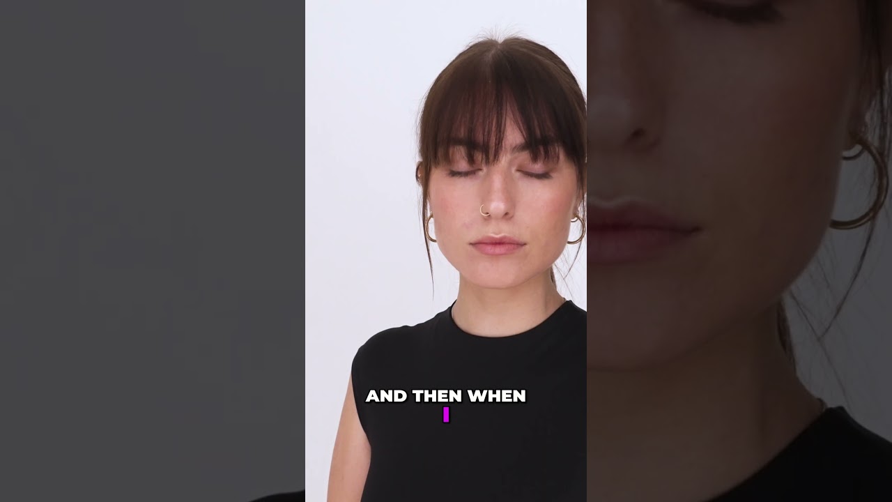
In this Visual Education tutorial, photographer and educator Visual Education walks through a deceptively simple technique called black flagging, demonstrating it live on a portrait subject named Caris. Watch the full tutorial on YouTube before reading or alongside it. The concept is easy to grasp in about two minutes, but understanding why it works changes how you think about light control on every shoot going forward.
The short version: where you block light matters just as much as where you place it. Black flags let you subtract light with surgical precision, cutting shadows into cheekbones, jawlines, and neck contours that your key light alone can’t create. You are not adding anything to the scene. You are taking something away, and that subtraction is what gives the face its shape.
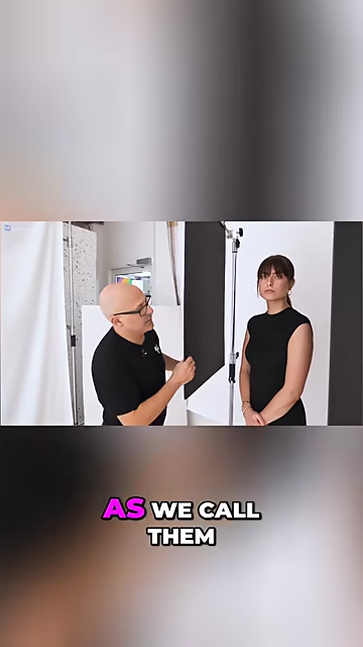
Step 1: Understand What a Black Flag Actually Is
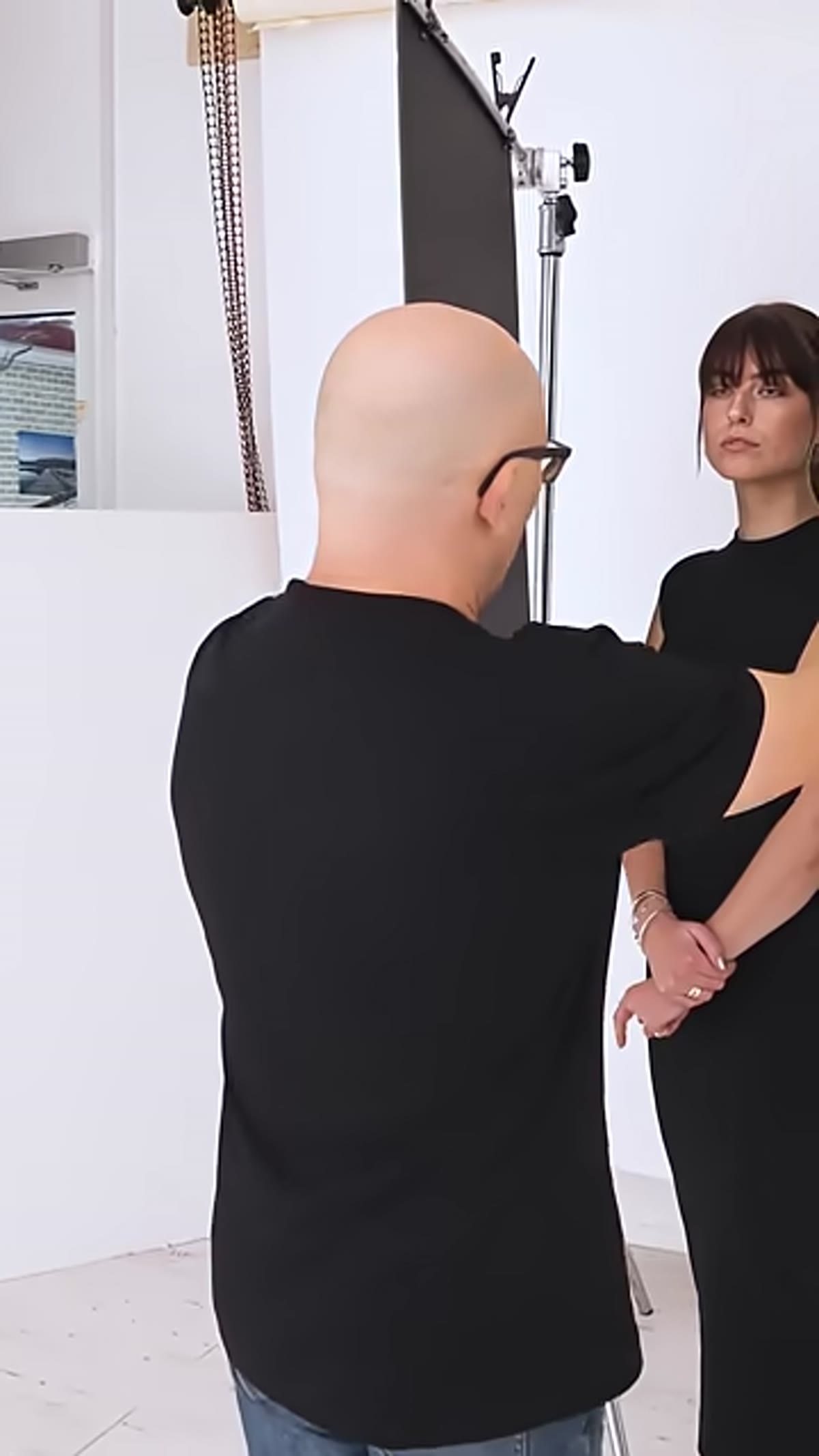
 Photographer holding black foam board next to subject’s face
A black flag is not special equipment. It is a piece of black card or black foam board held between a light source and your subject to block light from hitting a specific area. You can buy foam board at any craft store for a few dollars per sheet. The black surface absorbs light rather than reflecting it, which is the whole point. Reflective materials bounce light around. Matte black just kills it.
Photographer holding black foam board next to subject’s face
A black flag is not special equipment. It is a piece of black card or black foam board held between a light source and your subject to block light from hitting a specific area. You can buy foam board at any craft store for a few dollars per sheet. The black surface absorbs light rather than reflecting it, which is the whole point. Reflective materials bounce light around. Matte black just kills it.
Most photographers, especially those newer to studio work, focus entirely on their lights and their modifiers. Flags remind you that negative space in lighting is just as intentional as the light itself. Think of them as erasers for unwanted fill.
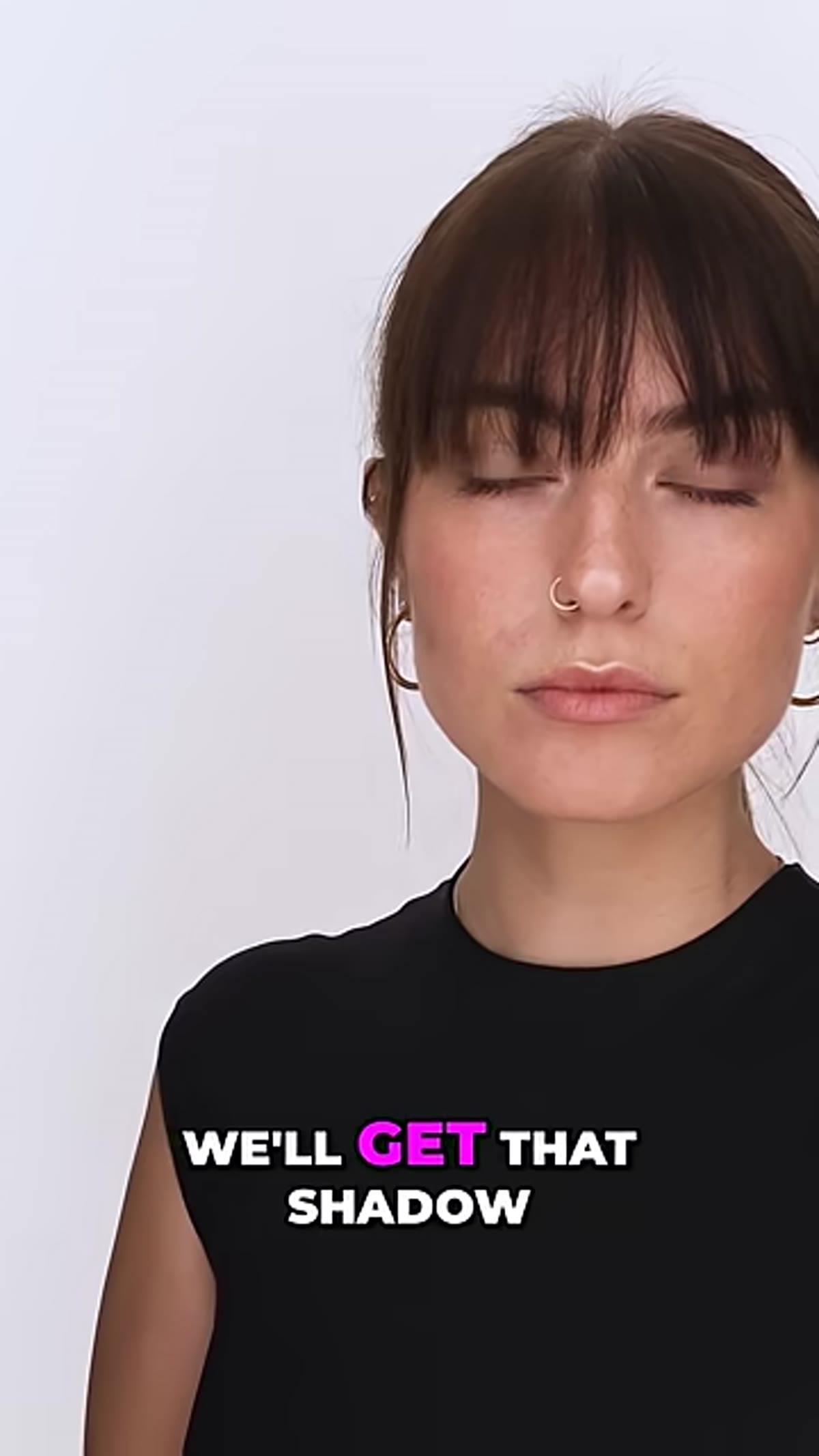
Step 2: Identify the Areas Where You Want More Shadow
 Subject’s face showing lit cheekbone and jawline areas
Before you place a flag, look at your subject’s face with your key light on and identify where the light is wrapping around and filling in areas you want to stay dark. Common targets are the far cheekbone from camera, the jawline, the side of the neck, and the tops of the shoulders. These are the structural edges of the face and body, and keeping shadow on them is what creates the illusion of depth in a two-dimensional photograph.
Subject’s face showing lit cheekbone and jawline areas
Before you place a flag, look at your subject’s face with your key light on and identify where the light is wrapping around and filling in areas you want to stay dark. Common targets are the far cheekbone from camera, the jawline, the side of the neck, and the tops of the shoulders. These are the structural edges of the face and body, and keeping shadow on them is what creates the illusion of depth in a two-dimensional photograph.
If your light source is large and soft, it is probably wrapping around your subject and filling in those shadow areas naturally. That is beautiful for some portraits, but if you want more chiseled, defined structure, a flag will let you dial it back. You are essentially narrowing the effective coverage of your light.
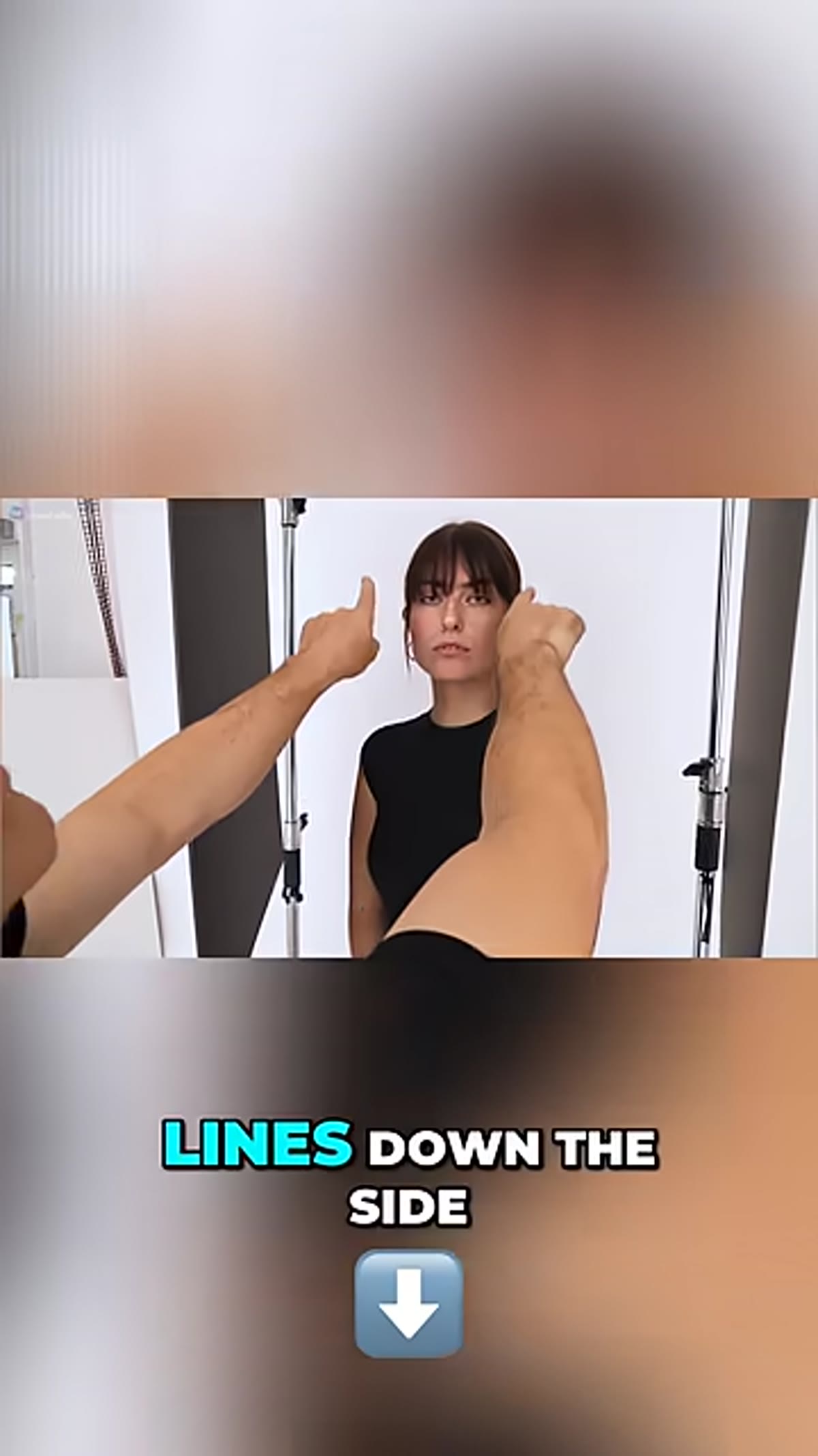
Step 3: Position the Flag Between the Light and the Subject
 Black foam board being placed close to subject’s face
Hold the flag on the side of the face closest to your light source. The goal is to interrupt the light path before it wraps around to the far edge of the face, the cheek, the jaw, and down the neck. Start with the flag at roughly the subject’s hairline and angle it so you are cutting light off the cheek and jaw on that same side.
Black foam board being placed close to subject’s face
Hold the flag on the side of the face closest to your light source. The goal is to interrupt the light path before it wraps around to the far edge of the face, the cheek, the jaw, and down the neck. Start with the flag at roughly the subject’s hairline and angle it so you are cutting light off the cheek and jaw on that same side.
You will see the shadow appear in real time as you move the board. That live feedback is one of the best things about this technique. You do not need to guess or chisel it out in post. Move the flag slowly and watch the shadow line form on the cheekbone. When it looks right, hold it there.
Step 4: Work the Flag in Close to the Subject
 Flag positioned very close to model’s face during shoot
This is the step that surprises most people the first time they try it. The flag needs to be very close to the subject to work effectively. We are talking inches from the face, well inside what feels like a comfortable personal boundary. If you are shooting solo, you will need an assistant to hold the flag or a stand with a grip arm. If you are shooting with a team, this is exactly the kind of task to hand off to a second pair of hands.
Flag positioned very close to model’s face during shoot
This is the step that surprises most people the first time they try it. The flag needs to be very close to the subject to work effectively. We are talking inches from the face, well inside what feels like a comfortable personal boundary. If you are shooting solo, you will need an assistant to hold the flag or a stand with a grip arm. If you are shooting with a team, this is exactly the kind of task to hand off to a second pair of hands.
The closer the flag is to the face, the sharper and more defined the shadow edge will be. Pull it back and the shadow softens and diffuses. Both can be right depending on the look you want, but for a clean jaw shadow or a defined cheekbone line, close proximity is what creates that crisp edge.
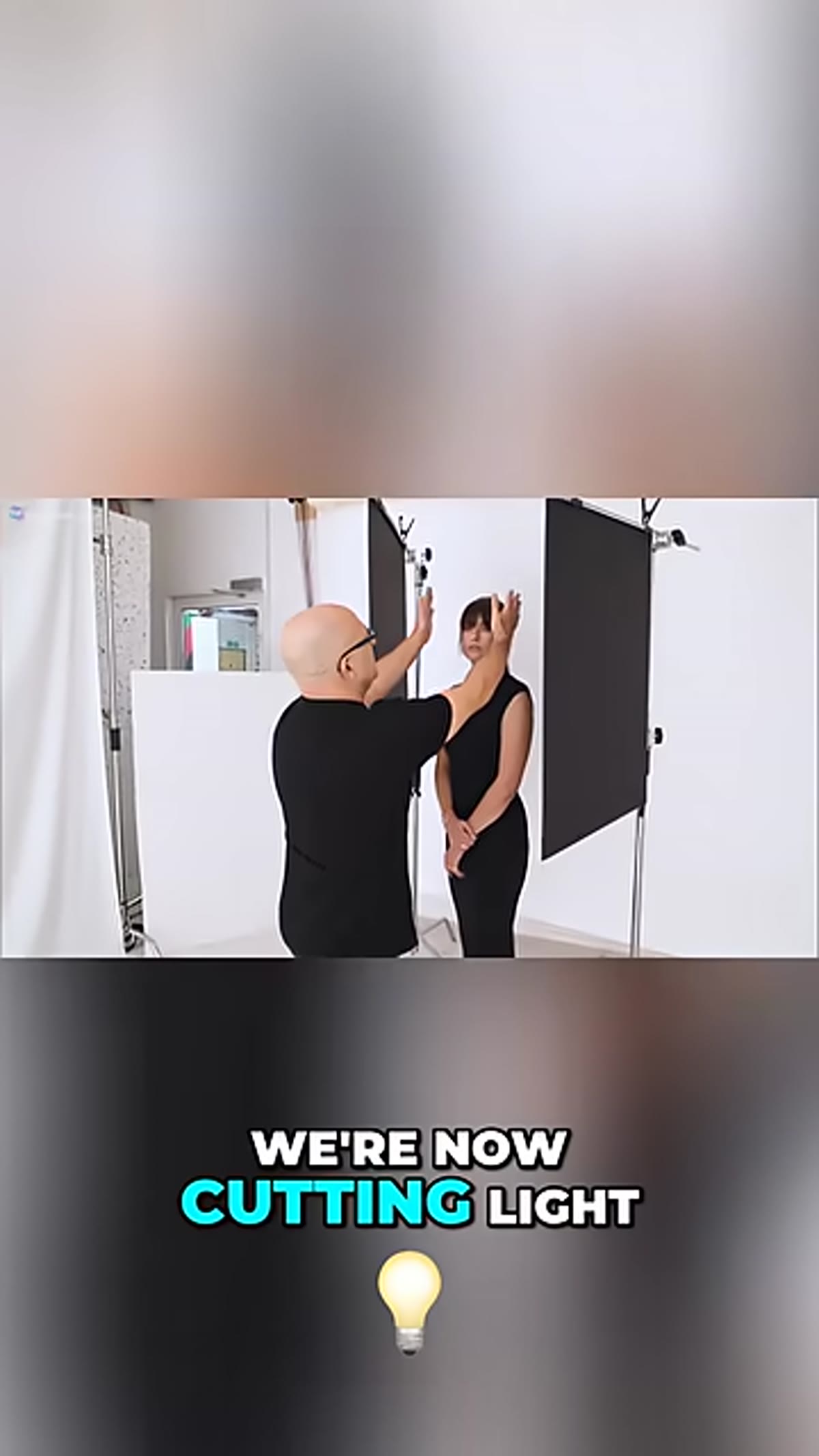
Step 5: Use a Second Flag for the Opposite Side
 Second black flag being slid in on opposite side of subject
Once your first flag is placed and locked in, introduce a second flag on the opposite side of the frame to mirror the effect. This brings a shadow line in on the other side of the face and neck, framing the lit area of the face between two blocks of shadow. The result is a portrait where the light feels intentional and contained rather than spilling everywhere.
Second black flag being slid in on opposite side of subject
Once your first flag is placed and locked in, introduce a second flag on the opposite side of the frame to mirror the effect. This brings a shadow line in on the other side of the face and neck, framing the lit area of the face between two blocks of shadow. The result is a portrait where the light feels intentional and contained rather than spilling everywhere.
When both flags are in position, take a test shot and compare it to a frame without flags. The difference in how three-dimensional the face reads is usually immediate and obvious. You have not touched your lights at all. You have only changed what parts of the subject your lights are allowed to reach.
A Note From My Own Shoots
I started keeping two pieces of foam board in my kit after I first saw this technique demonstrated, and I will be honest, I felt a little embarrassed that I had never thought to use them before. They weigh nothing, cost almost nothing, and have changed more of my portraits than any modifier I have bought in the last three years.
One thing I do that the tutorial does not specifically address: I also use a single flag positioned above the frame to cut light off the top of the shoulders on outdoor shoots when the sky is acting as a giant soft fill. It takes some trial and error since you are working with ambient light instead of a controlled studio source, but the principle is identical. Block the light you do not want. Let the light you do want do its job.
If you shoot alone and cannot hold flags by hand, a light stand with a super clamp and an arm extension can hold the board in place while you focus on composition and communication with your subject. It is not as quick to adjust, but it works.
The single most important idea here is this: controlling light is not only about where you point it. Subtracting light from specific areas of your subject is a legitimate, professional tool, and it costs almost nothing to try. Pick up a sheet of black foam board before your next portrait session and see what happens.
Watch the full tutorial on YouTube to see exactly how Visual Education positions the flags and the live before-and-after on the subject’s face.
Comments (3)
The before and after really sells it. Incredible difference.
Just subscribed. If the rest of your content is this good, I'm in.
Couldn't agree more. I've seen this make a huge difference in landscape work specifically.
Leave a Comment