
Portrait lighting analysis is one of those skills that separates photographers who keep getting better from ones who plateau. I spent years looking at images I admired and feeling vaguely inspired but having no idea how to translate what I was seeing into something I could actually set up in front of a subject. That changed when I started forcing myself to reverse-engineer lighting setups the way a mechanic would pull apart an engine.
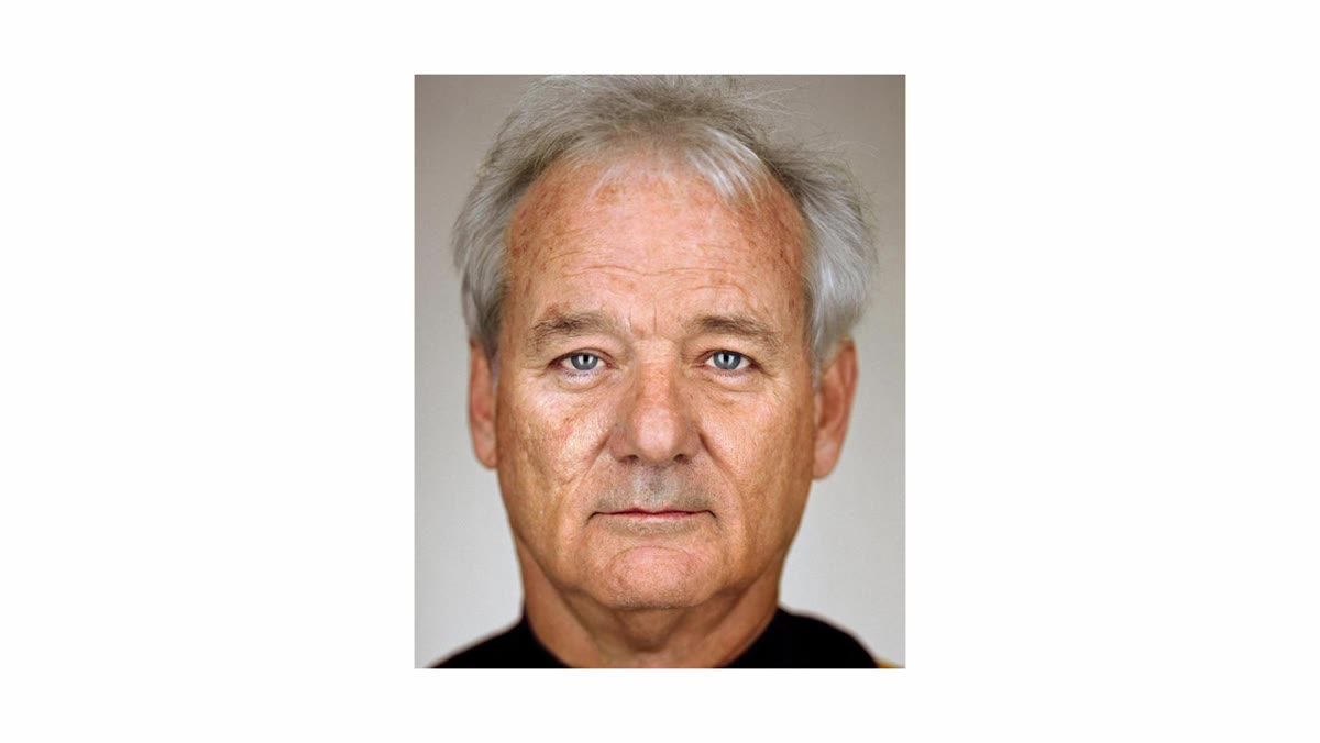
In this Sean Tucker tutorial, he takes on one of the most recognizable portrait styles in contemporary photography: Martin Schoeller’s ultra-close, hyper-detailed celebrity portraits. You’ve seen them even if you don’t know the name. The eyes fill the frame, the light wraps cleanly across the front of the face, and there are these striking vertical catch light strips that give subjects an almost otherworldly intensity. Tucker’s goal isn’t just to identify how Schoeller lights his shots. He actually builds the setup and photographs a subject, which makes this one of the more useful lighting breakdowns I’ve watched. Watch the full tutorial on YouTube before or after reading this. Either order works.
What hooked me about this video is Tucker’s framing of the whole exercise. He references a blog called “Guess the Lighting” that used to publish reverse-engineered lighting diagrams of famous portraits. Just reading those diagrams, even without picking up a camera, trained the blogger’s eye to recognize light in any image. Tucker pushes it one step further by actually executing the shot. That combination, reading the light AND building it, is where the real learning happens.
Step 1: Study the Catch Lights First
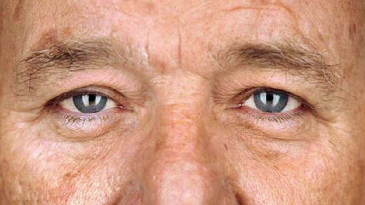 Close-up portrait showing two vertical catch light strips in the eyes
Before you touch a single light, spend real time looking at the eyes in Schoeller’s portraits. Catch lights are the reflections of light sources in the eye, and they’re your clearest clue to how a shot was lit. In Schoeller’s work, you’ll see two narrow vertical strips sitting on either side of the pupil. Most people look at those strips, note the gap between them, and assume the lights must be placed far apart, maybe at 45-degree angles to each side of the subject.
Close-up portrait showing two vertical catch light strips in the eyes
Before you touch a single light, spend real time looking at the eyes in Schoeller’s portraits. Catch lights are the reflections of light sources in the eye, and they’re your clearest clue to how a shot was lit. In Schoeller’s work, you’ll see two narrow vertical strips sitting on either side of the pupil. Most people look at those strips, note the gap between them, and assume the lights must be placed far apart, maybe at 45-degree angles to each side of the subject.
Tucker argues that’s the wrong read, and he’s right. The eye is a curved surface, not a flat mirror. A curved surface distorts and separates reflections the same way a chrome mixing bowl does in product photography. Two lights that are actually very close together will appear more spread apart in a curved eye. The takeaway: when you analyze catch lights, mentally compress what you’re seeing. Those strips are probably closer together than they look.
Step 2: Hypothesize the Light Placement Before You Build Anything
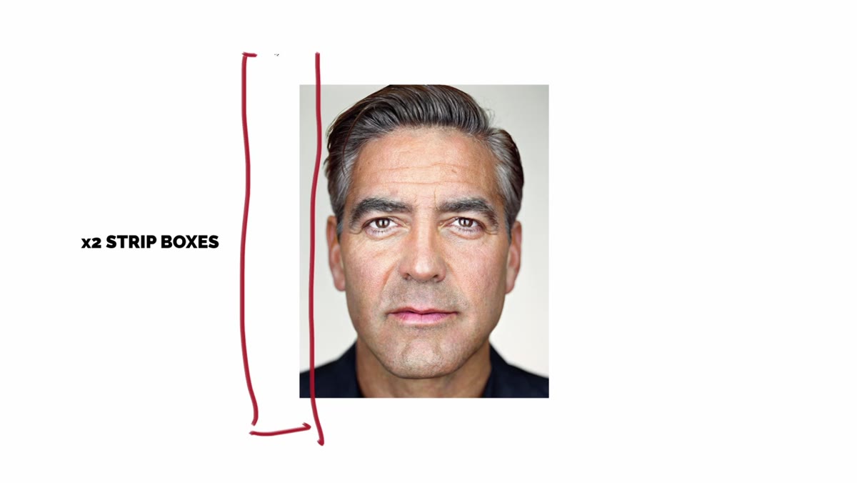 Sketched lighting diagram showing two strip boxes positioned close together in front of subject
This is the step most people skip, and it costs them hours of trial-and-error in the studio. Based on the catch light analysis, Tucker works out a theory before moving a single light stand. His conclusion is that Schoeller is using two strip boxes (narrow rectangular softboxes) placed almost directly in front of the subject, one on each side of the lens, with just enough gap between them for the camera to shoot through.
Sketched lighting diagram showing two strip boxes positioned close together in front of subject
This is the step most people skip, and it costs them hours of trial-and-error in the studio. Based on the catch light analysis, Tucker works out a theory before moving a single light stand. His conclusion is that Schoeller is using two strip boxes (narrow rectangular softboxes) placed almost directly in front of the subject, one on each side of the lens, with just enough gap between them for the camera to shoot through.
Write your hypothesis down. Sketch it if that helps. Committing to a theory forces you to actually test something specific rather than randomly repositioning lights until something looks okay. If your first guess is wrong, the gap between your result and the reference image will tell you exactly what to adjust.
Step 3: Set Up Two Strip Boxes Close and Front-Facing
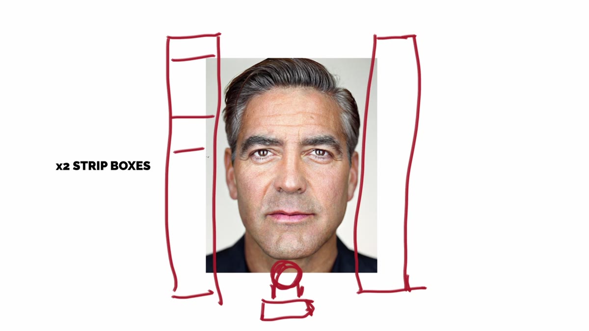 Two strip boxes positioned on either side of camera lens, very close to subject
Strip boxes, sometimes called strip banks, are long rectangular softboxes, typically somewhere around 1 by 3 feet or similar. For this setup, you’ll position one on each side of your camera, oriented vertically. The key detail Tucker emphasizes is how close they are, both to each other and to the subject. These are not lights pushed to the sides of the room. They’re right up front, almost flanking the lens, with the subject fairly close to them.
Two strip boxes positioned on either side of camera lens, very close to subject
Strip boxes, sometimes called strip banks, are long rectangular softboxes, typically somewhere around 1 by 3 feet or similar. For this setup, you’ll position one on each side of your camera, oriented vertically. The key detail Tucker emphasizes is how close they are, both to each other and to the subject. These are not lights pushed to the sides of the room. They’re right up front, almost flanking the lens, with the subject fairly close to them.
This proximity is important for two reasons. First, it creates that clean front-on illumination that defines Schoeller’s look. Second, close light sources (relative to the subject) are softer, which helps with skin texture rendering at close crop distances. If you’re working with speedlights rather than studio strobes, you can still approximate this with small softboxes or shoot-through umbrellas placed close together, though you’ll want to match the output carefully so both sides are balanced.
Step 4: Control What the Lens Sees Between the Lights
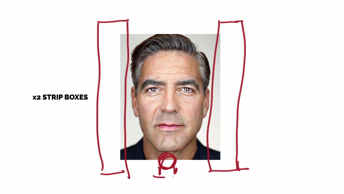 Camera lens positioned to shoot through narrow gap between the two strip boxes
The strip boxes need to be close enough together that the gap between them is just wide enough to fit your lens through. This is not a wide gap. Tucker is essentially threading the camera between two light sources, which is what creates the defining visual characteristic of this style. The subject is lit almost entirely from sources that are collinear with the camera axis, meaning the light hits the face straight on from the viewer’s perspective.
Camera lens positioned to shoot through narrow gap between the two strip boxes
The strip boxes need to be close enough together that the gap between them is just wide enough to fit your lens through. This is not a wide gap. Tucker is essentially threading the camera between two light sources, which is what creates the defining visual characteristic of this style. The subject is lit almost entirely from sources that are collinear with the camera axis, meaning the light hits the face straight on from the viewer’s perspective.
If you have a tethering setup, this step is much easier to troubleshoot in real time. You can see immediately whether the catch lights are landing in the right position in the eyes. Shoot a test frame and zoom into the eyes at 100 percent. You’re looking for those two vertical strip reflections sitting close to the center of the iris on either side of the pupil.
Step 5: Refine by Checking the Shadow Fall-Off on the Sides of the Face
 Portrait showing bright front lighting with darker shadow on sides of face
The second major characteristic of Schoeller’s portraits, after the catch lights, is that the sides of the face drop off into shadow. The front-center of the face is well-lit, and the temples and sides of the jaw go darker. This sculpts the face even in a full-frontal composition. Check for this in your test shots. If the entire face is uniformly bright, your lights may be too far apart or angled too much toward the sides. Pull them in toward the front axis.
Portrait showing bright front lighting with darker shadow on sides of face
The second major characteristic of Schoeller’s portraits, after the catch lights, is that the sides of the face drop off into shadow. The front-center of the face is well-lit, and the temples and sides of the jaw go darker. This sculpts the face even in a full-frontal composition. Check for this in your test shots. If the entire face is uniformly bright, your lights may be too far apart or angled too much toward the sides. Pull them in toward the front axis.
Also note that the background in Schoeller’s portraits is typically very dark, which keeps all attention on the face. A simple black backdrop or shooting in a dark room with no fill on the background will get you there. The contrast between that bright, detailed face and the dark surround is a lot of what gives these images their intensity.
My Caveat: Focal Length Matters More Than People Realize
Tucker focuses mainly on the lighting, which is the right priority. But I’d add one thing from my own experience trying setups like this: focal length changes everything about how close-up portrait lighting reads on the face. Schoeller shoots extremely close with longer focal lengths, which compresses depth and makes every skin texture read clearly. If you replicate this lighting with a 35mm lens at close distance, you’ll get distortion that undermines the whole effect. Start at 85mm minimum, and 135mm is worth trying if you have it. The light setup alone won’t get you to Schoeller’s look without the right focal length doing its part.
The single most important habit this video reinforced for me is this: look at the eyes first, every time. The catch lights in any portrait are a map of the lighting setup. Train yourself to read that map and you’ll start seeing lighting everywhere differently, in magazine covers, in film stills, even in well-lit phone photos. That skill compounds over time in ways that gear purchases simply don’t.
Watch the full tutorial on YouTube to see Tucker build this setup from scratch and compare his final image directly against Schoeller’s original. Watching the iteration process is as instructive as the final result.
Comments
Leave a Comment