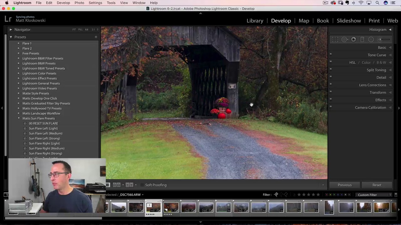
Every October I tell myself the same thing: I’ll drive out to the Cascades, the light will be perfect, and I’ll come home with a memory card full of golden-hour magic. And every October I come home with a card full of “almost.” The sky is too white, the yellows look more like tired green, and the warm glow I saw with my own eyes just isn’t there in the raw file. Fall foliage is genuinely one of the hardest things to photograph because the colors you experience in person are partly emotional. The camera doesn’t feel anything. It just records light.
That’s exactly why I’ve been returning to this Matt Kloskowski tutorial on start-to-finish fall photo editing. Watch the full tutorial on YouTube – it’s worth your time even if you’ve been editing for years. Matt works through a Vermont covered bridge scene with muted, partially-turned foliage and brings it to life using tools most of us already have in Lightroom. What I appreciate most is that he isn’t faking a scene that wasn’t there. He’s restoring what the camera failed to capture. That distinction matters to me, and it’ll matter to your editing philosophy too.
Step 1: Crop and Straighten First
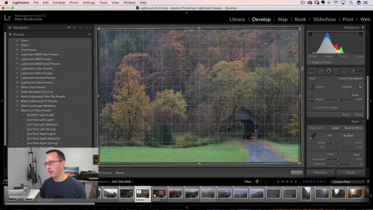 Crop tool open, image being rotated slightly
Before you touch a single tone or color slider, get your composition locked in. Matt opens with the crop tool and applies a small rotation to straighten the horizon. This sounds minor, but editing a crooked photo is like trying to hang a painting on a tilted wall – everything else you do will feel slightly off, even if you can’t name why.
Crop tool open, image being rotated slightly
Before you touch a single tone or color slider, get your composition locked in. Matt opens with the crop tool and applies a small rotation to straighten the horizon. This sounds minor, but editing a crooked photo is like trying to hang a painting on a tilted wall – everything else you do will feel slightly off, even if you can’t name why.
Tighten the crop to remove distracting empty space, especially blown-out white sky that you have no intention of recovering. A tighter frame also concentrates your color work in the areas that actually matter.
Step 2: Add a Touch of Warmth in the Basic Panel
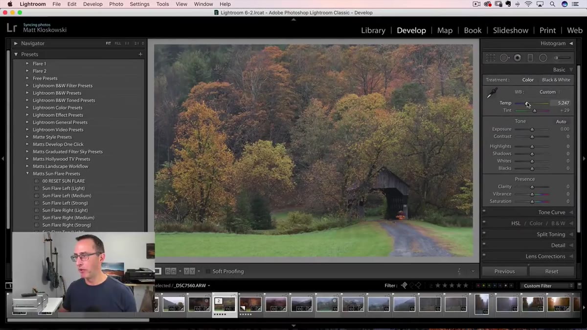 Basic panel open, Temperature slider being adjusted
Fall photos often come out of the camera with a cooler color temperature than the scene felt in person. Cloud cover, shade from tree canopy, and the lower angle of autumn sun all pull the white balance toward blue. A small nudge of the Temperature slider toward the warm (yellow/orange) end of the scale helps reconnect the image to what your eyes actually experienced.
Basic panel open, Temperature slider being adjusted
Fall photos often come out of the camera with a cooler color temperature than the scene felt in person. Cloud cover, shade from tree canopy, and the lower angle of autumn sun all pull the white balance toward blue. A small nudge of the Temperature slider toward the warm (yellow/orange) end of the scale helps reconnect the image to what your eyes actually experienced.
Don’t overdo it here. You’re not trying to fake golden hour – you’re correcting for what the sensor missed. A shift of 200 to 400 Kelvin is usually enough to feel warmer without looking like you slapped an Instagram filter on it.
Step 3: Set Your White Point and Black Point
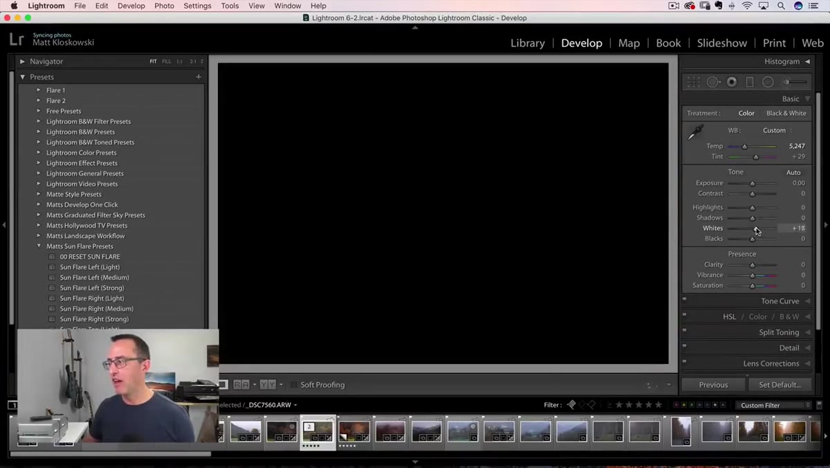 Whites slider being dragged right with Alt key held, showing clipping overlay
This is the step that separates flat-looking edits from ones that have real depth. Hold Alt (Windows) or Option (Mac) while dragging the Whites slider to the right. Your screen will go black, and small colored or white specks will appear as you push further – those specks indicate clipping. Drag until you just start to see a few specks, then back off slightly. That’s your white point.
Whites slider being dragged right with Alt key held, showing clipping overlay
This is the step that separates flat-looking edits from ones that have real depth. Hold Alt (Windows) or Option (Mac) while dragging the Whites slider to the right. Your screen will go black, and small colored or white specks will appear as you push further – those specks indicate clipping. Drag until you just start to see a few specks, then back off slightly. That’s your white point.
Repeat the same process with the Blacks slider, this time dragging left. You’re looking for the first hint of clipping in the shadows. Setting a true black point gives the image contrast and richness without you having to crank a Contrast slider and blow out the midtones. It’s one of the most reliable habits you can build into your editing workflow.
Step 4: Shift Hues in the HSL Panel to Intensify Fall Colors
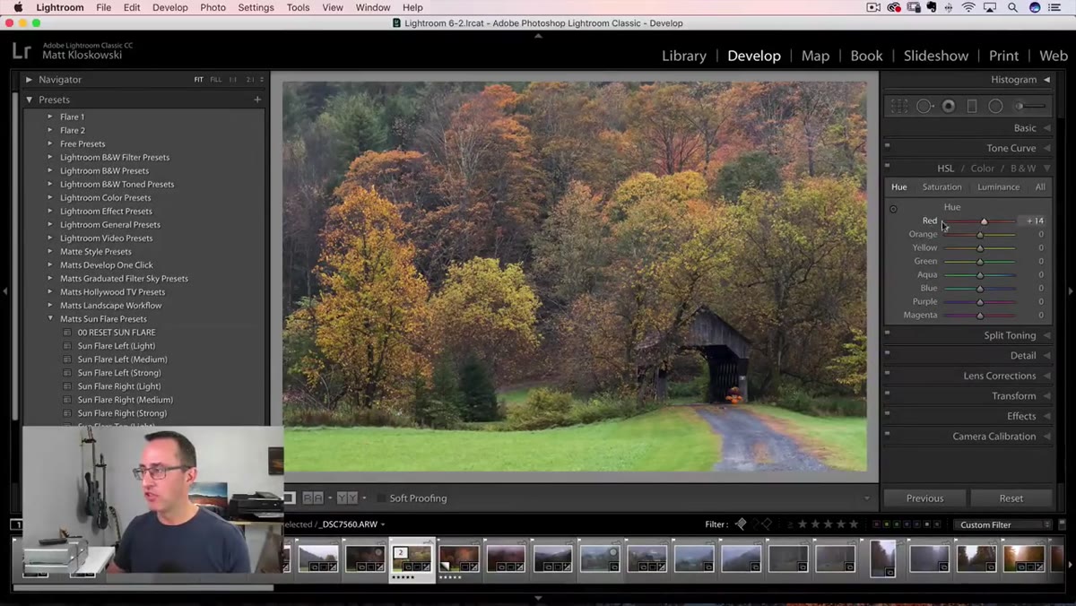 HSL panel open, Orange Hue slider being pulled toward red
This is where the real transformation happens, and it’s also the step that makes some purists uncomfortable. Matt is transparent about it: if you don’t believe in helping colors along in post, this technique isn’t for you. But if you’ve ever stood in a forest surrounded by deep reds and burnt oranges, then looked at your raw file and felt genuinely betrayed, keep reading.
HSL panel open, Orange Hue slider being pulled toward red
This is where the real transformation happens, and it’s also the step that makes some purists uncomfortable. Matt is transparent about it: if you don’t believe in helping colors along in post, this technique isn’t for you. But if you’ve ever stood in a forest surrounded by deep reds and burnt oranges, then looked at your raw file and felt genuinely betrayed, keep reading.
Open the HSL panel and go to the Hue tab. The move here is to push Oranges toward Red and push Yellows toward Orange. This mimics what happens when foliage is at peak color – those transitional yellow-greens and pale oranges shift further along the spectrum into richer, warmer tones. You don’t need to push all the way to the extreme of the slider. Find the point where the change looks natural rather than artificial, and stop there.
Step 5: Use the Luminance Tab to Add Depth to Your Colors
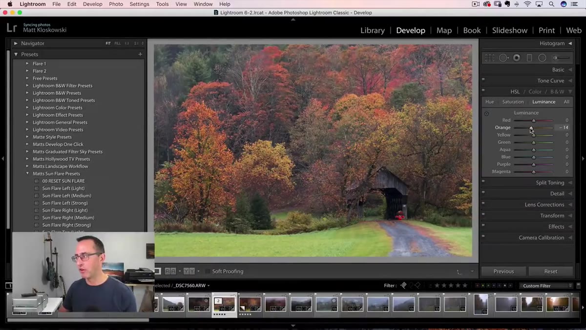 Luminance tab selected, Yellow and Orange sliders being adjusted
Once your hues are where you want them, switch to the Luminance tab within HSL. Luminance controls how bright or dark each color range appears without changing the color itself. For fall scenes, pulling the Yellows and Oranges slightly darker adds richness and weight to those tones – they start to look saturated and dimensional rather than washed out.
Luminance tab selected, Yellow and Orange sliders being adjusted
Once your hues are where you want them, switch to the Luminance tab within HSL. Luminance controls how bright or dark each color range appears without changing the color itself. For fall scenes, pulling the Yellows and Oranges slightly darker adds richness and weight to those tones – they start to look saturated and dimensional rather than washed out.
Think of it this way: a bright yellow reads as cheerful and light. A slightly deeper yellow reads as golden. That difference is often what separates a photo that looks like fall from one that truly feels like fall.
Step 6: Leave Some Colors Alone
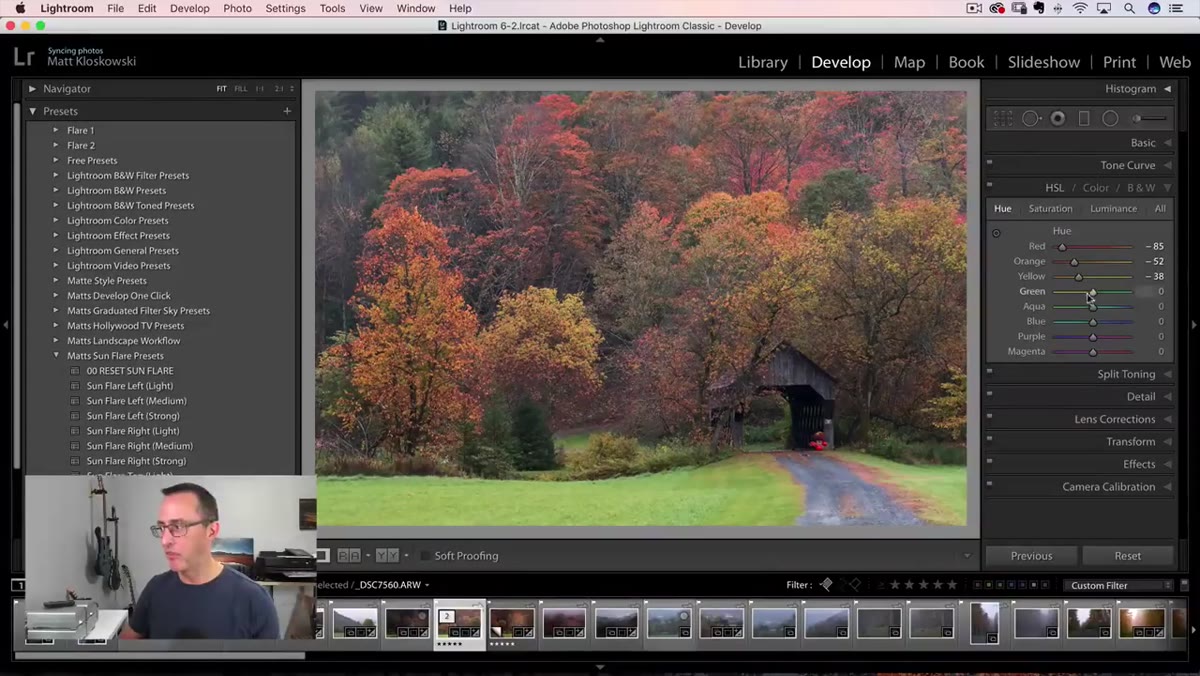 Green Hue slider being adjusted, then pulled back toward zero
One of the most useful moments in the tutorial is when Matt pulls the Green slider toward Yellow and then decides to leave it mostly alone. The green grass and understory in his image provides contrast against the warm trees, and pushing it too far toward yellow makes the whole image feel monochromatic.
Green Hue slider being adjusted, then pulled back toward zero
One of the most useful moments in the tutorial is when Matt pulls the Green slider toward Yellow and then decides to leave it mostly alone. The green grass and understory in his image provides contrast against the warm trees, and pushing it too far toward yellow makes the whole image feel monochromatic.
Restraint is a real skill in color editing. Not every slider needs to move. When you’re working on fall images, let some cooler or neutral tones stay where they are – they give the viewer’s eye a place to rest and make the warm tones pop by comparison.
A Note From My Own Sunday Morning Walks
I test edits like these regularly on my Sunday photo walks around Seattle, and the biggest mistake I see beginners make with HSL is treating each color channel as isolated. The sliders interact with each other in complex ways depending on your specific image. A yellow tree and yellow-green grass occupy overlapping parts of the spectrum, so a Yellows adjustment hits both.
My habit is to work one slider at a time, watch what changes in the actual image rather than staring at the slider value, and then check the before and after with the backslash key. If I can’t immediately see what changed without squinting, I’ve either done it right or overdone it. The answer is usually obvious once you toggle.
The single most transferable idea from this entire tutorial is this: fall color editing isn’t about inventing colors that weren’t there – it’s about recovering colors your camera couldn’t quite render the way your eyes saw them. Work the HSL Hue sliders with intention, set a real white and black point, and know when to stop.
Watch the full tutorial on YouTube to see Matt walk through each adjustment in real time – seeing the before and after on the covered bridge image is worth more than any written description.
Comments (1)
This is going in my reference folder. Incredibly useful.
Leave a Comment