
If you photograph products for small businesses or e-commerce clients, you have almost certainly run into this exact problem: a furniture company has one beautiful sofa, it comes in fourteen fabric colors, and they want fourteen polished, consistent product images for their website. Reshooting every single colorway is expensive and time-consuming. There has to be a smarter way.
That smarter way is digital recoloring, and in this Sean Tucker tutorial, he walks through exactly how to pull it off in Photoshop using physical fabric swatches as your color reference. Watch the full tutorial on YouTube if you want to follow along with the screen recording. This is part three of his series on photographing large products like sofas, beds, and dining sets. Parts one and two cover studio lighting and cutting out your subject onto a white background, so by this point you should have a clean, retouched cutout ready to go.
What I appreciate most about Tucker’s approach here is that he is upfront about the limits of the technique before he shows you how to do it. That kind of honesty is rare in tutorial content, and it saves you from setting expectations you cannot meet with a client.
Step 1: Understand the Tonal Range Limitation Before You Shoot
 Sean explaining recoloring tonal limits with dark and light sofas
Before you ever open Photoshop, you need to plan your shoot around a key constraint: you cannot reliably recolor across extreme tonal differences. Pulling a near-black sofa all the way to cream destroys detail because you are stretching the tonal information too far. The fabric texture, the shadows in the folds, the highlights on the armrests, all of it degrades.
Sean explaining recoloring tonal limits with dark and light sofas
Before you ever open Photoshop, you need to plan your shoot around a key constraint: you cannot reliably recolor across extreme tonal differences. Pulling a near-black sofa all the way to cream destroys detail because you are stretching the tonal information too far. The fabric texture, the shadows in the folds, the highlights on the armrests, all of it degrades.
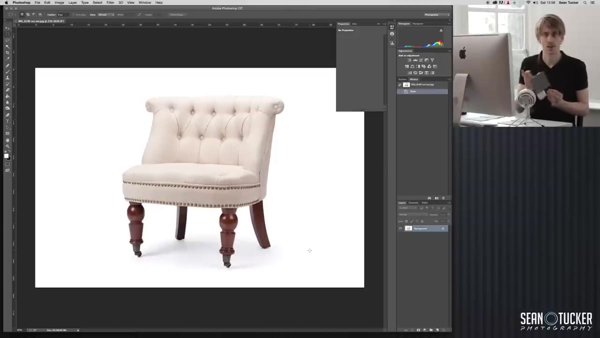
The practical solution is to shoot at least three versions of each fabric type: your darkest colorway, your lightest, and one in the middle. Then you recolor between those anchors rather than across the full range. If you are only shooting one version to recolor from, shoot something mid-tone or light. Tucker shot a relatively light-colored chair for this demonstration, which gives him flexibility to shift toward other lighter and medium tones without losing quality.
Step 2: Recognize What Recoloring Cannot Do
 Sean holding fabric swatches, explaining fabric texture differences
This technique changes the hue and tone of a fabric in a photo. It does not change the fabric’s texture or the way it interacts with light. A coarse, woven material will still look coarse and woven after you recolor it. You cannot make it look like velvet. The light-bounce characteristics are baked into the original image.
Sean holding fabric swatches, explaining fabric texture differences
This technique changes the hue and tone of a fabric in a photo. It does not change the fabric’s texture or the way it interacts with light. A coarse, woven material will still look coarse and woven after you recolor it. You cannot make it look like velvet. The light-bounce characteristics are baked into the original image.
This matters practically because it means recoloring works best when your client’s fabric options share a similar weave and texture. If they sell both a linen and a chenille version of the same sofa shape, those need to be photographed separately, not recolored from a single shot. Be honest with your clients about this boundary upfront. It protects you and sets them up for realistic results.
Step 3: Photograph Your Physical Fabric Swatches Under Consistent Light
 Fabric swatches laid on white desk near natural light window
Most furniture and fabric companies have physical swatch samples. Your job is to get those swatches into your computer as accurate digital color references. The key word is accurate, and that is entirely dependent on your light source.
Fabric swatches laid on white desk near natural light window
Most furniture and fabric companies have physical swatch samples. Your job is to get those swatches into your computer as accurate digital color references. The key word is accurate, and that is entirely dependent on your light source.
Position yourself near a window with clean natural daylight and turn off every artificial light in the room. Mixing daylight with tungsten ceiling lights or fluorescent overheads creates color casts that will corrupt your color reference. Tucker recommends shooting on or near a white or light neutral surface, like a white desk or a piece of white paper, to keep the surrounding color environment neutral. The swatch photo does not need to be a beautiful shot. It just needs to be a clean, accurate read of the fabric color under consistent, neutral light.
Step 4: Open Both Images in Photoshop
 Photoshop open with cutout sofa image from previous episode
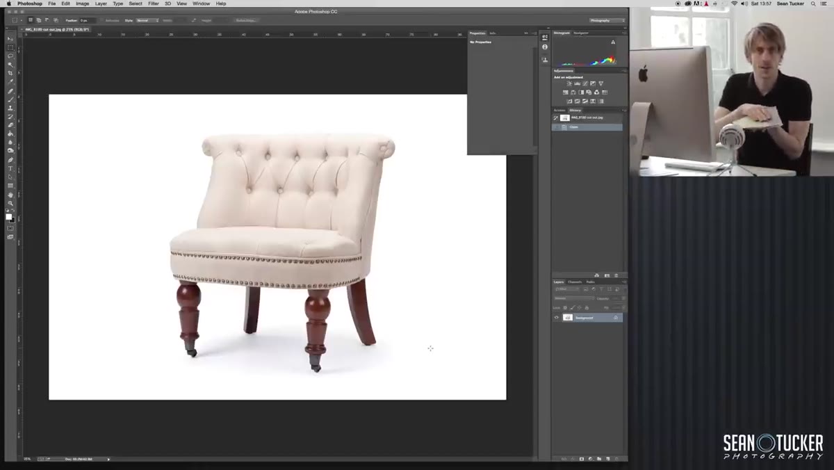
With your product cutout from part two and your swatch photos ready, open them both in Photoshop. Your product image should already be a clean cutout on a white or transparent background with any retouching and drop shadows applied. This is your base file, and you will be duplicating it for each colorway rather than working destructively on the original.
Photoshop open with cutout sofa image from previous episode
With your product cutout from part two and your swatch photos ready, open them both in Photoshop. Your product image should already be a clean cutout on a white or transparent background with any retouching and drop shadows applied. This is your base file, and you will be duplicating it for each colorway rather than working destructively on the original.
Work non-destructively from here forward. Duplicate your base layer before making any color adjustments. Keeping your original intact means you can go back and produce a different colorway without starting from scratch every time.
Step 5: Sample the Swatch Color as Your Target Reference
 Using eyedropper tool to sample color from photographed fabric swatch
This is where the earlier step about clean lighting pays off. Use the eyedropper tool to sample the dominant color from your swatch photograph. Because you shot the swatch under neutral daylight without mixed color sources, the sample you pull will be a true representation of the fabric color rather than a biased reading from a warm or cool light source.
Using eyedropper tool to sample color from photographed fabric swatch
This is where the earlier step about clean lighting pays off. Use the eyedropper tool to sample the dominant color from your swatch photograph. Because you shot the swatch under neutral daylight without mixed color sources, the sample you pull will be a true representation of the fabric color rather than a biased reading from a warm or cool light source.
Take your sample from the mid-tone area of the swatch, not the highlights or deep shadows. The mid-tone gives you the most representative color of the fabric itself. Use this sampled color as the target when building your adjustment layers.
Step 6: Apply Hue/Saturation Adjustments Within the Product Selection
 Hue/Saturation adjustment layer applied with layer mask on sofa
With your product layer selected, build a Hue/Saturation adjustment layer and clip it to the product layer so the adjustment only affects the sofa, not the background or shadows. Use the selection from your cutout mask to confine the changes even further if needed.
Hue/Saturation adjustment layer applied with layer mask on sofa
With your product layer selected, build a Hue/Saturation adjustment layer and clip it to the product layer so the adjustment only affects the sofa, not the background or shadows. Use the selection from your cutout mask to confine the changes even further if needed.
Shift the hue toward your target color and adjust saturation and lightness to match the sampled swatch value as closely as possible. This rarely takes a single pass. You will likely need to fine-tune by toggling back and forth between the swatch reference and the adjusted product image. Trust your eyes under that same natural light you used for the swatch photo, not the color picker numbers alone.
A Note From My Own Experience With Client Recoloring Work
I started doing this kind of work for a small furniture maker here in Seattle, and the biggest lesson I learned beyond Tucker’s excellent caveats was this: show clients a side-by-side comparison of the recolored image next to the physical swatch before you deliver the final files. Screens vary. Their laptop might be warmer than your calibrated monitor. When they can hold the swatch next to the image, they feel confident in the result and so do you.
Also, name your files clearly from the start. Fourteen colorways of the same sofa will become a chaotic mess in your delivery folder if you are not disciplined about naming conventions from the moment you start duplicating layers.
Digital recoloring is not a shortcut that replaces thoughtful photography. It is a post-production workflow that extends the value of great photography you have already done. Shoot smart, plan your tonal anchors, get accurate swatch references under good light, and Photoshop gives you the tools to do the rest efficiently.
Watch the full tutorial on YouTube to see Tucker walk through the Photoshop steps on screen. His delivery is clear and he shows his actual working file, which makes following along much easier than any written description can replicate.
Comments
Leave a Comment