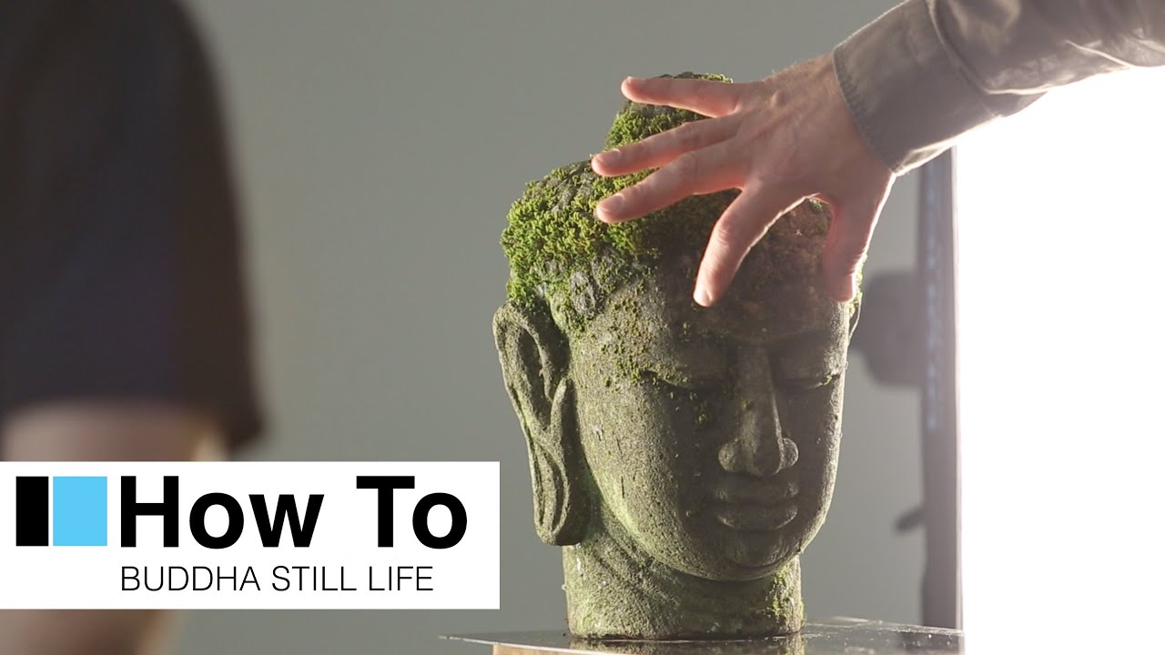
Still life photography has this reputation for being the “easy” genre because your subject doesn’t move, blink, or ask to see the back of the camera. But that stillness is exactly what raises the stakes. When nothing moves, every lighting decision is completely exposed. There’s nowhere to hide a lazy setup.
I kept running into this problem when shooting objects with complex surfaces - carved wood, rough stone, anything with real texture. My front-facing soft box was doing what it was designed to do, spreading light evenly, and in the process it was flattening everything that made the subject interesting in the first place. The shape disappeared. The texture disappeared. What was left looked like a product shot for a discount catalog.
In this Visual Education tutorial featuring photographer Or Rachel, he works through a complete lighting setup for a Buddha head he brought back from Indonesia. It’s a technically dense walkthrough packed into a short runtime, and the core problem he’s solving, how to keep three-dimensionality and surface texture alive while still filling in the shadows enough to get a workable image, is one I wish someone had explained to me years ago. Watch the full tutorial on YouTube if you want to follow along while you read.
Step 1: Define What You’re Actually Trying to Show
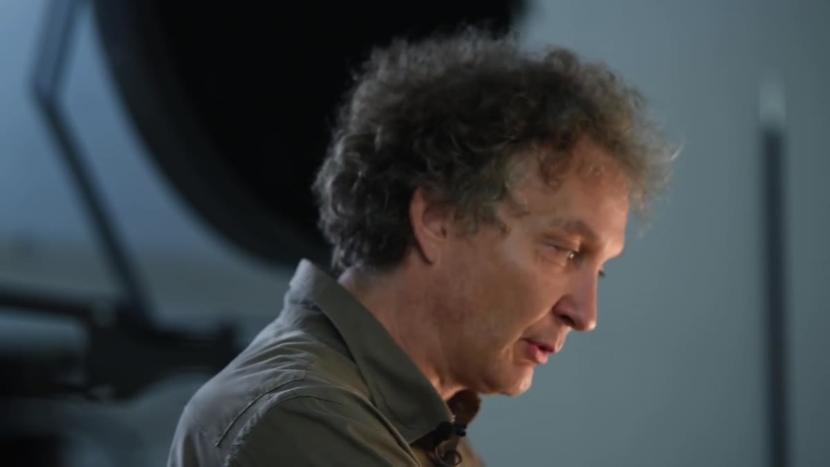 Rachel explaining texture and three-dimensionality as twin goals
Before you touch a single light, get clear on your two goals: shape and texture. Or Rachel names them directly at the start. Shape means the viewer reads the form as three-dimensional, not flat. Texture means the surface material reads as what it actually is, stone, wood, fabric, rather than a smooth gradient. These two goals drive every lighting decision that follows.
Rachel explaining texture and three-dimensionality as twin goals
Before you touch a single light, get clear on your two goals: shape and texture. Or Rachel names them directly at the start. Shape means the viewer reads the form as three-dimensional, not flat. Texture means the surface material reads as what it actually is, stone, wood, fabric, rather than a smooth gradient. These two goals drive every lighting decision that follows.
Write them down if you need to. Seriously. Once you’re adjusting power ratios in a dark studio, it’s easy to lose the thread.
Step 2: Place Two Small Soft Boxes as Rear Edge Lights
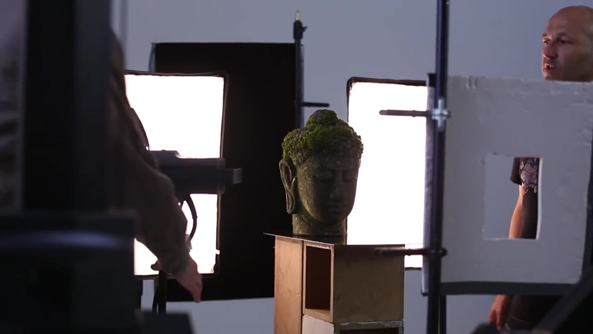
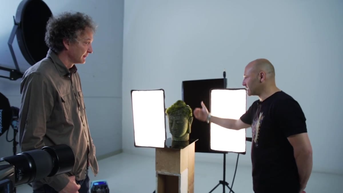 Two small soft boxes positioned behind and to each side of the Buddha head
Position two small soft boxes behind your subject, one to the left and one to the right, angled so the light grazes the edges of the form without spilling onto the front face. Or Rachel positions his so the light wraps just past the ears and falls off before it reaches the nose or lips. The front of the subject stays in shadow at this stage. That’s intentional.
Two small soft boxes positioned behind and to each side of the Buddha head
Position two small soft boxes behind your subject, one to the left and one to the right, angled so the light grazes the edges of the form without spilling onto the front face. Or Rachel positions his so the light wraps just past the ears and falls off before it reaches the nose or lips. The front of the subject stays in shadow at this stage. That’s intentional.
What this achieves is immediate: the ears, the jaw line, and any raised surface detail along the sides of the subject pick up a strong, slightly aggressive highlight. Because these are back lights, they produce harder-edged shadows and more contrast than a front light would. That contrast is what reads as three-dimensionality when the viewer looks at the final image. You’re not describing the shape with light - you’re carving it.
Step 3: Take a Test Shot and Flag the Lens Flare
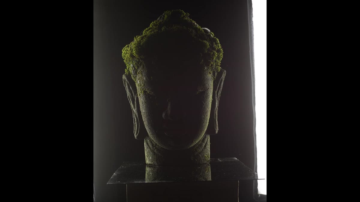 First test shot showing heavy lens flare from rear lights
Once your edge lights are placed, take a test shot before adding anything else. The almost certain result when shooting with back lights: significant lens flare. Or Rachel gets it immediately, a wash of light across the frame caused by the soft boxes firing more or less directly toward the lens.
First test shot showing heavy lens flare from rear lights
Once your edge lights are placed, take a test shot before adding anything else. The almost certain result when shooting with back lights: significant lens flare. Or Rachel gets it immediately, a wash of light across the frame caused by the soft boxes firing more or less directly toward the lens.
The fix is a flag - a black panel or cutter placed in front of the lens (but outside the frame) to block the stray light from reaching the glass. Or Rachel uses a simple window-cut mask to shoot through. Once the flag is in, the flare disappears and the gradation on the subject’s face becomes visible and clean. This step matters because no amount of post-processing fully recovers an image that’s been wrecked by flare. Deal with it in-camera.
Step 4: Test the Front Soft Box Aimed Straight On - and See Why It Fails
 Straight-on soft box result showing flattened nose, lips, and lost texture
Now add a third light - a front-facing soft box - aimed directly at the subject in the conventional position. Take a shot. Or Rachel does this deliberately as a teaching moment, and the result is instructive: the nose flattens, the lips lose definition, the stone surface looks like painted plastic. The edge lights are still technically there, but the front light has overpowered all the gradation they created.
Straight-on soft box result showing flattened nose, lips, and lost texture
Now add a third light - a front-facing soft box - aimed directly at the subject in the conventional position. Take a shot. Or Rachel does this deliberately as a teaching moment, and the result is instructive: the nose flattens, the lips lose definition, the stone surface looks like painted plastic. The edge lights are still technically there, but the front light has overpowered all the gradation they created.
This is the default mistake in soft box lighting. Soft boxes are designed to wrap light evenly, which makes them great for smoothing skin in portraiture (Or Rachel even notes they’re useful for hiding wrinkles in elder portraits). But that same quality actively works against you when your subject’s most interesting feature is its surface detail.
Step 5: Rotate the Soft Box to Make It Behave Like a Hard Light
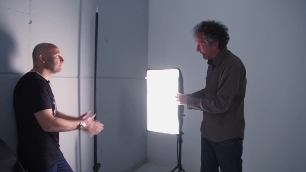 Soft box being rotated sideways so it appears narrower from subject’s perspective
Here’s the technique that makes this whole tutorial worth bookmarking. Instead of aiming the soft box directly at the subject, rotate it so that it turns edgewise toward the subject. As the soft box rotates, the effective size of the light source - as seen from the subject’s perspective - shrinks. A smaller apparent light source produces harder shadows and more defined gradation.
Soft box being rotated sideways so it appears narrower from subject’s perspective
Here’s the technique that makes this whole tutorial worth bookmarking. Instead of aiming the soft box directly at the subject, rotate it so that it turns edgewise toward the subject. As the soft box rotates, the effective size of the light source - as seen from the subject’s perspective - shrinks. A smaller apparent light source produces harder shadows and more defined gradation.
Or Rachel describes this as turning a soft box into a hard box, and it’s an accurate description. The modifier hasn’t changed, only its orientation. What changes is the light’s behavior: instead of flooding the front face with even illumination, it now skims across it at an angle, creating the exact gradation you need to hold onto the three-dimensional quality the edge lights established. The shadows get harder, the texture comes back, and the shape stays intact.
Step 6: Fine-Tune Gradation to Balance Fill Against Texture
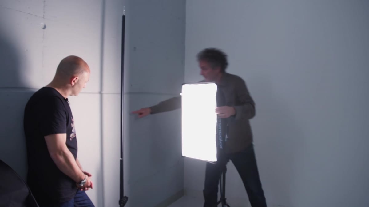 Incremental rotation of soft box with visible shadow hardening on test surface
With the soft box rotated, adjust the angle incrementally and watch how the shadow quality shifts in real time. Or Rachel works through this with a test surface before applying it to the Buddha head. The sweet spot is enough fill that the shadow side of the face isn’t a dead black hole, but not so much that the gradation you’ve spent the whole setup building gets washed out.
Incremental rotation of soft box with visible shadow hardening on test surface
With the soft box rotated, adjust the angle incrementally and watch how the shadow quality shifts in real time. Or Rachel works through this with a test surface before applying it to the Buddha head. The sweet spot is enough fill that the shadow side of the face isn’t a dead black hole, but not so much that the gradation you’ve spent the whole setup building gets washed out.
Power balance matters here too. Your fill light (the rotated soft box) should almost certainly be at a lower power than your edge lights, sometimes significantly lower. Trust the edge lights to do the heavy lifting on shape. The fill is just there to open up detail in the darkest areas without flattening what’s already working.
My Note on Taking This to Other Subjects
I’ve started applying the rotated soft box approach beyond still life work - specifically for objects I’m shooting for travel content, carved stone details at temples, weathered wood on fishing boats, anything where surface character is the whole story. One adjustment I’d add: if your subject is smaller than Or Rachel’s Buddha head (which is already quite compact), even a small soft box can still be too large at close range. I’ve had good results pulling the light further back and then rotating it, which gives you more control over the gradation without losing too much overall power.
The other thing I’d say is don’t skip the test-with-straight-on-light step that Or Rachel demonstrates. It feels counterproductive to deliberately take a bad shot, but seeing the flat result in your own histogram makes the rotated technique click in a way that description alone doesn’t.
The single most transferable idea in this tutorial is that gradation equals three-dimensionality. Every lighting decision Or Rachel makes comes back to that. If a light is destroying gradation, it’s destroying shape and texture along with it. If you internalize that one principle, you’ll start seeing your studio setups differently from the very first test shot.
Watch the full tutorial on YouTube to see the final result and catch the finer adjustments Or Rachel makes to the power balance between all three lights.
Comments (2)
Printing this out and pinning it next to my monitor. That good.
Simple but effective. Sometimes that's all you need.
Leave a Comment