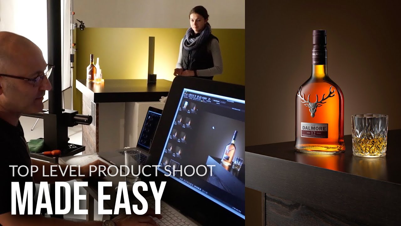
Product photography has a reputation for being intimidating, and honestly, for a long time I avoided it. I’m a lifestyle and travel shooter at heart. Give me golden hour on a mountain trail and I’m happy. But clients don’t always want mountains. Sometimes they want a bottle of whiskey looking like it belongs in a magazine spread, and that used to send me scrambling.
What changed things for me was watching how working commercial photographers actually think through a product setup, not just the gear list, but the logic behind every decision. In this Visual Education tutorial, photographer Carl walks through a full product shoot of a whiskey bottle with chrome stag antlers on the cap, which he flags immediately as a challenge because of the reflective metalwork. Watching him problem-solve in real time is worth more than most theoretical breakdowns I’ve read. Watch the full tutorial on YouTube and follow along with the steps below.
The through-line of his whole approach is this: you’re not just lighting the bottle, you’re sculpting it. Every decision, from how far the softbox sits to whether you add a scrap of foil behind the product, is about revealing the object’s form. That framing made the whole process click for me.
Step 1: Build a Surface That Adds Context
 Whiskey bottle positioned on layered wood surface
Before you touch a light, think about what your product is sitting on and what that surface says about it. Carl uses a stepped wooden platform built from a coffee table top and some scrap paneled wood from his studio. The step creates depth and makes the product feel more premium, like something displayed rather than just placed. You don’t need to buy anything. Hardware stores, secondhand shops, and your own furniture are fair game. The goal is a surface texture that reinforces the product’s personality. A rough-hewn wood plank reads rustic and premium. Glass reads sleek and modern. Match the material to the brand.
Whiskey bottle positioned on layered wood surface
Before you touch a light, think about what your product is sitting on and what that surface says about it. Carl uses a stepped wooden platform built from a coffee table top and some scrap paneled wood from his studio. The step creates depth and makes the product feel more premium, like something displayed rather than just placed. You don’t need to buy anything. Hardware stores, secondhand shops, and your own furniture are fair game. The goal is a surface texture that reinforces the product’s personality. A rough-hewn wood plank reads rustic and premium. Glass reads sleek and modern. Match the material to the brand.
Step 2: Choose a Background That Supports the Product
 Painted hardboard background placed behind the bottle
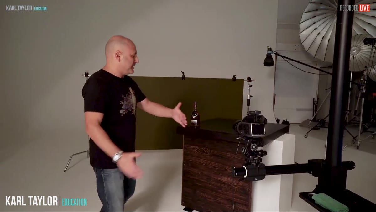
Carl uses a painted hardboard as a background, something simple and controllable. The key decision here is tone and texture, not brand. You want a background that lets the product breathe without competing with it. He also makes an intentional choice to angle the bottle slightly rather than shooting it straight on. That small rotation introduces three-dimensionality, which lets you see the label, the logo, and the sculptural details of the cap all at once. Shoot square-on and you flatten everything. A 10-to-20-degree turn is usually enough to show depth without distorting proportions.
Painted hardboard background placed behind the bottle
Carl uses a painted hardboard as a background, something simple and controllable. The key decision here is tone and texture, not brand. You want a background that lets the product breathe without competing with it. He also makes an intentional choice to angle the bottle slightly rather than shooting it straight on. That small rotation introduces three-dimensionality, which lets you see the label, the logo, and the sculptural details of the cap all at once. Shoot square-on and you flatten everything. A 10-to-20-degree turn is usually enough to show depth without distorting proportions.
Step 3: Set Up a Scrim as Your Primary Light Modifier
 Scrim placed close to the side of the whiskey bottle
The first light in Carl’s setup is not pointed directly at the bottle. He positions a vertical strip softbox behind a scrim on one side. A scrim is a translucent diffusion panel that acts as a secondary light source, softening and spreading what comes through it. The softbox fires into the scrim, and the scrim becomes a large, even plane of light right next to the product. Carl places the scrim as close to the bottle as possible without it entering the frame. The closer it is, the larger and softer the apparent light source, which means smoother gradients across curved surfaces like glass.
Scrim placed close to the side of the whiskey bottle
The first light in Carl’s setup is not pointed directly at the bottle. He positions a vertical strip softbox behind a scrim on one side. A scrim is a translucent diffusion panel that acts as a secondary light source, softening and spreading what comes through it. The softbox fires into the scrim, and the scrim becomes a large, even plane of light right next to the product. Carl places the scrim as close to the bottle as possible without it entering the frame. The closer it is, the larger and softer the apparent light source, which means smoother gradients across curved surfaces like glass.
Step 4: Move the Light to Understand the Inverse Square Law in Practice
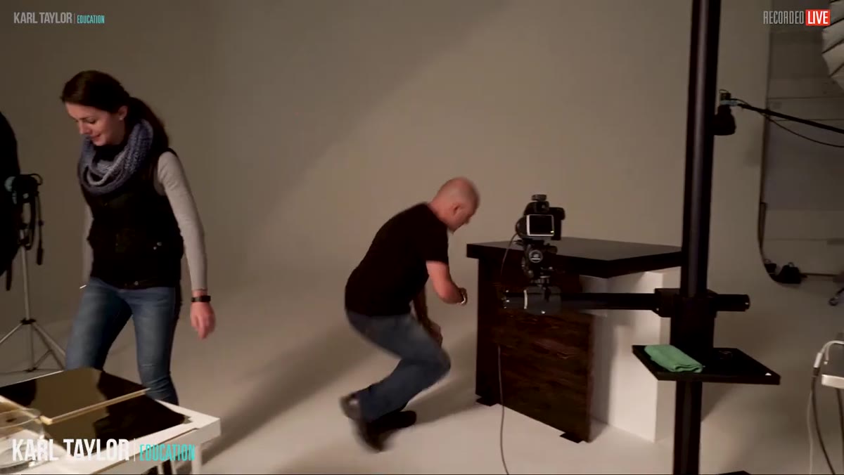
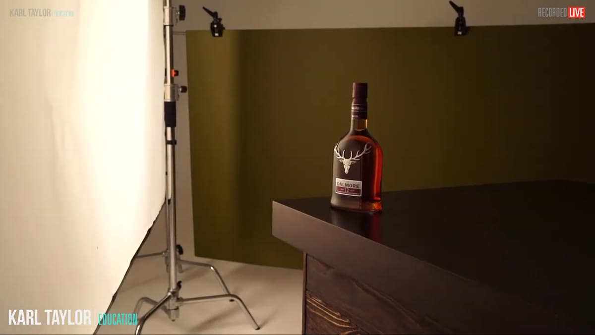 Assistant moving softbox further from scrim, light changing on bottle
This step is where I learned the most from watching, because Carl doesn’t just set the light and move on. He has his assistant move the softbox progressively further from the scrim while he watches the effect on the bottle in real time. Moving the light further away softens the spread but reduces intensity, a direct demonstration of the inverse square law. To compensate, he raises the power by one stop. The practical takeaway: if your product looks harshly lit, try moving your light source further back and bumping the power rather than adding more diffusion. You’ll get a broader, more even spread across the surface.
Assistant moving softbox further from scrim, light changing on bottle
This step is where I learned the most from watching, because Carl doesn’t just set the light and move on. He has his assistant move the softbox progressively further from the scrim while he watches the effect on the bottle in real time. Moving the light further away softens the spread but reduces intensity, a direct demonstration of the inverse square law. To compensate, he raises the power by one stop. The practical takeaway: if your product looks harshly lit, try moving your light source further back and bumping the power rather than adding more diffusion. You’ll get a broader, more even spread across the surface.
His aperture setting throughout this shoot is f/11 on a medium-format Hasselblad, which he notes translates to roughly f/8 on a full-frame 35mm camera. That gives him enough depth of field to keep the whole bottle sharp while controlling the background.
Step 5: Use Gold Foil Card as a Reflector to Bring the Product to Life
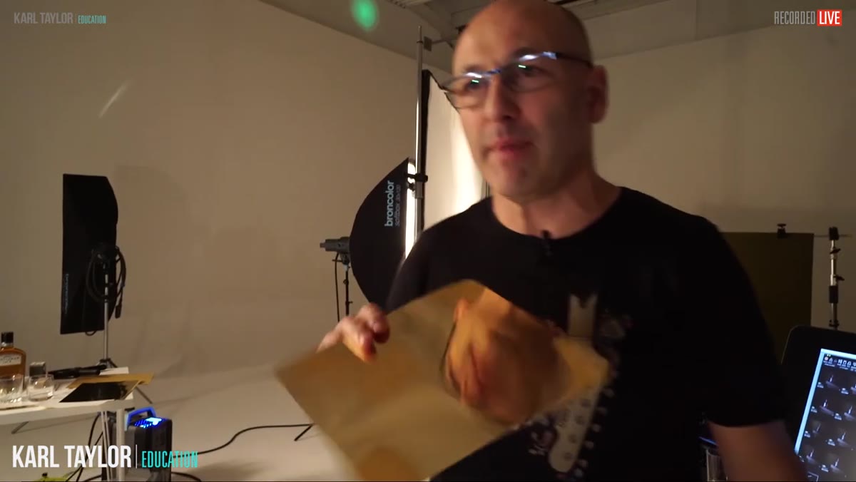 Gold foil card mounted on foam board placed behind the bottle
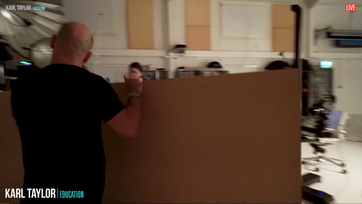
This is the step that will genuinely change how you shoot products if you haven’t tried it. Carl introduces a piece of gold foil card, the kind that looks like a mirror, mounted onto a foam board for stability. When placed behind or beside the product, it bounces the existing light back into the shadow side and adds a warm, rich glow that reads as expensive. Watching the before and after on screen is stark. The bottle goes from flat and underlit to dimensional and alive in seconds.
Gold foil card mounted on foam board placed behind the bottle
This is the step that will genuinely change how you shoot products if you haven’t tried it. Carl introduces a piece of gold foil card, the kind that looks like a mirror, mounted onto a foam board for stability. When placed behind or beside the product, it bounces the existing light back into the shadow side and adds a warm, rich glow that reads as expensive. Watching the before and after on screen is stark. The bottle goes from flat and underlit to dimensional and alive in seconds.
You can find gold foil card at craft stores or online for almost nothing. Gluing it to foam board, as Carl’s assistant does here, gives you a rigid flag you can angle precisely. The foam board also lets you use it freestanding on a table, which saves you from needing an extra stand for every shoot.
Step 6: Adjust and Iterate - The Set Is Always a Work in Progress
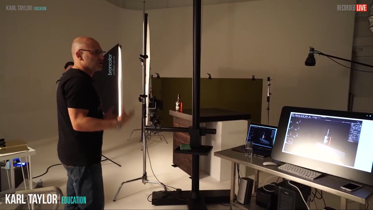 Carl assessing the full setup, background and product both visible
Carl is explicit about something that I think beginners underestimate: the setup described above is a starting point, not a final answer. He moves the softbox by six inches and notes a visible difference on the bottle. He tweaks the scrim position, adjusts the angle of the reflector, and keeps checking the full frame, including how the background reads, not just the product. Product photography rewards this kind of patient iteration. Give yourself time to look, adjust, and look again rather than shooting a hundred frames hoping one works.
Carl assessing the full setup, background and product both visible
Carl is explicit about something that I think beginners underestimate: the setup described above is a starting point, not a final answer. He moves the softbox by six inches and notes a visible difference on the bottle. He tweaks the scrim position, adjusts the angle of the reflector, and keeps checking the full frame, including how the background reads, not just the product. Product photography rewards this kind of patient iteration. Give yourself time to look, adjust, and look again rather than shooting a hundred frames hoping one works.
What I’d Add From My Own Experience
One thing Carl doesn’t dig into here is the value of shooting tethered when you’re doing product work. Judging a shiny, reflective object on a camera’s rear LCD will mislead you every time. The highlights look different at scale, and subtle color shifts from your reflectors show up more clearly on a larger screen. If you have a tethering option, this is the shoot type where it earns its place. Even a basic laptop and a USB cable changes how accurately you can evaluate what you’re building in real time.
The single most important thing I took from this tutorial is that product lighting is not about adding more light. It is about placing light precisely and using simple, inexpensive tools like scrims, foil cards, and a painted board to control what that light does to the object’s surface. Most of the expensive-looking results here come from understanding the physics of light behavior, not from buying better gear.
Watch the full tutorial on YouTube to see every adjustment Carl makes as the shoot progresses. Seeing the before-and-after moments in motion is worth it.
Comments
Leave a Comment