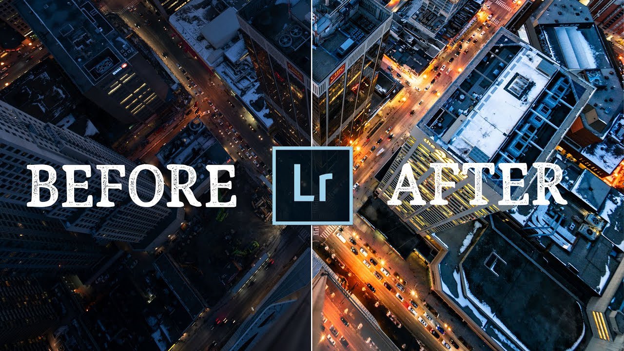
Every Sunday morning I’m out on a photo walk around Seattle, and I probably shoot more city scenes than anything else. Rainy streets, glass towers, the blue-gray light that rolls in off the sound. But for the longest time, my edits felt flat. I’d nail the composition and then sit in front of Lightroom wondering why the photo looked nothing like what I’d felt standing there. The problem wasn’t the shot. It was the edit.
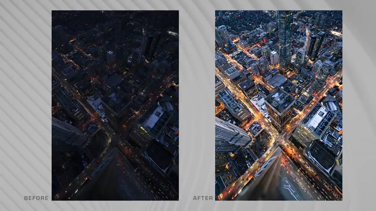
In this Peter McKinnon tutorial from his “Editing YOUR Photos” series, he works through two real community-submitted images. One is a jaw-dropping rooftop city shot, the other a moody urban portrait. What he demonstrates across both edits is a repeatable approach to building drama in city photography. Not through heavy-handed presets, but through deliberate, layered decisions. I took notes. Here’s what I pulled out.
Watch the full tutorial on YouTube
Step 1: Evaluate the Exposure Before You Touch Anything
 Peter examining rooftop city photo before editing
Before you reach for a slider, spend thirty seconds just reading the image. Peter points out something worth burning into your brain: the photographer who submitted the rooftop shot had deliberately underexposed in camera. That choice preserved highlight detail in the city lights and kept noise low, because it meant keeping ISO in check. You can always recover shadows in post. Blown highlights are much harder to fix.
Peter examining rooftop city photo before editing
Before you reach for a slider, spend thirty seconds just reading the image. Peter points out something worth burning into your brain: the photographer who submitted the rooftop shot had deliberately underexposed in camera. That choice preserved highlight detail in the city lights and kept noise low, because it meant keeping ISO in check. You can always recover shadows in post. Blown highlights are much harder to fix.
When you open your city shot in Lightroom, ask yourself: where is the information hiding? If the shot skews dark but the highlights aren’t clipped, you’re in a good position. That’s the starting point for the whole edit.
Step 2: Drag Exposure and Shadows Up First
 Lightroom exposure and shadows sliders being pulled up
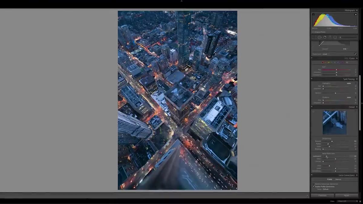
This is the moment Peter calls one of his favorite parts of the process. Bring your Exposure slider up to reveal the overall scene, then pull Shadows up hard. On a city night shot or a photo taken on an overcast day, this single move can feel like watching a photo breathe for the first time. Details in the darker areas of buildings, street textures, and window reflections start to emerge.
Lightroom exposure and shadows sliders being pulled up
This is the moment Peter calls one of his favorite parts of the process. Bring your Exposure slider up to reveal the overall scene, then pull Shadows up hard. On a city night shot or a photo taken on an overcast day, this single move can feel like watching a photo breathe for the first time. Details in the darker areas of buildings, street textures, and window reflections start to emerge.
Don’t try to finalize the exposure here. Think of this as a reveal pass. You’re seeing what the sensor actually captured. From this point, every other decision is about shaping that information into a mood.
Step 3: Push the White Balance Cool for Urban Scenes
 White balance temperature slider shifted toward cooler tones
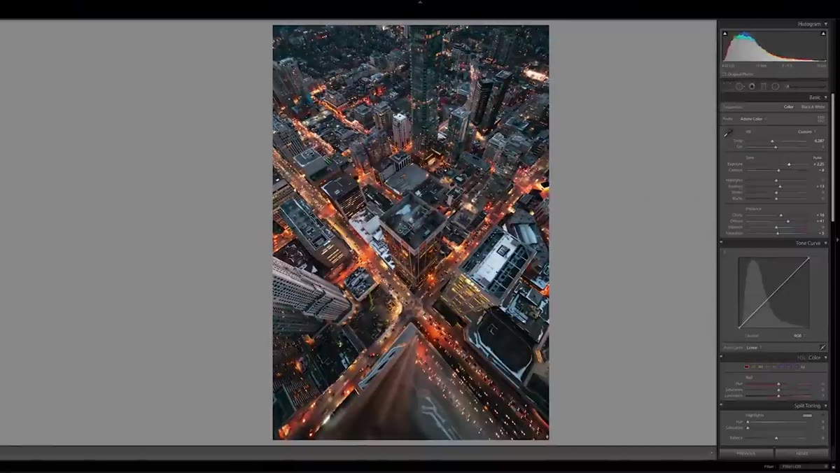
Here is a color principle that has genuinely changed how I edit city photos. Peter consistently pulls his white balance toward cooler, bluer tones when editing urban scenes. The reason is contrast. City environments are full of warm tones. Sodium streetlights, illuminated signs, the orange glow that bounces off wet pavement. When you cool the overall image, those warm elements pop harder because they’re fighting against the blue.
White balance temperature slider shifted toward cooler tones
Here is a color principle that has genuinely changed how I edit city photos. Peter consistently pulls his white balance toward cooler, bluer tones when editing urban scenes. The reason is contrast. City environments are full of warm tones. Sodium streetlights, illuminated signs, the orange glow that bounces off wet pavement. When you cool the overall image, those warm elements pop harder because they’re fighting against the blue.
In Lightroom, drag your Temperature slider left toward the blue side. Start subtle. A shift of 10 to 20 points can be enough to shift the whole feel of the image without making skin tones or architectural details look unnatural.
Step 4: Use Photoshop Layer Masks to Separate Color Tones
 Photoshop masking roads and buildings separately
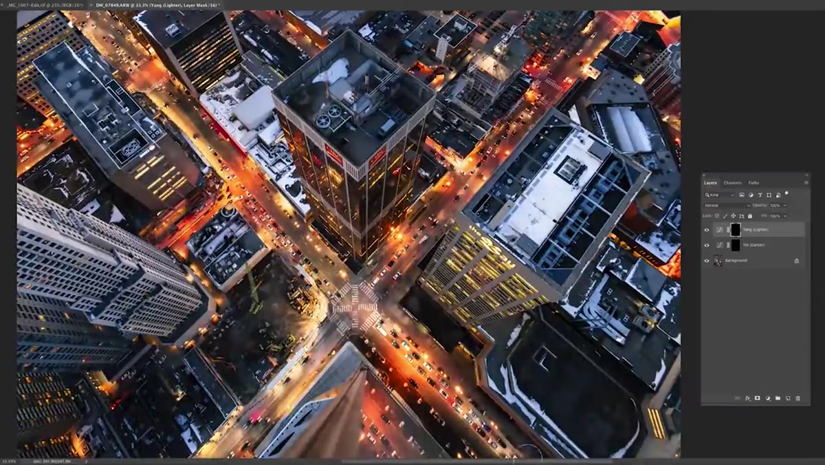
This is where the real magic happens, and it’s simpler to execute than it sounds. Peter takes the city shot into Photoshop and treats the roads and the buildings as two separate color zones. The roads get a warm tone. The buildings get a cool tone. The result is that blue-and-orange color pairing you see in cinematic photography everywhere right now. It works because those two colors sit opposite each other on the color wheel and naturally create visual tension.
Photoshop masking roads and buildings separately
This is where the real magic happens, and it’s simpler to execute than it sounds. Peter takes the city shot into Photoshop and treats the roads and the buildings as two separate color zones. The roads get a warm tone. The buildings get a cool tone. The result is that blue-and-orange color pairing you see in cinematic photography everywhere right now. It works because those two colors sit opposite each other on the color wheel and naturally create visual tension.
Here is how to do it. Add a Color Balance or Hue/Saturation adjustment layer and push it warm. Then add a layer mask, fill it black to hide the effect entirely, and paint white over just the road areas using a soft brush. Add a second adjustment layer and push it cool. Mask it the same way, but paint white over the buildings instead. You can do this loosely. Perfect selection isn’t the goal. A rough, natural-looking separation between warm streets and cool architecture is exactly the vibe.
Step 5: Edit Portraits with a Bias Toward Mood, Not Correction
 Lightroom color panel adjustments on urban portrait
For the second photo, a portrait taken against the reflective glass exterior of a Toronto office tower, Peter shifts his approach. With portraits in urban environments, the edit should support the mood of the environment rather than try to perfectly correct for it. The photo was taken on a cloudy day. Rather than warm it up to compensate, Peter leans into the coolness and moodiness that the overcast light naturally gives you.
Lightroom color panel adjustments on urban portrait
For the second photo, a portrait taken against the reflective glass exterior of a Toronto office tower, Peter shifts his approach. With portraits in urban environments, the edit should support the mood of the environment rather than try to perfectly correct for it. The photo was taken on a cloudy day. Rather than warm it up to compensate, Peter leans into the coolness and moodiness that the overcast light naturally gives you.
In practice this means resisting the urge to push skin tones warmer just because that’s the “safe” choice. Run through your color panel in Lightroom. Make small shifts to individual hue and saturation values. Keep things dark and contrasty. Don’t let any single color dominate. The goal is a quiet, cinematic tension, not a bright social media polish.
Step 6: Don’t Over-Lift the Shadows on Detail-Heavy Shots
 Shadows slider pulled back after initial lift on city photo
One note Peter drops almost casually but I think is critical: once you’ve done your initial shadow lift, back off a little. Especially on a shot packed with architectural detail, lifting shadows all the way flattens the image and washes out the atmosphere you’re trying to build. Some darkness should remain. Shadows give a photo its sense of depth and mystery. If everything is equally visible, nothing is interesting.
Shadows slider pulled back after initial lift on city photo
One note Peter drops almost casually but I think is critical: once you’ve done your initial shadow lift, back off a little. Especially on a shot packed with architectural detail, lifting shadows all the way flattens the image and washes out the atmosphere you’re trying to build. Some darkness should remain. Shadows give a photo its sense of depth and mystery. If everything is equally visible, nothing is interesting.
After your initial reveal pass, bring the Shadows slider back down 10 to 20 percent from your starting point. Then fine-tune using the Blacks slider to control how deep the darkest areas go. That separation between midtones and blacks is where moody city editing actually lives.
What I’d Add From My Own Experience
I’ve run this exact workflow on dozens of Seattle street shots and there’s one thing I always add that Peter doesn’t specifically cover here: a slight S-curve in the Tone Curve panel. After you’ve done your exposure adjustments and color toning, a gentle S-curve. pulling the highlights up and the shadows down a hair. adds a punchy contrast that ties everything together. It makes the color tones feel intentional rather than applied. If you’re editing overcast or night city shots specifically, try lifting the very bottom of your curve slightly to give the blacks a faint lifted quality. It reads as cinematic rather than muddy.
Also worth saying: these techniques apply whether you’re shooting with a full-frame camera or your phone. I know because I’ve tested it. Some of my most-edited urban shots started life as phone captures. The edit does a lot of the heavy lifting when the light is right.
The single most important takeaway from this tutorial is that dramatic city edits are built in layers, not applied all at once. Start with what the sensor captured, reveal it intentionally, then shape the color and tone in separate passes. That workflow stops you from chasing corrections and starts you building something deliberate.
Watch the full tutorial on YouTube to see Peter walk through both edits in real time. Watching the before-and-after on that rooftop shot alone is worth the twelve minutes.
Comments
Leave a Comment