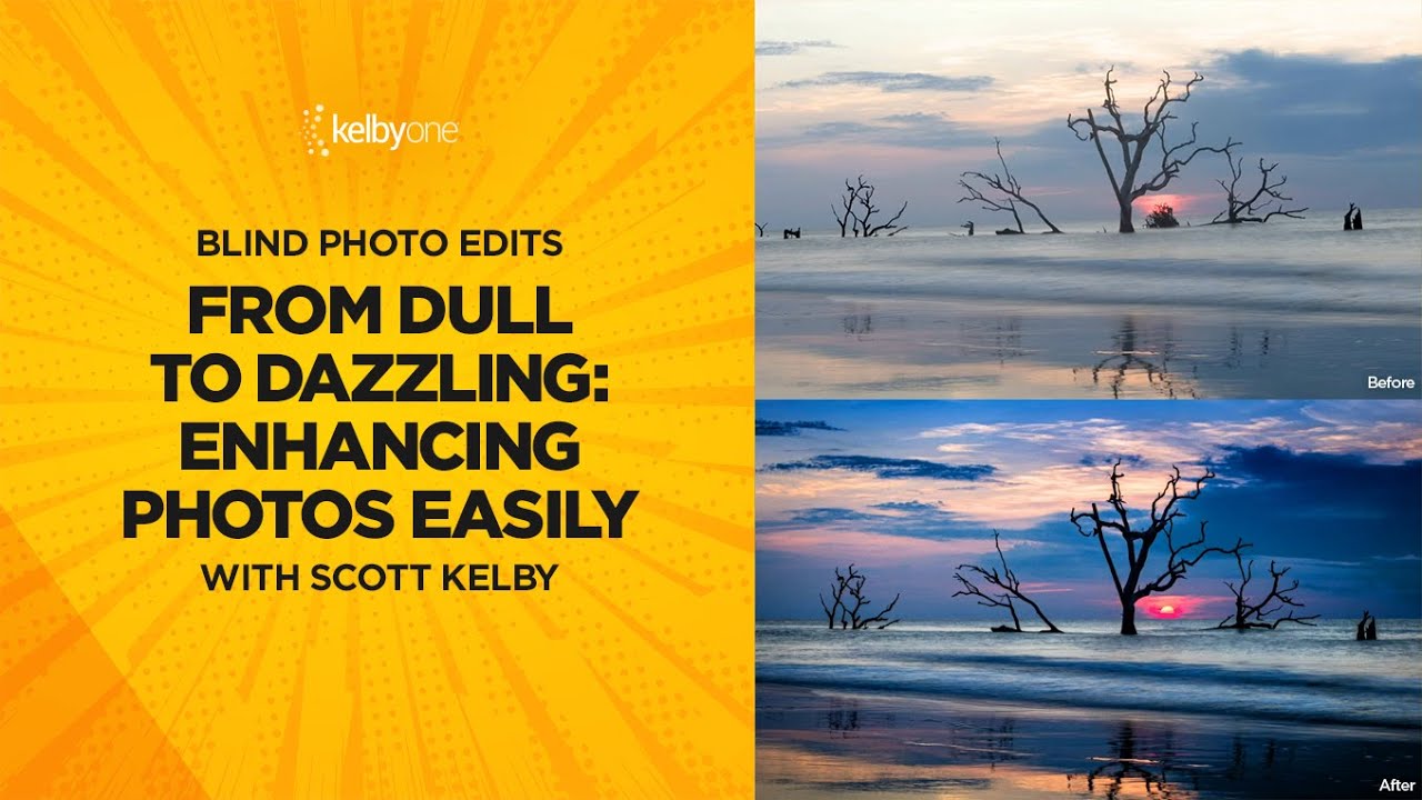
There’s a particular kind of frustration I know well: standing at a gorgeous location, nailing the shot in the moment, and then opening Lightroom to find the image looks… flat. The sky is washed out, the horizon tilts just enough to be annoying, and the whole thing lacks the punch you felt when you pressed the shutter. That gap between what you saw and what the file shows is exactly the problem this tutorial addresses head-on.
In this KelbyOne tutorial, Scott Kelby works through a blind photo edit, meaning he’s seeing the image for the first time and editing it live, no preparation, no safety net. That format is genuinely useful for learners because you get to watch a working pro make decisions in real time, including the small ones that most polished tutorials skip. Watch the full tutorial on YouTube alongside this breakdown if you want to follow along in Lightroom.
What I appreciate most about his approach is that the edit is genuinely short. Straighten, grade the sky, add contrast, use generative AI to clean up distractions. The whole thing takes minutes. That kind of efficient, intentional workflow is worth studying closely, so here’s every step laid out so you can apply it to your own images.
Step 1: Apply the Adobe Landscape Profile and Run Auto
 Switching to Adobe Landscape profile in Lightroom
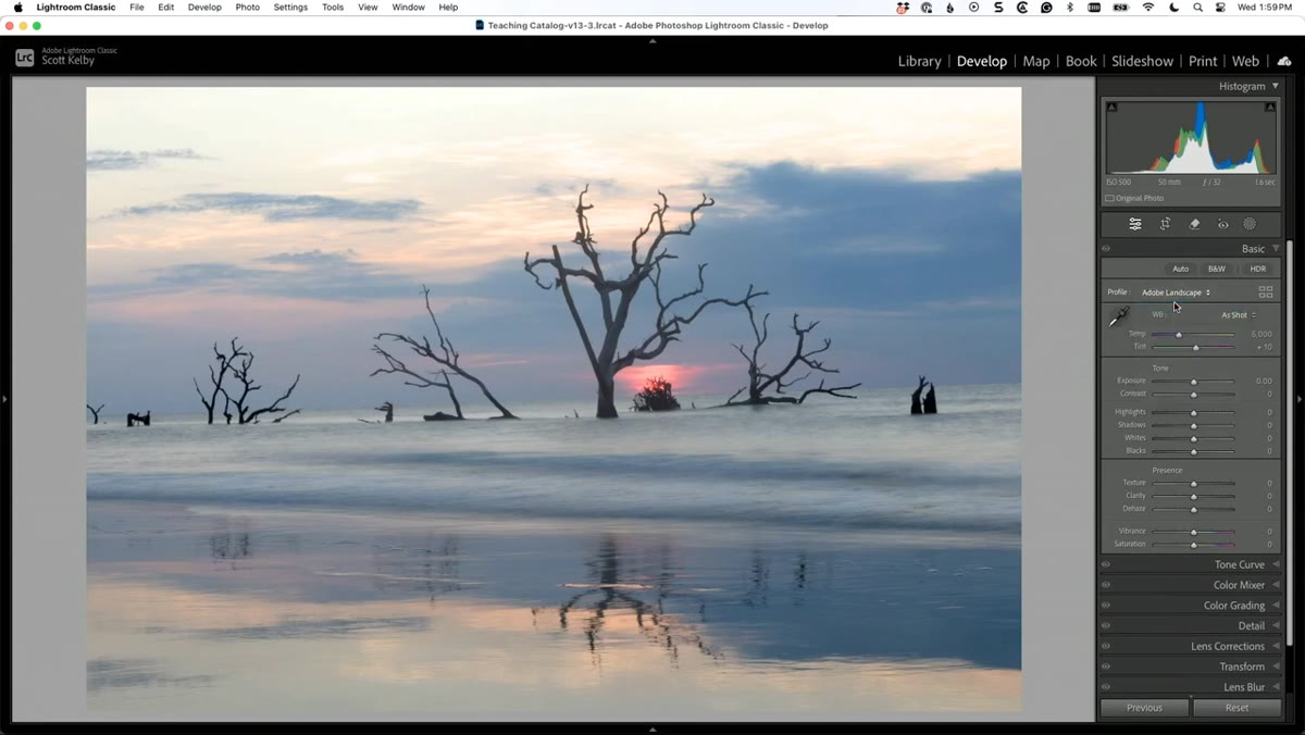
Before touching a single slider, Kelby switches the camera profile to Adobe Landscape. You’ll find this in the Basic panel under “Profile” at the very top. Click the grid icon next to the profile name and look for the Adobe Landscape option in the list. This profile boosts saturation and contrast in a way that’s specifically tuned for outdoor scenes, and it immediately gives the image more life without any manual adjustments.
Switching to Adobe Landscape profile in Lightroom
Before touching a single slider, Kelby switches the camera profile to Adobe Landscape. You’ll find this in the Basic panel under “Profile” at the very top. Click the grid icon next to the profile name and look for the Adobe Landscape option in the list. This profile boosts saturation and contrast in a way that’s specifically tuned for outdoor scenes, and it immediately gives the image more life without any manual adjustments.
Once the profile is applied, hit the Auto button in the Basic panel. Lightroom analyzes the tonal range of your specific image and sets exposure, highlights, shadows, whites, and blacks accordingly. It’s not always perfect, but it gets you to a strong starting point in one click, which means you’re correcting from a reasonable baseline rather than guessing from scratch.
Step 2: Straighten the Horizon with the Rotation Slider
 Adjusting the Rotation slider under Transform panel
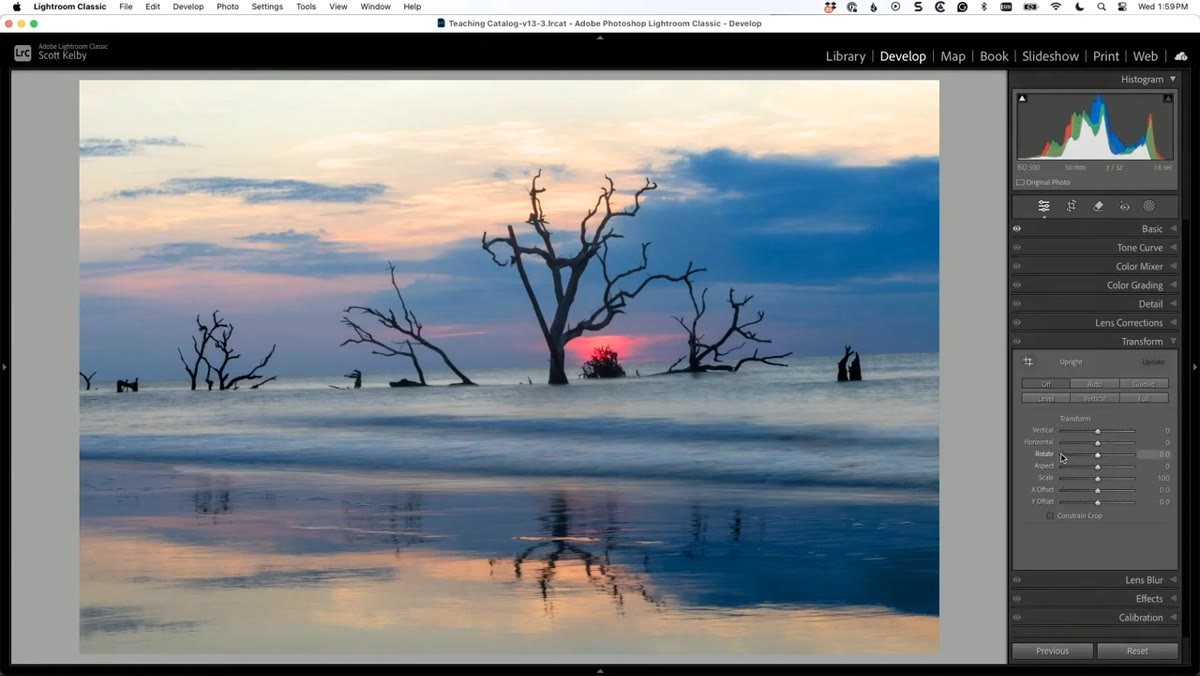
Crooked horizons are one of the most common issues with landscape photos, especially handheld shots near water. Kelby heads to the Transform panel and uses the Rotation slider to level the image manually. The Transform panel lives below the Lens Corrections section in the Develop module. Just nudge the Rotation slider left or right in small increments until the horizon sits level.
Adjusting the Rotation slider under Transform panel
Crooked horizons are one of the most common issues with landscape photos, especially handheld shots near water. Kelby heads to the Transform panel and uses the Rotation slider to level the image manually. The Transform panel lives below the Lens Corrections section in the Develop module. Just nudge the Rotation slider left or right in small increments until the horizon sits level.
After rotating, you’ll notice white triangles appear in the corners where the canvas edge doesn’t match the image anymore. Check the “Constrain Crop” checkbox at the bottom of the Transform panel, and Lightroom automatically crops to the largest possible rectangle with no empty edges. You lose a sliver of the frame, but the result looks intentional rather than sloppy.
Step 3: Add a Linear Gradient to Deepen the Sky
 Dragging a linear gradient down from the top of the image
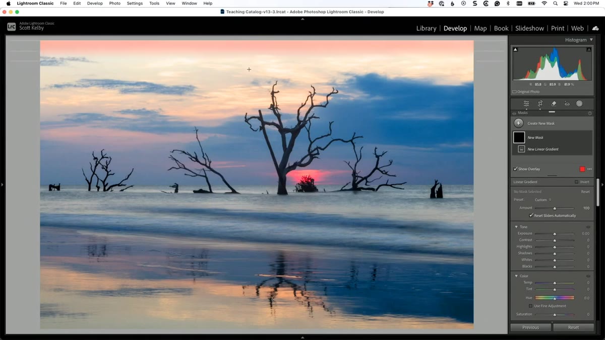
A bright, detail-less sky is one of the fastest ways a landscape photo looks amateur. Kelby’s fix is a linear gradient pulled down from the top of the frame. Open the Masking panel (the circle icon in the toolbar), choose Linear Gradient, and drag from the top of the image downward, stopping roughly where the sky meets the land.
Dragging a linear gradient down from the top of the image
A bright, detail-less sky is one of the fastest ways a landscape photo looks amateur. Kelby’s fix is a linear gradient pulled down from the top of the frame. Open the Masking panel (the circle icon in the toolbar), choose Linear Gradient, and drag from the top of the image downward, stopping roughly where the sky meets the land.
With that gradient mask active, reduce Exposure slightly to darken the sky. Then shift the color temperature toward blue using the Temp slider, and nudge the Tint toward purple just slightly for warmth and atmosphere. Kelby also lifts the Whites a touch to keep the cloud detail from going muddy. The goal is not a dramatic HDR effect but a believable, slightly moodier sky that draws the eye upward.
Step 4: Apply a Subtle Vignette
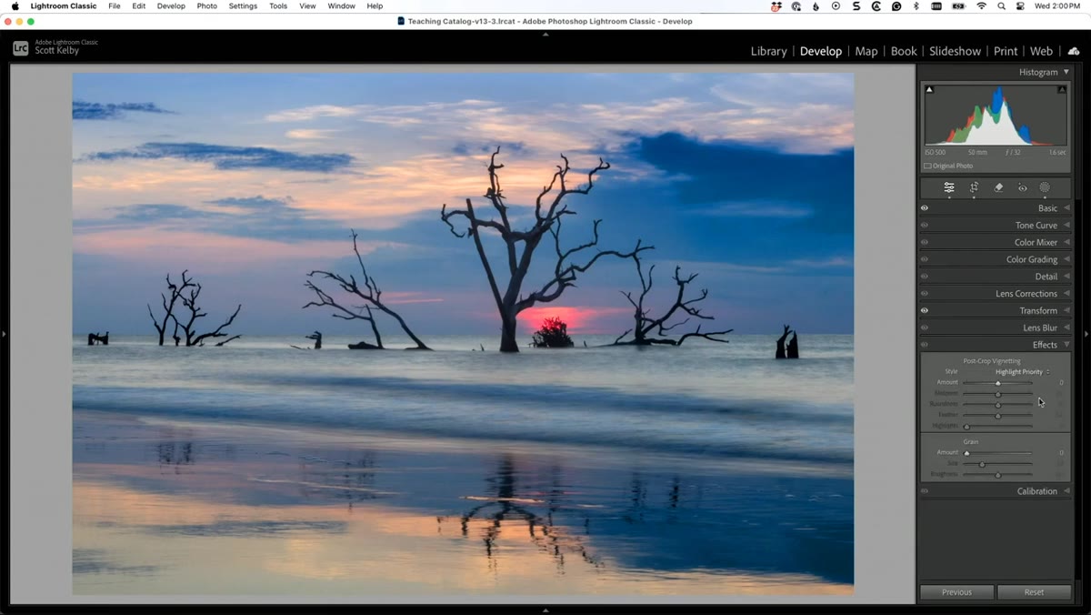 Adding a vignette in the Effects panel in Lightroom
A vignette is one of those edits that works almost invisibly. Kelby toggles it on and off to demonstrate the difference, and honestly, it’s subtle enough that most viewers wouldn’t identify it, but the image feels more composed and deliberate with it applied. In the Effects panel, find the Vignetting section and drag the Amount slider left to somewhere around -10 to -20. The edges darken slightly, which pulls attention toward the center of the frame.
Adding a vignette in the Effects panel in Lightroom
A vignette is one of those edits that works almost invisibly. Kelby toggles it on and off to demonstrate the difference, and honestly, it’s subtle enough that most viewers wouldn’t identify it, but the image feels more composed and deliberate with it applied. In the Effects panel, find the Vignetting section and drag the Amount slider left to somewhere around -10 to -20. The edges darken slightly, which pulls attention toward the center of the frame.
Keep the Feather value high (80 or above) so the transition from dark to light is gradual and natural. A heavy or sharp vignette reads as an Instagram filter. A subtle one reads as a printing technique.
Step 5: Increase Contrast, Texture, and Clarity
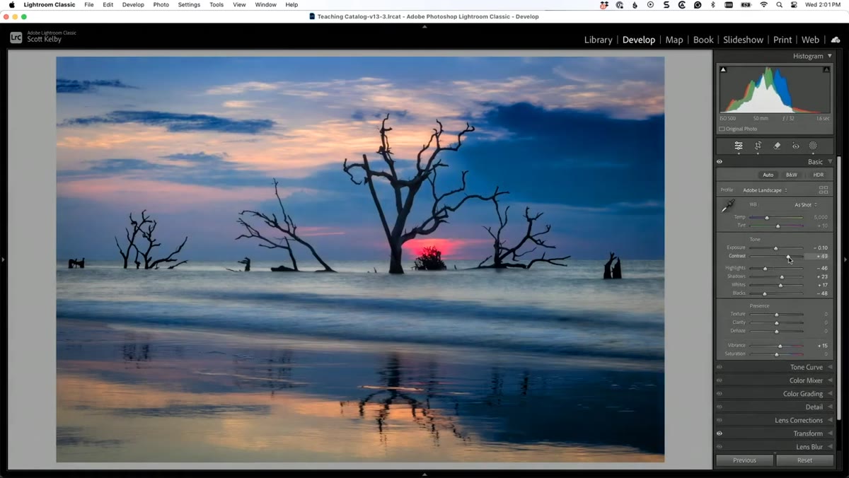 Boosting Contrast, Texture, and Clarity sliders in Basic panel
Back in the Basic panel, Kelby bumps Contrast to make the colors read as more saturated and the tonal separation more defined. Then he adds Texture and Clarity. Texture works on mid-frequency detail, great for things like water surface, bark, stone, or clouds. Clarity adds micro-contrast in the midtones, which makes water especially look like it has depth and movement.
Boosting Contrast, Texture, and Clarity sliders in Basic panel
Back in the Basic panel, Kelby bumps Contrast to make the colors read as more saturated and the tonal separation more defined. Then he adds Texture and Clarity. Texture works on mid-frequency detail, great for things like water surface, bark, stone, or clouds. Clarity adds micro-contrast in the midtones, which makes water especially look like it has depth and movement.
One thing worth noting: Clarity darkens the image slightly because it’s adding contrast to the midtone range. If you add Clarity and the image looks moodier than you intended, just lift the Exposure slider by a small increment, maybe +0.10 to +0.20, to compensate. It’s a tiny correction, but it keeps your highlights and shadows balanced.
Step 6: Use Generative AI Remove to Clean Up Distractions
 Using the Remove tool with Generative AI in Lightroom
This is where the edit gets interesting. Kelby notices several objects in the scene that he wants to thin out, not eliminate entirely, but reduce to an odd number. Odd numbers of objects in a frame are a composition principle worth knowing: five boats reads as more natural and visually pleasing than six.
Using the Remove tool with Generative AI in Lightroom
This is where the edit gets interesting. Kelby notices several objects in the scene that he wants to thin out, not eliminate entirely, but reduce to an odd number. Odd numbers of objects in a frame are a composition principle worth knowing: five boats reads as more natural and visually pleasing than six.
Select the Remove tool from the toolbar and choose the Generative AI option rather than the standard content-aware heal. Paint over the objects you want to remove, then click Apply. Lightroom generates three variations for you to choose from in the Options panel. If none of them look right, hit Refresh and it generates three more. This uses Photoshop’s generative fill technology, now available inside Lightroom, and for relatively simple backgrounds like sky and water, it handles the result cleanly and quickly.
What I’d Add From My Own Experience
One thing Kelby doesn’t mention here but that I think about constantly: save your gradient and vignette settings as a preset so you’re not rebuilding them from scratch every time. After a Sunday morning photo walk, I’m usually sitting down to edit 40 or 50 images, and the minutes saved by applying a base preset to a batch of similar shots add up fast.
I’d also encourage you to toggle your before-and-after view (backslash key in Lightroom) after each major step, not just at the end. It keeps you from over-editing, which is easy to do when you’re excited about a tool. The best version of most landscape photos looks like a better version of what the camera captured, not a different photo entirely.
The single most important takeaway from Kelby’s approach here is that a strong landscape edit doesn’t require a long edit. Straighten, treat the sky, add depth with contrast and clarity, and remove what doesn’t belong. Four to six deliberate moves will beat 45 minutes of slider-dragging almost every time. Watch the full tutorial on YouTube to see every decision made in real time.
Comments (2)
Just used this on a wedding shoot edit. Client was thrilled.
Well explained. I think my audience would really benefit from this — mind if I link to it?
Leave a Comment