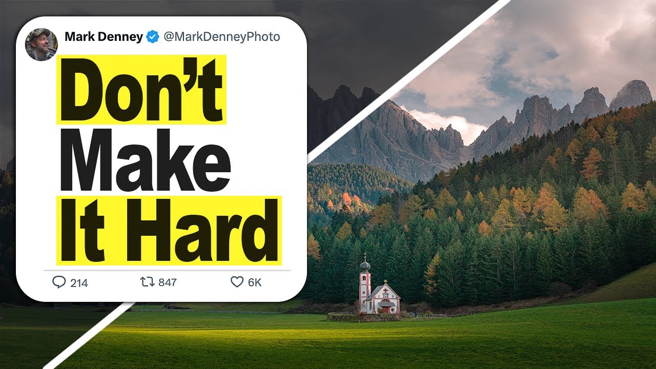
I used to think the goal of editing was simple: make the photo look like what I saw with my eyes. So I’d drag sliders around until everything was bright, balanced, and visible. The highlights came down, the shadows came up, and technically the image looked “correct.” But something always felt off. The photos were readable, sure, but they weren’t engaging. They looked flat in a way I couldn’t quite name, and I spent a long time blaming my camera or my locations instead of my editing logic.
That changed when I watched Watch the full tutorial on YouTube by landscape photographer Mark Denney, where he breaks down the one conceptual shift that reframed how I approach every edit. It’s not about a specific slider or a secret panel. It’s about understanding how the human eye actually reads a photograph, and then editing with that knowledge instead of against it.
The short version: when we chase a perfectly balanced exposure across the whole frame, we accidentally flatten the image. Every area ends up at a similar brightness level, and without variation in luminance, the viewer’s eye has nowhere to go. There’s no visual hierarchy, no sense of depth, and no reason to linger. Denney’s tutorial walks through a Dolomites landscape to demonstrate exactly how to fix this, and the difference between his two versions is immediately obvious even as a still.
Step 1: Start With the Raw File and Resist the Urge to Just “Brighten Everything”
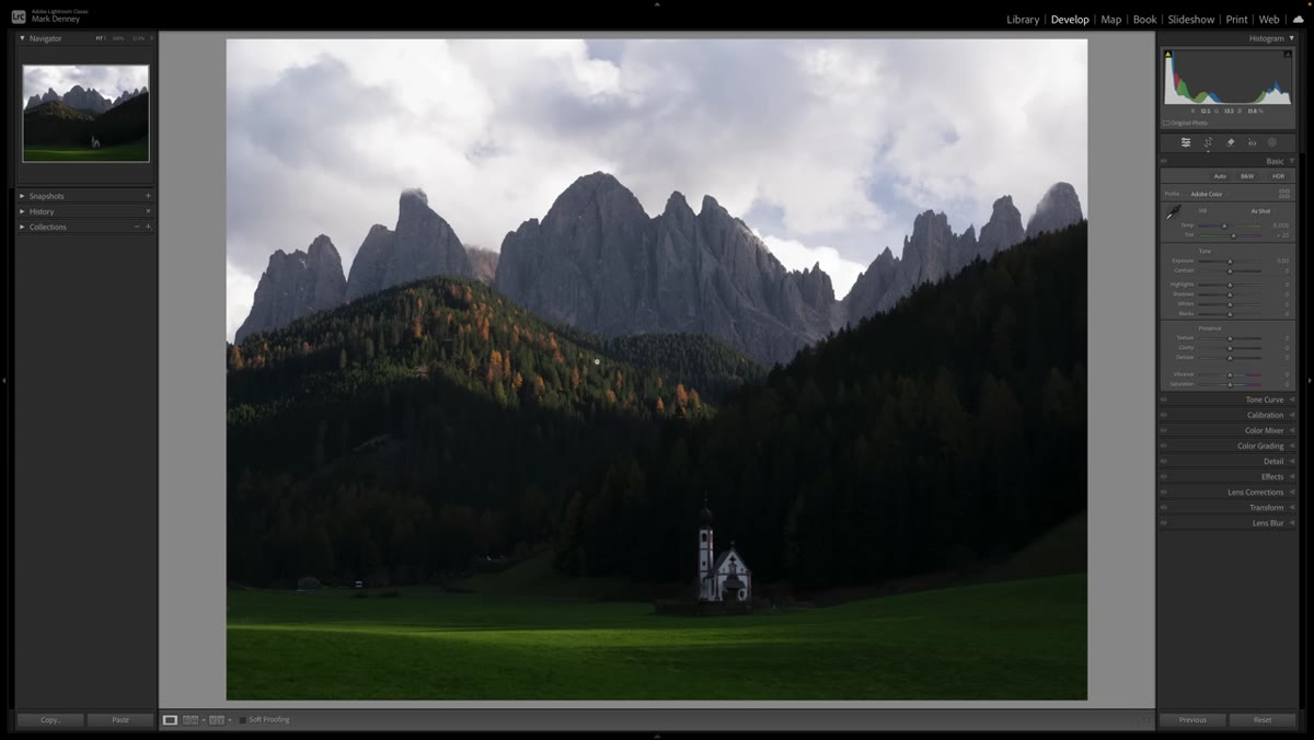 Raw underexposed Dolomites photo open in Lightroom
Open your raw file and sit with it for a moment before touching anything. Notice where it’s underexposed and where it isn’t. Denney’s example image is exposed for the sky, which means the foreground is darker. The instinct most of us have at this point is to lift the overall exposure and balance everything out. He actually demonstrates this first edit so you can see what it produces. It’s fine. It’s just not interesting.
Raw underexposed Dolomites photo open in Lightroom
Open your raw file and sit with it for a moment before touching anything. Notice where it’s underexposed and where it isn’t. Denney’s example image is exposed for the sky, which means the foreground is darker. The instinct most of us have at this point is to lift the overall exposure and balance everything out. He actually demonstrates this first edit so you can see what it produces. It’s fine. It’s just not interesting.
The lesson here is that “correcting” the exposure isn’t the same as making an intentional image. Before you touch a slider, ask yourself where you want the viewer to look. That question should drive every decision that follows.
Step 2: Understand That Brightness Directs the Eye
 Split comparison showing flat edit vs. intentional exposure
Denney explains the principle that underpins everything else in this tutorial: the human eye is naturally drawn to brighter areas in a photograph and tends to move away from darker areas. This isn’t a creative preference. It’s visual psychology. A vignette works precisely because of this, darkening the edges to push attention toward the center.
Split comparison showing flat edit vs. intentional exposure
Denney explains the principle that underpins everything else in this tutorial: the human eye is naturally drawn to brighter areas in a photograph and tends to move away from darker areas. This isn’t a creative preference. It’s visual psychology. A vignette works precisely because of this, darkening the edges to push attention toward the center.
Once you internalize this, a flat, uniformly exposed image starts to look like a missed opportunity. Every part of the frame is competing equally for attention, which means nothing wins. Your job as the editor is to use light and shadow to build a path through the image.
Step 3: Pull the Overall Exposure Down Instead of Up
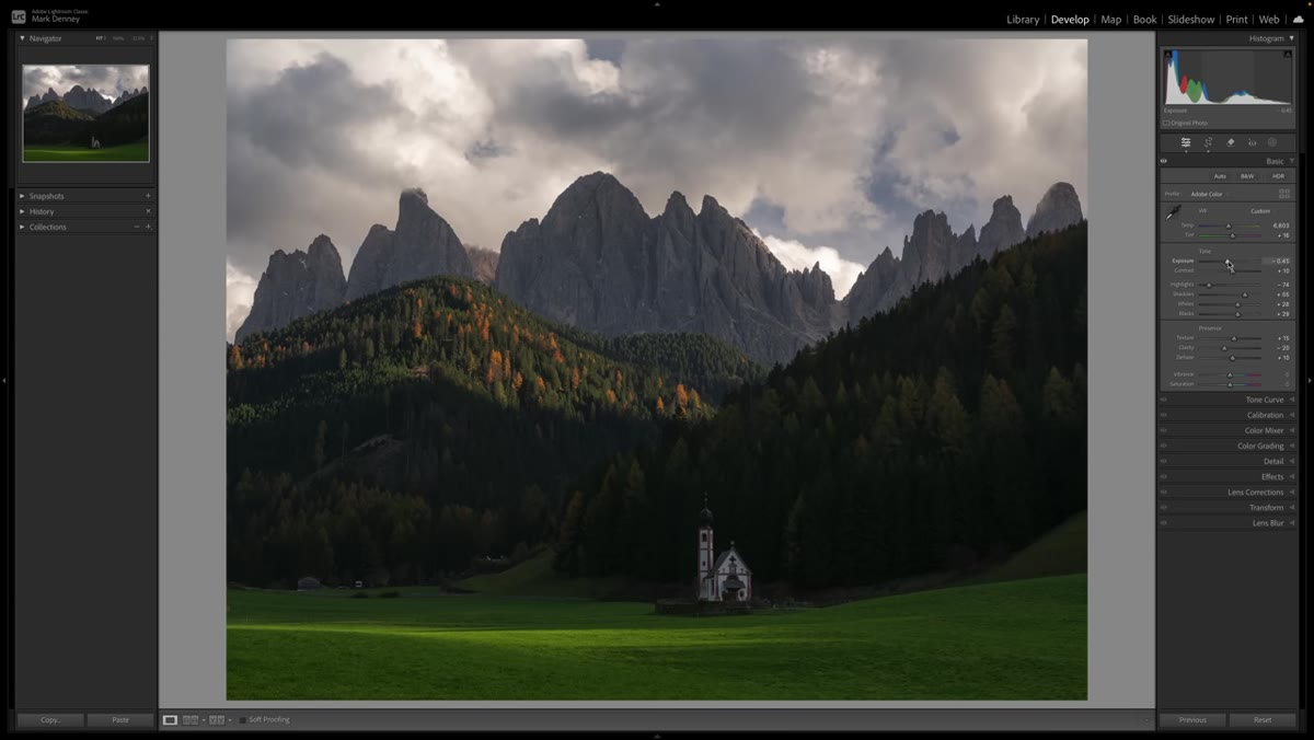 Exposure slider pulled down nearly half a stop in Lightroom
Here’s where Denney’s second version diverges sharply from the first. Rather than lifting the exposure to compensate for the underexposed raw file, he brings it down by about half a stop. That’s a full stop difference from the corrected version, and it feels counterintuitive the first time you try it.
Exposure slider pulled down nearly half a stop in Lightroom
Here’s where Denney’s second version diverges sharply from the first. Rather than lifting the exposure to compensate for the underexposed raw file, he brings it down by about half a stop. That’s a full stop difference from the corrected version, and it feels counterintuitive the first time you try it.
The reason this works is that a slightly darker base gives you more room to selectively brighten the areas that matter, which is what the next steps build toward. If your starting point is already bright everywhere, you have nowhere left to go when you want something to stand out.
Step 4: Make Your Standard Basic Panel Adjustments With the Darker Base in Mind
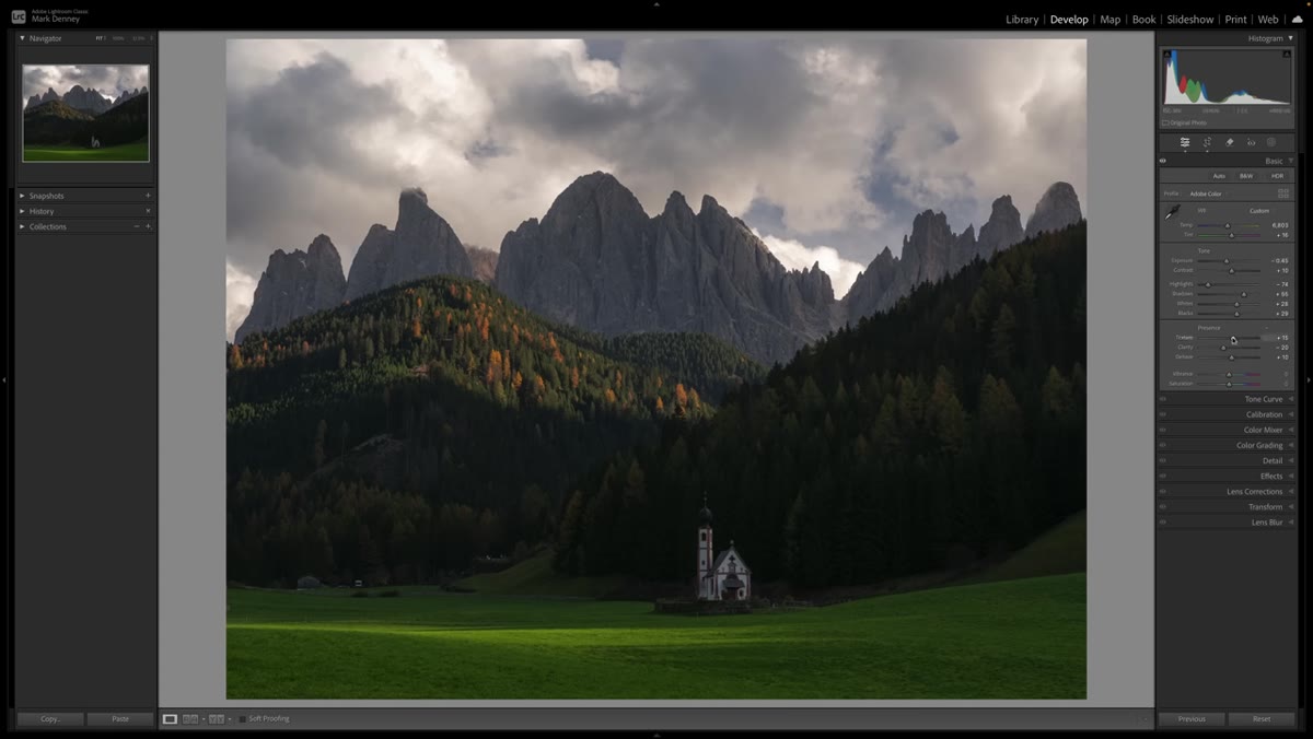 Highlights, shadows, whites, blacks sliders being adjusted in Lightroom
With the exposure pulled down, work through the basic panel adjustments the way you normally would: bring highlights down to recover sky detail, nudge shadows and blacks to retain depth in the darker areas, and adjust whites carefully so you’re not clipping anything important. Denney also pulls texture down slightly and brings clarity down while adding a touch of dehaze, which keeps the image from looking overly harsh at this stage.
Highlights, shadows, whites, blacks sliders being adjusted in Lightroom
With the exposure pulled down, work through the basic panel adjustments the way you normally would: bring highlights down to recover sky detail, nudge shadows and blacks to retain depth in the darker areas, and adjust whites carefully so you’re not clipping anything important. Denney also pulls texture down slightly and brings clarity down while adding a touch of dehaze, which keeps the image from looking overly harsh at this stage.
The difference here is that you’re not trying to make everything visible. You’re keeping the image intentionally moody and directional. Some areas should stay dark. That’s not a problem to solve. It’s part of the design.
Step 5: Use Selective Edits to Guide the Eye Toward Your Subject
 Masking or local adjustment tool being applied to a specific region
This is where the approach pays off. With a darker base established, you can now use local adjustments, whether that’s masking, graduated filters, or radial filters, to selectively brighten only the areas you want the viewer to land on. Denney uses this to create separation between different planes in the scene: the foreground, the midground, and the sky. Each sits at a slightly different luminance level, which builds perceived depth in what is technically a flat, two-dimensional image.
Masking or local adjustment tool being applied to a specific region
This is where the approach pays off. With a darker base established, you can now use local adjustments, whether that’s masking, graduated filters, or radial filters, to selectively brighten only the areas you want the viewer to land on. Denney uses this to create separation between different planes in the scene: the foreground, the midground, and the sky. Each sits at a slightly different luminance level, which builds perceived depth in what is technically a flat, two-dimensional image.
Think of it like stage lighting. You’re not illuminating the whole stage evenly. You’re pointing the spotlight exactly where you want the audience to look, and letting everything else settle into relative shadow.
Step 6: Compare Both Versions and Evaluate the Visual Journey
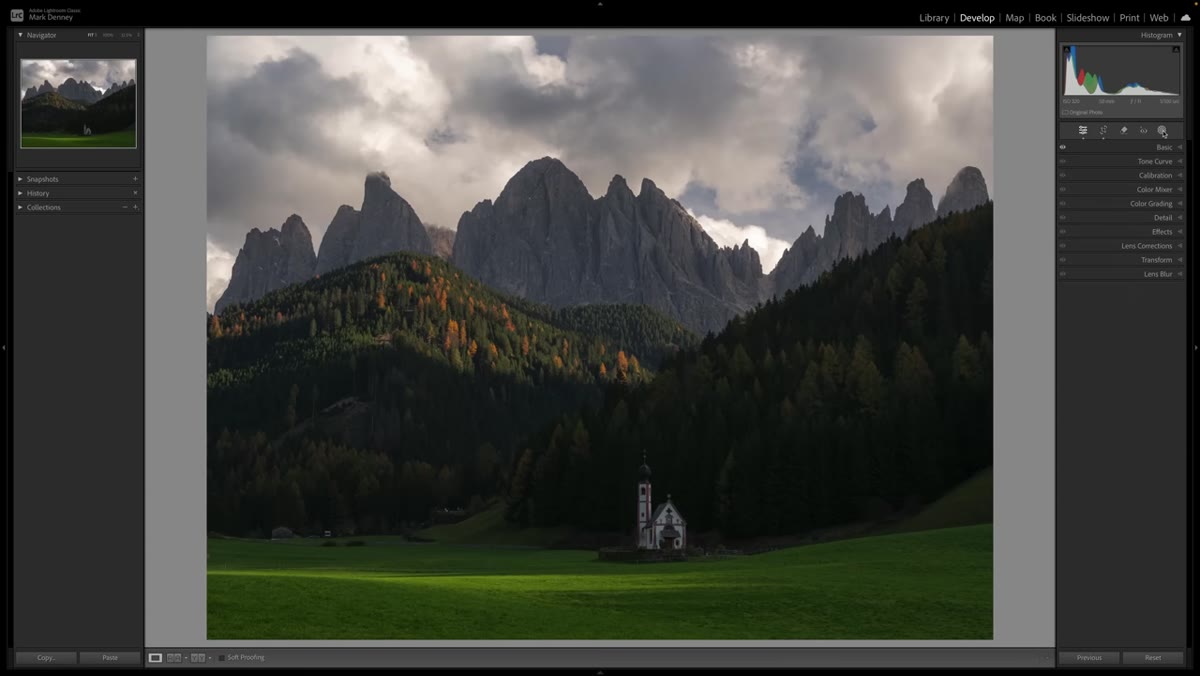 Side-by-side comparison of flat edit and depth-driven edit in Lightroom
Denney places both versions side by side, and the contrast is the real lesson. The first version is brighter and shows more detail. The second version feels like it has layers. Your eye enters the frame through a brighter foreground element, moves toward the subject, and settles into the scene rather than skimming across it.
Side-by-side comparison of flat edit and depth-driven edit in Lightroom
Denney places both versions side by side, and the contrast is the real lesson. The first version is brighter and shows more detail. The second version feels like it has layers. Your eye enters the frame through a brighter foreground element, moves toward the subject, and settles into the scene rather than skimming across it.
Step back from your monitor and let your eyes relax. Notice where they land first, and then trace where they travel. If your gaze moves through the image in a logical, satisfying way, you’ve succeeded. If everything looks equally lit and your eyes just… rest on the center without any real journey, go back and add more separation between your luminance zones.
What I’d Add From My Own Editing Practice
I started applying this approach to travel photos, which is where it clicked hardest for me. Street scenes especially tend to go flat fast when you try to balance the exposure, because there’s so much happening at once. What I’ve found is that it helps to identify your “anchor point” before you open Lightroom at all. Pick the one thing in the frame that earned the shot. Then ask whether your edit makes that thing the brightest element with intentional purpose, or just one of many equally visible things.
I’ve also found this technique works just as well on phone photos, where you have less raw latitude to play with. You might only have a stop of room to work in either direction, but the directional logic is identical. Darker edges, brighter subject, intentional depth.
The single most important thing this tutorial taught me is that a technically correct exposure and a visually compelling exposure are not the same thing. Brightness creates attention. If you spread that brightness evenly across your whole frame, you dilute it. If you concentrate it deliberately, you create an image that actually holds someone’s gaze.
Watch the full tutorial on YouTube to see Mark Denney walk through both edits with the full before-and-after in Lightroom. Seeing the comparison in motion makes the difference undeniable.
Comments (4)
Quality content like this is rare. Keep it up.
This is exactly what I needed today. Been struggling with this for weeks.
Love how you break down complex stuff into manageable steps.
Would love to see a follow-up going deeper into this topic.
Leave a Comment