There’s a question I used to skip entirely when I first started doing product work: What is this photo supposed to feel like? I’d set up my flat lay, adjust my lighting, fire off a hundred frames, and then wonder why the results looked technically fine but completely flat. Something was missing, and it took me an embarrassingly long time to figure out that the missing piece wasn’t in my camera settings at all. It was in my head, before I ever touched the shutter.
That’s exactly what this short but dense clip from Visual Education tackles. Watch the full tutorial on YouTube - and even if the preview is brief, the core idea is worth unpacking in full because it applies whether you’re shooting a luxury perfume bottle or a hand-thrown coffee mug for a small Etsy seller.
The argument is simple and kind of obvious once someone says it out loud: every product carries an intended message, and your job as a photographer is to translate that message into a visual language. If you skip that translation step, you’re just documenting an object. You’re not creating a photo that sells it, connects to it, or means anything.
Step 1: Identify What the Product Is Trying to Say
 Mug, computer, glasses, and perfume mentioned as examples
Start by putting the camera down and asking one question: what does this product represent to the person who buys it? Not what it does, but what it means. A mug isn’t just a vessel for coffee. Depending on the brand, it might represent a slow morning ritual, a cozy domestic life, or a minimalist aesthetic. A bottle of perfume might be about sensuality, status, or memory.
Write down three to five words that describe the feeling the product is meant to give the customer. Don’t overthink it at this stage. These words are your starting point, not your finished brief. If the brand has a website or social feed, spend five minutes scrolling it before you write anything down. Their existing visual choices will tell you a lot.
Step 2: Build a Word-Based Moodboard First
 Moodboard concept introduced for a specific product
Before you pull images, work with words. The Visual Education tutorial specifically mentions words like “luxury” alongside terms tied to form, structure, and strength. That’s not accidental. Words force you to be specific about abstract qualities in a way that browsing Pinterest doesn’t always encourage.
Take your three to five feeling words and push each one further. If “luxury” is on your list, ask what luxury looks like in a photo. Is it negative space? Cool tones? Soft directional light? A single hero object with no clutter? Each word should start generating visual decisions. This is the step most tutorials skip, and it’s the one that separates photos with a clear point of view from photos that just look “nice.”
Step 3: Gather Visual References That Match Those Words
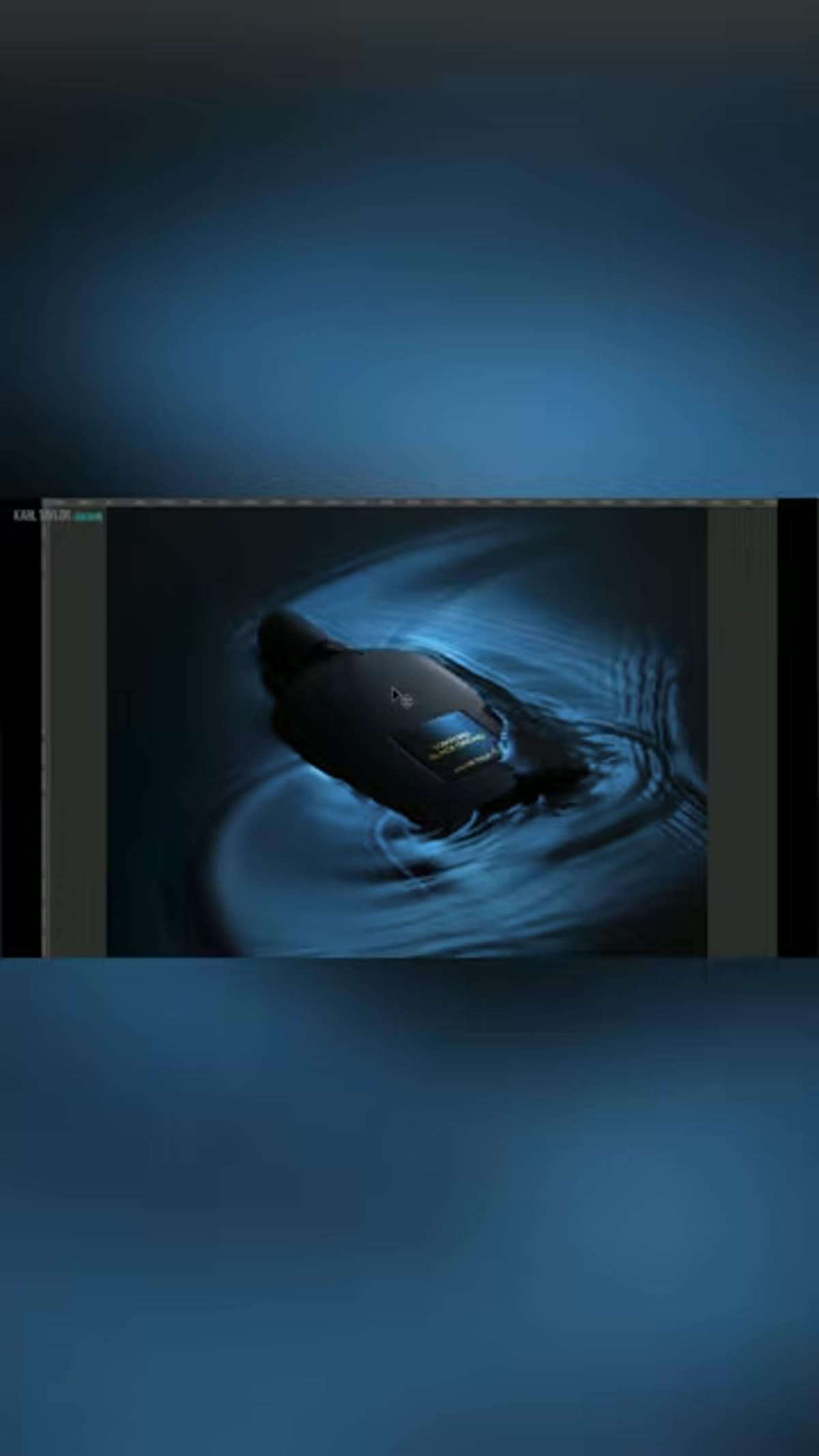 Images, words, and moodboards described as building in imagination
Now you can go find images, but filter them through your word list. You’re not collecting photos you personally love. You’re collecting photos that demonstrate what your chosen words look like in a real frame. There’s a difference. I’ve built moodboards for clients where almost none of the reference images were product photos at all - architecture shots, textile close-ups, film stills. What mattered was that they captured the right visual quality.
Keep your moodboard tight. Eight to twelve images is plenty. Too many references start to cancel each other out and you end up shooting toward a vague average instead of a clear direction.
Step 4: Translate the Moodboard Into Specific Shooting Decisions
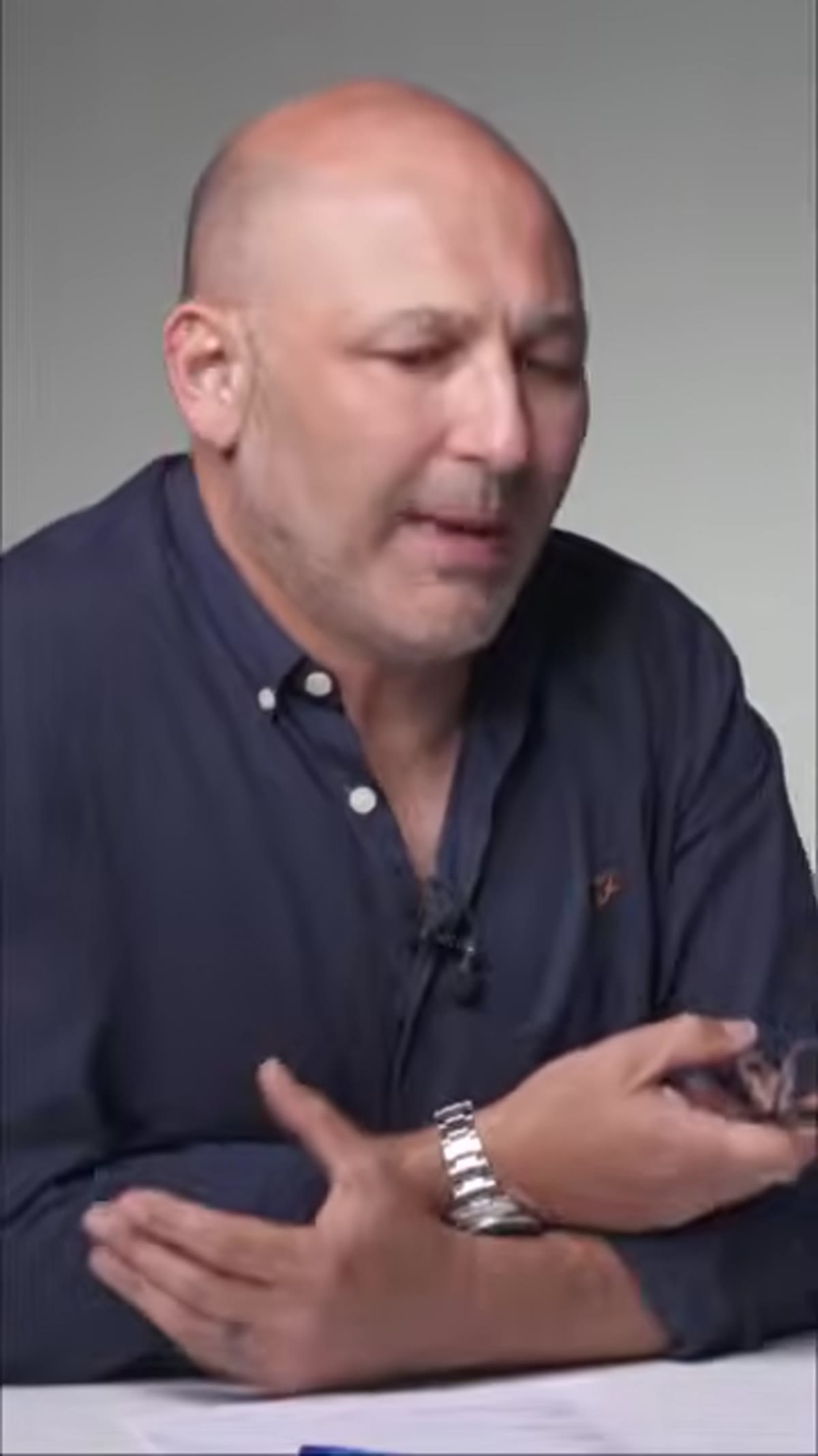 Product and customer relationship introduced as the guiding idea
A moodboard sitting in a folder doesn’t help you in the studio. You have to convert it into concrete choices. Go through your reference images and identify what’s actually creating the feeling you want. Is it the angle? The color palette? The texture of the surface the product sits on? The hardness or softness of the light?
Make a short list of technical decisions before you set anything up. Something like: soft diffused window light from the left, desaturated warm background, product shot at eye level, one supporting prop maximum. That list came from the moodboard. Now your setup has a reason behind it instead of just being a guess.
Step 5: Check Every Element in the Frame Against Your Message
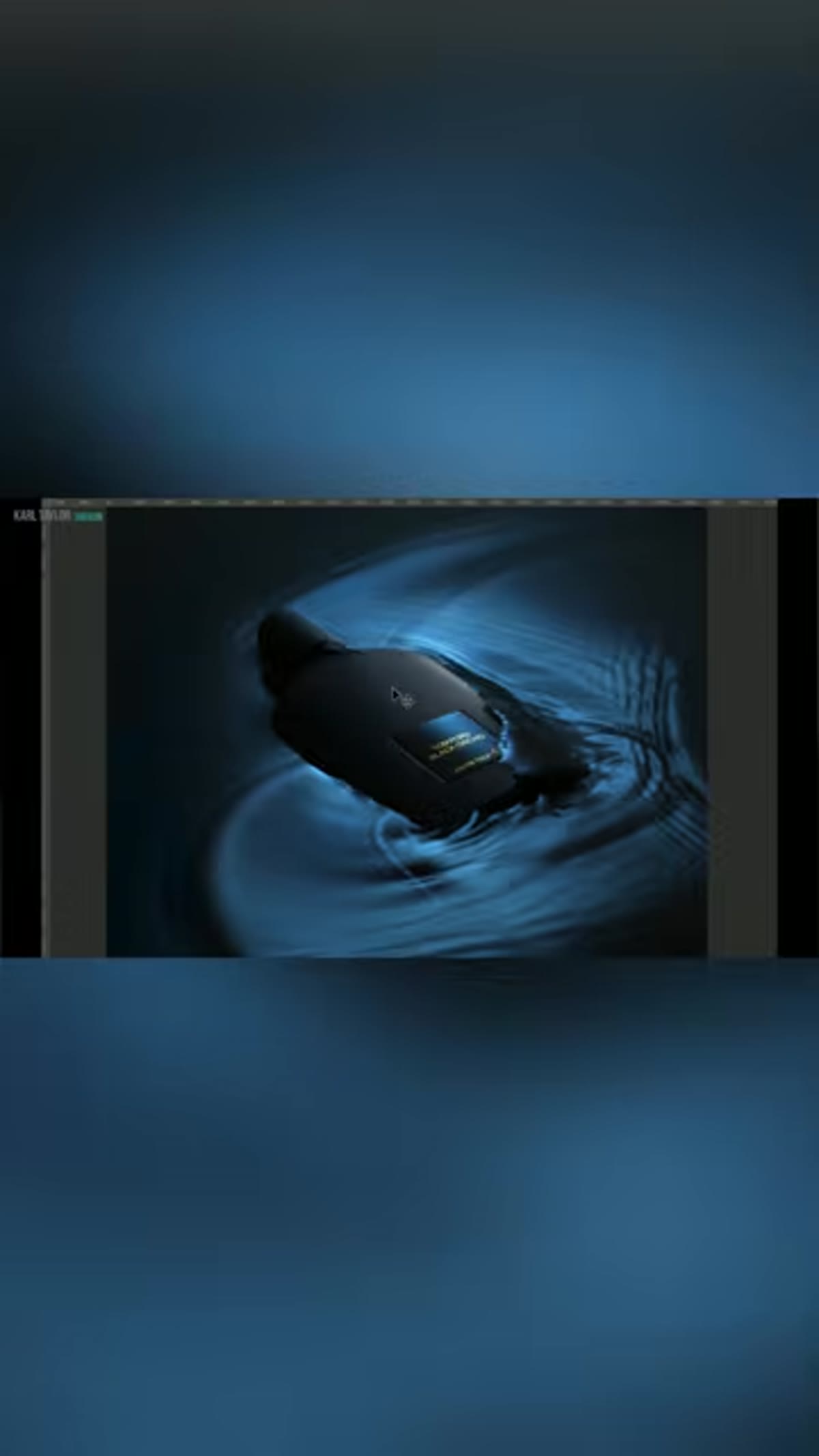 Words about form, structure, and strength highlighted as moodboard examples
Once you have a test shot up, go back to your original words. Does every element in the frame support them, or is something working against the message? This is where photographers with a clear brief catch problems that photographers without one miss entirely.
A common example: you’ve defined the product as minimal and refined, but there’s a prop in the frame that reads as rustic or casual. It might be a beautiful prop in isolation, but it’s contradicting the message. Pull it. The moodboard isn’t just for inspiration - it’s your quality control filter at every stage of the shoot.
One Thing I’d Add From My Own Experience
The video focuses on defining what a product should say, and I think that’s the right starting place. But I’d add a parallel question: who is the product saying it to? The same perfume can be marketed toward someone who wants to feel powerful versus someone who wants to feel nostalgic, and those two audiences require completely different visual approaches even if the words “luxury” and “quality” apply to both.
When I’m building a moodboard now, I actually try to picture a specific person looking at the finished photo. Not a demographic, but an actual imagined human being with a mood and a context. Are they scrolling Instagram at 10pm? Are they reading a print catalog? That detail changes your composition, your color choices, even your crop. The product’s message only works if it lands with the right receiver.
I picked this habit up gradually after teaching beginners for a few years. When students struggled to make a photo feel intentional, it was almost never a technical problem. It was a clarity problem. They hadn’t decided what they were trying to say or who they were saying it to.
The single most important takeaway here is that the creative brief for a product photo lives before the shoot, not in post-processing. Lightroom can’t save a photo that had no direction. Getting clear on what a product needs to communicate - in words, then in visual references, then in concrete shooting decisions - is the work that actually makes product photography effective.
Watch the full tutorial on YouTube for the Visual Education team’s complete breakdown. It’s worth your time, especially if you’ve ever finished a product shoot and felt like something was off but couldn’t name it.
Comments (3)
I've been looking for exactly this kind of tutorial. Perfect timing.
Would love to see a follow-up going deeper into this topic.
Couldn't agree more. I've seen this make a huge difference in workflows work specifically.
Leave a Comment