
There’s a question I get asked constantly, usually from someone standing next to me at a coffee shop or on one of my Sunday morning photo walks: “Why do some photographers’ images just feel different?” I’ve given a lot of answers over the years, some better than others. But I’ve never had a framework clean enough to hand someone and say, “Start here.” That changed when I sat down with this workshop announcement from Visual Education.
Watch the full tutorial on YouTube
In this Visual Education tutorial, commercial photographer Karl Taylor and world-renowned fine art and animal photographer Tim Flach outline the core philosophy behind a live workshop they hosted in Guernsey, England. It runs just a few minutes, but it packs in a surprisingly honest breakdown of why certain photographers consistently produce provocative, eye-catching work, and what specific pillars of knowledge get them there. What struck me most is that Karl doesn’t frame this as talent. He frames it as learnable. That reframing alone is worth pausing on.
The tutorial walks through the core curriculum of their four-day workshop in a way that doubles as a roadmap for self-directed study. I’ve taken those concepts and laid them out below as a step-by-step framework you can start applying to your own photography, whether you shoot weddings, wildlife, products, or portraits on a Tuesday afternoon.
Step 1: Understand That Great Photography Has Emotional, Aesthetic, and Scientific Reasons Behind It
 Karl Taylor speaking directly to camera about image quality
Most photographers treat these three dimensions as separate buckets. Emotion is for art school graduates. Science is for gear nerds. Aesthetics is some vague thing you either have or you don’t. Karl’s core argument is that the photographers who consistently rise to the top are fluent in all three simultaneously. Before you pick up a camera, it helps to ask: what emotional response am I trying to create? What aesthetic choices will reinforce that? And what does the science of human vision tell me about how that image will actually be perceived?
This isn’t abstract. The next time you look at a photo you love, try naming one thing from each category. What emotion does it trigger? What compositional or tonal choice drives the aesthetic? And what is it doing to your eye at a purely physiological level, like where your gaze goes first and why? Building this habit of analysis is the foundation everything else rests on.
Step 2: Study the Relationship Between Light, Form, Shape, and Solidity
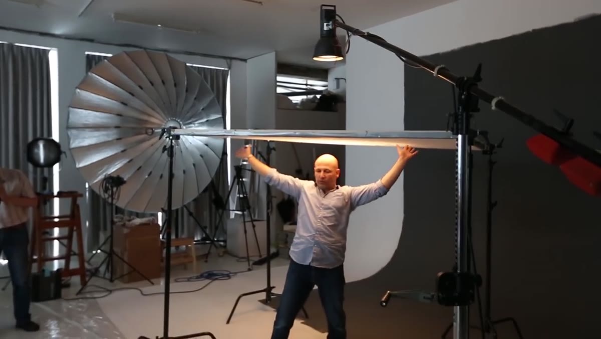 Karl describing lighting demonstrations with concepts listed
Karl describes leading attendees through practical lighting demonstrations specifically designed to teach how light reveals or hides form. This isn’t about knowing which modifier to use. It’s about understanding that light is a storytelling tool. A hard side light creates drama and dimension. A flat, diffused front light flattens and softens. Neither is wrong. Both are choices, and choices communicate.
Pick one object in your home and spend 20 minutes lighting it five different ways. Don’t change the object. Don’t change your camera position. Only move the light source. Notice how the shape reads differently, how texture appears and disappears, how the object can feel heavy or weightless depending on where the shadow falls. This is the exercise behind what Karl is describing, and it will permanently change how you read a scene before you shoot it.
Step 3: Connect Your Lighting Decisions to Emotional Persuasion
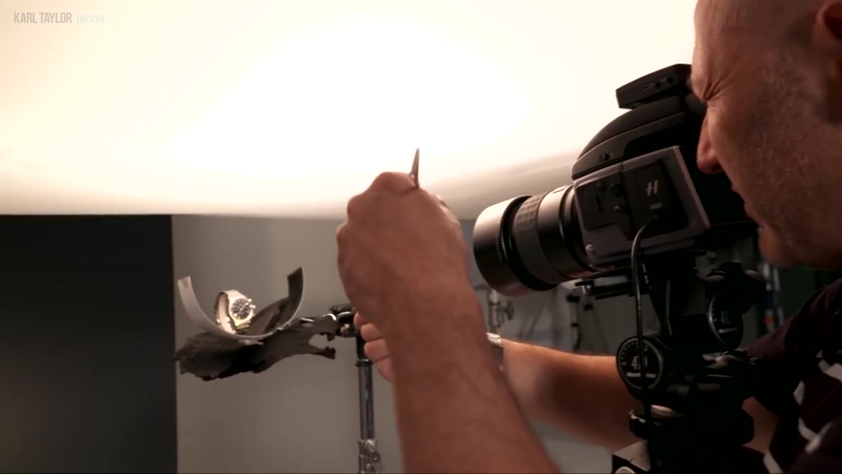 Karl Taylor discussing high-end product shoots and emotional lighting control
Karl specifically uses the phrase “controlling light for emotional persuasion,” which is a phrase I wish I’d had when I first started teaching. Light doesn’t just illuminate. It persuades. Warm, low-angle light feels intimate and nostalgic. Cool, overhead light feels clinical or lonely. High contrast suggests tension. Even illumination suggests safety and approachability.
The practical exercise here is to look at three images in your portfolio and reverse-engineer the emotional message your lighting is actually sending, not the one you intended. Sometimes they match. Sometimes they don’t, and that gap is where growth happens. If you’re shooting product work or portraits, start asking before each shoot: what do I want the viewer to feel? Then build your lighting setup around that answer rather than defaulting to whatever worked last time.
Step 4: Learn Post-Production as an Extension of Visual Intent, Not a Fix-It Step
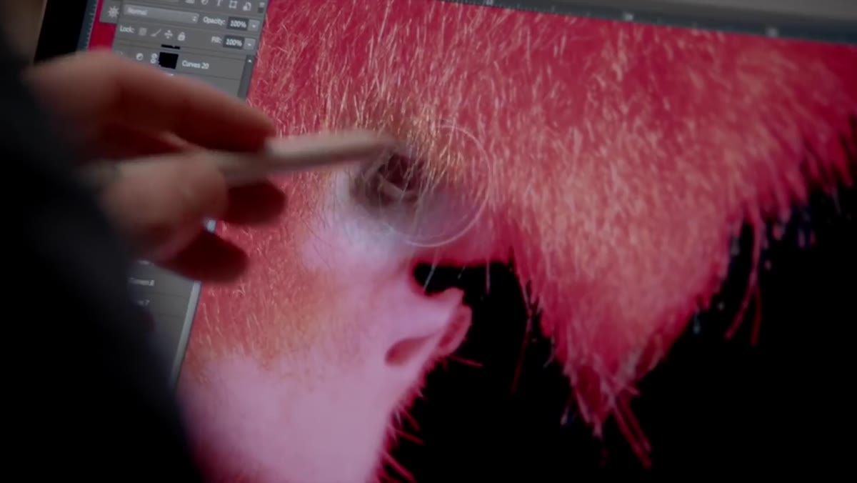 Tim Flach post-production techniques mentioned with iconic images reference
Tim Flach’s contribution to the workshop focuses heavily on post-production, specifically his own processing techniques applied to some of his most recognizable animal portraits. The key insight here is that Tim doesn’t treat retouching as correction. He treats it as a continuation of the same visual language he established in-camera. His post-production choices around color, contrast, and depth are deliberate extensions of emotional intent.
For your own workflow, try writing one sentence before you open an image in Lightroom or Photoshop: “This image should feel ___.” Then make every edit in service of that sentence. If a color grade doesn’t support the feeling, it doesn’t belong. This single constraint will make your editing more purposeful and your final images more coherent.
Step 5: Apply Color Theory and Depth Perception to Broaden Your Visual Vocabulary
 Karl and Tim presenting post-production examples with color theory referenced
Karl and Tim both present examples drawn from color theory and depth perception as tools for expanding how you think about image construction. Color relationships, like warm against cool, saturated against muted, create visual tension or harmony that the viewer feels before they consciously register it. Depth cues, like atmospheric haze, focus falloff, and scale contrast, tell the brain how to move through a three-dimensional space rendered on a flat surface.
A simple starting point: look at the color palette of five images you admire and name the dominant relationship. Is it complementary? Analogous? Monochromatic with one accent? Then look at your own recent work and name yours. Most photographers have an accidental palette. The goal is to develop an intentional one.
What I’d Add From My Own Experience
I shoot a lot on location, often with whatever light I find rather than whatever light I build. For years I thought the science-and-theory framework Karl describes was mostly for studio photographers. But the Sunday I spent shooting at Golden Gardens Park here in Seattle and consciously asked “what is this light emotionally saying?” before every frame, my hit rate jumped noticeably. The theory doesn’t require a studio. It requires a habit of asking better questions before you press the shutter.
I’ll also say this: Tim Flach’s work is worth studying independently before you watch this. His animal portraits carry a psychological weight that’s unusual for the genre. Looking at his images through the lens of these five steps is its own education.
The single most important takeaway from this tutorial is deceptively simple: the gap between competent photography and genuinely powerful photography is knowledge, not gear. Emotional intent, lighting literacy, post-production coherence, and color fluency are all learnable skills. They compound over time. And the photographers who seem to have an inexplicable “it factor” almost always just started asking these questions earlier than everyone else.
Watch the full tutorial on YouTube and pay close attention to how Karl frames the why behind this workshop. The workshop itself may have already happened, but the framework it’s built on is as relevant as ever.
Comments (4)
Great breakdown. The step-by-step approach really helps.
Really solid breakdown. This pairs perfectly with the workflows work I've been writing about.
Would love to see a follow-up going deeper into this topic.
Well explained. I think my audience would really benefit from this — mind if I link to it?
Leave a Comment