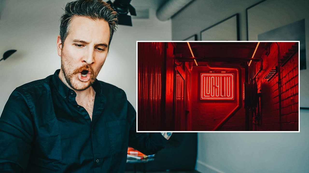
Every Sunday morning I walk the same neighborhoods in Seattle with my camera, and I still catch myself defaulting to the same kinds of shots. Interesting light, sure. Decent framing, usually. But intentional? That’s the harder question. One thing that’s helped me shake loose from comfortable habits is watching how experienced photographers critique work, not just make it. Seeing someone break down why a photo lands, or why it almost does, teaches you to look at your own images differently.
In this Peter McKinnon tutorial, Watch the full tutorial on YouTube, McKinnon reviews ten community submissions from a color-themed photo assignment focused on the color red. It sounds simple. It is not. What he’s actually doing across these critiques is building a practical framework for how color functions as more than a visual element. It becomes mood, structure, and emotional language. Here’s what I took away, broken down step by step.
Step 1: Assign Meaning Before You Shoot
 McKinnon explaining the red assignment prompt to viewers
McKinnon didn’t just say “go shoot something red.” He asked his audience a pointed question: what does red mean to you? Is it a color, a mood, a feeling? That reframe is the whole assignment. Before you pick up your camera, decide what you want the color to do. Red can mean danger, romance, warmth, urgency, or stillness depending entirely on what surrounds it and how you frame it. Going into a shoot with that kind of intention puts you in a completely different headspace than just hunting for a colorful subject.
McKinnon explaining the red assignment prompt to viewers
McKinnon didn’t just say “go shoot something red.” He asked his audience a pointed question: what does red mean to you? Is it a color, a mood, a feeling? That reframe is the whole assignment. Before you pick up your camera, decide what you want the color to do. Red can mean danger, romance, warmth, urgency, or stillness depending entirely on what surrounds it and how you frame it. Going into a shoot with that kind of intention puts you in a completely different headspace than just hunting for a colorful subject.
Try this before your next themed shoot: write one sentence about what the color means to you in that moment. Tape it to your camera bag if you have to. It sounds cheesy but it genuinely changes the kinds of images you bring home.
Step 2: Use Color to Create Visual Balance, Not Just Interest
 Flat lay photo of coffee, thumbtack, and phone with red and white elements
The first submission McKinnon highlights is a flat lay, coffee cup, a red thumbtack, and a phone, all arranged with almost mathematical precision. What he responds to immediately is the balance. The red appears in multiple small places across the frame rather than dominating one corner. Nothing feels too heavy. The composition breathes. McKinnon describes it as “cohesive” and notes how everything feels measured from space to space.
Flat lay photo of coffee, thumbtack, and phone with red and white elements
The first submission McKinnon highlights is a flat lay, coffee cup, a red thumbtack, and a phone, all arranged with almost mathematical precision. What he responds to immediately is the balance. The red appears in multiple small places across the frame rather than dominating one corner. Nothing feels too heavy. The composition breathes. McKinnon describes it as “cohesive” and notes how everything feels measured from space to space.
When you’re building a shot around a color, think about distribution. Where does that color appear, and does its placement pull the eye around the frame evenly? A single red object in the corner of a frame creates tension. Red appearing at three balanced points creates rhythm. Both can work, but you need to know which one you’re going for.
Step 3: Let Color Be a Supporting Character, Not the Hero
 Moody airport bus photo with red pops from pipes, seats, and carpet
The second submission McKinnon reviews is a candid shot of someone sitting on an airport bus. The subject is relaxed, legs crossed, completely unbothered. Red appears in the pipes overhead, the seats, the floor carpeting. It’s everywhere and nowhere at the same time. McKinnon loves the moodiness of this one, and that’s because the red isn’t the point. The person is the point. The color reinforces a feeling rather than announcing itself.
Moody airport bus photo with red pops from pipes, seats, and carpet
The second submission McKinnon reviews is a candid shot of someone sitting on an airport bus. The subject is relaxed, legs crossed, completely unbothered. Red appears in the pipes overhead, the seats, the floor carpeting. It’s everywhere and nowhere at the same time. McKinnon loves the moodiness of this one, and that’s because the red isn’t the point. The person is the point. The color reinforces a feeling rather than announcing itself.
This is a trap I see a lot in beginner work, including my own early stuff. You find a red door or a red umbrella and you make it the subject. Sometimes that works. But the most interesting images often use color as atmosphere. Ask yourself: if I removed this color from the frame, does the story fall apart or does it just get quieter? If the story still holds, your color is doing its real job.
Step 4: Capture Motion Within a Color Theme
 Card spring photo from Mumbai with cards fanning through the air
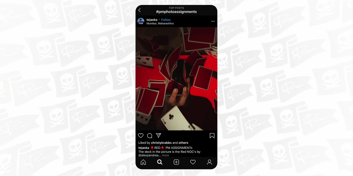
One of the more technically demanding submissions shows a cascade of red playing cards mid-spring, fanned out and fluttering across the frame. McKinnon points out something most viewers would miss: getting a clean, even scatter of cards on camera is genuinely hard. Cards tend to clump or trail in one direction. Getting them to spread evenly across a frame takes multiple attempts and good timing.
Card spring photo from Mumbai with cards fanning through the air
One of the more technically demanding submissions shows a cascade of red playing cards mid-spring, fanned out and fluttering across the frame. McKinnon points out something most viewers would miss: getting a clean, even scatter of cards on camera is genuinely hard. Cards tend to clump or trail in one direction. Getting them to spread evenly across a frame takes multiple attempts and good timing.
If you’re shooting movement within a color-focused assignment, give yourself more time than you think you need. Set your shutter speed fast enough to freeze the motion (somewhere in the 1/500 to 1/1000 range depending on light), and plan for multiple takes. The color theme doesn’t let you off the hook from the technical side. In fact, it raises the stakes because every frame needs to carry both the color intention and the motion clearly.
Step 5: Find Geometry and Pattern to Anchor a Color Story
 Symmetrical overhead grid pattern shot submitted for the red assignment
McKinnon’s next featured submission is taken looking straight up at a grid pattern. The symmetry does a lot of heavy lifting here. When you pair a strong geometric structure with a deliberate color, the image feels intentional almost immediately. The viewer’s eye has somewhere to go, a clear path created by the lines, and the color rewards them along the way.
Symmetrical overhead grid pattern shot submitted for the red assignment
McKinnon’s next featured submission is taken looking straight up at a grid pattern. The symmetry does a lot of heavy lifting here. When you pair a strong geometric structure with a deliberate color, the image feels intentional almost immediately. The viewer’s eye has somewhere to go, a clear path created by the lines, and the color rewards them along the way.
If you’re stuck on a color assignment, look for architecture or repeating patterns in your environment. Stairs, tiled floors, window grids, fences, all of these give you a built-in compositional skeleton. Layer your color into that structure and you’ll almost always come out with something that reads as considered rather than accidental.
Step 6: Build Community Feedback Into Your Practice
 McKinnon encouraging viewers to visit each other’s Instagram accounts
This one isn’t about camera settings or composition. McKinnon pauses mid-critique to encourage viewers to go find these photographers on Instagram and tell them they found them through the assignment. He’s building something deliberate here: a feedback loop where making work is only half the process. Sharing it and receiving a response closes the loop.
McKinnon encouraging viewers to visit each other’s Instagram accounts
This one isn’t about camera settings or composition. McKinnon pauses mid-critique to encourage viewers to go find these photographers on Instagram and tell them they found them through the assignment. He’s building something deliberate here: a feedback loop where making work is only half the process. Sharing it and receiving a response closes the loop.
I started teaching photography after a stranger at a coffee shop asked how I got a shot I’d taken on my phone. That one question changed how I thought about what I was doing. Feedback, even casual feedback, is information. Participating in a community assignment like this one gives you that information at scale. You see what resonates with others, what gets overlooked, and where your instincts line up or diverge from the crowd.
What I’d Add From My Own Practice
McKinnon’s critique sessions work because he responds to emotion first and technique second. He doesn’t lead with “your exposure is slightly off.” He leads with how the image made him feel, then explains the technical choices that created that feeling. That’s a useful inversion for how most of us were taught to evaluate photos.
When I review my own work on Sunday evenings after a photo walk, I try to do the same thing. I look through the images and note which ones make me pause, before I can explain why. Then I reverse-engineer the reason. Usually it comes down to one of the elements McKinnon highlights here: balance, color intention, geometry, or motion. Training yourself to feel a good image before you analyze it is a skill, and it takes repetition.
The single most important thing this tutorial reinforced for me is that a color isn’t a subject. Treating it like one is the beginner move. Using it to build mood, structure, and meaning is where the real work happens. Every photo in McKinnon’s review that truly landed was using red as a tool, not a destination.
Watch the full tutorial on YouTube and pay attention to the order in which McKinnon reacts to each photo. His gut response tells you almost as much as his explanation does.
Comments
Leave a Comment