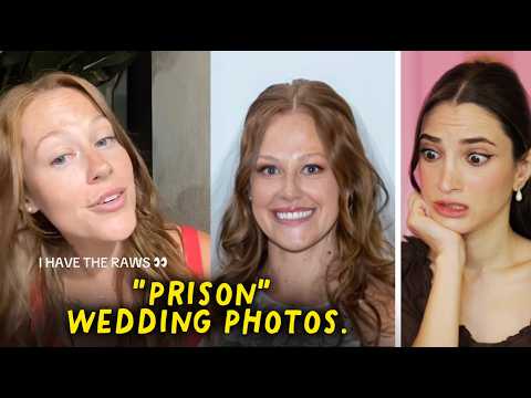
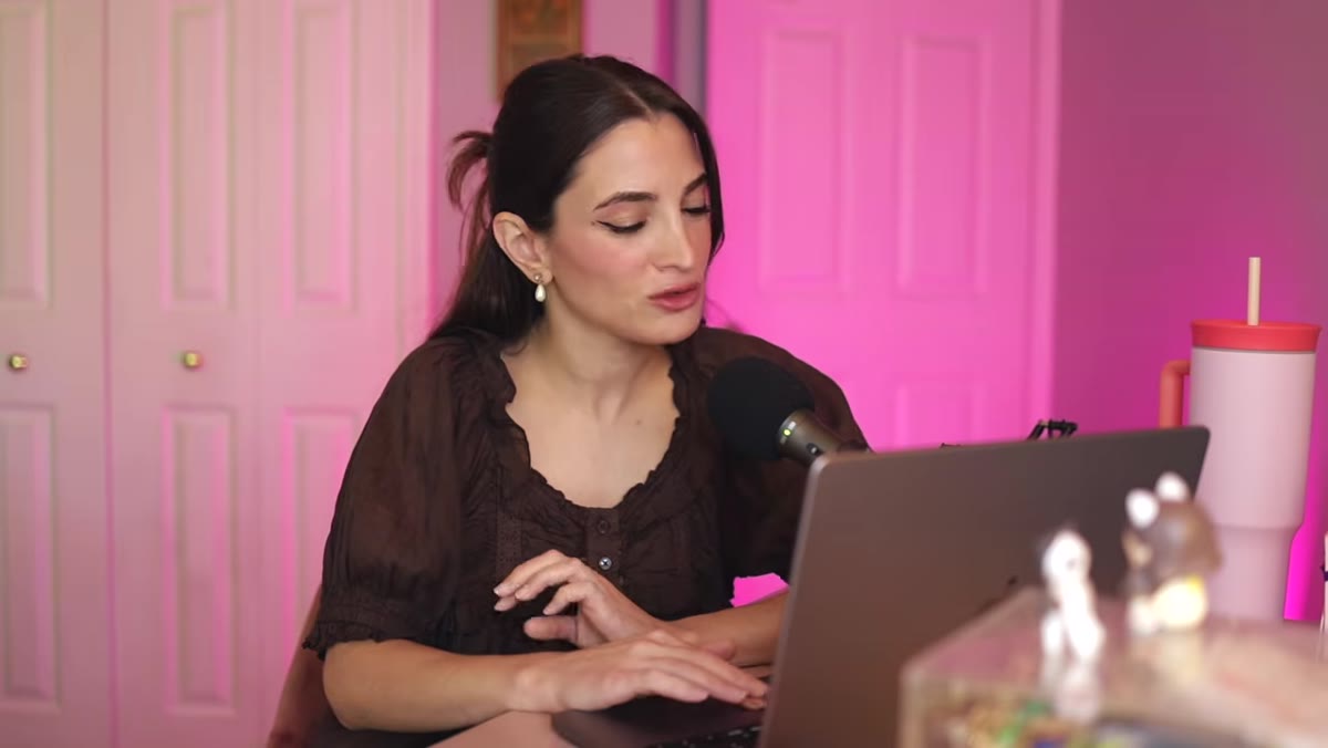
I’ve been shooting weddings and lifestyle sessions long enough to know that a bad photo rarely comes from one single mistake. It’s almost always a stack of small decisions that compound into something the client can’t unsee. That’s why when I came across this Jessica Kobeissi reaction video, I stopped scrolling and watched it twice. Watch the full tutorial on YouTube – Jessica is a working wedding photographer, and watching her calmly dissect what went wrong felt less like pile-on commentary and more like a quiet masterclass in what actually makes or breaks a portrait.
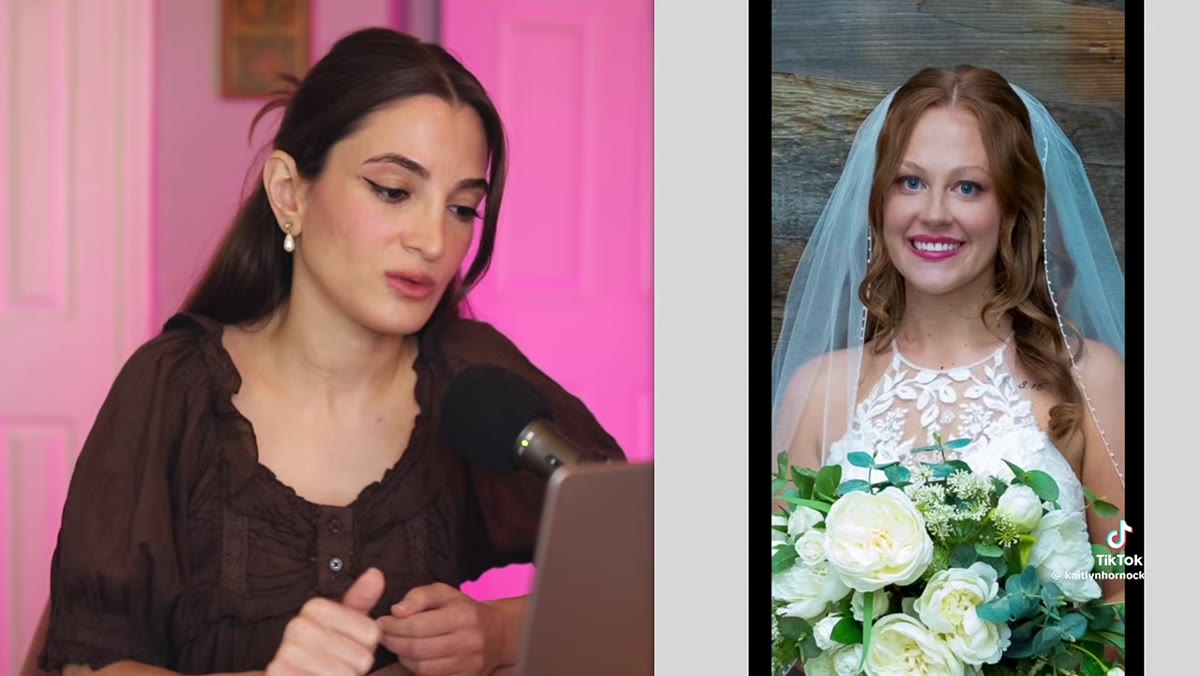
The setup: a bride posted her wedding photos on TikTok calling them “police shots.” The photos went viral. People were brutal in the comments. Jessica sat down, looked at the images without the noise, and gave a measured, technical read on each one. What she found wasn’t some catastrophic failure of creativity. It was a handful of very fixable technical issues: over-cropping, blown-out flash, and saturation settings that had clearly been dragged way past any reasonable stopping point.
I’m writing this out as a step-by-step breakdown because these same problems show up constantly in beginner and intermediate work, including some of my own early stuff. If you’ve ever gotten your photos back and felt something was “off” without being able to name it, this one’s for you.
Step 1: Evaluate Crop Before You Judge Anything Else
 Flash-lit couple portrait showing tight, heavily cropped framing
The first thing Jessica flags is how tightly cropped the photos are. Before you can assess lighting or color, you need to know whether you’re even looking at the full image. A photo that’s been cropped to just faces and shoulders can feel claustrophobic and mugshot-like even if the original wide composition was perfectly fine.
Flash-lit couple portrait showing tight, heavily cropped framing
The first thing Jessica flags is how tightly cropped the photos are. Before you can assess lighting or color, you need to know whether you’re even looking at the full image. A photo that’s been cropped to just faces and shoulders can feel claustrophobic and mugshot-like even if the original wide composition was perfectly fine.
When you’re shooting portraits, especially at weddings, frame wider than you think you need to. Give your subjects breathing room. Cropping can always happen in post, but you can’t add back what wasn’t there. A general rule I follow: if I’m cropping a couple portrait tighter than mid-thigh, I have a good reason for it, not just a habit.
Step 2: Check Your Flash Placement and Diffusion
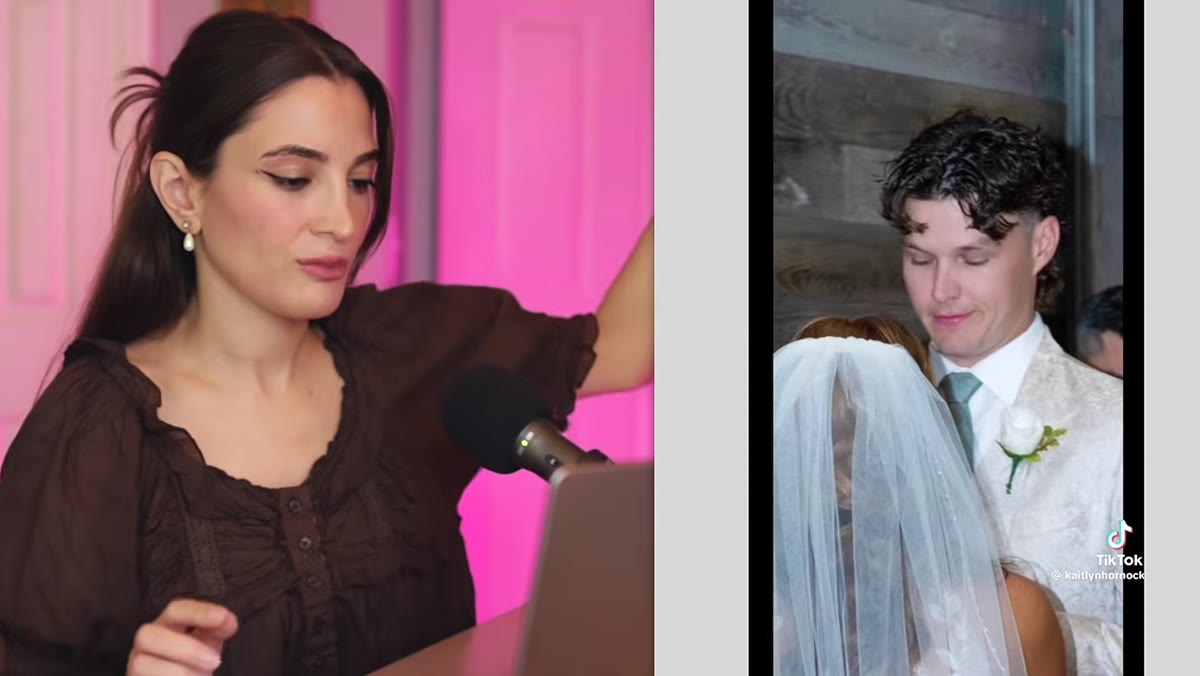 Portrait showing harsh shoulder shadow from direct flash source
Jessica points to a specific tell: a hard shadow falling from the bride’s shoulder onto the background. That shadow is the fingerprint of a direct, undiffused flash source positioned to one side without any bounce or softening. The result is lighting that flattens the subjects and creates the flat, institutional look that made everyone think “passport photo.”
Portrait showing harsh shoulder shadow from direct flash source
Jessica points to a specific tell: a hard shadow falling from the bride’s shoulder onto the background. That shadow is the fingerprint of a direct, undiffused flash source positioned to one side without any bounce or softening. The result is lighting that flattens the subjects and creates the flat, institutional look that made everyone think “passport photo.”
If you’re using on-camera flash, bounce it off a ceiling or wall whenever possible. If you’re using a separate flash or a small softbox, move it further from the camera axis and bring it slightly above eye level. The goal is to wrap light around your subject, not project it at them. Even a $20 diffuser cap on your speedlight will make a meaningful difference in how the shadows fall.
Step 3: Spot Oversaturation Before You Export
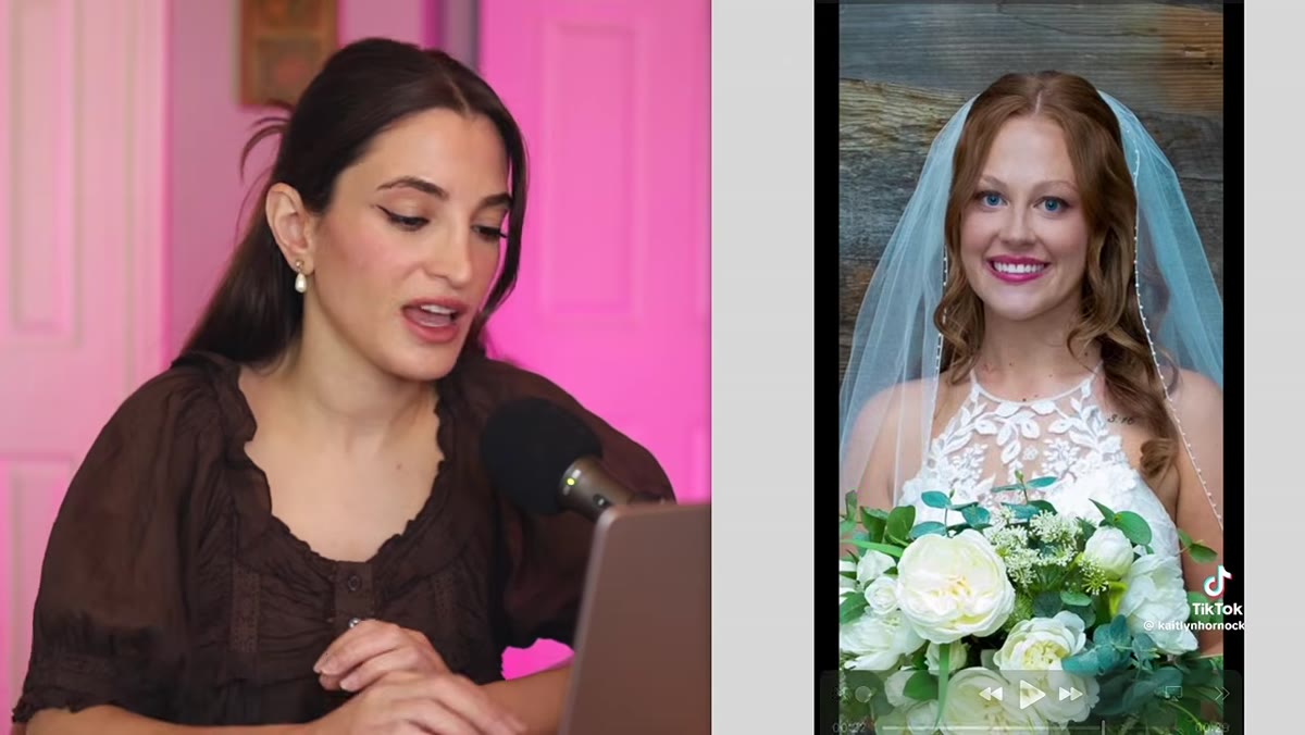 Wedding portrait with unnaturally vivid green foliage and blue veil
This is the one that Jessica spends the most time on, and honestly it deserves it. The photos in question had saturation pushed so far that the white veil was reading as blue, the leaves behind the couple looked like they belonged in a cartoon, and the bride’s eye color had been altered to something almost surreal.
Wedding portrait with unnaturally vivid green foliage and blue veil
This is the one that Jessica spends the most time on, and honestly it deserves it. The photos in question had saturation pushed so far that the white veil was reading as blue, the leaves behind the couple looked like they belonged in a cartoon, and the bride’s eye color had been altered to something almost surreal.
Oversaturation is one of the most common beginner editing mistakes because cranked color looks exciting on a calibrated editing monitor, especially late at night. The fix is to zoom in on neutral tones while you edit. White fabric, cream walls, gray concrete – these should stay neutral. If your whites are shifting toward blue or yellow, your global saturation is too high. In Lightroom, try dropping your saturation to around -5 to -10 from your starting point and see how the image breathes. You can always selectively boost one or two colors using the HSL panel without nuking the whole image.
Step 4: Handle Eye Retouching With a Light Hand
 Close-up portrait showing artificially enhanced, oversaturated eye color
Jessica notices that the bride’s eyes look dramatically different between photos – one shot has them almost neon blue. This is almost certainly an overzealous use of eye enhancement tools in Lightroom or Photoshop, where the iris saturation and luminance sliders get pushed hard to make eyes “pop.”
Close-up portrait showing artificially enhanced, oversaturated eye color
Jessica notices that the bride’s eyes look dramatically different between photos – one shot has them almost neon blue. This is almost certainly an overzealous use of eye enhancement tools in Lightroom or Photoshop, where the iris saturation and luminance sliders get pushed hard to make eyes “pop.”
Eyes should look bright and alive, not digitally replaced. In Lightroom’s adjustment brush, you can use the “Iris Enhance” preset as a starting point, then back the effect off by 50 to 60 percent. The goal is for a viewer to think the subject has beautiful eyes, not to notice that something looks strange. If someone can tell you edited the eyes, you went too far.
Step 5: Match Your Editing Style to the Light You Actually Captured
 Night portrait with flash, showing mismatch between ambient and artificial lighting
One of Jessica’s most useful observations is that the lighting in some of the night shots wasn’t actually terrible. The subject was well-lit, the exposure was reasonable. The problem was that the editing style didn’t match the conditions. Heavy saturation presets applied to flash-lit night portraits will almost always look wrong because flash already produces a cooler, harder light than golden-hour sun, and boosting saturation on top of that amplifies every flaw.
Night portrait with flash, showing mismatch between ambient and artificial lighting
One of Jessica’s most useful observations is that the lighting in some of the night shots wasn’t actually terrible. The subject was well-lit, the exposure was reasonable. The problem was that the editing style didn’t match the conditions. Heavy saturation presets applied to flash-lit night portraits will almost always look wrong because flash already produces a cooler, harder light than golden-hour sun, and boosting saturation on top of that amplifies every flaw.
Think of your editing style as something that should respond to the light in each image, not override it. If you shot in flat overcast light, a high-contrast moody preset is going to fight the image. If you shot with a hard flash at night, your edits should be measured and focused on white balance and skin tone more than global color drama.
From My Own Kit: The One-Monitor Problem
I’ve given workshops to beginners who were editing on laptops with uncalibrated screens, and this is exactly where oversaturation lives. What looks like a punchy, vibrant edit on a cheap screen looks like a nuclear event on a properly calibrated monitor. If you can’t budget a full calibration tool right now, at least edit during the day with consistent ambient light, and always check your exports on a second screen or your phone before you send anything to a client. I keep a reference photo on my phone of a shot I know is properly color-graded, and I compare new edits to it when I’m unsure. It’s low-tech, but it works.
The single most important thing this whole breakdown reinforces is something photographers of all levels need to hear regularly: restraint is a skill. Dialing back your saturation, softening your flash, leaving more frame in the shot – these aren’t failures of boldness. They’re exactly what makes a client look at their photos and feel something instead of trying to figure out what went wrong.
Watch the full tutorial on YouTube to see Jessica walk through each photo in real time. Watching a working photographer react to real-world examples, without a script, is one of the fastest ways to build your own editing eye.
Comments (1)
My workflow just got 10x faster. Not even kidding.
Leave a Comment