There’s a specific kind of uncomfortable that happens when someone else looks at your photos and tells you the truth. I’ve been on both sides of that conversation, and I’ll tell you honestly — the critique sessions that pushed my work forward the most were never the ones where someone said “great shot.” They were the ones where a more experienced photographer pointed at my image and said, this isn’t working, and here’s why.
That’s exactly what makes blind critique formats so valuable for learning. In this KelbyOne tutorial, Scott Kelby reviews real photos from real photographers without knowing who submitted them — which means the feedback is honest, specific, and completely unfiltered. Watch the full tutorial on YouTube if you want to see the images alongside the commentary. But if you want to walk away with actionable techniques you can apply to your own shooting and editing right now, keep reading. I’ve broken down the core lessons into steps you can actually use.
Step 1: Diagnose Focus Problems Before Blaming Your Gear
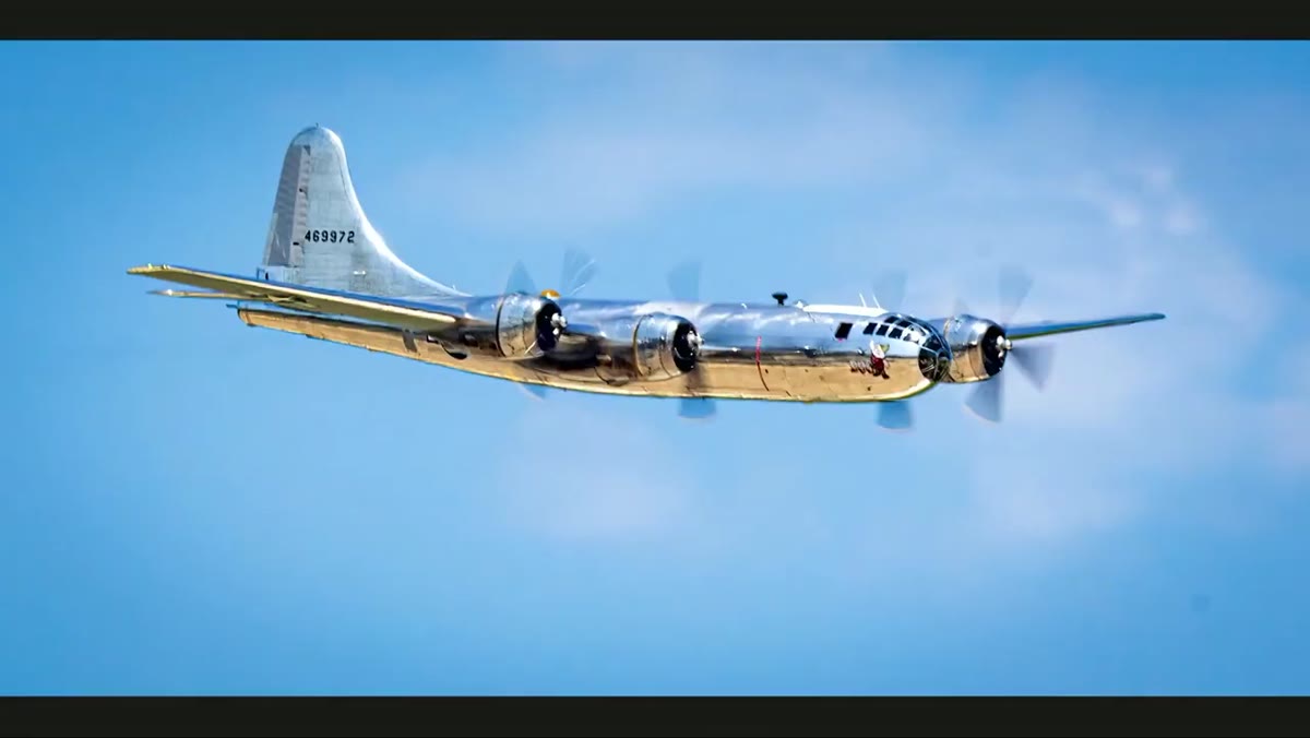 Zoomed-in view of a soft, out-of-focus airplane in flight
When a photo comes up soft, the instinct is to blame the camera or the lens. Kelby’s first critique pushes back on that. The image in question shows a propeller plane in flight, and the softness isn’t random lens blur. It’s the result of panning at a slower shutter speed to capture prop blur, which is actually a creative choice. The problem is that the panning speed wasn’t quite matched to the plane’s movement, so the subject came out soft instead of sharp-with-motion.
Zoomed-in view of a soft, out-of-focus airplane in flight
When a photo comes up soft, the instinct is to blame the camera or the lens. Kelby’s first critique pushes back on that. The image in question shows a propeller plane in flight, and the softness isn’t random lens blur. It’s the result of panning at a slower shutter speed to capture prop blur, which is actually a creative choice. The problem is that the panning speed wasn’t quite matched to the plane’s movement, so the subject came out soft instead of sharp-with-motion.
The lesson here is that before you write off an image or start over-processing it, zoom in and ask why it’s soft. Is it motion blur from panning? Camera shake? Missed autofocus? Each cause has a different fix. Prop planes especially require a slow enough shutter to show the spinning blades (typically somewhere in the 1/100 to 1/250 range depending on the plane), but that same slow shutter demands a very precise pan to keep the fuselage sharp. If you’re shooting airshows or any moving subject, practice the pan before you commit to a slower shutter speed.
Step 2: Use AI Sharpening Tools Selectively, Not as a Cure-All
 Topaz Photo AI panel open on a soft airplane image
Kelby runs the soft airplane image through Topaz Photo AI mid-critique, and the results are genuinely impressive. The tool detects the blur, and applying the “out of focus, very blurry” setting produces a noticeably crisper result. But here’s the thing he makes clear without spelling it out: AI sharpening is a recovery tool, not a replacement for getting it right in camera.
Topaz Photo AI panel open on a soft airplane image
Kelby runs the soft airplane image through Topaz Photo AI mid-critique, and the results are genuinely impressive. The tool detects the blur, and applying the “out of focus, very blurry” setting produces a noticeably crisper result. But here’s the thing he makes clear without spelling it out: AI sharpening is a recovery tool, not a replacement for getting it right in camera.
When you use Topaz or a similar tool, pay attention to the settings it recommends automatically. If it flags your image as “out of focus” rather than “motion blur,” that tells you something about what happened technically. Start with the suggested setting, but try the more aggressive options (like “very blurry”) on a duplicate layer so you can compare. Over-sharpening with AI tools can introduce artifacts, especially around fine edges like hair or text. Use it as a finishing touch, not a foundation.
Step 3: Evaluate Your Portfolio as a Set, Not as Individual Images
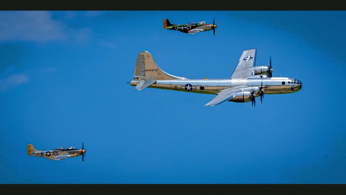
 Three thumbnail images displayed side by side for comparison
One of the sharpest observations in the whole video happens fast and it’s easy to miss. Kelby notes that great photos look good even at thumbnail size. When he looks at a set of three images before diving in, he can already tell which ones are working just from the small previews. That’s worth sitting with.
Three thumbnail images displayed side by side for comparison
One of the sharpest observations in the whole video happens fast and it’s easy to miss. Kelby notes that great photos look good even at thumbnail size. When he looks at a set of three images before diving in, he can already tell which ones are working just from the small previews. That’s worth sitting with.
When you’re building a portfolio or even just selecting what to post, lay your images out small. If a photo only looks good when you’re zoomed into the details, it may not have strong enough composition or contrast to read at a distance. The images that pass the thumbnail test tend to have clear subjects, strong tonal contrast, and a defined point of interest. If you’re struggling with selection, step back literally and look at your images at postage-stamp size. It changes the conversation immediately.
Step 4: Commit to a Visual Style Across a Series
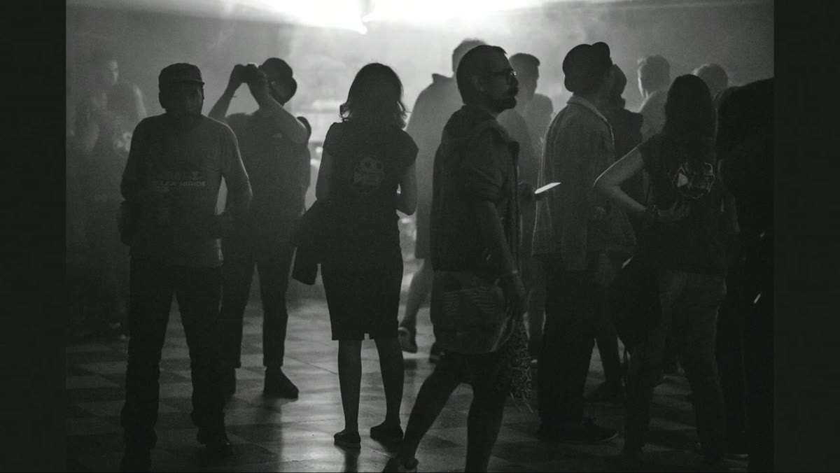 Three misty, low-contrast black-and-white cinematic images on screen
The second set of images stops Kelby in his tracks in a good way. The photographer has developed a consistent, moody, low-contrast black-and-white style that reads as cinematic. He describes the images as looking like film stills, and that’s a huge compliment. The style is doing real work. Even when one of the three images is technically weaker than the others, it still fits the visual language the photographer has established.
Three misty, low-contrast black-and-white cinematic images on screen
The second set of images stops Kelby in his tracks in a good way. The photographer has developed a consistent, moody, low-contrast black-and-white style that reads as cinematic. He describes the images as looking like film stills, and that’s a huge compliment. The style is doing real work. Even when one of the three images is technically weaker than the others, it still fits the visual language the photographer has established.
This is the piece that most photographers I work with are missing. You can have technically perfect photos that feel like they came from three different photographers. Consistency builds trust with your audience and makes your whole body of work feel intentional. Pick two or three editing decisions (tonal range, contrast style, color temperature, film grain level) and apply them as a starting point for everything in a series. You can always adjust, but working from a consistent baseline is what separates a gallery from a folder of nice pictures.
Step 5: Know When an Image Breaks Your Visual Language
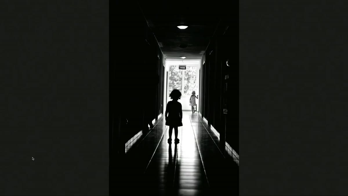
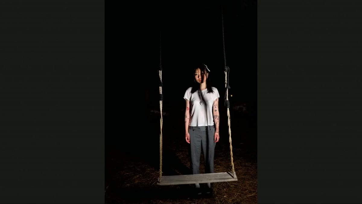 Out-of-place portrait image among otherwise cohesive stylized photos
Here’s where the critique gets uncomfortable in a useful way. In the same series with that strong cinematic style, one image is a close-up portrait with a heavy blur effect that reads as eerie and unflattering. Kelby is blunt: it feels like it belongs to a completely different photographer. It breaks the visual logic of the set.
Out-of-place portrait image among otherwise cohesive stylized photos
Here’s where the critique gets uncomfortable in a useful way. In the same series with that strong cinematic style, one image is a close-up portrait with a heavy blur effect that reads as eerie and unflattering. Kelby is blunt: it feels like it belongs to a completely different photographer. It breaks the visual logic of the set.
This happens to everyone. You try something experimental, and it’s exciting in the moment, but it doesn’t belong next to your other work. The fix isn’t to delete the image. It’s to separate it. Build a second folder or series for experiments and side projects. That way your main body of work stays coherent and your experiments don’t dilute your strongest material. If the experimental image becomes a new direction, great. But it earns its place in the main gallery when the style is consistent, not just because it’s different.
Step 6: Location and Light Are the Foundation Everything Else Builds On
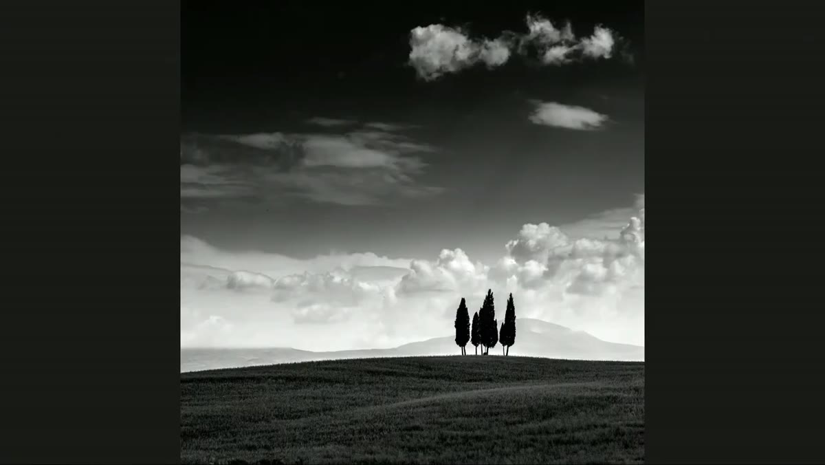 Wide landscape images of rolling Tuscan hills with soft clouds
The final set of images in the critique segment is landscapes shot in Tuscany, and the reaction shifts completely. The light is doing heavy lifting here. Soft, directional natural light over rolling hills with a few clouds in the frame creates an image that almost edits itself. Kelby’s response is immediate and enthusiastic.
Wide landscape images of rolling Tuscan hills with soft clouds
The final set of images in the critique segment is landscapes shot in Tuscany, and the reaction shifts completely. The light is doing heavy lifting here. Soft, directional natural light over rolling hills with a few clouds in the frame creates an image that almost edits itself. Kelby’s response is immediate and enthusiastic.
Strong location work isn’t luck. It’s timing and patience. If you’re planning a landscape trip, research golden hour and blue hour windows for your specific location. Apps like PhotoPills or The Photographer’s Ephemeris will show you exactly where the sun will be and when. Clouds like the ones in these Tuscany shots are a gift, but you can improve your odds by shooting during times when partial cloud cover is more likely. The point is that no amount of post-processing replaces good light. It’s always easier to edit a well-lit image than to rescue a flat one.
What I’d Add From My Own Experience
Kelby’s approach to these critiques reinforces something I’ve come to believe pretty firmly: the problems that show up most often aren’t technical ones. They’re clarity problems. Photographers who are struggling usually know a lot about their gear and very little about what they’re actually trying to say with a photo.
My Sunday morning photo walks have been more useful for developing my visual style than any gear upgrade I’ve ever made. Forcing yourself to shoot regularly in the same light, in the same neighborhood, with the same general subject matter builds the kind of muscle memory that makes these decisions automatic. You stop asking “should I pan?” and start knowing. You stop wondering if the image fits your portfolio. You just feel it.
The single most transferable lesson from this tutorial is that consistency and intentionality matter more than technical perfection. A soft image from a difficult pan shot tells a story. A technically sharp photo with no clear visual identity tells you nothing. Know what you’re going for before you raise the camera.
Watch the full tutorial on YouTube to see all the images Kelby reviews and hear his unedited reactions in real time. It’s one of the most practically useful critique formats I’ve come across for photographers at any level.
Comments (2)
The before and after really sells it. Incredible difference.
Excellent tutorial. I'd add that from a compositing standpoint, this technique is incredibly versatile.
Leave a Comment