
For a long time, I defaulted to black and white whenever I felt unsure. Desaturate the image, lean into contrast and shadow, and suddenly everything looked intentional. It was a crutch I didn’t even know I was holding until I started noticing how many of my color shots felt flat and almost accidental, like color was just something that happened to be there instead of something I was actually working with. If that sounds familiar, this tutorial hit me somewhere specific.
In this Sean Tucker tutorial, Watch the full tutorial on YouTube, Tucker walks through what he learned from studying the work of Alex Webb, a longtime Magnum photographer who built his reputation on some of the most visually complex color street photography ever made. Tucker isn’t teaching Lightroom sliders here. He’s unpacking a philosophy, a way of seeing color as a structural and emotional element of a photograph rather than a side effect of not converting to grayscale. What I appreciated most is that he frames it as a personal journey, one that mirrors something a lot of us go through when we realize our visual toolkit has a ceiling.
The steps below pull out the core ideas from the video in a way you can actually act on, whether you’re on a Sunday morning walk with a camera or standing somewhere genuinely overwhelming with color and light.
Step 1: Acknowledge the Real Reason You Avoid Color
 Tucker describing feeling limited by black and white work
Before any technique, Tucker asks you to be honest with yourself. He describes reaching a point where black and white felt like a creative dead end, not because it’s a lesser medium, but because he had squeezed out what he personally needed from it. Alex Webb went through the same thing around 1975. Recognizing that feeling of visual limitation is the first practical step, because until you name it, you’ll keep retreating to what’s comfortable.
Tucker describing feeling limited by black and white work
Before any technique, Tucker asks you to be honest with yourself. He describes reaching a point where black and white felt like a creative dead end, not because it’s a lesser medium, but because he had squeezed out what he personally needed from it. Alex Webb went through the same thing around 1975. Recognizing that feeling of visual limitation is the first practical step, because until you name it, you’ll keep retreating to what’s comfortable.
Ask yourself: are you shooting in black and white because it genuinely serves the image, or because it feels safer? There’s no shame in the answer either way. But if it’s the latter, that’s your signal to start treating color as a serious creative language worth learning from scratch.
Step 2: Study a Photographer Who Solved the Problem You Have
 Tucker holding and discussing Alex Webb’s photobook
Tucker’s method for breaking through a creative plateau wasn’t to read a technique manual. He found a photographer whose work represented where he wanted to go and studied it closely. For him, that was Alex Webb. For Webb himself, the shift started with a novel, Graham Greene’s “The Comedians,” set in Haiti, which sent him on a trip that changed his entire relationship with color.
Tucker holding and discussing Alex Webb’s photobook
Tucker’s method for breaking through a creative plateau wasn’t to read a technique manual. He found a photographer whose work represented where he wanted to go and studied it closely. For him, that was Alex Webb. For Webb himself, the shift started with a novel, Graham Greene’s “The Comedians,” set in Haiti, which sent him on a trip that changed his entire relationship with color.
The practical instruction here is simple but easy to skip: pick one photographer whose color work genuinely stops you mid-scroll, get a physical book of their images if you can, and sit with it. Tucker recommends Webb’s “The Suffering of Light” specifically because it spans 30 years and lets you track how the approach developed over time. Watching an aesthetic evolve gives you permission to be in process yourself.
Step 3: Understand That Color Carries Emotional Weight
 Tucker discussing emotional necessity of color in Webb’s Caribbean work
One of the sharpest ideas Tucker pulls from Webb’s story is that color in certain environments isn’t decorative. It’s essential. Webb realized in the Caribbean and along the U.S.-Mexico border that converting those images to black and white would have stripped something true out of them. The heat, the noise, the life of those places lived in the color itself.
Tucker discussing emotional necessity of color in Webb’s Caribbean work
One of the sharpest ideas Tucker pulls from Webb’s story is that color in certain environments isn’t decorative. It’s essential. Webb realized in the Caribbean and along the U.S.-Mexico border that converting those images to black and white would have stripped something true out of them. The heat, the noise, the life of those places lived in the color itself.
This reframes how you approach a scene. Instead of asking “should I shoot this in color or black and white,” start asking “does color do something irreplaceable here?” If a wall painted electric blue is the reason a scene has tension, that’s compositional information, not decoration. Begin looking at color as structure, the same way you’d look at light and shadow.
Step 4: Train Yourself to See Layers Before You Shoot
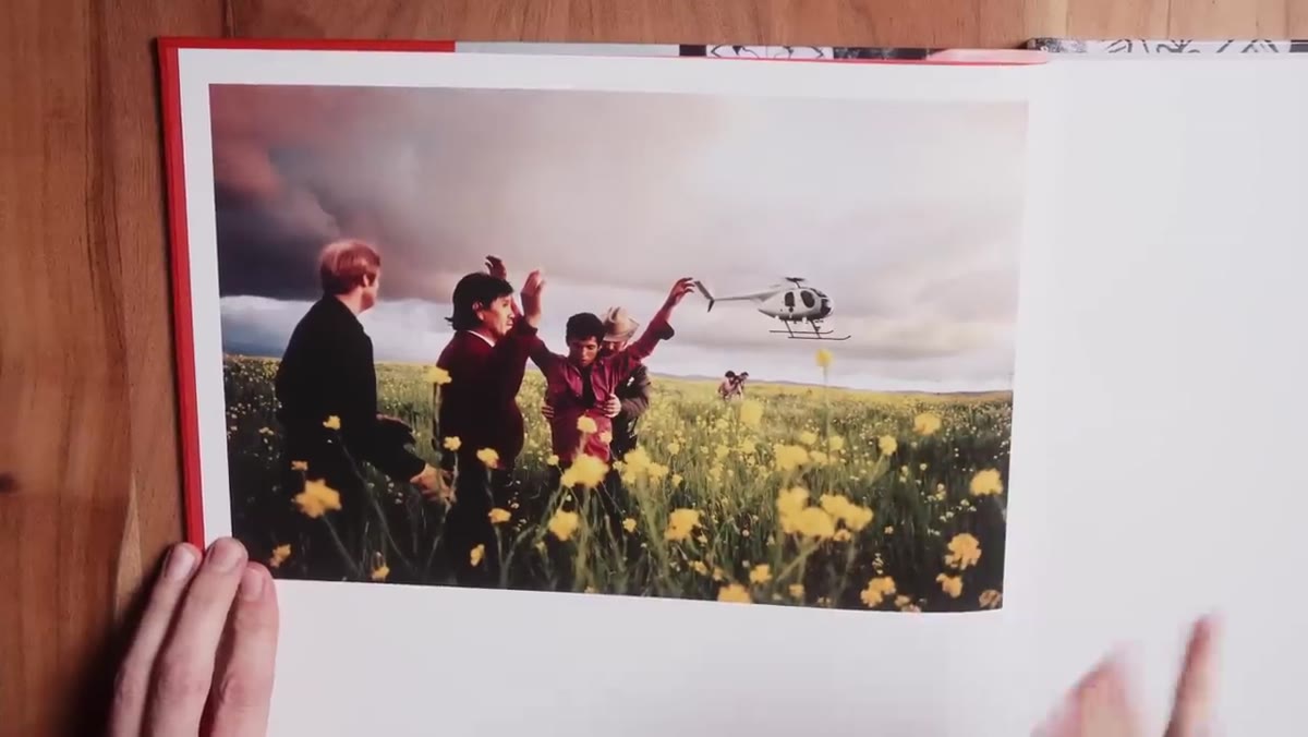 Tucker analyzing a specific Alex Webb photograph from the book
Webb’s images are famously complex. Multiple planes of action, foreground figures, background figures, shafts of light, and pools of color all coexisting without chaos. Tucker’s breakdown of specific images in the book is where the tutorial gets genuinely instructional. He walks through how Webb builds a frame in depth, using color to separate layers that might otherwise collapse into visual noise.
Tucker analyzing a specific Alex Webb photograph from the book
Webb’s images are famously complex. Multiple planes of action, foreground figures, background figures, shafts of light, and pools of color all coexisting without chaos. Tucker’s breakdown of specific images in the book is where the tutorial gets genuinely instructional. He walks through how Webb builds a frame in depth, using color to separate layers that might otherwise collapse into visual noise.
Your exercise here: before you press the shutter, count the visual layers in front of you. Foreground, midground, background. What color anchors each one? If two layers are the same hue and tone, they’ll merge. Learning to spot that before you shoot, not after in Lightroom, is the skill Webb’s work teaches by example.
Step 5: Let Color Relationships Drive Composition
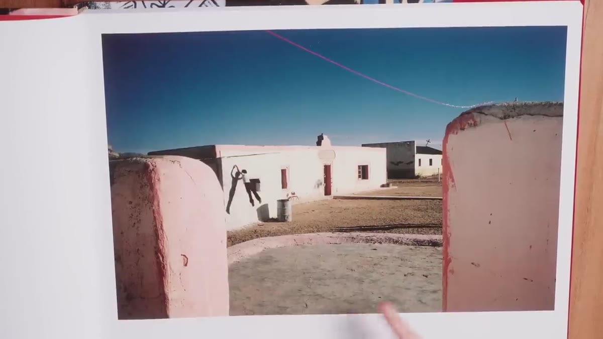 Tucker pointing to color contrasts within a Webb street photograph
In black and white photography, you’re chasing contrast between light and dark. In color work, Tucker explains that you’re chasing contrast between hues. A red jacket against a green wall. A yellow taxi cutting through a frame of blue shadow. These relationships create visual tension and give the eye somewhere to travel.
Tucker pointing to color contrasts within a Webb street photograph
In black and white photography, you’re chasing contrast between light and dark. In color work, Tucker explains that you’re chasing contrast between hues. A red jacket against a green wall. A yellow taxi cutting through a frame of blue shadow. These relationships create visual tension and give the eye somewhere to travel.
This is something you can practice immediately. On your next shoot, pick one color and hunt for its complement or contrast in the environment. Let that relationship be your reason for making the frame. It sounds prescriptive, but it builds a muscle. After a few sessions of doing it deliberately, you start seeing those tensions automatically.
Step 6: Give Yourself Permission to Be a Beginner Again
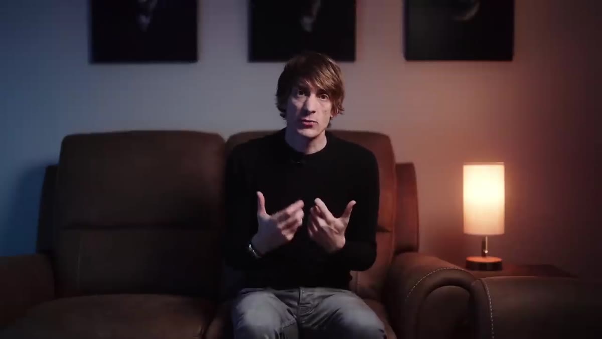 Tucker explaining he didn’t want his work led by audience preference
Tucker is direct about something that I think gets glossed over in most photography education: he was willing to get worse before he got better. He knew his color work wasn’t as strong as his black and white work, and he chose to share it anyway because growth mattered more to him than approval. Webb spent years developing his color eye. Tucker spent years developing his.
Tucker explaining he didn’t want his work led by audience preference
Tucker is direct about something that I think gets glossed over in most photography education: he was willing to get worse before he got better. He knew his color work wasn’t as strong as his black and white work, and he chose to share it anyway because growth mattered more to him than approval. Webb spent years developing his color eye. Tucker spent years developing his.
If you’re making the same shift, expect the first batch of color work to feel inconsistent. That’s not a sign you’re doing it wrong. That’s the process. Shoot more than you share during this phase. Keep a folder of experiments you’re not ready to post. Give the learning room to breathe.
What I’d Add From My Own Experience
The thing Tucker’s tutorial doesn’t quite say out loud, but that Alex Webb’s work illustrates constantly, is that chaos is not the enemy in color street photography. For months I was trying to simplify my color frames the way I simplified my black and white ones, one strong subject, clean background, clear geometry. But color scenes with complexity can hold together beautifully when the hues are doing organizational work. The day I stopped trying to reduce and started trying to balance was the day my color shots started feeling like choices instead of accidents.
The single biggest shift from this tutorial is treating color as a compositional tool on the same level as light, shadow, and framing. It’s not a mood filter. It’s a structural element that creates depth, tension, and emotional specificity in a frame. Once you start seeing it that way, you can’t unsee it.
Watch the full tutorial on YouTube and spend extra time in the sections where Tucker holds the book open and walks through specific Webb photographs. That’s where the real teaching happens.
Comments (4)
Solid advice. Especially the part about taking your time with it.
I tried this on a client project yesterday and the results were way better than expected.
Bookmarked. Coming back to this one for sure.
Just subscribed. If the rest of your content is this good, I'm in.
Leave a Comment