Every Sunday morning I go on a photo walk. No agenda, just my camera and whatever light shows up. And honestly, some of my worst habits follow me right out the door. I over-pose people. I let busy backgrounds fight my subject. I forget that a great expression will save an average composition every single time.
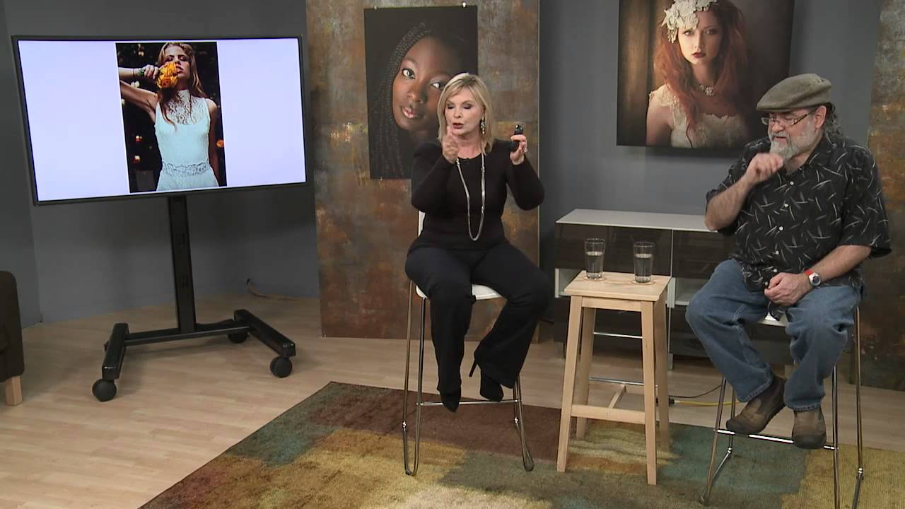
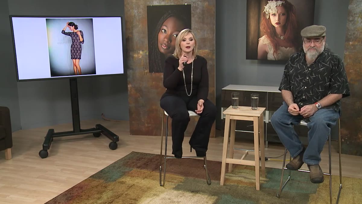
That’s why I keep coming back to critique-style tutorials from working professionals. Watching someone analyze a real image, out loud, in real time, cuts through the theory and gets to the stuff you can actually use on your next shoot. In this CreativeLive tutorial, photographers Bambi Cantrell and John Cornicello walk through a series of advertising and editorial images and talk about exactly what works, what doesn’t, and why. Watch the full tutorial on YouTube - it’s one of those sessions where you’ll want a notebook nearby.
What follows is my breakdown of the key techniques they discuss, pulled out into steps you can actually apply whether you’re shooting product work, portraits, or just trying to level up your eye for composition.
Step 1: Design Your Background to Support the Subject
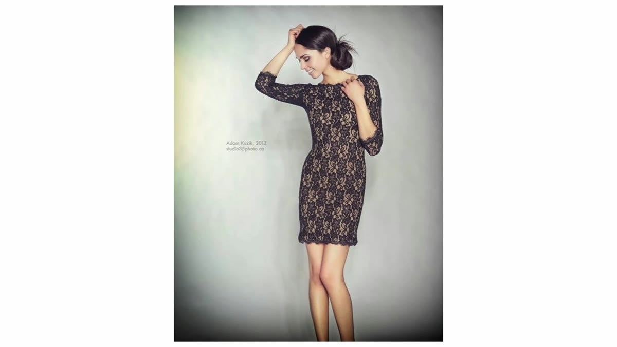
 Gray vignetted background framing a model in a dress
The first image Cantrell and Cornicello look at is a fashion shot on a neutral gray background with darkened corners. It seems simple, but there’s real thinking behind it. The background doesn’t compete. The vignette pulls the eye inward toward the subject. And critically, there’s negative space left for copy, which is exactly what an advertising client needs.
When you’re shooting anything with commercial intent, ask yourself: if a client dropped a headline and logo onto this image, would it have room to breathe? If the answer is no, your background is probably too busy or your subject is centered in a way that leaves no dead space. Try pushing your subject to one side and letting the other side go clean and open.
Step 2: Shape Hands with Intention, Not as an Afterthought
 Model’s hand position across the front of her body
Cantrell flags one specific detail on that first image: the hand across the front of the body is too flat. She calls it “ballet hands” - a technique where you gently press the center of a subject’s palm so the thumb and fingers naturally curve together into a soft, elegant shape. The goal is to shoot the side of the hand rather than the flat face of it, which reads as stiff or blocky in a photo.
This is one of those tiny adjustments that separates a snapshot from a polished portrait. Hands are notoriously hard to pose because people tense up the moment a camera appears. I always give a quick physical demonstration before I shoot - I show people what I want with my own hand so they don’t have to guess. It takes ten seconds and it changes the frame.
Step 3: Prioritize Expression Above Every Other Element
 Model with playful expression wearing the featured garment
This is the most important thing either photographer says in the entire tutorial, so I want to give it its own step. Cantrell points out that the reason the fashion image works emotionally is because the model looks like she’s genuinely enjoying wearing the dress. She’s not performing. She looks like she’s in on something fun.
The practical rule they offer is this: if everything else in a frame falls apart - the pose is imperfect, the composition is off - but you’ve captured a real, honest expression, most of those other problems become forgivable. I’ve shot enough sessions to know this is true. The image people always respond to isn’t the technically perfect one. It’s the one where the person looks alive.
Step 4: Use Selective Color Carefully - or Not at All
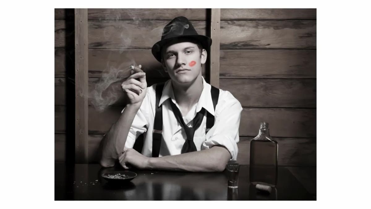 Black and white portrait with isolated red lips
The second image they critique is a moody portrait using spot color - black and white with red lips retained. Cantrell admits the technique has been overdone (she puts it in the same category as HDR), but she doesn’t dismiss it entirely. Her caveat is that in an advertising context, where visual boldness is often the point, it can still work. What she’d consider instead: a heavy desaturation rather than full black and white, which keeps some color information and can feel more intentional than a hard conversion with one accent color popped.
The lesson here isn’t “never use spot color.” It’s “know when a technique is a shortcut versus a choice.” If you’re reaching for a Lightroom selective color preset because you’re not sure what else to do with the image, that’s the shortcut version. If you’ve looked at the image and decided that one element of color serves the story, that’s the choice version.
Step 5: Separate Your Subject from the Background with Aperture and Distance
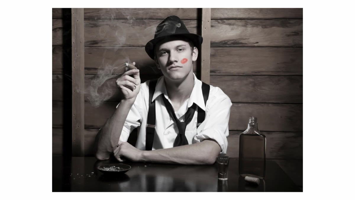 Male subject too close to a detailed wall background
Cornicello’s critique of a moody liquor-style ad gets specific: the subject is too close to the wall behind him, so the background texture is competing with his face. The fix he suggests isn’t a lighting change - the hard, directional light on the face is actually working. The fix is aperture and distance. Moving the subject further from the wall and shooting at a wider aperture would throw the background out of focus and let the face read cleanly.
This is one of those problems that’s much easier to solve in camera than in post. I try to get into the habit of checking my background before I check my subject. If I can see individual bricks, wood grain, or fabric weave behind someone’s head, I either move them forward or drop my aperture.
Step 6: Match Your Lighting Logic to the Scene’s Reality
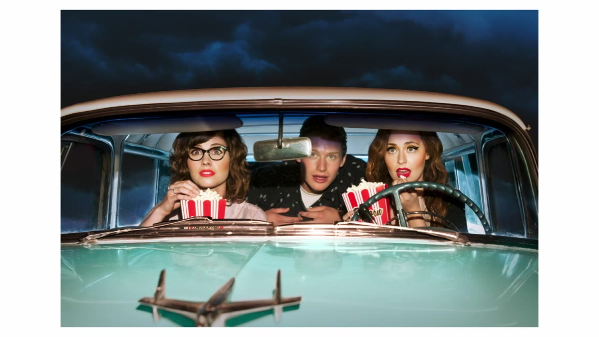 Three people in a car lit as if watching a movie or screen
The third image shows a group of people in a car, apparently watching something on a screen. The lighting is clean and even across all three faces. Cornicello points out that this reads more like advertising than editorial - in advertising, you want to see the faces clearly, so flat, even lighting makes sense. But if the goal were editorial and the story is “people watching a movie,” the light should behave more like a screen actually would: shifting colors, moving shadows, uneven illumination across faces.
This is a question worth asking before every shoot: what is the light source supposed to be in this world? If your lighting contradicts the story, viewers feel it even if they can’t name it.
A Note from My Own Shooting Experience
The hardest thing about watching a critique like this is resisting the urge to apply every note at once. I’ve been there - I leave a tutorial inspired and then try to fix my hands AND my background AND my expression coaching in the same session and end up overthinking everything.
My suggestion: pick one of these steps per shoot and work it deliberately. This week, just focus on hands. Next week, check your backgrounds before your subjects. The techniques stack over time, and you’ll absorb them faster when you’re not trying to rewire your whole approach in an afternoon.
If you take one thing from Cantrell and Cornicello’s analysis, make it this: a compelling expression covers more problems than any technical fix ever will. Light better, pose smarter, clean up your backgrounds - but never stop chasing the moment where your subject actually feels something. That’s what makes an image worth looking at.
Watch the full tutorial on YouTube to see the full image critiques and hear both photographers’ reasoning in their own words.
Comments
Leave a Comment