
Every Sunday morning I do a photo walk around my neighborhood in Seattle. Same streets, different light. And the thing that humbles me every single time is how a scene that feels genuinely three-dimensional when I’m standing in it somehow arrives on my screen looking like a postcard that’s been left in the sun too long. Flat. Lifeless. Like the air got sucked out of it.
For a long time I blamed my lens, my camera body, my location. But the real culprit is something much more fundamental, and it has nothing to do with gear. In this Mark Denney tutorial, he names it plainly: photography is a two-dimensional art form trying to represent a three-dimensional world. The collapse happens the moment you press the shutter. Everything with shape, separation, and dimension gets compressed into a flat plane. That’s not a gear problem. That’s a physics problem. And the solution lives in how you edit.
What Denney lays out is a practical, software-agnostic method for rebuilding the illusion of depth through intentional light transitions. He walks through a foggy autumn road shot from the Smoky Mountains, showing how dramatically a raw file can transform when you start making deliberate choices about where light lives and where it doesn’t. The techniques work in Lightroom, Capture One, Photoshop, or whatever you edit in. Here’s the breakdown.
Step 1: Understand How the Eye Moves Through a Photo
 Human eye naturally gravitates toward brightest image areas
Before you touch a single slider, shift how you think about the viewer’s experience. When someone looks at your image, their eye doesn’t scan it evenly. It moves toward the brightest part of the frame first, then travels from there. This isn’t a theory. It’s a consistent visual behavior that painters figured out centuries ago, and photographers can absolutely use it.
Human eye naturally gravitates toward brightest image areas
Before you touch a single slider, shift how you think about the viewer’s experience. When someone looks at your image, their eye doesn’t scan it evenly. It moves toward the brightest part of the frame first, then travels from there. This isn’t a theory. It’s a consistent visual behavior that painters figured out centuries ago, and photographers can absolutely use it.
The goal isn’t just to make a pretty image. It’s to design a path for the viewer’s eye to follow. Ask yourself: where does the light lead? Where do you want the viewer to land? Once you have that answer, you can start shaping the image to guide them there rather than leaving it to chance.
Step 2: Apply a Subtle Vignette as Your Depth Foundation
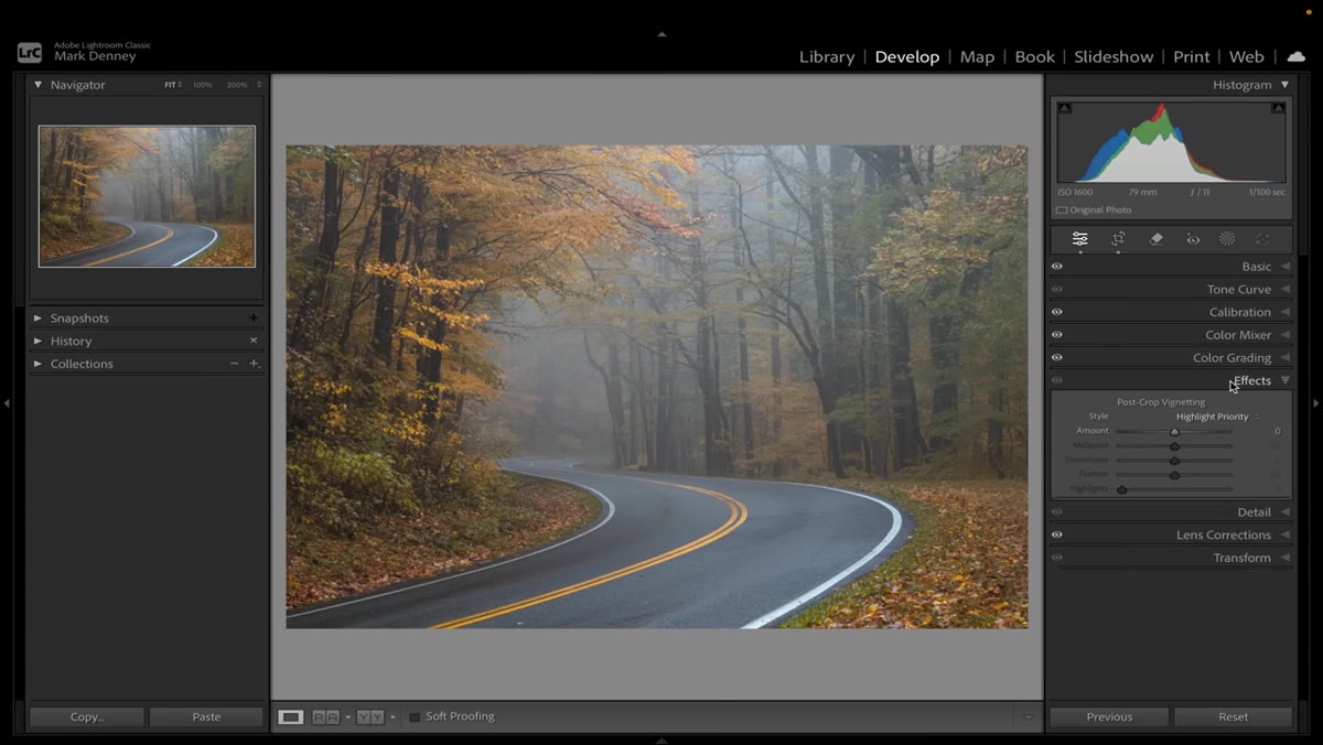 Vignette slider in Effects panel set to minus 15
The fastest way to create a sense of depth is also one of the most underused tools in editing: a vignette. Not the heavy-handed dark halo that screams “2009 Instagram filter,” but a gentle, barely-there darkening of the edges that nudges the eye toward the center of the frame.
Vignette slider in Effects panel set to minus 15
The fastest way to create a sense of depth is also one of the most underused tools in editing: a vignette. Not the heavy-handed dark halo that screams “2009 Instagram filter,” but a gentle, barely-there darkening of the edges that nudges the eye toward the center of the frame.
In Lightroom, head to the Effects panel and pull the vignette slider toward the negative side. Denney’s go-to starting point is around minus 15. Toggle it on and off to check how it reads. At that value, it shouldn’t be obvious. It should just feel like the center of the image has a little more weight and presence than the edges. That quiet shift already starts to suggest depth.
Step 3: Use Light Transitions to Create Separation
 Light transitioning from foreground dark to bright background area
A light transition is any place in an image where dark moves to light or light moves to dark. That edge, that gradient, is where the brain perceives depth. Think about fog on a mountain range. Each successive ridge gets lighter and softer, and your eye reads that as distance. You can replicate that effect intentionally in post.
Light transitioning from foreground dark to bright background area
A light transition is any place in an image where dark moves to light or light moves to dark. That edge, that gradient, is where the brain perceives depth. Think about fog on a mountain range. Each successive ridge gets lighter and softer, and your eye reads that as distance. You can replicate that effect intentionally in post.
Look at your image and identify where natural light transitions already exist. Then ask how you can strengthen them. If your foreground is slightly brighter than your midground, try pulling it down just a touch. If your background is already a bit hazy, lean into that by softening the contrast there. You’re not fabricating reality. You’re amplifying the depth cues that were already present when you took the shot.
Step 4: Brighten the Path You Want the Eye to Follow
 Viewer’s eye path traced toward brightest scene area
Once you’ve darkened the areas that should recede, the next move is to brighten the areas you want to lead the viewer through. In a winding road shot, for example, that might mean lifting the light on the road itself so it pulls the eye from foreground through the midground into the distance. In a portrait, it might mean painting light gently across the face and letting everything else fall back.
Viewer’s eye path traced toward brightest scene area
Once you’ve darkened the areas that should recede, the next move is to brighten the areas you want to lead the viewer through. In a winding road shot, for example, that might mean lifting the light on the road itself so it pulls the eye from foreground through the midground into the distance. In a portrait, it might mean painting light gently across the face and letting everything else fall back.
Use a radial filter, a brush, or a gradient in whatever software you’re working in. The specific tool matters less than the intention behind it. You’re building a visual hierarchy: bright things come forward, dark things recede. Work that contrast deliberately rather than applying it globally.
Step 5: Check the Edit by Toggling Before and After
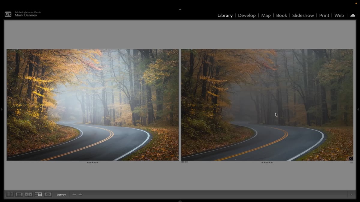 Side-by-side comparison of raw file and completed edited image
This sounds obvious, but it’s worth making a habit out of: flip between your before and after views regularly throughout the edit, not just at the end. When you’ve been staring at an image for 20 minutes, your eye adjusts and stops noticing the cumulative effect of your changes. The before-and-after toggle resets your perception.
Side-by-side comparison of raw file and completed edited image
This sounds obvious, but it’s worth making a habit out of: flip between your before and after views regularly throughout the edit, not just at the end. When you’ve been staring at an image for 20 minutes, your eye adjusts and stops noticing the cumulative effect of your changes. The before-and-after toggle resets your perception.
Denney does this throughout his walkthrough, and it’s genuinely useful to see how even a gentle vignette changes the feel of the raw file. What you’re looking for is whether the image now seems to have air in it. Whether the foreground feels closer and the background feels farther. If it still reads flat, that’s your signal to push the transitions a little harder.
My Take: Don’t Wait Until You’re Editing
Everything Denney covers in post can also start in the field. I started paying attention to where light falls in a scene before I even set up my shot, specifically asking myself where the natural light transitions are happening. Fog, overcast light, backlit subjects, sun breaking through trees. These are depth machines if you position yourself to use them. When I find a scene with a strong gradient of light, I know the edit is going to be much easier because the raw material is already doing half the work.
The editing steps Denney teaches are genuinely useful, and they’ll rescue a flat file. But if you can go out and actively look for scenes where dark-to-light transitions already exist naturally, you’ll spend less time manufacturing depth at a desk and more time finding it in the world. Both approaches are valid. I just find the combination is what really starts to make images feel like you were there.
The single most important thing I took from this tutorial is also the simplest: depth is something you design, not something that just happens. Every flat image is an opportunity to rebuild what the camera took away. Start with a light vignette, follow the transitions, and always know where you want the viewer’s eye to land.
Watch the full tutorial on YouTube to see Mark Denney walk through the full edit on his Smoky Mountains shot. The before and after alone is worth your time.
Comments
Leave a Comment