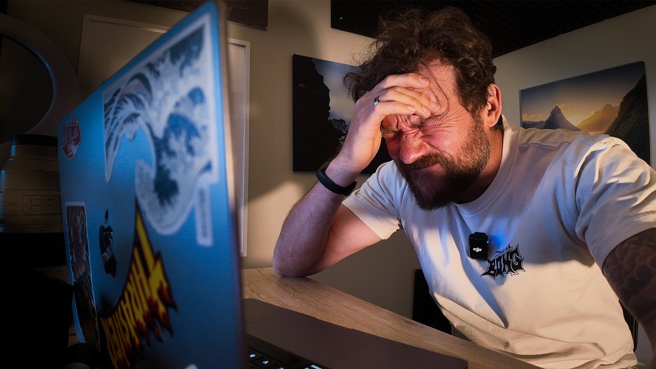
I spent three evenings one fall chasing a waterfall shot in Olympic National Park. I had the composition. I had the light. What I did not have was an edit that matched what I remembered feeling when I was standing there. Every time I opened the file, I’d reach for the contrast slider, drag it too far, pull it back, overcorrect with shadows, and end up with something that looked processed rather than felt. Sound familiar?
The problem, I’ve come to realize, is that most of us approach editing as a series of global corrections when what the image actually needs is local, intentional light sculpting. In this William Patino tutorial, Watch the full tutorial on YouTube, he demonstrates exactly that: a brush-based, painter’s mindset for processing landscape photos in Adobe Camera Raw. His workflow applies just as cleanly in Lightroom or Capture One, and once you see it, you can’t unsee it.
What makes his approach worth your time is that it’s not about chasing a look. It’s about reading the image for what depth and light already want to do, and then helping them along. Here’s how he does it, step by step.
Step 1: Start With the Landscape Profile
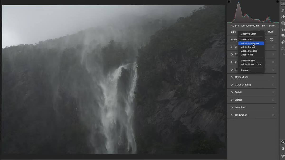 Applying the Landscape camera profile in Camera Raw
Before touching a single slider, William applies the Landscape camera profile. In Camera Raw, you’ll find this under the Camera Calibration panel (or in Lightroom, under Profile in the Basic panel). It’s a small move, and sometimes it barely shifts the image, but it nudges colors toward slightly richer saturation that suits natural scenes. Think of it as setting the table before you cook. You’re not building a meal yet, you’re just making sure the foundation is right.
Applying the Landscape camera profile in Camera Raw
Before touching a single slider, William applies the Landscape camera profile. In Camera Raw, you’ll find this under the Camera Calibration panel (or in Lightroom, under Profile in the Basic panel). It’s a small move, and sometimes it barely shifts the image, but it nudges colors toward slightly richer saturation that suits natural scenes. Think of it as setting the table before you cook. You’re not building a meal yet, you’re just making sure the foundation is right.
Step 2: Read the Image for Natural Depth Before Touching Global Sliders
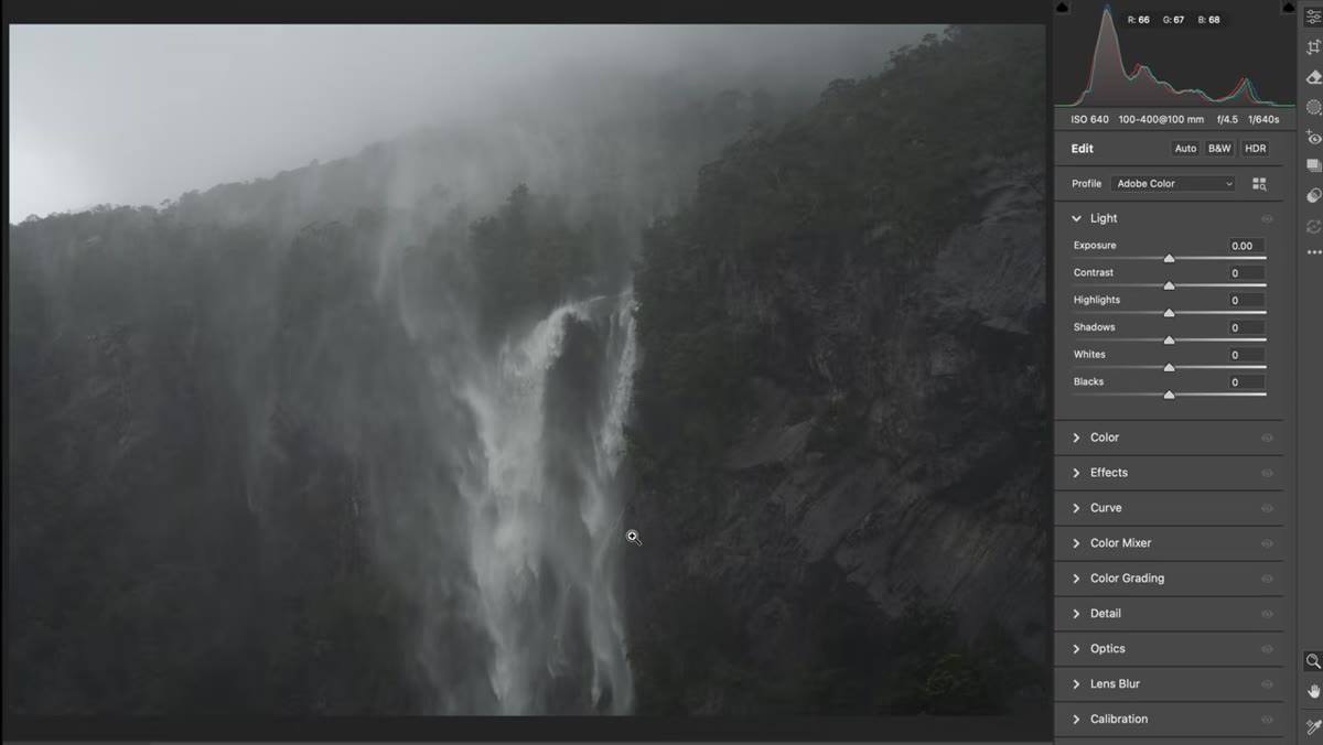 Unprocessed waterfall RAW file showing flat contrast
This is the step most people skip entirely. Before William touches contrast, exposure, or saturation, he spends a moment reading the image for its natural depth logic. In landscape photography, objects closer to the camera carry deeper, richer tones. Objects farther away appear progressively lighter. If your image doesn’t reflect that, it will feel flat no matter how many sliders you move.
Unprocessed waterfall RAW file showing flat contrast
This is the step most people skip entirely. Before William touches contrast, exposure, or saturation, he spends a moment reading the image for its natural depth logic. In landscape photography, objects closer to the camera carry deeper, richer tones. Objects farther away appear progressively lighter. If your image doesn’t reflect that, it will feel flat no matter how many sliders you move.
For his waterfall scene, the right side of the frame is the foreground, and it needs to be darker. The upper left is the distance, and it should feel open and bright. Identifying this before you edit means every adjustment you make will work with the image’s natural geometry instead of against it.
Step 3: Make a Subtle Global Color Shift, Then Stop
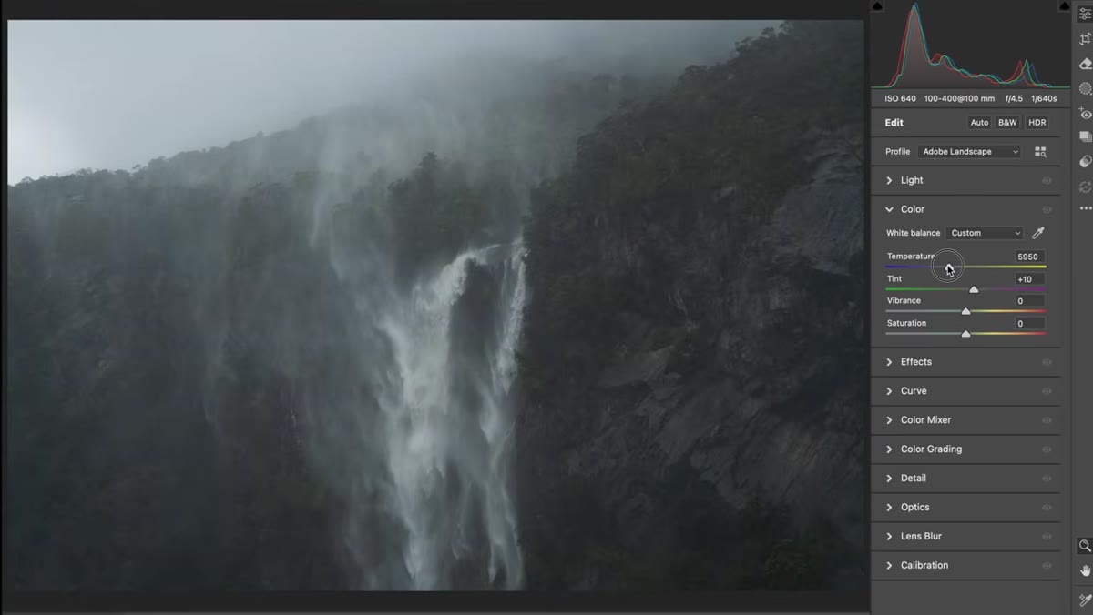 Temperature and tint sliders pulled slightly cooler and green
William makes one small global adjustment: he cools the white balance slightly and nudges the tint toward green. For this near-monochrome waterfall and granite scene, that cooler tone feels more natural and atmospheric. Importantly, he deliberately avoids touching vibrance or saturation at this stage. If the scene is already close to monochromatic, pumping saturation just creates noise without adding feeling.
Temperature and tint sliders pulled slightly cooler and green
William makes one small global adjustment: he cools the white balance slightly and nudges the tint toward green. For this near-monochrome waterfall and granite scene, that cooler tone feels more natural and atmospheric. Importantly, he deliberately avoids touching vibrance or saturation at this stage. If the scene is already close to monochromatic, pumping saturation just creates noise without adding feeling.
The principle here is restraint. Identify the one global color quality the image needs, adjust it lightly, and then move on to local work. This is where a lot of tutorials stop, and also where William is just getting started.
Step 4: Build a Local Brush Mask for the Foreground
 Brush mask being painted over the dark foreground corner
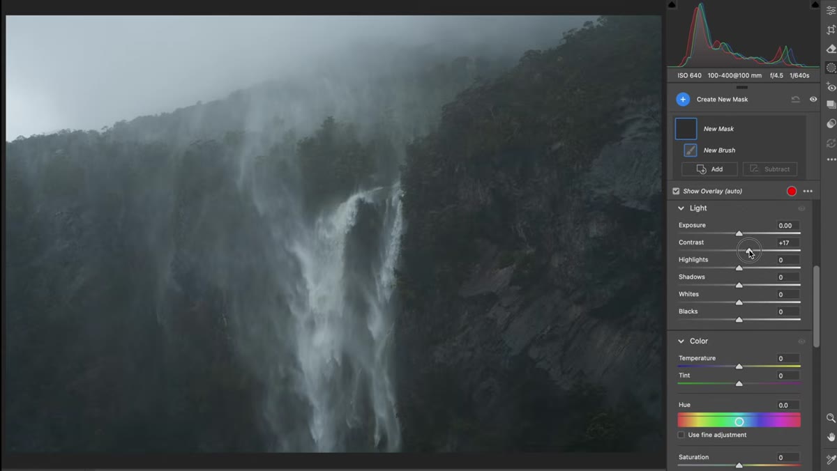
Now comes the core of his workflow. Open the Masking panel and select the Brush tool. William sets feather, flow, and density all to 100. That sounds counterintuitive if you’re used to softer, lower-flow brushes, but his reasoning is practical: he wants to see exactly what the brush is doing in real time, and then evaluate whether the result works before refining it.
Brush mask being painted over the dark foreground corner
Now comes the core of his workflow. Open the Masking panel and select the Brush tool. William sets feather, flow, and density all to 100. That sounds counterintuitive if you’re used to softer, lower-flow brushes, but his reasoning is practical: he wants to see exactly what the brush is doing in real time, and then evaluate whether the result works before refining it.
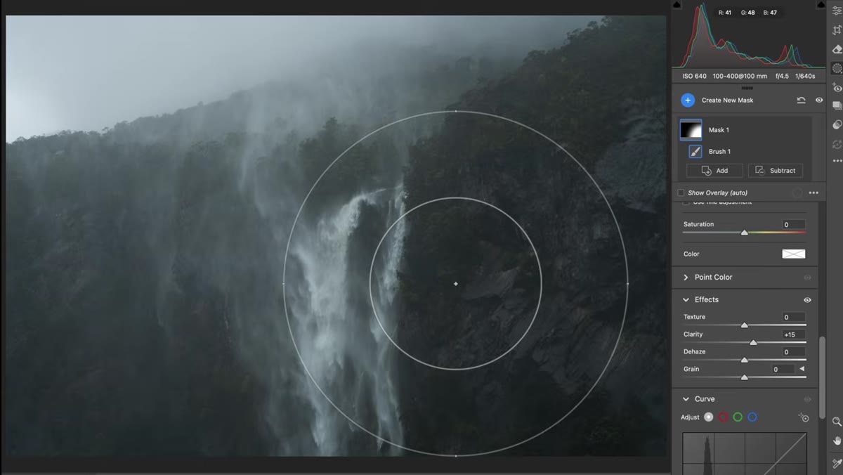
He paints a mask over the bottom right corner of the frame, the darker foreground area, and then adjusts contrast (not exposure) inside that mask. This is a key distinction. Dropping exposure in the foreground would flatten the light hitting the granite and kill the texture. Increasing local contrast instead deepens the shadows while preserving the highlights on the rock. He also adds a small amount of texture or clarity (around 15 points) to emphasize the grain of the stone. The foreground now has weight.
Step 5: Build an Opposite Brush Mask for the Background Light
 Second brush mask painted into the upper left to brighten light
With a new brush mask (press K to start fresh), William does the inverse on the upper left of the frame. This is where existing light is already entering the scene, and his goal is to amplify that feeling rather than invent something artificial. He increases exposure slightly on this mask and brings contrast down, which opens the area up and creates a sense of soft, incoming light.
Second brush mask painted into the upper left to brighten light
With a new brush mask (press K to start fresh), William does the inverse on the upper left of the frame. This is where existing light is already entering the scene, and his goal is to amplify that feeling rather than invent something artificial. He increases exposure slightly on this mask and brings contrast down, which opens the area up and creates a sense of soft, incoming light.
Together, steps 4 and 5 work as a pair. You’re darkening the near, brightening the far, and letting the viewer’s eye travel naturally from one to the other. It’s the same principle painters use when directing attention through a landscape composition.
Step 6: Save the Draft and Let It Breathe
 Multiple unprocessed RAW files shown in Bridge panel
William mentions something I think gets undervalued in most editing tutorials: he doesn’t necessarily finish these edits in one session. He saves the file to a drafts folder and lets it sit. Coming back to an image after a few hours or a few days completely resets your perception of it. What felt right in the moment might look overdone later. What you thought was flat might actually have a quiet quality worth preserving.
Multiple unprocessed RAW files shown in Bridge panel
William mentions something I think gets undervalued in most editing tutorials: he doesn’t necessarily finish these edits in one session. He saves the file to a drafts folder and lets it sit. Coming back to an image after a few hours or a few days completely resets your perception of it. What felt right in the moment might look overdone later. What you thought was flat might actually have a quiet quality worth preserving.
This isn’t a software step, it’s a workflow habit. And it’s one of the most useful things I’ve borrowed from photographers I admire.
A Note on Applying This to Your Own Work
What I’d add from my own experience: this brush masking approach is especially powerful when shooting in overcast or diffused light conditions, the kind of flat days that seem unpromising in the field. Overcast light gives you an even base to work with, and the local masking technique William demonstrates is how you introduce the dimension that the weather didn’t provide. I’ve done this with forest shots, coastal cliffs, and yes, waterfalls. The same depth logic applies every time: near is dark, far is light, and the transition between them is where the image lives.
If you’re working in Lightroom rather than Camera Raw, every single step here translates directly. The masking panel, brush tool, and adjustment sliders all behave identically. The only difference is the interface skin.
The single most important thing I took from this tutorial is this: stop reaching for global contrast when what you actually need is local depth. Global sliders affect everything at once and almost never solve a compositional problem. A brush mask, applied with intention, lets you work the way painters do, placing light and shadow exactly where the scene calls for it.
Watch the full tutorial on YouTube to see William walk through multiple files and watch his brush work in real time. Seeing the mask overlay as he paints makes the technique click in a way that screenshots can only partially capture.
Comments
Leave a Comment