Every Sunday morning I do a photo walk around Seattle. No agenda, just me, my camera, and a playlist I’ve been building since 2019 called “slow light, slow feet.” And for a long time, I’d come home with shots that were technically fine, sharp, well-exposed, but somehow flat. Like I’d showed up to a conversation and said nothing interesting.
The problem wasn’t my gear or my light-chasing. It was how I was placing things inside the frame. I was centering subjects out of habit, not intention. I’d heard “rule of thirds” a thousand times and thought I understood it. Turns out I was applying it mechanically, without understanding the why behind it.
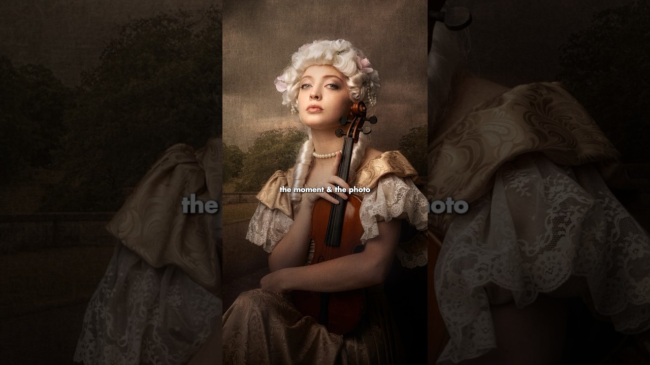
That’s what made this short tutorial from Joel Grimes land so hard.
Why Centered Subjects Make Images Feel Static
In this Joel Grimes tutorial, he gets right to the point: placing your subject dead center creates visual tension in the wrong direction. The eye lands, has nowhere to go, and the image just sits there. It doesn’t breathe.
Grimes talks about how the human eye naturally wants to travel through a frame, and your job as a photographer is to choreograph that journey. When your subject is anchored to the middle, you’ve essentially blocked the path. The viewer’s gaze parks itself and exits. Nothing is discovered.
This clicked for me immediately because I realized I’d been thinking about composition as placement, where does this thing go? Rather than thinking about it as movement, where does the eye go after it lands?
How the Rule of Thirds Actually Works in Practice
The fix Grimes outlines is built around the rule of thirds, but with a clarity that most tutorials skip over. Here’s the breakdown:
Mentally divide your frame into a 3x3 grid. You’ve got two vertical lines and two horizontal lines, and four intersection points where they cross. Those intersections are your power zones. They’re called “crash points” or sometimes “phi points,” and placing your subject on or near one of them gives the frame asymmetry, which gives it energy.
Most cameras and phones let you turn this grid on in your display settings, so you’re not guessing. Turn it on. Keep it on until placing subjects off-center becomes muscle memory.
Grimes emphasizes that it’s not about hitting the intersection precisely every single time. It’s about deliberately pulling your subject away from center and toward one of those four zones. That pull creates what he describes as visual weight on one side, which then makes the empty space on the other side feel intentional, not accidental.
That empty space now has a function. It gives your subject room to exist in, something to look into, something to move toward. The image starts to tell a story about direction and possibility rather than just documenting that a thing exists.
Giving Your Subject Space to “Look Into”
One of the most practical points Grimes makes is about eyeline and lead room. If your subject is a person, an animal, or anything with a clear facing direction, you want the bulk of your empty space in front of them, not behind them.
So if someone is positioned on the left third of the frame and facing right, the right two-thirds of the frame is open. That open space creates a feeling of anticipation. The viewer’s eye follows the subject’s gaze into the frame and wonders what’s there. It creates narrative tension without a single word.
If you flip it and put the subject on the right third facing left, suddenly they’re “leaving” the frame. That can work as a deliberate mood choice, something wistful or unresolved, but it needs to be intentional. As a default, lead room in front of your subject is the safer starting point for beginners.
Where I’d Push This Further (Or Apply It Differently)
I want to add one thing Grimes doesn’t go into here, and it’s something I’ve tested on travel shoots where the environment is as important as the subject.
When you’re shooting landscape-forward images with a person for scale, the rule of thirds works a little differently. I’ll often place the horizon on a third rather than the subject. Subject goes small, near an intersection, but the scene does the storytelling. The human becomes a reference point, not the focal point.
The tension in that case isn’t built around lead room. It’s built around scale contrast, small human, massive world. The asymmetry comes from putting more sky or more foreground, not from where the person stands in the horizontal plane.
Grimes’ framework still applies. You’re still making deliberate choices about where visual weight lives. But you’re applying it to the scene rather than the subject. Worth experimenting with on your next landscape shoot.
The One Thing to Take Into Your Next Shoot
Composition isn’t about following a rule. It’s about guiding a moving eye through a still frame, and every placement decision either helps or hurts that journey. Start by getting your subjects off center, give them space to exist in, and watch how much life comes back into images you might have otherwise dismissed.
Watch the full Joel Grimes video for the visual side of this. Seeing it demonstrated in real frames makes the concept stick in a way that written description can only partially do.
Comments (1)
This saved me so much time on my last edit. Wish I'd found this sooner.
Leave a Comment