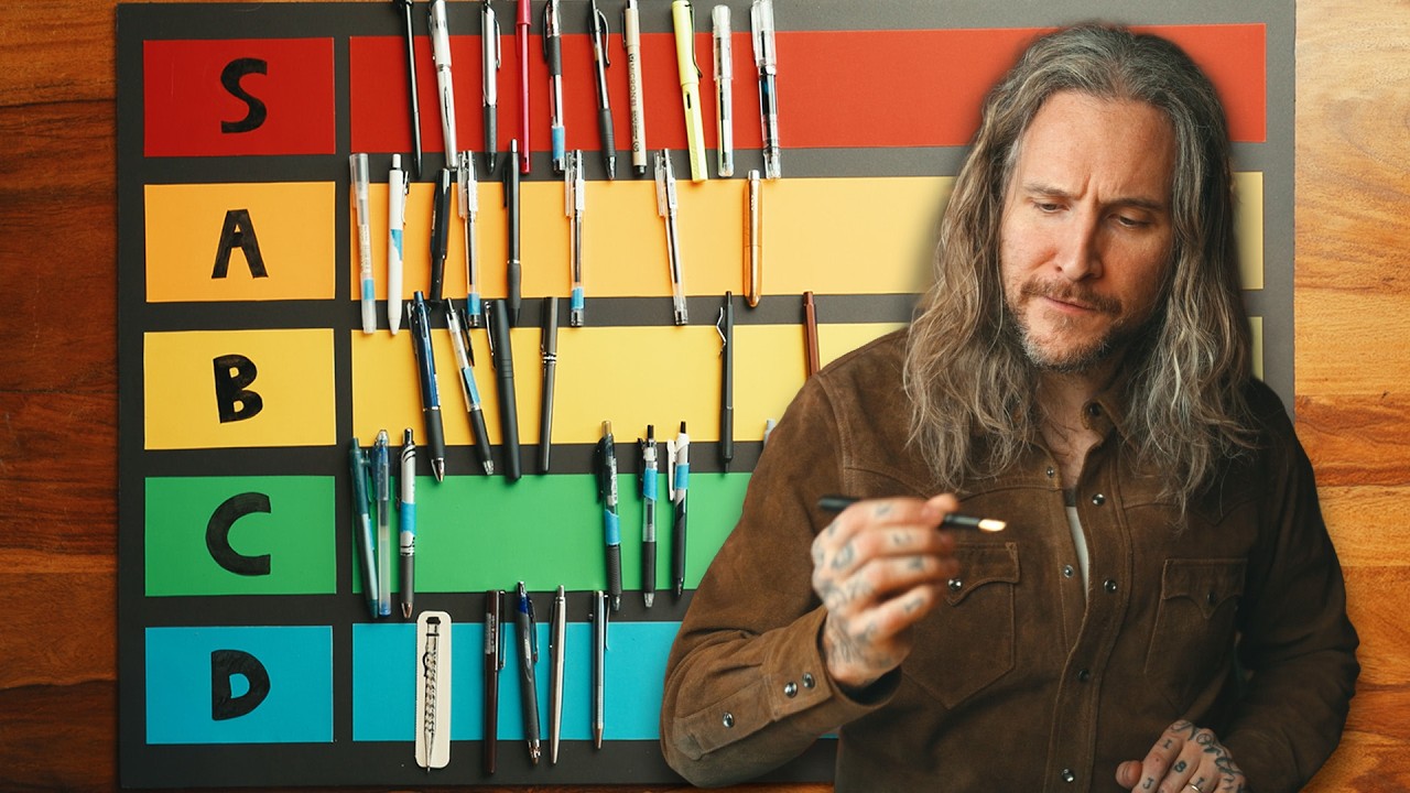
There’s a running joke among the photographers I know that we have strong opinions about everything except the things that don’t directly involve a camera. Lens cloths, card wallets, notebook brands - all of it gets obsessed over. So when I stumbled onto a Peter McKinnon video where he ranked over 30 of the world’s most popular pens, sent in by his audience, I fully expected to watch five minutes and move on. I watched the whole thing twice.
Here’s why it matters beyond pen enthusiasm: the tools you use to plan a shoot, sketch a lighting diagram, or jot down a client’s shot list genuinely affect how you work. A pen that skips, bleeds through your notebook, or is too thick for tight handwriting slows you down in ways that add up. And if you journal, which I do every Sunday morning before my photo walks, the pen in your hand shapes how freely ideas come out. This was Watch the full tutorial on YouTube a surprisingly useful 30 minutes.
What follows is a breakdown of Peter’s ranking process, the pens that landed at the top, and a few takeaways that will actually help you choose.
Step 1: Understand the Ranking System Before You Buy
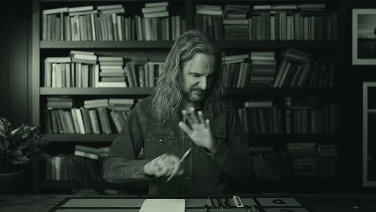 Tier labels S through D displayed on screen
Peter uses a tiered ranking system running from S (the best) down through A, B, C, and D. S-tier is reserved for pens that genuinely surprised him. D-tier is where things go wrong fast. This framing is worth borrowing when you evaluate any tool: define your best-case and worst-case scenarios before you start, so you’re not inflating mediocre results just because nothing catastrophic happened.
His criteria include how the pen feels in hand, how smooth the ink flow is, the line weight and consistency, and the overall writing experience. He’s not testing archival ink quality or bleed-through on specific paper stocks. He’s asking a simpler, more honest question: does this feel good to write with?
Step 2: Expect the Wild Cards First
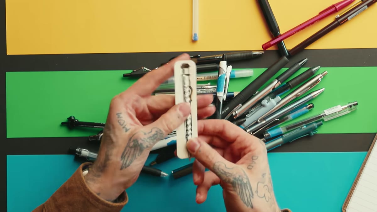 Unusual novelty pen pulled from packaging
Peter’s process involves pulling pens at random, which means surprises come early. The first one out of the pile is essentially a novelty item - something that barely qualifies as a writing instrument. It goes straight to D-tier and sets a useful floor. Knowing what the bottom looks like makes every subsequent pen easier to evaluate.
The lesson here isn’t about that specific pen. It’s about calibration. When you’re testing gear, whether cameras, lenses, or yes, pens, start with something you know is underwhelming. It recalibrates your expectations and keeps you from grading on too generous a curve later.
Step 3: Don’t Sleep on Pens That Look Boring
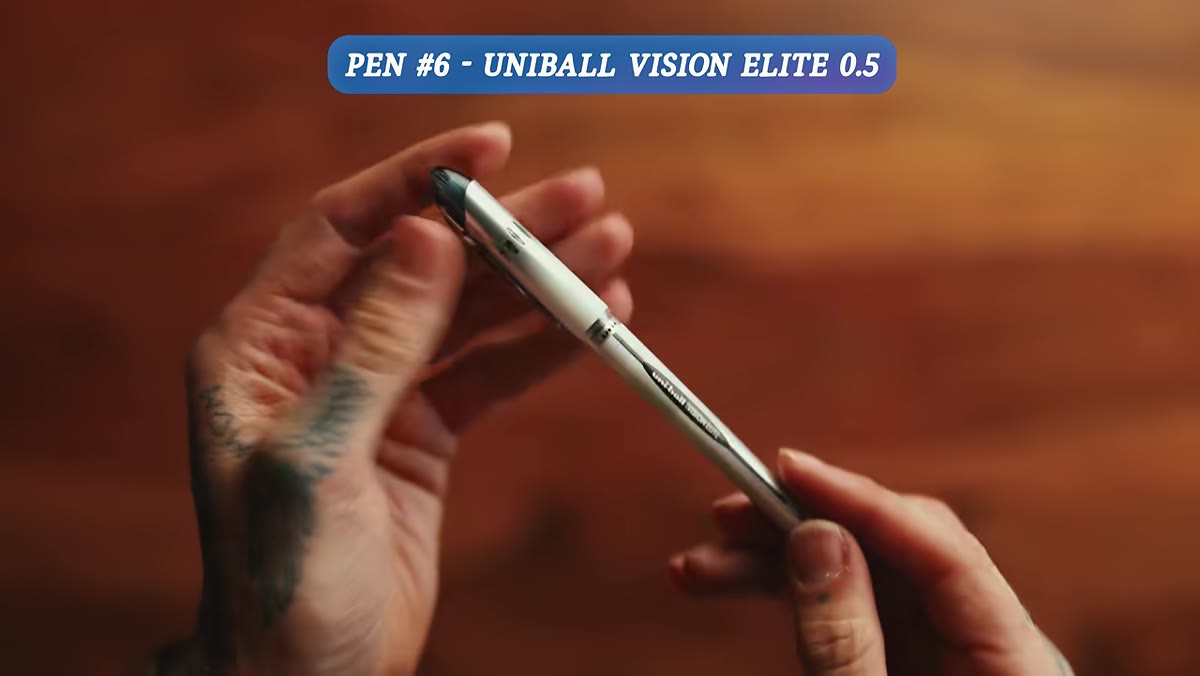 Uni-ball Vision Elite cap removed, pen ready to write
The Uni-ball Vision Elite is the clearest example of this principle. Peter pulls it out and immediately notes that it looks like it was left behind in an office next to an old fax machine. The design is dated, the body is thick, and it has zero visual charisma. Then he writes with it and completely reverses course. The ink is thick, smooth, and delivers a line that looks genuinely impressive on paper. It earns S-tier despite appearances.
This happens in photography gear too. The lens that looks clunky in your bag sometimes produces the sharpest files. The camera body that feels plasticky sometimes meters better than the premium option. Performance and aesthetics don’t always travel together, and Peter’s reaction here is a good reminder to actually test things before writing them off.
Step 4: Thin Nibs Usually Win for Precision Work
 Uni-ball Signo 0.5 nib close-up during writing test
A theme runs through Peter’s S-tier selections: thinner is usually better. He consistently favors 0.38mm and 0.5mm tips over broader ballpoints. His reasoning is about elegance and control. A finer line gives you more information on the page without crowding it. For photographers who sketch compositions or annotate contact sheets, this matters.
The Muji 0.38mm earns high praise specifically because of how precisely it moves across the page. Peter describes it almost cutting through the paper, which is his way of saying the line is clean and decisive. If you’re shopping for a daily writer and you’ve never tried 0.38mm, it’s worth the experiment. Most people find it immediately preferable once they try it, especially for small or tight handwriting.
Step 5: Factor in the Fidget and Feel
 Hand holding pen, assessing grip and weight
Peter pays real attention to how pens feel in the hand before ink ever hits paper. Grip texture, barrel diameter, and the ease of clicking or uncapping all factor into his ratings. The Uni-ball Signo 0.5, for example, has decent ink but loses points for being slippery with no real grip surface. It keeps sliding around, which is a legitimate problem when you’re writing for more than a few minutes.
This is the ergonomics question, and it’s worth taking seriously. A pen you hold for an hour during a planning session needs to feel stable. Grip fatigue is real. When Peter docks a pen for feel, he’s not being fussy - he’s describing something that will actually frustrate you on a long writing day.
Step 6: The Cat Pen Is Not a Joke
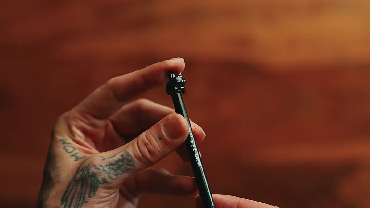 Cat-shaped pen with tail clicker demonstrated
This one deserves its own step because Peter’s reaction is instant and unqualified. A cat-shaped pen, with a tail you press to click, goes directly to S-tier before he even finishes the sentence. The ink tip is needle-fine, the line is excellent, and the novelty of pressing a cat’s tail to deploy the nib apparently never stops being satisfying.
The practical note here is that the pen is a 0.5mm needle-tip style, which writes beautifully. The design is a bonus. But the real takeaway is that joy in your tools is not a small thing. If you pick up your pen and smile, you’re more likely to actually use it, write more, plan better, and show up to your creative work with a better attitude. Don’t overthink that.
What I’d Add From My Own Experience
I’ve been using the Muji 0.38mm for about three years, so hearing Peter land it in the A-tier felt like confirmation of something I already knew. But I’d push back slightly on one thing: ink color matters more than the ranking process captured. I keep two pens in my Sunday photo walk kit - one black, one a warm gray - because I annotate prints differently depending on what I’m noting. A pen ranking that only tests black ink is still useful, but add a color test before you commit to anything you plan to use in a visual workflow.
If you annotate contact sheets, sketch lighting setups, or keep a creative journal alongside your photography practice, the difference between a pen that inspires you to write and one you just tolerate is worth taking seriously. The right pen doesn’t make you a better photographer. But it removes one more small friction from the process of becoming one.
The single most important thing Peter’s video demonstrates is that you can’t judge a pen by how it looks on a shelf. Write with it. That’s the whole test. Watch the full tutorial on YouTube to see all 30+ pens ranked in real time, including several fountain pens that might change how you feel about writing entirely.
Comments
Leave a Comment