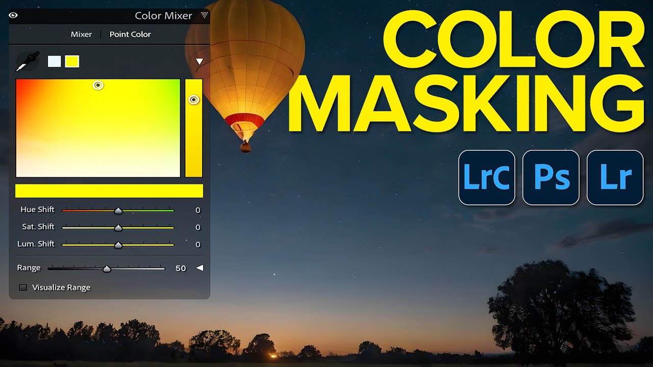
If you’ve ever cranked up the blue saturation in Lightroom and then wondered why your subject’s jacket also turned into a smurfy mess, you already understand the problem this technique solves. Global color edits are a blunt instrument. They work on everything at once, which sounds efficient until you realize “everything” includes all the parts you didn’t want to touch. I’ve been there on more Sunday morning photo walks than I care to admit, fighting with a slider that’s doing way too much.
In this Matt Kloskowski tutorial, Watch the full tutorial on YouTube, Matt lays out a clear progression for how to approach color editing with increasing precision. The core idea is simple but genuinely changes how you work: before you touch a color control, you need to think about how targeted your edit actually needs to be. The tools exist to go deep. Most of us just don’t use them in the right order.
Everything demonstrated here is in Lightroom Classic, but Matt makes a point worth repeating: Lightroom Classic, Lightroom, and Adobe Camera Raw all share the same controls. If you work in any of those Adobe raw editors, this workflow applies to you directly.
Step 1: Understand What “Global” Actually Means
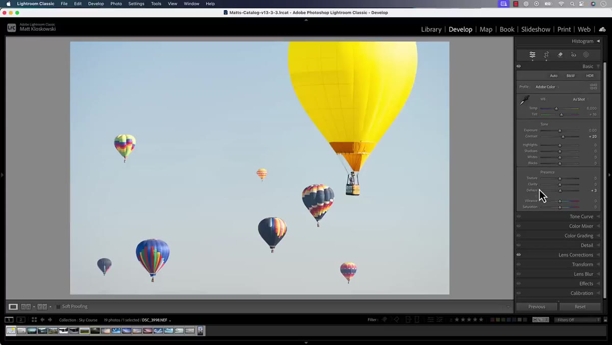 Vibrance and Saturation sliders in the main Edit panel
The main Edit panel in Lightroom gives you Vibrance and Saturation as your first color options. These sliders affect every single color in your image simultaneously. There’s no targeting happening here at all. Matt describes these as a starting point, not a destination. If your image needs a broad lift in color intensity and you’re not worried about specific hues, these sliders do the job. But if you care about which colors change, you need to keep moving down the panel.
Vibrance and Saturation sliders in the main Edit panel
The main Edit panel in Lightroom gives you Vibrance and Saturation as your first color options. These sliders affect every single color in your image simultaneously. There’s no targeting happening here at all. Matt describes these as a starting point, not a destination. If your image needs a broad lift in color intensity and you’re not worried about specific hues, these sliders do the job. But if you care about which colors change, you need to keep moving down the panel.
Think of global saturation like turning up the volume on every instrument in a band at once. Sometimes that’s what you want. More often, you just want the guitar louder.
Step 2: Move Into Color Mixer for Hue-Specific Control
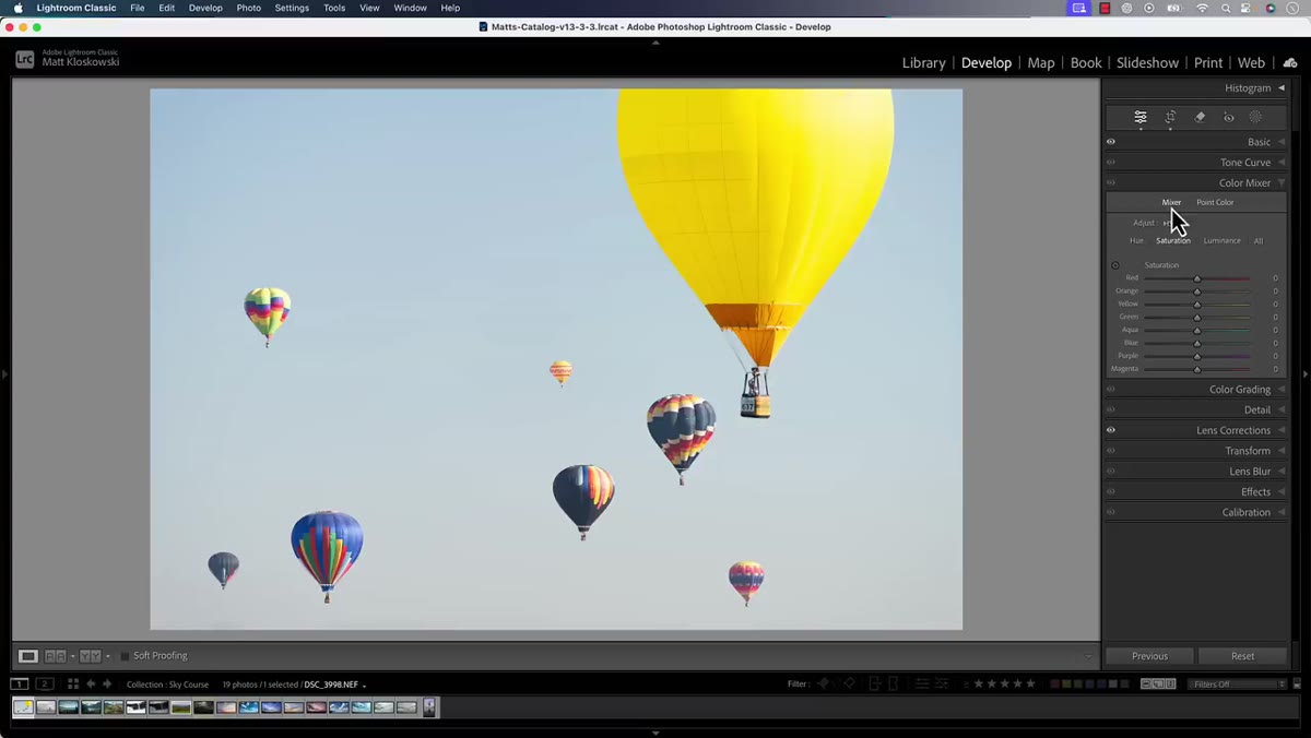 Color Mixer panel open showing Hue, Saturation, Luminance tabs
The Color Mixer panel (labeled HSL in some versions) lets you work on individual color ranges: reds, oranges, yellows, greens, aquas, blues, purples, and magentas. Each color has its own Hue, Saturation, and Luminance sliders. This is already a significant improvement over the global sliders because you’re now choosing which color family to affect.
Color Mixer panel open showing Hue, Saturation, Luminance tabs
The Color Mixer panel (labeled HSL in some versions) lets you work on individual color ranges: reds, oranges, yellows, greens, aquas, blues, purples, and magentas. Each color has its own Hue, Saturation, and Luminance sliders. This is already a significant improvement over the global sliders because you’re now choosing which color family to affect.
For example, if you want a richer, deeper sky, you’d go to Blues and pull up the Saturation slider there. Only the blue tones in the image get the boost. The problem Matt flags here is that “blue” in Lightroom is still a fairly wide definition. Your blue sky, a blue car in the background, and a blue tint on someone’s shirt might all respond to that slider together. It’s targeted by color family, but it’s still applied across the whole image with no spatial awareness.
Step 3: Switch to Point Color for Tighter Selection
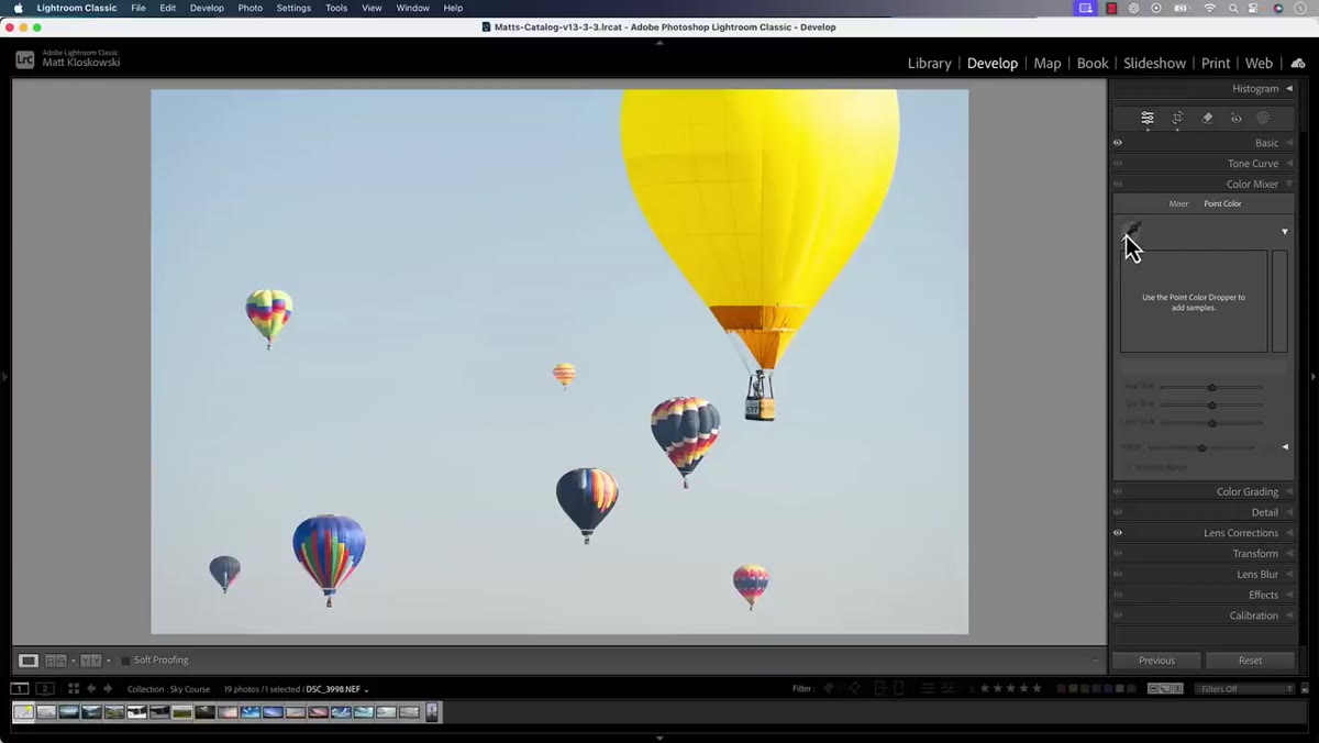 Point Color panel open with eyedropper tool active
Point Color is where things get genuinely interesting. This panel gives you an eyedropper tool that lets you click directly on a specific color in your photo rather than choosing a broad color category from a list. That distinction matters more than it sounds.
Point Color panel open with eyedropper tool active
Point Color is where things get genuinely interesting. This panel gives you an eyedropper tool that lets you click directly on a specific color in your photo rather than choosing a broad color category from a list. That distinction matters more than it sounds.
When you click a color with the eyedropper, Lightroom samples the actual hue at that point and builds a selection around it. You then adjust Hue, Saturation, and Luminance for that sampled color specifically. Matt demonstrates this by clicking on a hot air balloon in his test image and boosting its saturation. The result affects that specific shade of blue rather than the full blue spectrum. You’ll still see some spread into similar hues nearby, but it’s noticeably more contained than the mixer approach.
Step 4: Use the Range Sliders to Refine the Selection Further
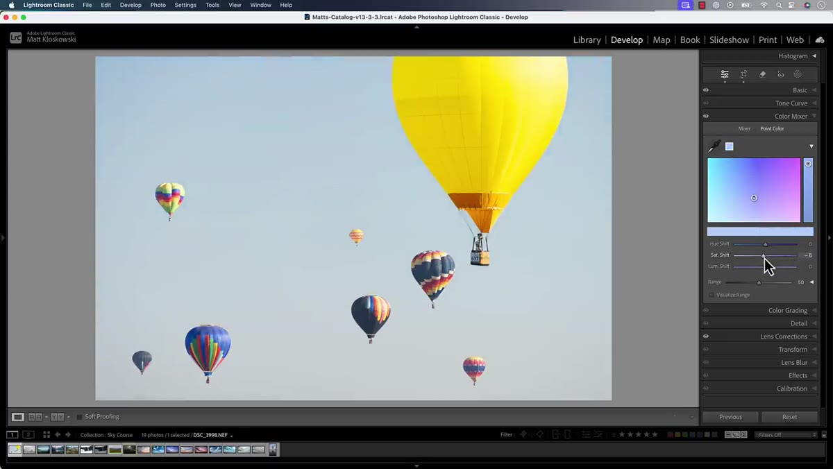 Point Color selection showing narrowed range on the color wheel
Once you’ve made a Point Color selection, you’re not locked into that initial sample. The panel gives you visual controls to expand or narrow the range of hues captured by your selection. Think of it as adjusting the sensitivity of the eyedropper after the fact.
Point Color selection showing narrowed range on the color wheel
Once you’ve made a Point Color selection, you’re not locked into that initial sample. The panel gives you visual controls to expand or narrow the range of hues captured by your selection. Think of it as adjusting the sensitivity of the eyedropper after the fact.
If your initial click grabbed colors that are bleeding into areas you didn’t intend to touch, tighten the range. If the effect looks patchy because it’s missing similar shades nearby, widen it. This refinement step is what separates a careful edit from one that just looks close. Spend time here. It’s the difference between a color that looks naturally rich and one that looks like it was selected with a highlighter.
Step 5: Compare the Results Side by Side
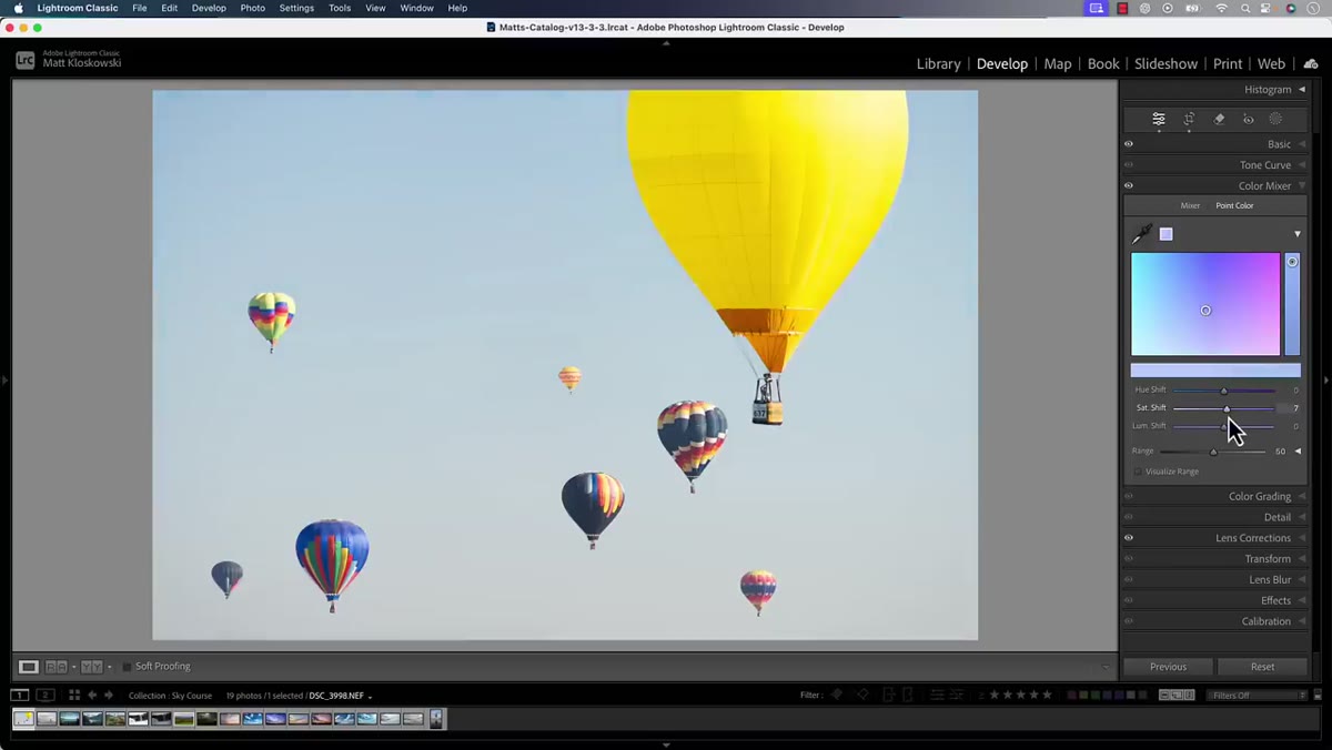 Before and after view showing Color Mixer vs Point Color results
Matt’s key teaching moment comes from putting the Color Mixer result next to the Point Color result and looking at which parts of the image are being affected. The Color Mixer version saturates a wider swath of the sky. The Point Color version keeps the effect more contained around the color you actually sampled.
Before and after view showing Color Mixer vs Point Color results
Matt’s key teaching moment comes from putting the Color Mixer result next to the Point Color result and looking at which parts of the image are being affected. The Color Mixer version saturates a wider swath of the sky. The Point Color version keeps the effect more contained around the color you actually sampled.
This comparison step is worth building into your own habit. Lightroom’s before/after view (backslash key in Lightroom Classic) makes it easy to flip back and see what changed. Don’t skip this. It keeps you honest about whether your edit is actually doing what you think it’s doing, or whether it’s silently messing with parts of the frame you weren’t watching.
A Note From My Own Editing Table
The first time I went through this progression methodically, I realized I’d been reaching for Color Mixer as though it were a precision tool when it’s really more of a medium-width brush. Point Color is where I should have been living for most of my travel work, especially any shot with a complex sky and a mix of blues that I want to treat differently.
One thing Matt doesn’t dig into here, but that I’ve found useful: Point Color becomes even more powerful when you combine it with masking. If you create a luminance or object mask first and then apply a Point Color adjustment inside that mask, you can control not just which color changes but where in the frame it changes. That combo is especially handy for images where the sky and a body of water share nearly the same blue but you want them to feel distinct. It’s a bit more work, but on the photos that matter, it’s absolutely worth it.
The single biggest shift this tutorial pushed me toward is treating color editing as a targeting problem before it’s a slider problem. Pick the right tool for the level of precision you need, and start with the most targeted option rather than defaulting to the global one.
Watch the full tutorial on YouTube to see Matt walk through each comparison with his actual photo. Watching the before/after on screen makes the difference between these tools much more concrete than any still screenshot can show.
Comments
Leave a Comment