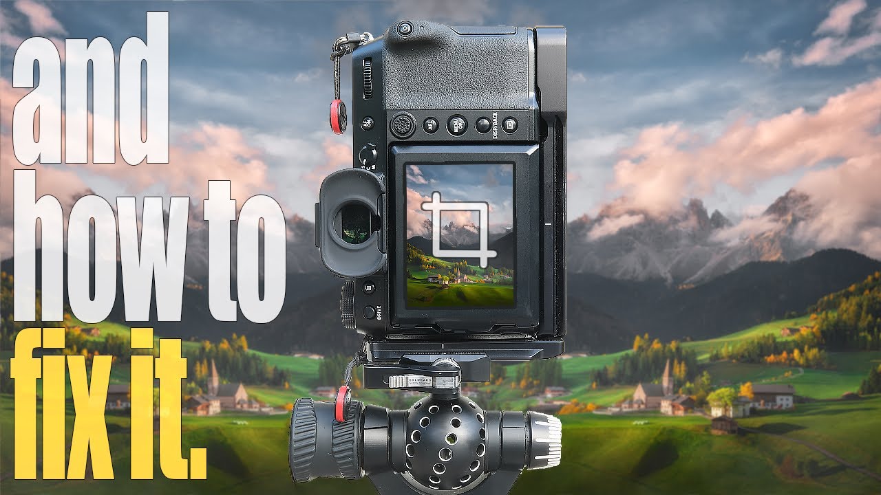
Every Sunday morning I take a photo walk. No agenda, no client, just me and whatever camera I feel like grabbing. And for years, I’d come home with shots I liked but couldn’t quite love. The framing felt loose. The subject was there, but so was a lot of other stuff, and all that extra stuff was quietly killing the image. I’d stare at the photo trying to figure out what was off, and honestly, I’d usually just move on.
It wasn’t until I started studying cropping intentionally that I realized the problem wasn’t my eye in the field. It was that I wasn’t finishing the job in post. Watch the full tutorial on YouTube by landscape photographer Mark Denney, who walks through this concept using real photos submitted by his community. What he lays out is a clean, repeatable framework that I’ve since folded into my own editing routine, and it changed the way I look at a histogram almost as much as it changed the way I look at a crop box.
The core idea is simple but easy to overlook: every photo has a fixed amount of visual real estate, and anything that doesn’t earn its spot in that space is working against you. Here’s how to apply that thinking one step at a time.
Step 1: Look at the Photo as a Collection of Zones
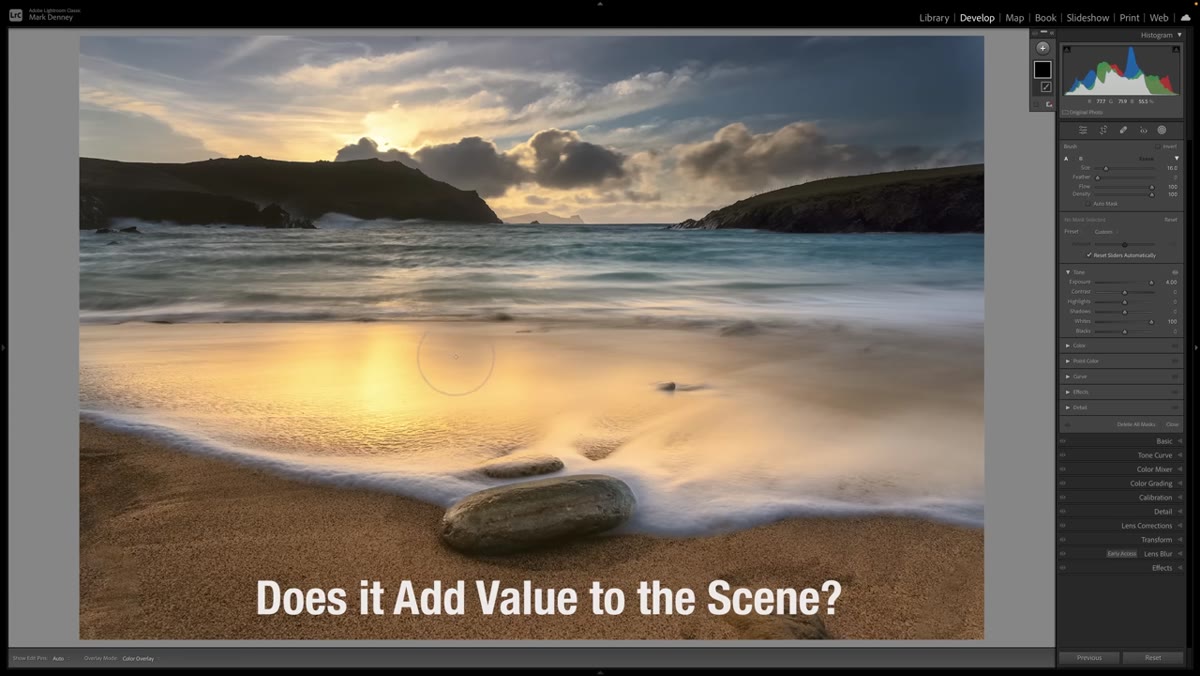 Photographer examining different regions of a landscape photo
Before you touch the crop tool, look at your image in sections. Mentally divide it into zones, left side, right side, foreground, background, and ask yourself which zones are doing something useful. You’re not trying to decide yet what to cut. You’re just taking inventory. This sounds almost too simple, but most people skip it and go straight to dragging the crop handles around based on gut feeling. Gut feeling is useful later. Right now, you need a clear read on what’s actually in the frame.
Photographer examining different regions of a landscape photo
Before you touch the crop tool, look at your image in sections. Mentally divide it into zones, left side, right side, foreground, background, and ask yourself which zones are doing something useful. You’re not trying to decide yet what to cut. You’re just taking inventory. This sounds almost too simple, but most people skip it and go straight to dragging the crop handles around based on gut feeling. Gut feeling is useful later. Right now, you need a clear read on what’s actually in the frame.
Step 2: Ask Question One - Does This Area Add Value?
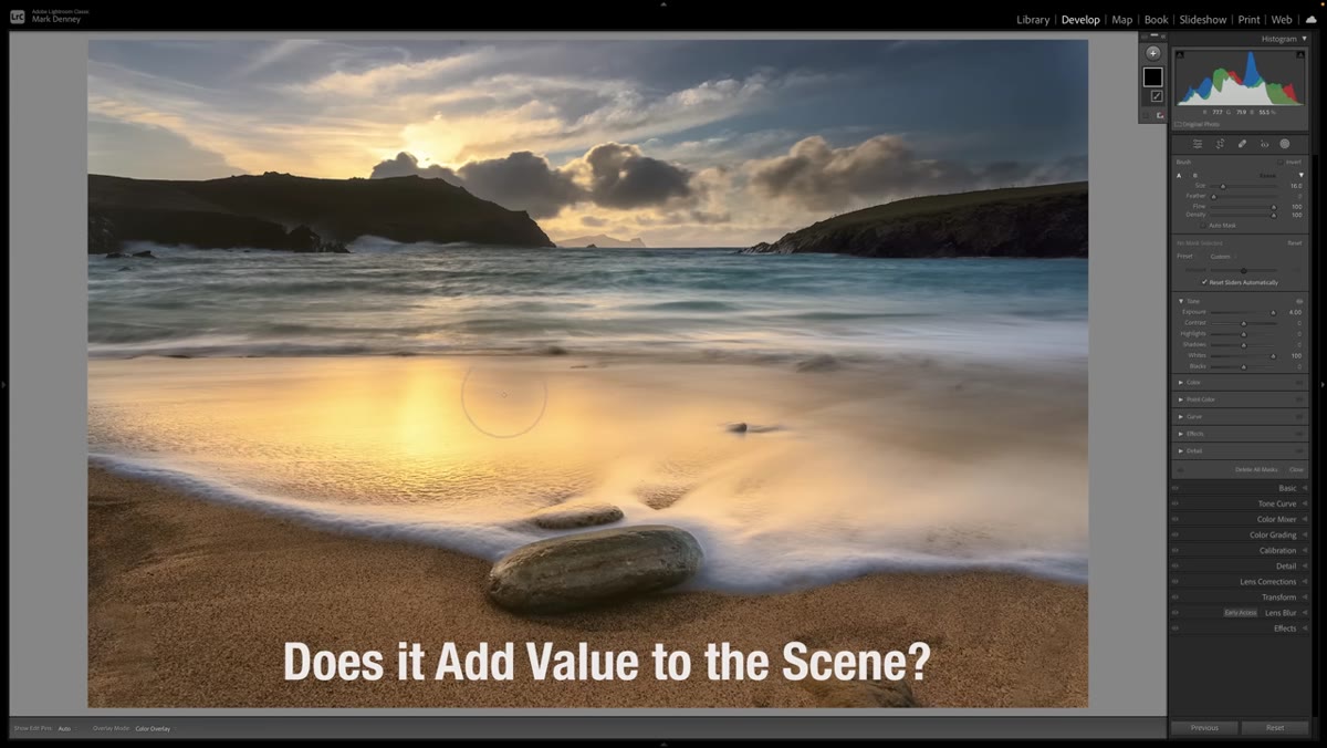 Side-by-side view highlighting strong versus weak areas of the scene
For each zone you identified, ask directly: does this add value to the scene? In Mark’s example, the sky, the light, and the clouds clearly earn their place. But the far left and far right edges of the frame? They’re just sort of there. They don’t contribute mood, they don’t support the subject, and they don’t add visual information the viewer needs. Value in this context doesn’t mean pretty. It means purposeful. A plain gray sky might be exactly right if it gives a lone subject room to breathe. A busy cluster of rocks might add value or kill the image depending on whether they support the composition. You’re making a judgment call, not following a rule.
Side-by-side view highlighting strong versus weak areas of the scene
For each zone you identified, ask directly: does this add value to the scene? In Mark’s example, the sky, the light, and the clouds clearly earn their place. But the far left and far right edges of the frame? They’re just sort of there. They don’t contribute mood, they don’t support the subject, and they don’t add visual information the viewer needs. Value in this context doesn’t mean pretty. It means purposeful. A plain gray sky might be exactly right if it gives a lone subject room to breathe. A busy cluster of rocks might add value or kill the image depending on whether they support the composition. You’re making a judgment call, not following a rule.
Step 3: Ask Question Two - Do You Want the Viewer’s Eye to Go There?
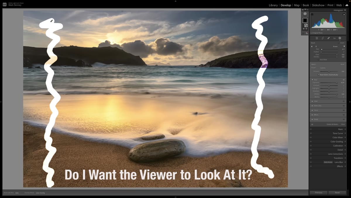 Arrow or eye-path illustration showing viewer attention pulled to image edges
This is the question that catches the most problems. Anything sitting near the edge of your frame has a natural pull on the viewer’s eye. Edges are exits. If you have a distracting element close to the edge, especially something partially cut off or oddly placed, it will drag attention away from your actual subject every single time. In Mark’s example, there’s a partial element on one edge that creates exactly this problem. Your eye keeps drifting toward it instead of staying with the scene. When you find these edge magnets, the fix is almost always a tighter crop, not a content-aware fill.
Arrow or eye-path illustration showing viewer attention pulled to image edges
This is the question that catches the most problems. Anything sitting near the edge of your frame has a natural pull on the viewer’s eye. Edges are exits. If you have a distracting element close to the edge, especially something partially cut off or oddly placed, it will drag attention away from your actual subject every single time. In Mark’s example, there’s a partial element on one edge that creates exactly this problem. Your eye keeps drifting toward it instead of staying with the scene. When you find these edge magnets, the fix is almost always a tighter crop, not a content-aware fill.
Step 4: Ask Question Three - Does the Photo Flow?
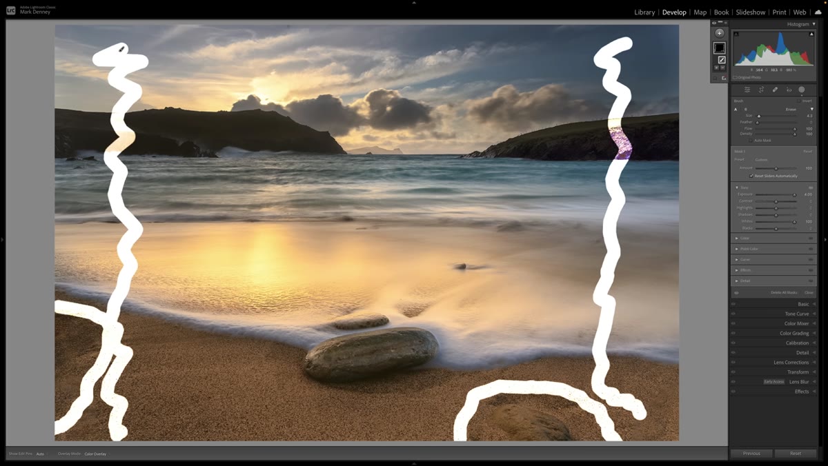 Before crop showing disjointed composition with awkward empty corners
Flow is harder to define than value or attention, but you know when it’s missing. A photo flows when your eye moves through it naturally, landing on the subject, traveling around supporting elements, and never getting stuck or bounced out of the frame. Cluttered edges break flow. So does dead space on one side that has no counterweight on the other. Ask yourself whether the image feels settled or whether it feels like something is pulling it off balance. This question is usually what confirms what the first two questions suggested.
Before crop showing disjointed composition with awkward empty corners
Flow is harder to define than value or attention, but you know when it’s missing. A photo flows when your eye moves through it naturally, landing on the subject, traveling around supporting elements, and never getting stuck or bounced out of the frame. Cluttered edges break flow. So does dead space on one side that has no counterweight on the other. Ask yourself whether the image feels settled or whether it feels like something is pulling it off balance. This question is usually what confirms what the first two questions suggested.
Step 5: Open the Crop Tool and Choose Your Ratio Intentionally
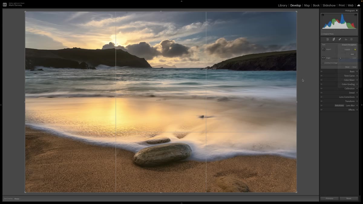 Crop ratio dropdown open in editing software showing 4x5 selected
Once you’ve answered all three questions and you know roughly where the useful parts of the image live, open your crop tool. Mark switches to a 4x5 ratio here, and it’s worth pausing on that choice. Changing your aspect ratio isn’t cheating or a lazy fix. It’s a compositional decision. A taller crop eliminates horizontal dead zones and can give vertical subjects more presence. A wider crop can emphasize sweep and scale. Don’t default to the ratio your camera captured. Ask what shape actually serves this image.
Crop ratio dropdown open in editing software showing 4x5 selected
Once you’ve answered all three questions and you know roughly where the useful parts of the image live, open your crop tool. Mark switches to a 4x5 ratio here, and it’s worth pausing on that choice. Changing your aspect ratio isn’t cheating or a lazy fix. It’s a compositional decision. A taller crop eliminates horizontal dead zones and can give vertical subjects more presence. A wider crop can emphasize sweep and scale. Don’t default to the ratio your camera captured. Ask what shape actually serves this image.
Step 6: Move the Crop Box to Center Your Strongest Elements
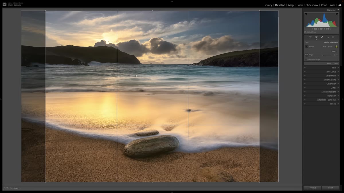 Crop box being repositioned to highlight waterfall and autumn foliage
With the ratio set, slide the crop box around until your strongest visual elements sit in the most powerful positions. In Mark’s case, that means the waterfall and the autumn foliage take center stage, and the distracting edges get removed entirely. You’re not trying to hit a rule-of-thirds grid by default. You’re trying to eliminate the zones that failed your three questions while preserving the ones that passed. Let the content drive where the box lands, then check whether the result follows good compositional logic.
Crop box being repositioned to highlight waterfall and autumn foliage
With the ratio set, slide the crop box around until your strongest visual elements sit in the most powerful positions. In Mark’s case, that means the waterfall and the autumn foliage take center stage, and the distracting edges get removed entirely. You’re not trying to hit a rule-of-thirds grid by default. You’re trying to eliminate the zones that failed your three questions while preserving the ones that passed. Let the content drive where the box lands, then check whether the result follows good compositional logic.
Step 7: Handle Any Remaining Edge Distractions
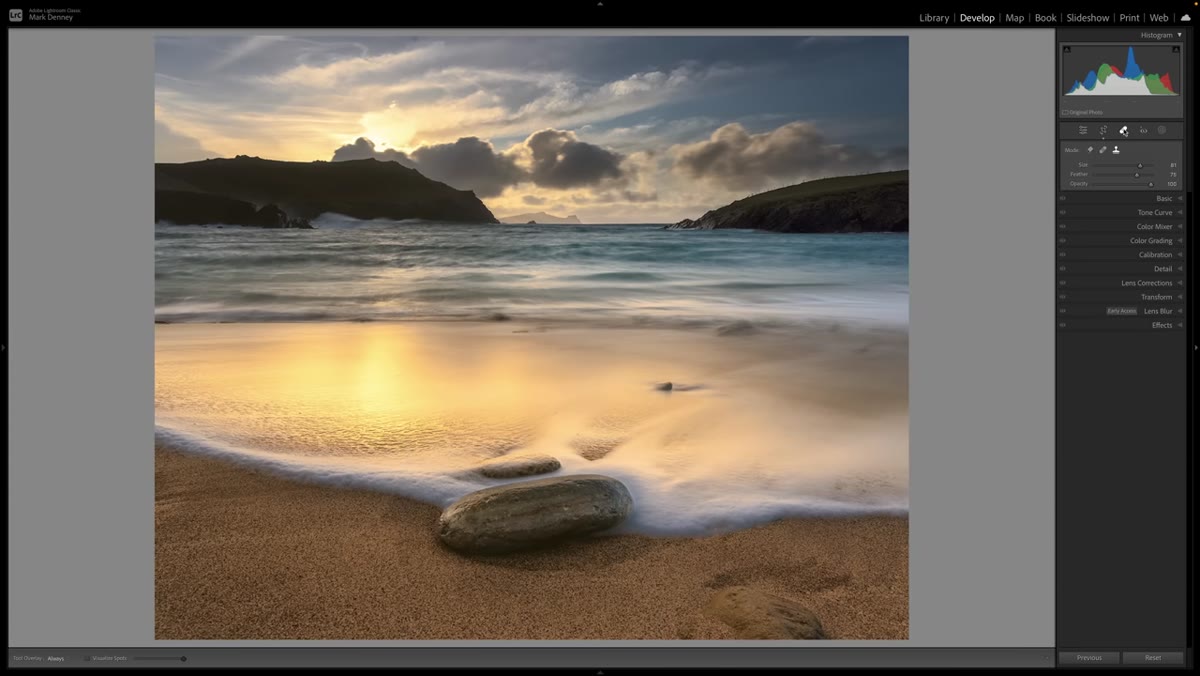 Brush or erase tool removing a small distracting element near the crop edge
Sometimes a crop doesn’t eliminate every problem element. There might still be a small intrusion along one edge that the crop box can’t cleanly cut without removing something you want to keep. Mark uses a quick brush erase here to clean up a small remaining distraction. This doesn’t have to be a perfect clone-stamp job, especially if you’re just evaluating the crop. The point is to see clearly whether the image works without that element before committing to a more polished fix.
Brush or erase tool removing a small distracting element near the crop edge
Sometimes a crop doesn’t eliminate every problem element. There might still be a small intrusion along one edge that the crop box can’t cleanly cut without removing something you want to keep. Mark uses a quick brush erase here to clean up a small remaining distraction. This doesn’t have to be a perfect clone-stamp job, especially if you’re just evaluating the crop. The point is to see clearly whether the image works without that element before committing to a more polished fix.
One Thing I’d Add From My Own Experience
I’ve started doing a “reverse crop” check before I finalize anything. After I apply the crop, I zoom out and look at what I removed. If any of it makes me second-guess my decision, I reset and try again. Sometimes what I thought was dead weight was actually providing context that the cropped version now feels starved of. This is especially common with wide landscape shots where the negative space was doing quiet compositional work. The three questions get you most of the way there, but that last sanity check has saved me from over-cropping more times than I’d like to admit.
The single most important shift this tutorial pushed me toward is treating cropping as a deliberate compositional act rather than a quick trim at the end of an edit. Every pixel you leave in the frame is a choice. Make sure each one is pulling its weight.
Watch the full tutorial on YouTube to see Mark apply this framework to multiple real photos with side-by-side before and after results. It’s one of those videos that will make you immediately want to reopen your last five edits.
Comments (2)
Finally someone explains this in a way that actually makes sense.
Just subscribed. If the rest of your content is this good, I'm in.
Leave a Comment