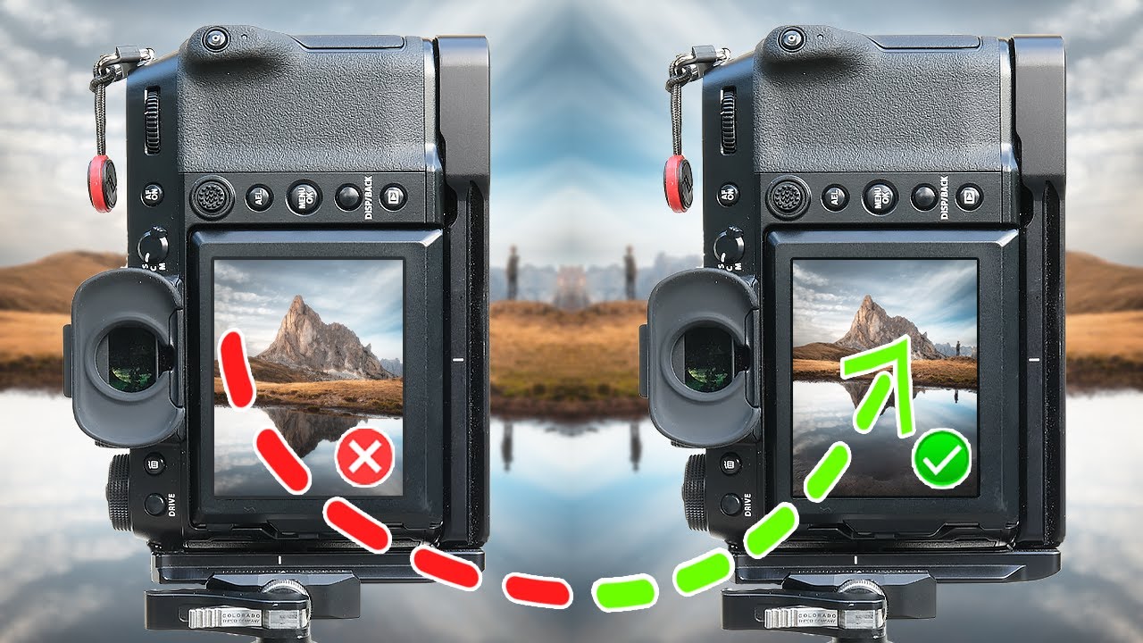
Every Sunday morning I take a photo walk around Seattle, and for the first year of doing it, nearly every single frame I came home with had the horizon sitting on the same horizontal third. Flowers in the lower third. Dramatic sky filling the upper two-thirds. It was compositionally “correct” and deeply, relentlessly boring. I didn’t even notice until I laid a grid over a month’s worth of shots and realized I’d essentially taken the same photograph forty times in different locations.
That’s exactly the problem Mark Denney tackles head-on in his updated beginner mistakes tutorial. He revisited a video he made five years ago that got close to a million views, and rather than just refreshing the thumbnail, he fundamentally rethought his advice based on working with hundreds of photographers since then. The result is sharper, more honest, and more useful than the original. Watch the full tutorial on YouTube - then come back here for the step-by-step breakdown.
What I appreciate most is that Denney doesn’t just tell you what not to do. He walks through real examples from his own archive, uses Lightroom’s crop overlay to make the problem visible, and then lays out a concrete set of alternatives. Here’s how to work through the ideas he presents so you can actually apply them on your next shoot.
Step 1: Audit Your Own Portfolio for Compositional Repetition
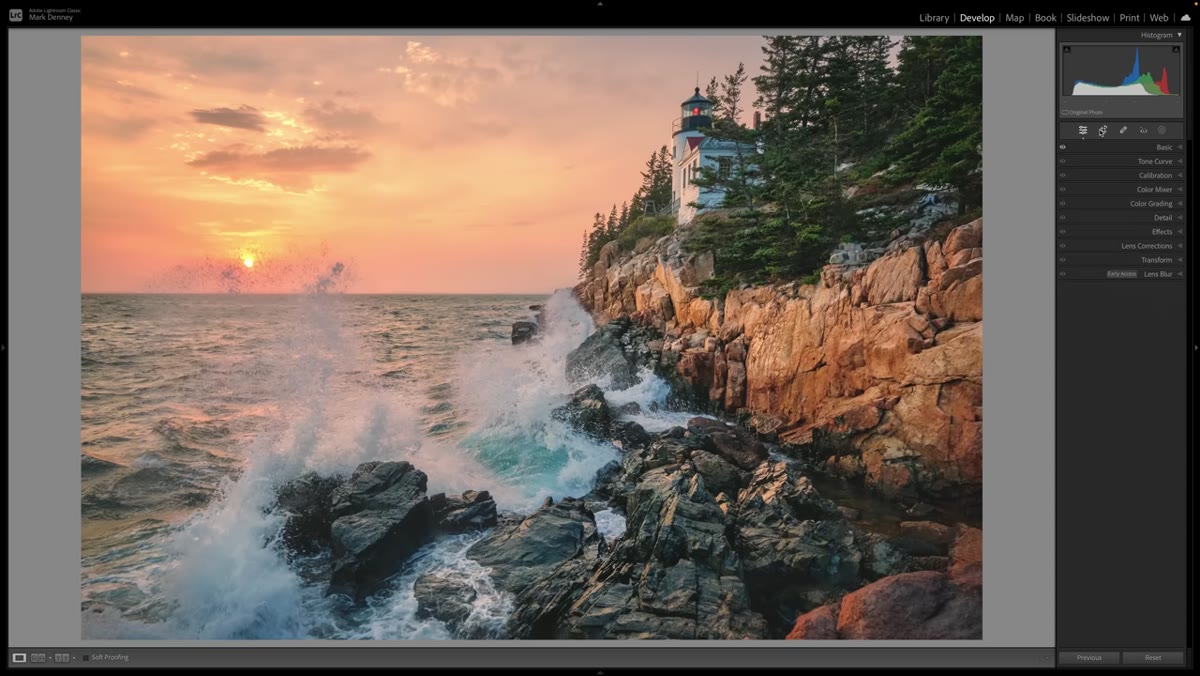 Rule of thirds grid overlaid on multiple landscape images
Before you can break a habit, you have to see it clearly. Open a recent folder of your landscape shots in Lightroom, go into the Develop module, and activate the crop tool. Cycle through the overlay options until you land on the rule of thirds grid (press O to cycle overlays). Now scroll through your images without changing anything - just look at where your key elements land relative to those lines.
Rule of thirds grid overlaid on multiple landscape images
Before you can break a habit, you have to see it clearly. Open a recent folder of your landscape shots in Lightroom, go into the Develop module, and activate the crop tool. Cycle through the overlay options until you land on the rule of thirds grid (press O to cycle overlays). Now scroll through your images without changing anything - just look at where your key elements land relative to those lines.
If your horizon, your primary subject, and your focal point are consistently snapping to the intersections, you’ve identified the pattern. This isn’t about beating yourself up. Denney does this exercise with his own older work in the video and approaches it with genuine humor. The point is that a portfolio where every image is composed identically starts to feel lazy, even when each individual shot is technically solid. You’re essentially showing viewers one idea repeated, not a range of visual thinking.
Step 2: Recognize Why the Rule of Thirds Became a Crutch
 Single landscape photo with rule of thirds grid perfectly aligned
The rule of thirds works. That’s the whole problem. Because it reliably produces a decent result, it becomes the default setting for your compositional brain, and you stop experimenting. Denney’s point here is subtle but worth sitting with: the rule of thirds creates visual tension effectively, but tension is just one tool in a much larger kit.
Single landscape photo with rule of thirds grid perfectly aligned
The rule of thirds works. That’s the whole problem. Because it reliably produces a decent result, it becomes the default setting for your compositional brain, and you stop experimenting. Denney’s point here is subtle but worth sitting with: the rule of thirds creates visual tension effectively, but tension is just one tool in a much larger kit.
Think about the last time you were genuinely excited by a photograph, either one you took or one you saw. Chances are it did something unexpected with space. Maybe the subject was dead center and it felt powerful rather than static. Maybe the frame was almost entirely negative space with a tiny figure at the edge. Those images stick because they made a deliberate compositional choice, not the default one. Knowing the rule of thirds is essential. Using it exclusively is where growth stops.
Step 3: Try Symmetry and Reflections as a Direct Alternative
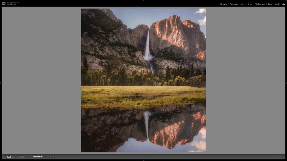 Symmetrical landscape reflection image centered in frame
One of the first alternatives Denney suggests is symmetry, particularly using reflections. This is the compositional opposite of the rule of thirds - instead of creating tension through offset placement, you create calm and impact through balance. Find still water, a wet road, or a mirrored surface, and place your horizon dead center. The result should feel intentional and graphic rather than accidental.
Symmetrical landscape reflection image centered in frame
One of the first alternatives Denney suggests is symmetry, particularly using reflections. This is the compositional opposite of the rule of thirds - instead of creating tension through offset placement, you create calm and impact through balance. Find still water, a wet road, or a mirrored surface, and place your horizon dead center. The result should feel intentional and graphic rather than accidental.
When you’re shooting for symmetry, small alignment errors read as mistakes rather than creative choices, so be precise. Use your camera’s electronic level if it has one, or enable the grid in your live view. In post, if you’re a degree or two off, correct it in the crop tool before you do anything else. The entire effect depends on the viewer sensing that the centering was deliberate.
Step 4: Use Repeating Patterns to Fill the Frame
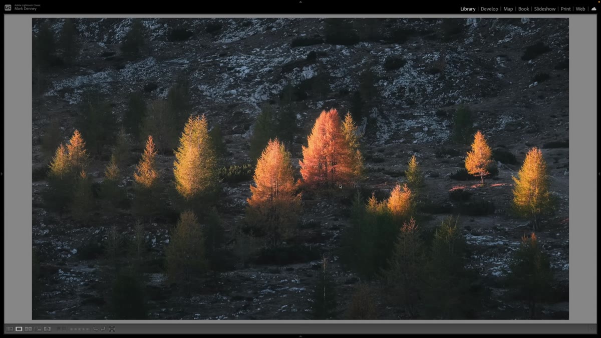 Landscape image built around repeating visual patterns
Repeating patterns are one of the most underused compositional tools in landscape photography. Think rows of lavender, stacked rock formations, waves receding across sand, or lines of trees in fog. The pattern itself becomes the subject, and your job is to find the angle that makes it read most clearly.
Landscape image built around repeating visual patterns
Repeating patterns are one of the most underused compositional tools in landscape photography. Think rows of lavender, stacked rock formations, waves receding across sand, or lines of trees in fog. The pattern itself becomes the subject, and your job is to find the angle that makes it read most clearly.
Get low, get close, or shoot straight down if the situation allows. The goal is to fill as much of the frame as possible with the repeating element so the viewer’s eye has somewhere to travel. Denney flags this as a technique that creates interest across the entire scene rather than directing attention to a single focal point - which is a fundamentally different compositional goal than the rule of thirds and worth practicing separately.
Step 5: Practice Leading Lines and Foreground Interest Intentionally
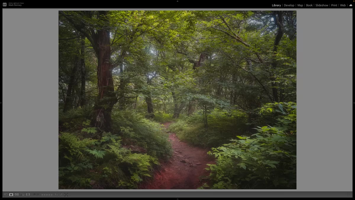 Landscape with strong foreground element drawing viewer into scene
Leading lines and foreground interest are techniques most beginners have heard of, but hearing about them and deliberately practicing them are different things. On your next shoot, before you raise the camera, ask yourself: what is pulling the viewer’s eye into this frame? A winding path, a rocky shoreline, a patch of wildflowers at your feet - these elements create depth and give the viewer a place to enter the scene.
Landscape with strong foreground element drawing viewer into scene
Leading lines and foreground interest are techniques most beginners have heard of, but hearing about them and deliberately practicing them are different things. On your next shoot, before you raise the camera, ask yourself: what is pulling the viewer’s eye into this frame? A winding path, a rocky shoreline, a patch of wildflowers at your feet - these elements create depth and give the viewer a place to enter the scene.
The word “intentionally” matters here. It’s easy to include foreground by accident and still compose primarily around the rule of thirds. The shift Denney is pushing for is making the foreground element the starting point of your compositional decision, not an afterthought. Get physically lower than you think you need to. A few inches of elevation change dramatically affects how much foreground you capture and how much depth the image reads.
Step 6: Experiment with Framing Within the Scene
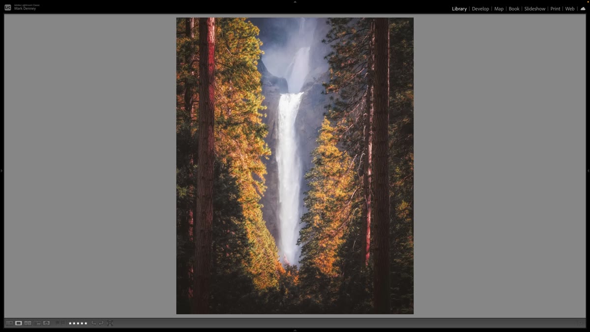 Subject framed by natural elements within the landscape
Natural framing - using trees, rock arches, windows, or overhanging branches to frame your primary subject - works because it adds layers to an image and focuses the viewer’s attention without relying on placement relative to a grid. It also adds a sense of place and context that a clean horizon shot often can’t.
Subject framed by natural elements within the landscape
Natural framing - using trees, rock arches, windows, or overhanging branches to frame your primary subject - works because it adds layers to an image and focuses the viewer’s attention without relying on placement relative to a grid. It also adds a sense of place and context that a clean horizon shot often can’t.
Look for framing opportunities before you set up your tripod. Walk the scene first. A frame that isn’t obvious from your first position might become clear from ten feet to the left. Once you find it, adjust your depth of field so both the framing element and the subject are sharp, or make a deliberate choice to let the frame fall slightly soft for mood.
What I’d Add From My Own Experience
The hardest part of breaking the rule-of-thirds habit isn’t learning the alternatives. It’s giving yourself permission to make a frame that feels “wrong” at first. Centered compositions felt deeply uncomfortable to me the first few times I tried them. They looked like mistakes in the viewfinder. It wasn’t until I saw them on a large screen that I understood what Denney is talking about.
My suggestion: dedicate one full photo walk entirely to a single alternative technique. Don’t mix it with your usual approach. Shoot only symmetry, or only patterns, for the whole session. You’ll make a lot of frames that don’t work, and a few that surprise you. Those surprises are where your visual style actually develops.
The single most important idea in this tutorial is that compositional rules are starting points, not destinations. The rule of thirds is a tool. Use it when it serves the image, and reach for something else when it doesn’t.
Watch the full tutorial on YouTube to see Denney’s actual portfolio examples and the Lightroom overlay demonstration - seeing the grid land perfectly on image after image makes the problem click in a way that’s hard to convey in text alone.
Comments (2)
Applied this to my portfolio shots and the improvement is noticeable.
Great article! I actually covered something related on my site — the business angle is really complementary to this.
Leave a Comment