Every few months I get a message from someone asking how brands get those rich, moody product shots that look like they required a full studio crew. Nine times out of ten, the answer is simpler than you’d expect. I started thinking about this more seriously when I realized I was turning down small product photography requests because I assumed I didn’t have the “right” setup. Spoiler: I was wrong, and a Peter McKinnon tutorial on shooting playing cards changed how I approach the whole thing.
In this Peter McKinnon tutorial on product photography, he shoots two decks of Star Wars-themed playing cards using props he picked up from a dollar store in about ten minutes. The results look like a campaign shoot. What makes this tutorial worth studying isn’t just the finished photos. It’s the decision-making process before a single camera setting gets touched. That’s where the real lesson lives.
The core idea McKinnon keeps coming back to is one I’ve heard in other forms but never applied so practically to product work: making the ordinary look extraordinary isn’t about expensive gear, it’s about intention. Every choice, from the background material to a two-dollar water bottle, serves the story you’re trying to tell about the product. Here’s how to actually do it.
Step 1: Study the Product Before You Touch Your Camera
 Two decks of Star Wars playing cards held up for the camera
Before scouting a single location or thinking about lighting, spend real time looking at what you’re shooting. Pick it up. Turn it over. Read the copy on the packaging. McKinnon starts by identifying the core design language of these cards: futuristic, industrial, metallic, cinematic. That analysis drives every prop and background choice that follows. If you skip this step, you end up with a beautiful photo that has nothing to do with the product, which doesn’t actually serve the brand.
Two decks of Star Wars playing cards held up for the camera
Before scouting a single location or thinking about lighting, spend real time looking at what you’re shooting. Pick it up. Turn it over. Read the copy on the packaging. McKinnon starts by identifying the core design language of these cards: futuristic, industrial, metallic, cinematic. That analysis drives every prop and background choice that follows. If you skip this step, you end up with a beautiful photo that has nothing to do with the product, which doesn’t actually serve the brand.
Ask yourself: what textures, colors, and moods does this product already suggest? A handmade ceramic mug and a titanium travel flask require completely different environments to feel authentic. Write down three or four adjectives before you start pulling props.
Step 2: Build a Theme Around the Product’s Identity
 Peter describing the industrial, futuristic design direction for the shoot
Once you have your adjectives, translate them into a visual theme. For the Star Wars cards, the theme is clear: think spacecraft interiors, brushed steel, clean geometric lines. For a skincare product you might land on “soft morning light, linen textures, botanical elements.” The theme is your creative brief, even if you’re the only person on the shoot.
Peter describing the industrial, futuristic design direction for the shoot
Once you have your adjectives, translate them into a visual theme. For the Star Wars cards, the theme is clear: think spacecraft interiors, brushed steel, clean geometric lines. For a skincare product you might land on “soft morning light, linen textures, botanical elements.” The theme is your creative brief, even if you’re the only person on the shoot.
This step keeps you from grabbing random props just because they’re nearby. Everything you put in frame should earn its place by reinforcing the theme. If it doesn’t fit the brief you wrote in Step 1, it goes back on the shelf.
Step 3: Make Your Own Background If You Have To
 A custom-printed background designed to match the Star Wars card aesthetic
Here’s the part that genuinely surprised me the first time I watched this. McKinnon uses a custom-printed background that a designer friend created specifically for the shoot. It’s just a printed sheet, but it immediately anchors the whole setup in the right world. You don’t need a designer friend to do this.
A custom-printed background designed to match the Star Wars card aesthetic
Here’s the part that genuinely surprised me the first time I watched this. McKinnon uses a custom-printed background that a designer friend created specifically for the shoot. It’s just a printed sheet, but it immediately anchors the whole setup in the right world. You don’t need a designer friend to do this.
Go into Canva, Photoshop, or even Google Slides. Create a texture or pattern that fits your theme and print it at a copy shop on cardstock or foam board. For metallic or industrial themes, you can also buy adhesive contact paper in brushed steel finishes for a few dollars. The background is the largest surface in most product shots. Getting it right does more work than almost any other single decision.
Step 4: Source Props That Match the Theme, Not Your Existing Collection
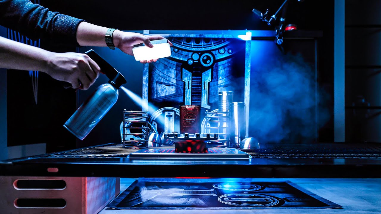
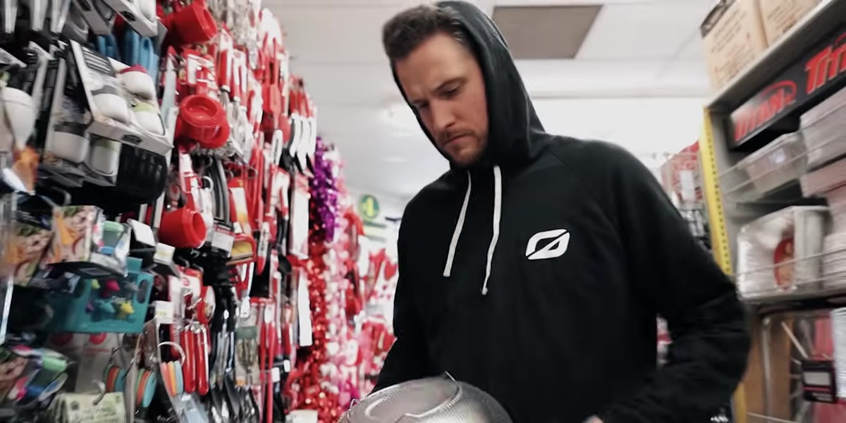 McKinnon searching through items for brushed steel and metallic textures
McKinnon goes to a dollar store specifically looking for brushed steel and aluminum items that read as futuristic. He comes back with water bottles and a grill tray. Not because they’re glamorous, but because their surfaces and shapes fit the world he’s building. This is the mindset shift: you’re not shopping for “photography props,” you’re shopping for set pieces that belong to a specific story.
McKinnon searching through items for brushed steel and metallic textures
McKinnon goes to a dollar store specifically looking for brushed steel and aluminum items that read as futuristic. He comes back with water bottles and a grill tray. Not because they’re glamorous, but because their surfaces and shapes fit the world he’s building. This is the mindset shift: you’re not shopping for “photography props,” you’re shopping for set pieces that belong to a specific story.
When you’re sourcing, look for objects at different heights. Varying the elevation of your props creates visual depth and lets you place the hero product at a compelling angle. Items that add texture in the background without competing for attention are almost always more useful than items that are inherently interesting on their own.
Step 5: Arrange the Scene With Intention, Starting With the Hero Product
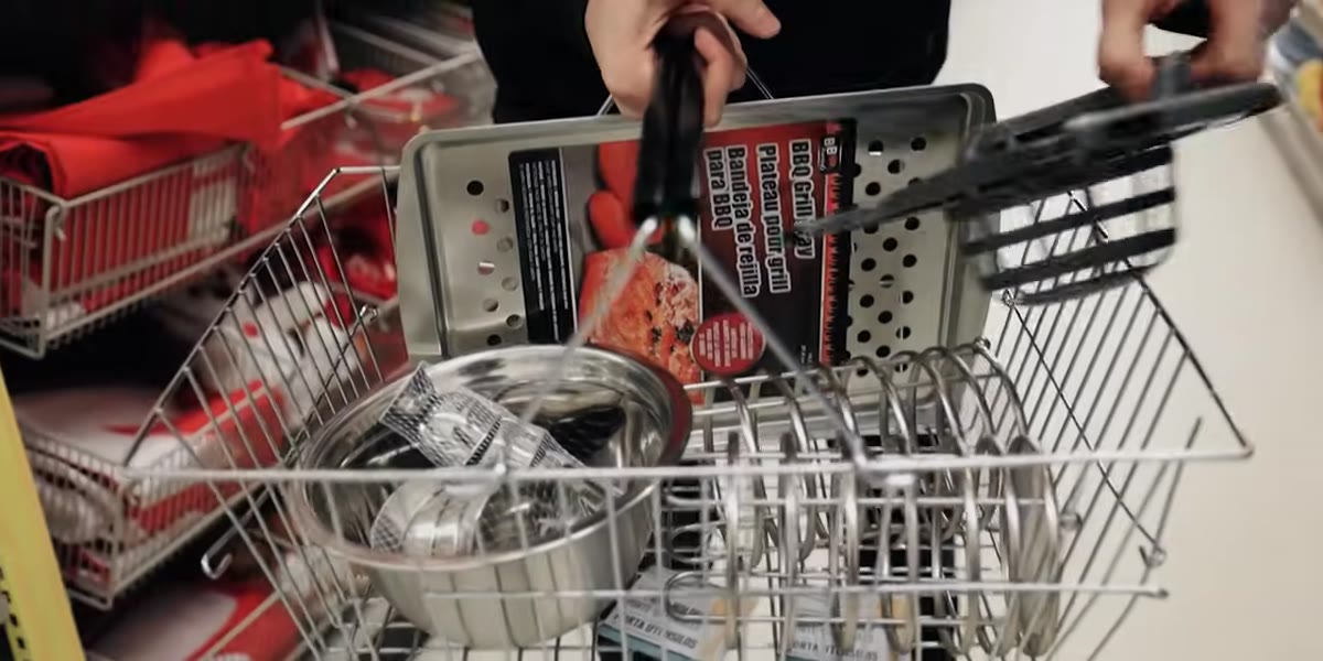 A grill tray being incorporated into the product flatlay arrangement
Once you have your background down and your props gathered, place the product first. It gets the best light, the most prominent position, and the most visual breathing room. Then build the scene around it. Think of your props as a supporting cast: they add context and texture, but they shouldn’t pull focus.
A grill tray being incorporated into the product flatlay arrangement
Once you have your background down and your props gathered, place the product first. It gets the best light, the most prominent position, and the most visual breathing room. Then build the scene around it. Think of your props as a supporting cast: they add context and texture, but they shouldn’t pull focus.
Step back and look at the composition from your shooting angle before you lock anything in. Small adjustments matter more at this stage than any camera setting. Rotate the product slightly. Move a prop a few centimeters back. Notice how the eye moves through the frame and redirect it if needed.
Step 6: Commit to the Story You’re Telling
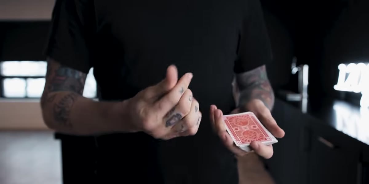 Peter reflects on making ordinary movements look extraordinary through intentional craft
McKinnon opens this video with something I keep thinking about. He talks about his background in magic and how he spent as much time practicing how tricks looked as he did learning the mechanics of the tricks themselves. The principle translates directly: the craft behind a product photo is invisible when it’s done well, and that invisibility is the point.
Peter reflects on making ordinary movements look extraordinary through intentional craft
McKinnon opens this video with something I keep thinking about. He talks about his background in magic and how he spent as much time practicing how tricks looked as he did learning the mechanics of the tricks themselves. The principle translates directly: the craft behind a product photo is invisible when it’s done well, and that invisibility is the point.
Every choice in your scene should serve the story so completely that the viewer never thinks about how the photo was made. They just feel that the product belongs in that world. That level of intention is what separates a product snapshot from a product photograph.
My Own Addition: Test With Your Phone First
I always do a quick scan of the scene with my phone before I set up my camera. Not because the phone shot is better, but because it’s fast, and it shows me compositional problems before I’ve invested ten minutes adjusting a tripod. Some of my best-composed product setups were ones I caught and rearranged during this phone check. The phone has no prestige attached to it, which means I’m more willing to look critically and make changes. Once the “real” camera comes out, there’s a subtle psychological pull to commit to the setup you have. Use that phone pass to stay honest.
The single most important takeaway from this tutorial is that great product photography is mostly a styling and planning problem, not a technical one. The gear matters less than the story you build around the product before you press the shutter. Spend your creative energy there first.
Watch the full tutorial on YouTube to see how McKinnon builds and shoots the complete setup, including how he uses light to pull the metallic textures forward. It’s one of the more practical and genuinely fun product photography breakdowns I’ve come across.
Comments
Leave a Comment