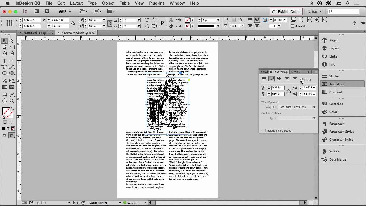
If you’ve ever placed a photo into an InDesign layout and watched your text run straight through it like the image isn’t even there, you know the specific frustration I’m talking about. For a long time I avoided multi-image editorial layouts because getting text to flow gracefully around an oddly shaped subject felt more like wrestling than designing. What I wanted was text that hugged the actual contours of a flower, a person, or a product shot. What I kept getting was text that hugged a rectangle.
That changed when I worked through this CreativeLive tutorial on clipping paths in Adobe InDesign CC. Watch the full tutorial on YouTube. The instructor walks through using InDesign’s built-in edge detection to generate a clipping path directly from an image, then connecting that path to the text wrap panel to get text flowing around the actual subject. It’s the kind of workflow that looks complicated until someone shows you the exact sequence of clicks, and then it feels obvious.
What I appreciate most about this technique is that it doesn’t require you to do any path-drawing in Photoshop beforehand. InDesign does the heavy lifting. Here’s how to work through it.
Step 1: Place Your Image and Open the Clipping Path Dialog
 Object menu open, Clipping Path option highlighted
Start with your image already placed in an InDesign frame. Select the image (not just the frame), then go to Object in the top menu and scroll down to Clipping Path, then Options. This opens the dialog where all the edge-detection magic happens. If you try this with the frame selected instead of the image inside it, the options you need may be grayed out, so make sure you’ve double-clicked into the frame first.
Step 2: Set the Type to Detect Edges
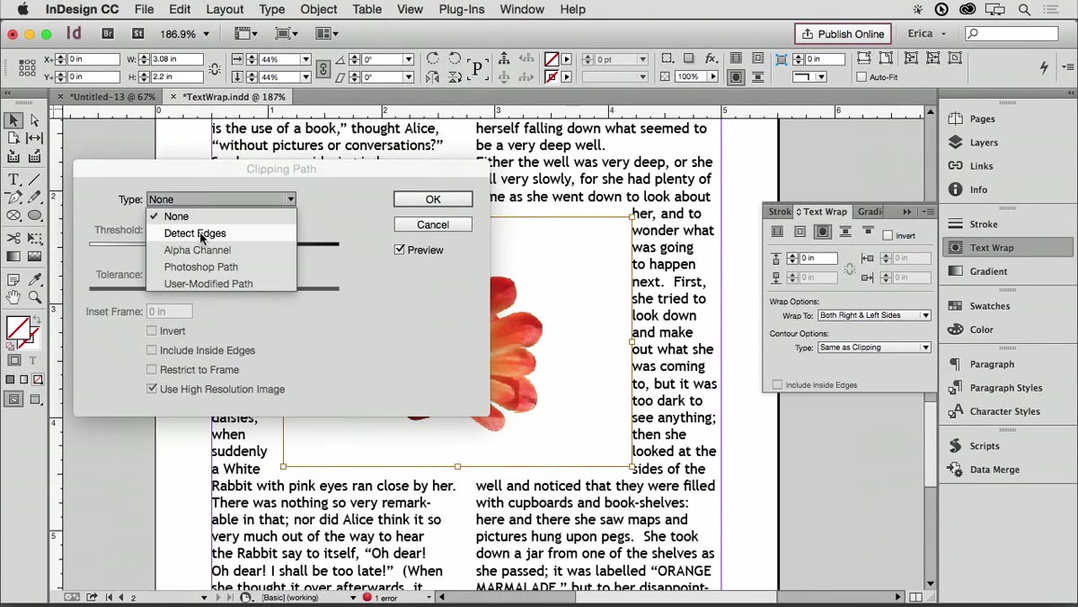 Clipping Path dialog open, Type dropdown set to Detect Edges
Inside the Clipping Path dialog, find the Type dropdown menu and choose “Detect Edges.” This tells InDesign to analyze the contrast between your subject and its background and automatically generate a path around the subject’s silhouette. It works best on images with a relatively clean background, like a product shot on white or a flower on a simple backdrop. Click OK when you’re ready, and InDesign will draw that path around your subject automatically.
Step 3: Check the Generated Path
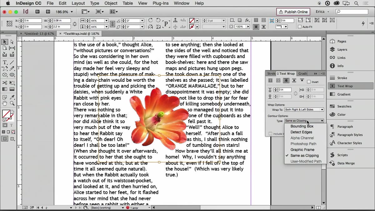 Blue clipping path visible around image subject
After you click OK, you’ll see a blue outline hugging the shape of your subject. That blue line is your new clipping path, and it tells InDesign exactly where the edges of your subject are. Take a moment to look at how closely it follows the contours. In the tutorial, the instructor points out that for a single cohesive object, there’s only one offset option available, because the path wraps the entire subject as one unit. If your subject has complex edges or fine details like fur or hair, the path may not be pixel-perfect, and that’s okay. We’ll address that.
Step 4: Apply Text Wrap Using the Clipping Path
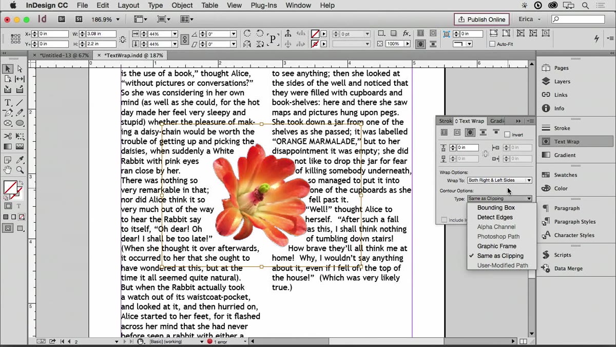 Text Wrap panel open, wrap to clipping path selected
Open the Text Wrap panel (Window > Text Wrap) and choose the option to wrap text around the object shape. When you have your clipping path active, the wrap follows those detected edges rather than the rectangular bounding box of the frame. You’ll see the text in your layout shift immediately to flow around the subject’s actual silhouette. The offset controls let you add breathing room between the text and the edge of the shape, which almost always makes the layout feel less crowded.
Step 5: Edit the Path Manually When It Gets Messy
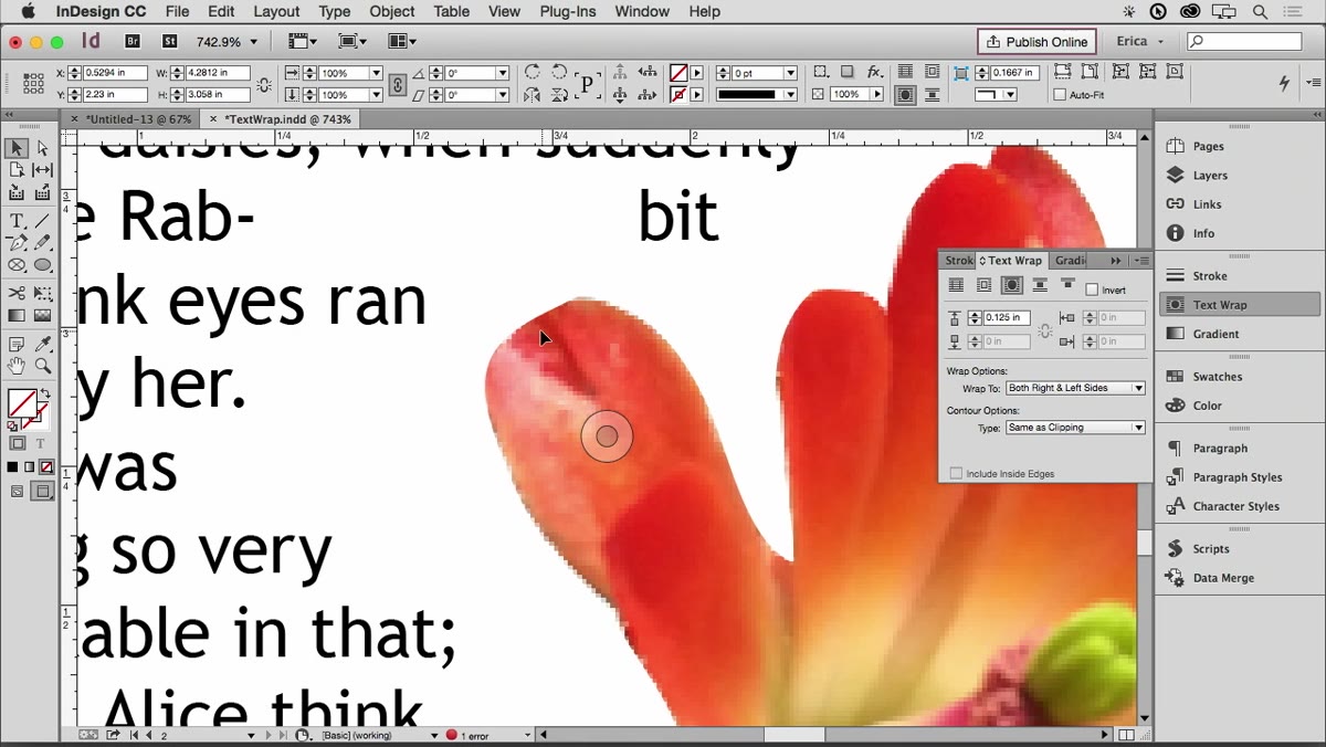 Direct Selection tool active, path anchor point being dragged
Here’s where the real control lives. The clipping path InDesign generates is fully editable. If the auto-detected path is pushing a word to hyphenate awkwardly or creating a weird gap in your text columns, you don’t have to accept it. Switch to the Direct Selection tool (the white arrow, not the black one), click on the blue path, and you can drag individual anchor points to reshape it. The instructor demonstrates pulling a section of the path back so a split word rejoins its line. It’s a small nudge, but it makes a real difference to readability.
Step 6: Explore Text Wrap Behavior Options
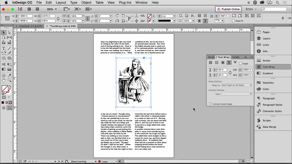 Text Wrap panel showing Jump, Both Sides, and other wrap options
The Text Wrap panel gives you more options than just wrapping both sides. The instructor runs through several worth knowing. “Jump” makes your text skip entirely over the image, creating the visual effect of two stacked single-column text blocks. This is useful when the image is wide enough that wrapping text beside it would result in columns too narrow to read comfortably. You can also wrap on just the left or right side, or choose options relative to the spine if you’re working in a bound document. Take a few minutes to click through these options on a test layout. The difference between “both sides” and “right side only” can completely change the visual weight of a spread.
Step 7: Use Hidden Layers to Wrap Text Around an Invisible Shape
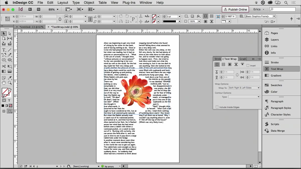 Layer panel showing image on hidden layer, text still wrapping around shape
This is the technique I found most surprising. You can place your image on a hidden layer, and the text wrap still respects it. That means you can create a shaped gap in your text, defined by any image or even a custom-drawn shape, without that shape being visible to the reader. The instructor uses a flower image to carve a flower-shaped negative space into a column of text. The image is hidden. The shaped gap remains. It’s a sophisticated layout trick that takes about thirty seconds to set up once you know it exists.
A Note on Managing Imperfect Results
I want to be honest: this technique rarely gives you a perfect result on the first pass. The edge detection works well, but typography is unforgiving. Leading, column width, and hyphenation settings all interact with your wrap path in ways that can create uneven gaps or awkward line breaks. The instructor mentions a script called Wrap Nudger that lets you reposition the image within the frame while keeping the wrap path in place, which helps you fine-tune the layout without redrawing the path from scratch. I’d recommend tracking that script down before you use this technique on a deadline. It saves real time.
If you’re working with an image that has a messy or detailed edge, consider cleaning up the background in Photoshop first, or doing a rough manual path in Photoshop and importing it as a clipping path that way. InDesign’s detect edges is a solid starting point, not always a finishing line.
The single most useful thing this tutorial taught me is that the clipping path and the text wrap path are two separate things you can manipulate independently. Once that clicked, text-wrap layouts stopped feeling like a guessing game. If you work in editorial design, book layout, or even client newsletters, this is a workflow worth having in your toolkit.
Watch the full tutorial on YouTube to see the instructor work through each step in real time. Some of the path-editing steps are much easier to follow when you can watch the cursor move.
Comments (3)
Tried this technique this morning. Game changer for real.
Tried this technique this morning. Game changer for real.
Great article! I actually covered something related on my site — the workflows angle is really complementary to this.
Leave a Comment