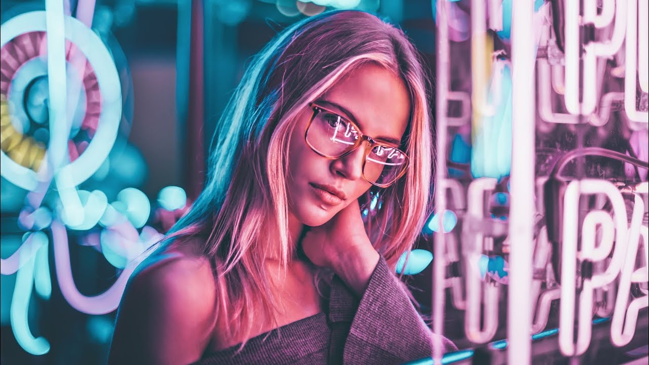
Every Sunday morning I take a photo walk through Seattle. It’s my reset, my practice, my church. And for the longest time I would walk past neon-lit storefronts, laundromats, late-night diners, and think: “cool sign,” and keep moving. It took watching someone else work to realize I was walking past free, beautiful light every single week.
That realization hit me hard while watching Peter McKinnon’s collaboration tutorial with photographer Brandon Woelfel. Watch the full tutorial on YouTube if you haven’t yet. Brandon has built an instantly recognizable aesthetic around neon light and dreamy, color-drenched portraits, and in this video Peter shadows him through a shoot, then breaks down the specific techniques that make his work look the way it does. What I love about it is that none of it requires a studio. It requires observation, a willingness to experiment, and a few cheap tools you can order online tonight.
This breakdown covers the five core tips from the video, written so you can take them out on your next shoot without needing to pause and rewind.
Step 1: Train Your Eye to See Ambient Light as a Tool
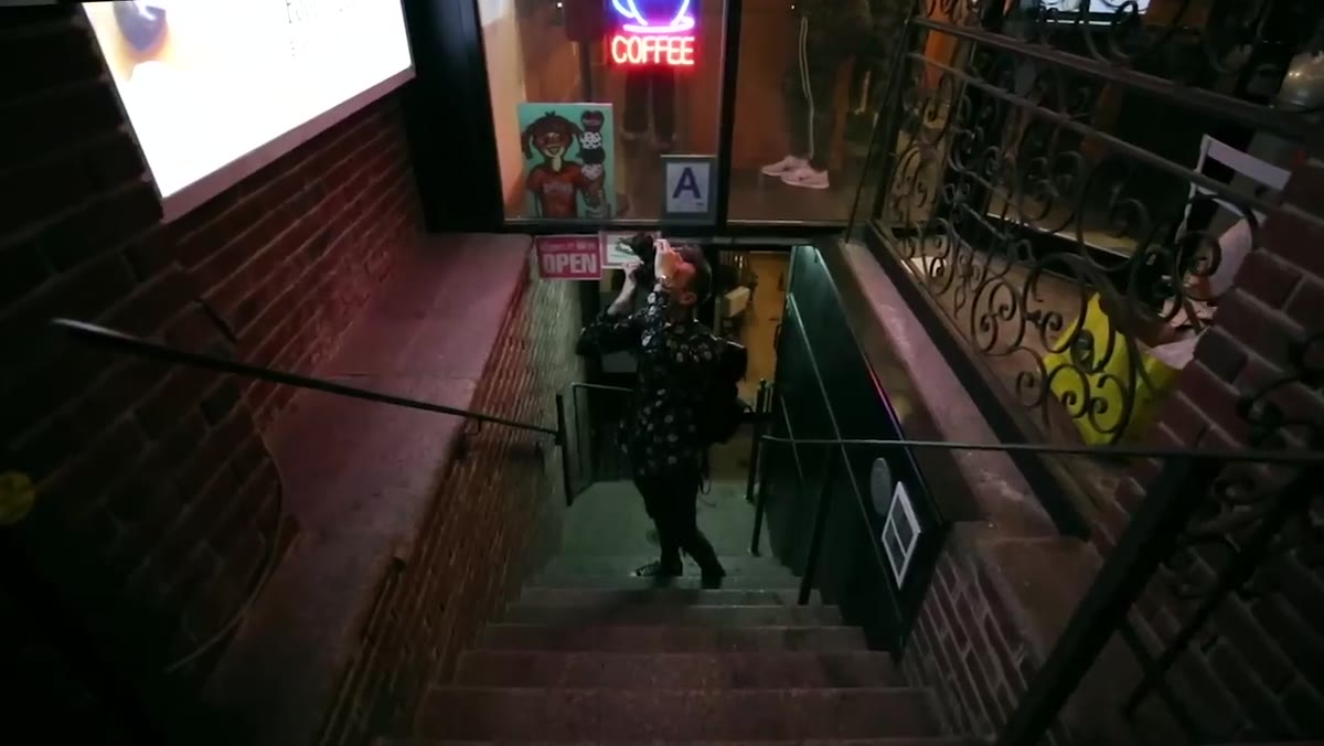
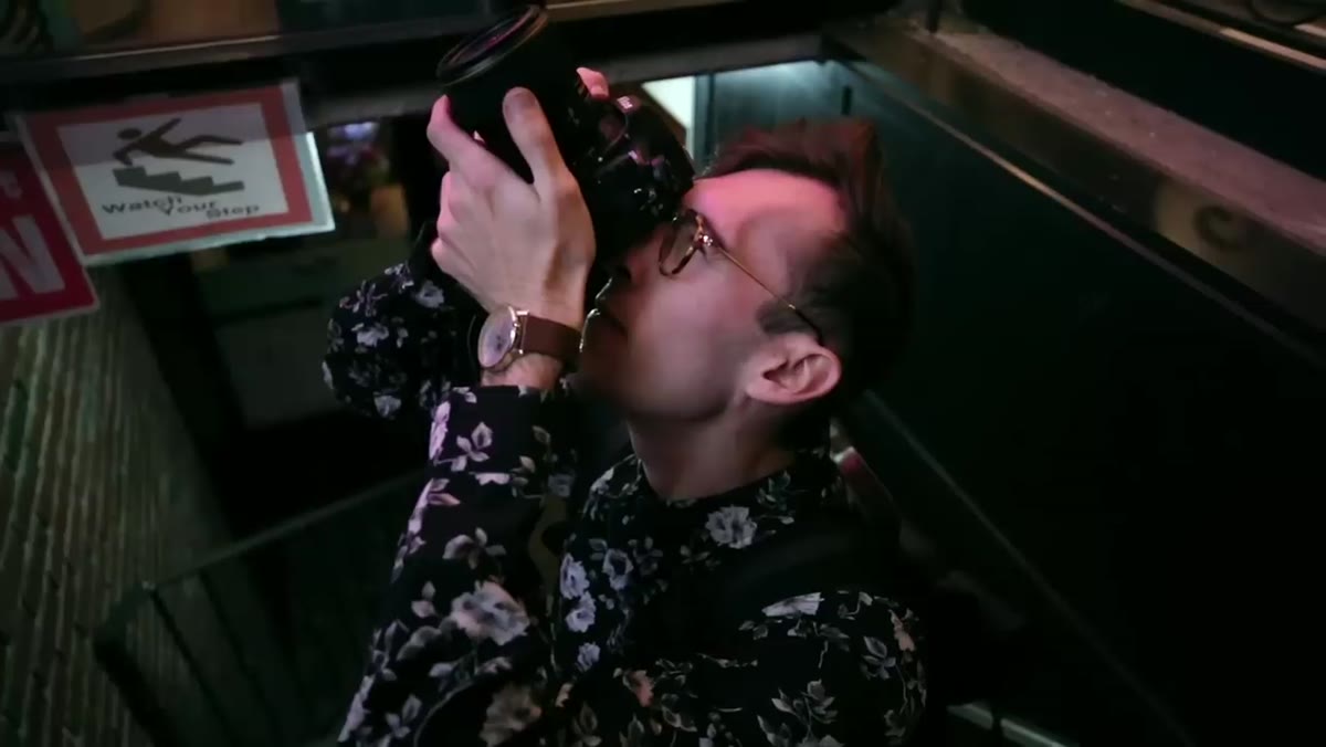 Brandon pointing out a small neon sign on a Brooklyn street
Brandon’s whole lighting philosophy starts with one shift in mindset: stop ignoring the light that’s already there. On a walk through Brooklyn at dusk, he was pointing out tiny signs, the kind that say “Open 24 Hours” or advertise ice cream, and explaining how he had used each one in past shoots. Peter’s reaction mirrors what most of us would feel: complete disbelief that something so small could produce anything usable.
Brandon pointing out a small neon sign on a Brooklyn street
Brandon’s whole lighting philosophy starts with one shift in mindset: stop ignoring the light that’s already there. On a walk through Brooklyn at dusk, he was pointing out tiny signs, the kind that say “Open 24 Hours” or advertise ice cream, and explaining how he had used each one in past shoots. Peter’s reaction mirrors what most of us would feel: complete disbelief that something so small could produce anything usable.
The lesson is to start scouting with your eyes before your camera even comes out. When you’re walking through any urban area after sundown, look for concentrated pools of colored light. Neon and LED signage throw surprisingly far. A sign that looks dim from across the street can cast enough light to illuminate a face cleanly if your subject stands within two or three feet of it. On your next evening walk, try pointing your phone camera at a sign from different distances and watch how the light quality changes. That’s your scouting tool, and it costs nothing.
Step 2: Position Your Subject Relative to the Sign, Not the Scene
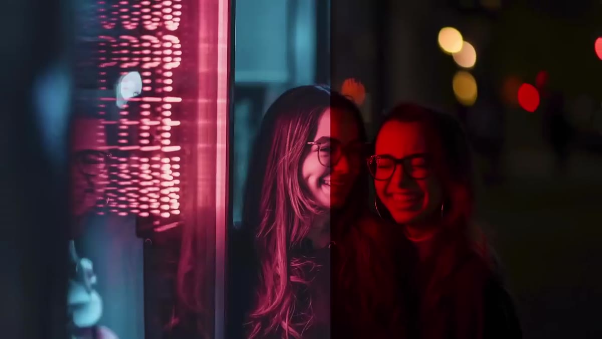 Split screen of the small sign location and the finished twin portrait
The before-and-after moment in the tutorial is the one that made me stop and rewatch it. Peter shows the actual storefront Brandon used to photograph a set of twins, then reveals the finished portrait. The location looks unremarkable. The photo looks like it was lit by a professional colorist.
Split screen of the small sign location and the finished twin portrait
The before-and-after moment in the tutorial is the one that made me stop and rewatch it. Peter shows the actual storefront Brandon used to photograph a set of twins, then reveals the finished portrait. The location looks unremarkable. The photo looks like it was lit by a professional colorist.
The difference is placement. Brandon positions subjects extremely close to the light source, close enough that the color wraps around the face rather than just kissing one cheek. Think of it like this: if you can hold your hand up between your subject and the sign and block most of the light, they’re too far away. You want the sign’s glow to be the dominant light on the face, with everything behind the subject falling into shadow. That contrast, bright colorful foreground against a dark or blurred background, is what gives the images their depth.
Step 3: Use a Light Prism to Layer in Lens Effects
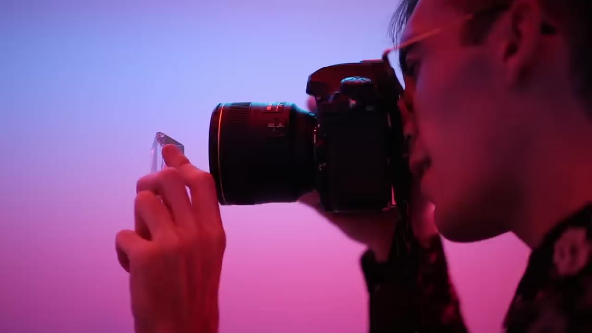 Peter holding a glass prism up to the camera lens in the neon room
This is the tool that gets the most attention in Brandon’s work, and for good reason. A light prism, sometimes called a photography prism or lens prism, is a triangular piece of optical glass you hold just outside the edge of your lens while shooting. When neon or any colored light hits it, it refracts into streaks, rainbows, and crystalline flares that layer over your subject.
Peter holding a glass prism up to the camera lens in the neon room
This is the tool that gets the most attention in Brandon’s work, and for good reason. A light prism, sometimes called a photography prism or lens prism, is a triangular piece of optical glass you hold just outside the edge of your lens while shooting. When neon or any colored light hits it, it refracts into streaks, rainbows, and crystalline flares that layer over your subject.
You can find them on Amazon for under twenty dollars. The technique is simple: hold the prism at the corner of your lens and rotate it slowly while shooting. The angle changes the effect dramatically. A slight tilt gives you a subtle streak of color. A more aggressive angle creates full rainbow arcs. The key is to shoot in burst mode while you experiment, because the effect shifts with every millimeter of movement. You’ll get a lot of misses, but the keepers are unlike anything you can replicate in post.
Step 4: Shoot at Dusk, Not Full Dark
 Peter and Brandon walking at dusk, blue hour light visible in background
There’s a timing window that makes neon portraits significantly easier to pull off, and it’s shorter than most people expect. Dusk, specifically the 20 to 30 minutes after sunset when the sky still holds a deep blue, gives you two light sources working together. The ambient sky fills in shadows softly while the neon handles color and drama. Once it goes fully dark, the contrast between the sign and the background gets extreme, which can look great but is much harder to expose correctly without losing shadow detail entirely.
Peter and Brandon walking at dusk, blue hour light visible in background
There’s a timing window that makes neon portraits significantly easier to pull off, and it’s shorter than most people expect. Dusk, specifically the 20 to 30 minutes after sunset when the sky still holds a deep blue, gives you two light sources working together. The ambient sky fills in shadows softly while the neon handles color and drama. Once it goes fully dark, the contrast between the sign and the background gets extreme, which can look great but is much harder to expose correctly without losing shadow detail entirely.
For camera settings during this window, start with a wide aperture (f/1.8 to f/2.8), ISO between 800 and 1600, and a shutter speed around 1/100. Meter off your subject’s face, not the sign itself. The sign will likely blow out slightly and that’s fine. Your goal is a correctly exposed face with light color wrapping around it.
Step 5: Shoot Constantly and Commit to a Style
 Brandon’s Instagram grid filling the screen, consistent neon aesthetic throughout
One thing Peter emphasizes when he talks about watching Brandon work is the sheer volume of shooting he does. This isn’t a casual hobbyist. Brandon is out with his camera almost every day, and that repetition is what built a recognizable aesthetic over time.
Brandon’s Instagram grid filling the screen, consistent neon aesthetic throughout
One thing Peter emphasizes when he talks about watching Brandon work is the sheer volume of shooting he does. This isn’t a casual hobbyist. Brandon is out with his camera almost every day, and that repetition is what built a recognizable aesthetic over time.
You don’t need to shoot daily to apply this principle. What you do need is intentionality. Pick a visual direction, neon street light, for example, and spend a full month pursuing only that. Shoot it in different cities, different weather, with different subjects. By the end, you’ll have a body of work with genuine coherence, and more importantly, you’ll have internalized what makes the light work and what kills it. Style isn’t something you design once. It’s something you practice into existence.
A Note From My Own Shoots
I want to add one caveat that the tutorial doesn’t explicitly cover but that I’ve run into repeatedly: color temperature conflicts can wreck a neon shot fast. If your subject is also being partially lit by a warm streetlamp or cool fluorescent from a nearby window, the colors will muddy and fight each other on the face. Before you start shooting, walk your subject around the scene and look for any secondary light sources competing with your neon. Block them with your body or a piece of black foam core if you have to, or reposition to eliminate them. Clean, single-source neon light is almost always more striking than a complicated mix.
The single most important takeaway from this tutorial is that the light is already out there. You don’t need to build a set or rent a studio. You need to slow down on your evening walks and start treating every neon sign as a potential portrait light. That mental shift is free and it changes everything.
Watch the full tutorial on YouTube to see Peter and Brandon work through these techniques in real time. Watching another photographer in their element, which is something Peter really captures well here, is one of the fastest ways to level up your own practice.
Comments
Leave a Comment