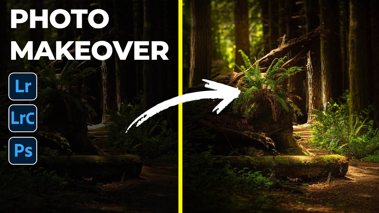
There’s a category of photo that lives on almost every photographer’s hard drive: the one that felt magical in person but came home looking flat, dark, or just… off. The light was doing something incredible, you saw it, you felt it, and somehow the camera disagreed. I have a folder of these. I used to just leave them there, hoping I’d eventually figure out what to do with them. What I’ve learned over time is that Lightroom’s masking tools, used intentionally, can actually reconstruct that feeling of light rather than just recover it.
Watch the full tutorial on YouTube
In this Matt Kloskowski tutorial, Matt works through a moody forest photo submitted by one of his students, Ken McClure. The image is very underexposed, with most of the frame sitting in deep shadow. But instead of brightening everything up and calling it done, Matt uses a layered radial gradient approach to paint light back into the scene selectively. It’s a smart workflow, and the key insight buried inside it changed how I approach any photo where the subject is defined by light rather than by content.
Step 1: Crank the Exposure First, Then Decide on Your Direction
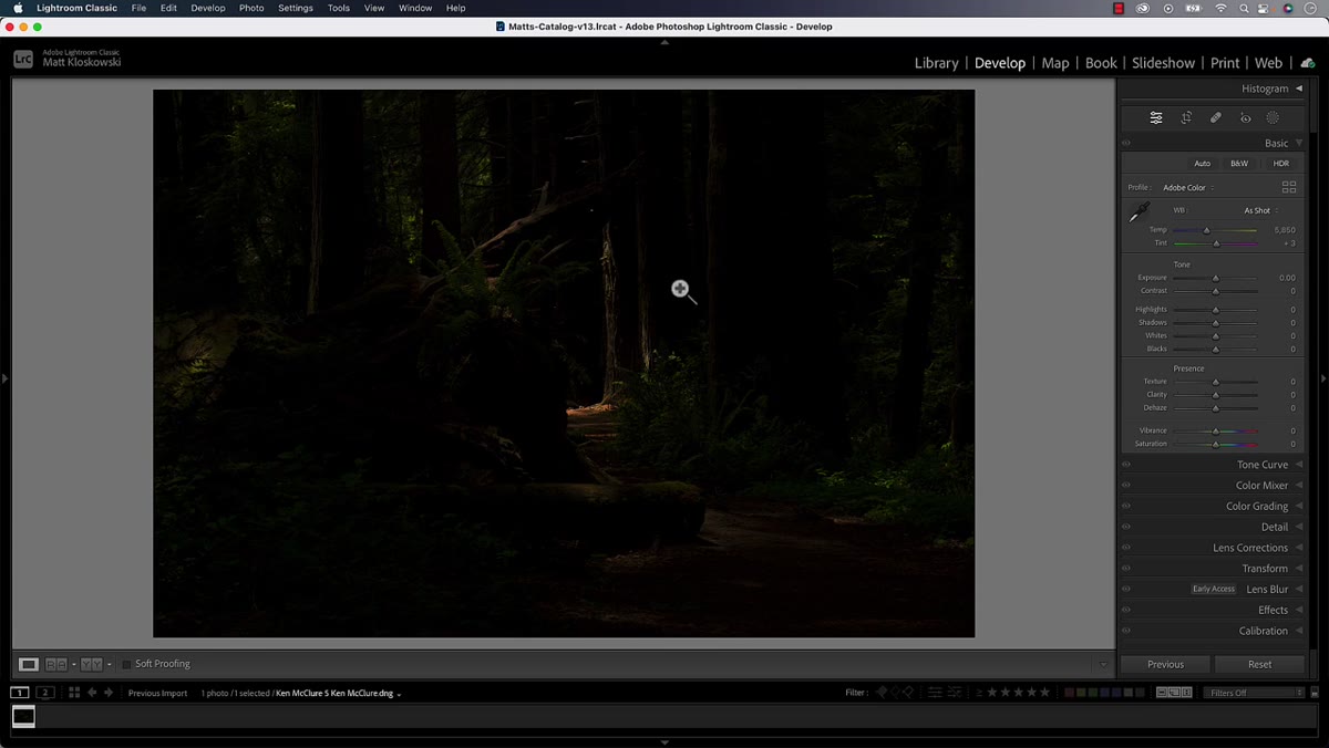 Dark forest photo with exposure slider pushed to maximum
Before committing to any edit, temporarily push your exposure slider as high as it will go. This is a diagnostic move, not a creative one. You’re looking for what’s actually in the file and, more importantly, where the natural light sources in the scene already exist. Matt does this with the forest photo and immediately spots a bright patch in the center of the frame. That discovery shapes every decision that follows.
Dark forest photo with exposure slider pushed to maximum
Before committing to any edit, temporarily push your exposure slider as high as it will go. This is a diagnostic move, not a creative one. You’re looking for what’s actually in the file and, more importantly, where the natural light sources in the scene already exist. Matt does this with the forest photo and immediately spots a bright patch in the center of the frame. That discovery shapes every decision that follows.
Once you’ve identified where the light lives, pull the exposure back down. In this case, Matt keeps the photo intentionally dark, because he recognizes that the moody, shadowy feel is what makes the central light patch interesting. If everything is bright, nothing is. Darkness is the contrast that makes selective light land with impact.
Step 2: Crop to Remove Distraction Before You Touch Light
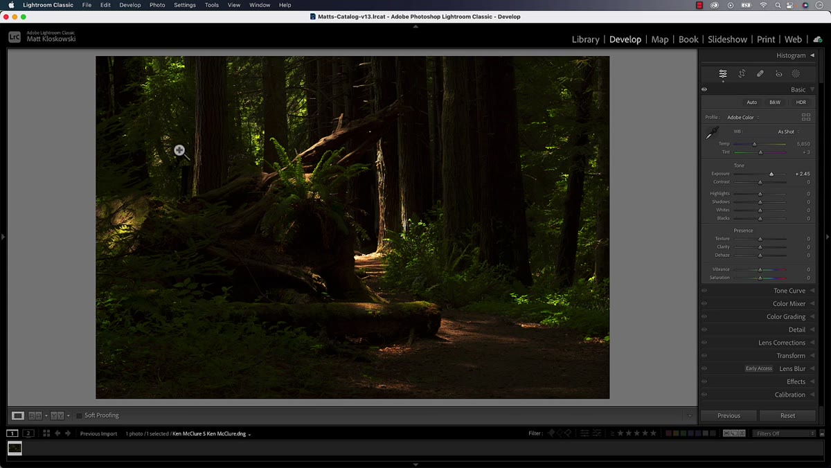 Square crop applied removing left and right sides of forest image
Before jumping into masking, commit to your crop. Matt notices that the left and right edges of this particular photo don’t contribute anything meaningful. They’re just more trees, more shadow, no story. A square crop eliminates that dead space and keeps the viewer’s eye moving along the path in the foreground toward the light in the center.
Square crop applied removing left and right sides of forest image
Before jumping into masking, commit to your crop. Matt notices that the left and right edges of this particular photo don’t contribute anything meaningful. They’re just more trees, more shadow, no story. A square crop eliminates that dead space and keeps the viewer’s eye moving along the path in the foreground toward the light in the center.
Cropping first matters because every masking decision you make after this point should serve the composition you’ve already committed to. If you mask and then crop later, you may end up adjusting light in areas that get cut out entirely. Work from the frame inward, not the other way around.
Step 3: Set Your Global Tone - Keep It Dark and Moody
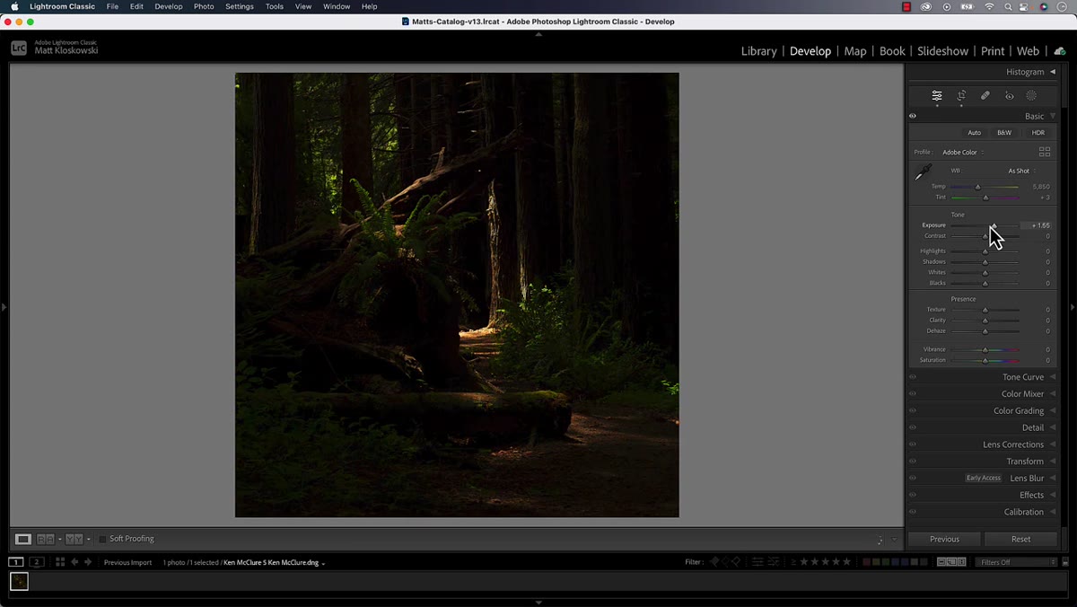 Basic panel with highlights pulled down and photo looking intentionally underexposed
With the crop locked in, Matt makes a few basic panel adjustments, and the direction is deliberate. He pulls the highlights down further rather than recovering them upward. He keeps the overall exposure low. The intention is to lean into the drama rather than fight it.
Basic panel with highlights pulled down and photo looking intentionally underexposed
With the crop locked in, Matt makes a few basic panel adjustments, and the direction is deliberate. He pulls the highlights down further rather than recovering them upward. He keeps the overall exposure low. The intention is to lean into the drama rather than fight it.
This is a mindset shift worth sitting with. A lot of us default to brightening a dark photo as the “fix.” But sometimes dark is the point. Committing to that and then using masking tools to paint in selective brightness produces a much more cinematic result than just lifting the exposure globally and flattening everything out.
Step 4: Add a Radial Gradient to Simulate Incoming Light
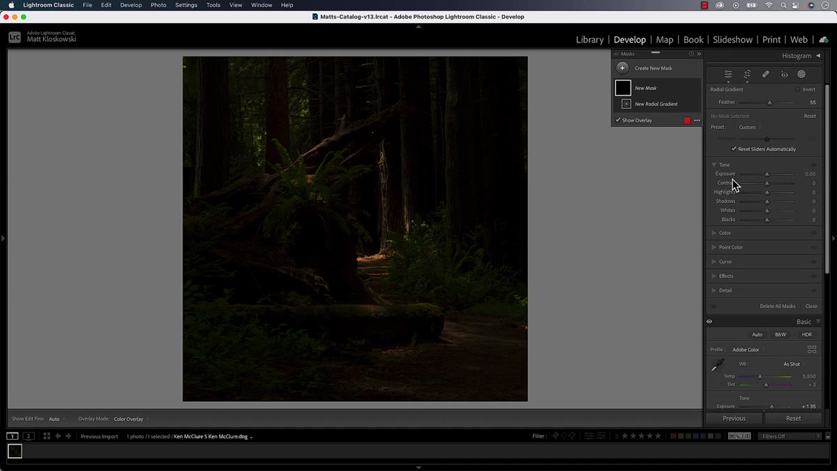 Radial gradient dragged out over the center of the forest image
Open the Masking panel and select Radial Gradient. Drag out a large oval shape that covers the area where you want your light source to appear. In Matt’s edit, this is the center of the frame, roughly where the natural bright patch already exists. Spin the oval so its angle suggests light coming in from a specific direction, in this case from the upper left.
Radial gradient dragged out over the center of the forest image
Open the Masking panel and select Radial Gradient. Drag out a large oval shape that covers the area where you want your light source to appear. In Matt’s edit, this is the center of the frame, roughly where the natural bright patch already exists. Spin the oval so its angle suggests light coming in from a specific direction, in this case from the upper left.
Once the shape is placed, raise the Exposure and Shadows sliders within that mask. You’re not trying to blow out that area. You’re trying to create the impression that light is skimming across the scene from a specific source. The effect should feel like a beam or a shaft of light, not a circle of brightness.
Step 5: Subtract from the Mask Where It Gets Too Bright
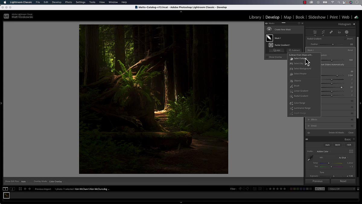 Brush tool set to Subtract painting over the brightest highlight spot
If the radial gradient overlaps an area that was already naturally bright, like a highlight patch or a break in the tree canopy, the combination can get too hot. Matt handles this by using the Subtract option within the mask and painting with a brush tool at around 50% flow.
Brush tool set to Subtract painting over the brightest highlight spot
If the radial gradient overlaps an area that was already naturally bright, like a highlight patch or a break in the tree canopy, the combination can get too hot. Matt handles this by using the Subtract option within the mask and painting with a brush tool at around 50% flow.
Lower flow means each brushstroke applies the subtraction gradually, giving you much more control than going in at full strength. Paint over the overexposed area in short passes and watch the histogram as you go. You want to take the edge off, not undo the whole effect. This subtract-with-a-brush step is what separates a mask that looks placed from one that looks real.
Step 6: Layer a Second Radial Gradient to Deepen the Effect
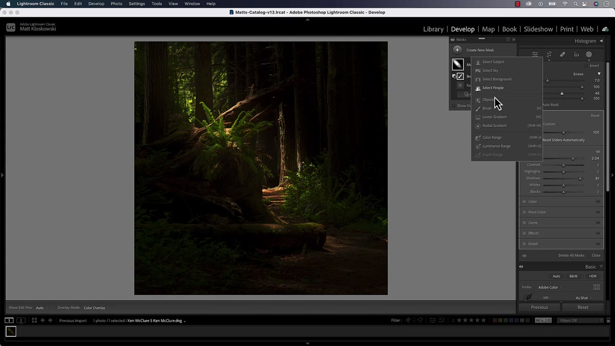 Second radial gradient added and overlapped with the first mask
Create a new mask and add a second radial gradient. Make this one slightly larger than the first and overlap it with the original. Matt stacks multiple radials rather than using one large one, because the overlap creates a more natural falloff. Real light doesn’t have a hard edge, and stacked gradients with different sizes give you a soft, convincing glow that builds from the center outward.
Second radial gradient added and overlapped with the first mask
Create a new mask and add a second radial gradient. Make this one slightly larger than the first and overlap it with the original. Matt stacks multiple radials rather than using one large one, because the overlap creates a more natural falloff. Real light doesn’t have a hard edge, and stacked gradients with different sizes give you a soft, convincing glow that builds from the center outward.
Adjust the exposure on this second mask independently. You don’t need to match the first one exactly. The goal is cumulative warmth, not uniformity. Each layer adds a little more luminosity to the area, and together they sell the illusion that something outside the frame is casting light in.
What I’d Add From My Own Experience
Matt focuses specifically on the radial gradient as the primary tool here, and it’s the right call for a centered light source. But when I use this technique on photos where the light source is at the edge of the frame, like a window or a setting sun just out of shot, I swap the first radial for a linear gradient instead. A linear gradient entering from one side reads more like directional, off-frame light, while a radial gradient reads more like a soft glow or a gap in overhead canopy. Choosing between them based on where your implied light source would physically be makes the result feel more grounded.
I’ve also found that adding a very slight warmth increase (nudging the Temperature slider toward yellow) inside these masks gives the effect more visual weight. Real light has color. A neutral brightness boost can look edited. A warm brightness boost looks like sun.
The single biggest takeaway from Matt’s approach is this: darkness isn’t a problem to fix, it’s a contrast tool. When you protect the shadows instead of fighting them, the light you add selectively becomes exponentially more powerful. That’s the whole technique in one sentence.
Watch the full tutorial on YouTube to see Matt’s full edit from start to finish, including how he fine-tunes the final look in ways that are much easier to follow once you’ve got the radial gradient layer logic locked in.
Comments
Leave a Comment