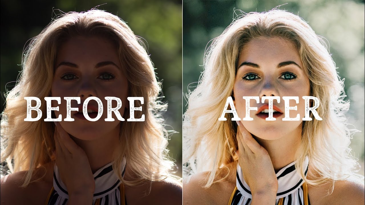
Every Sunday morning I take a photo walk through whatever neighborhood I end up in, and I come home with a card full of shots that are already pretty decent. That’s where I always used to get stuck. The photos that need a lot of work are easy to approach because anything you do is an improvement. But the ones that are already good? I’d over-edit them every single time, chasing some imaginary better version until the light felt fake and the colors looked like a video game.
That specific problem is exactly what this Peter McKinnon tutorial cuts right to the heart of. In this Watch the full tutorial on YouTube session, McKinnon works through five photos submitted by followers, including a stunning set of Lake Bled shots from a British photographer named Rory. What makes this tutorial genuinely useful isn’t the tool explanations. It’s watching someone make deliberate, mood-driven decisions on images that could easily survive without any editing at all. That discipline is hard to teach, and here it’s on full display.
He also opens with a point worth repeating: his edits aren’t better than the originals, and he’s not claiming they are. This is his style, his interpretation. That framing alone changed how I think about editing. You’re not fixing a photo. You’re making a creative statement about it.
Step 1: Assess the Image Before Touching a Single Slider
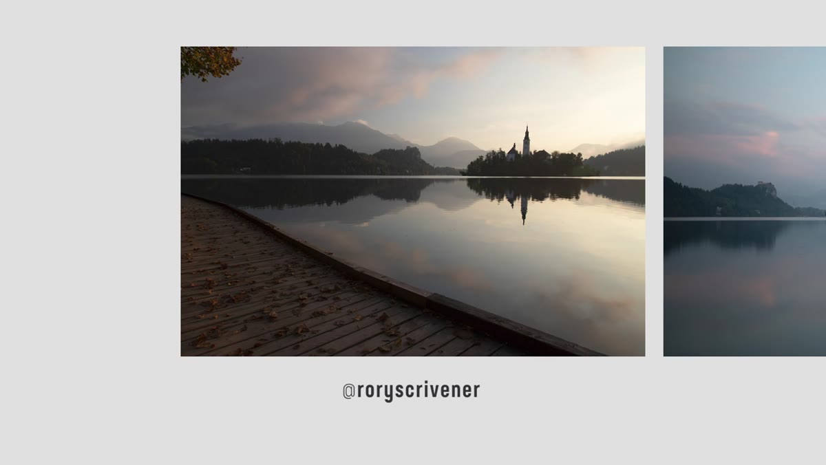 Raw Lake Bled JPEG files displayed side by side before editing
Before opening any panel, McKinnon looks at the three Lake Bled shots and reads them. He notes immediately that they’re JPEGs rather than RAW files, and he adjusts his expectations accordingly. JPEGs have less recoverable data in the highlights and shadows, so aggressive edits will degrade the image faster. He acknowledges the photos are well-exposed straight out of camera, which shapes every decision that follows: there’s nothing to rescue, so the edit is purely about interpretation.
Raw Lake Bled JPEG files displayed side by side before editing
Before opening any panel, McKinnon looks at the three Lake Bled shots and reads them. He notes immediately that they’re JPEGs rather than RAW files, and he adjusts his expectations accordingly. JPEGs have less recoverable data in the highlights and shadows, so aggressive edits will degrade the image faster. He acknowledges the photos are well-exposed straight out of camera, which shapes every decision that follows: there’s nothing to rescue, so the edit is purely about interpretation.
Do this before every edit session. Ask what the photo already does well, what mood it carries naturally, and what you’d lose if you pushed too hard. Rory’s Lake Bled shots had soft morning light and excellent natural reflections. The job wasn’t to add drama. It was to preserve a feeling.
Step 2: Crop for the Focal Point, Not the Full Frame
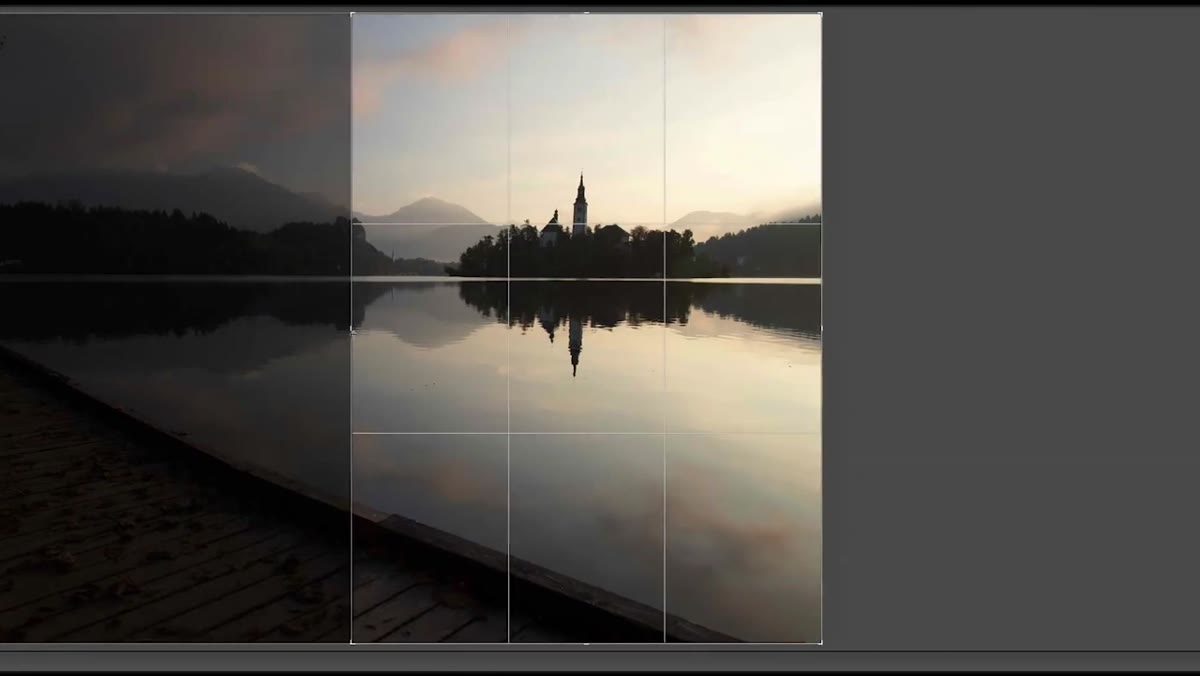 Crop tool active, removing left-side boardwalk from Lake Bled shot
McKinnon looks at the first Lake Bled image and immediately identifies the left side as a distraction. A wide boardwalk fills that edge of the frame and pulls attention away from where the real interest lives: the right side of the scene, where light wraps around the subject and gives it that three-dimensional quality he describes as looking “delicious.” He crops out the boardwalk entirely.
Crop tool active, removing left-side boardwalk from Lake Bled shot
McKinnon looks at the first Lake Bled image and immediately identifies the left side as a distraction. A wide boardwalk fills that edge of the frame and pulls attention away from where the real interest lives: the right side of the scene, where light wraps around the subject and gives it that three-dimensional quality he describes as looking “delicious.” He crops out the boardwalk entirely.
This is one of the most underused editing moves for new photographers. Cropping isn’t cheating and it isn’t a sign that you framed badly. It’s a compositional decision you can make after the fact. When you look at your image, ask where your eye wants to go first, and then ask whether the rest of the frame is helping or competing. If something isn’t earning its place, remove it.
Step 3: Match Your Color Treatment to the Mood of the Scene
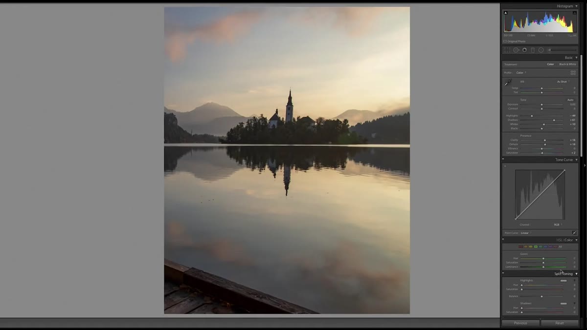 Color and tone sliders adjusted toward muted, earthy tones
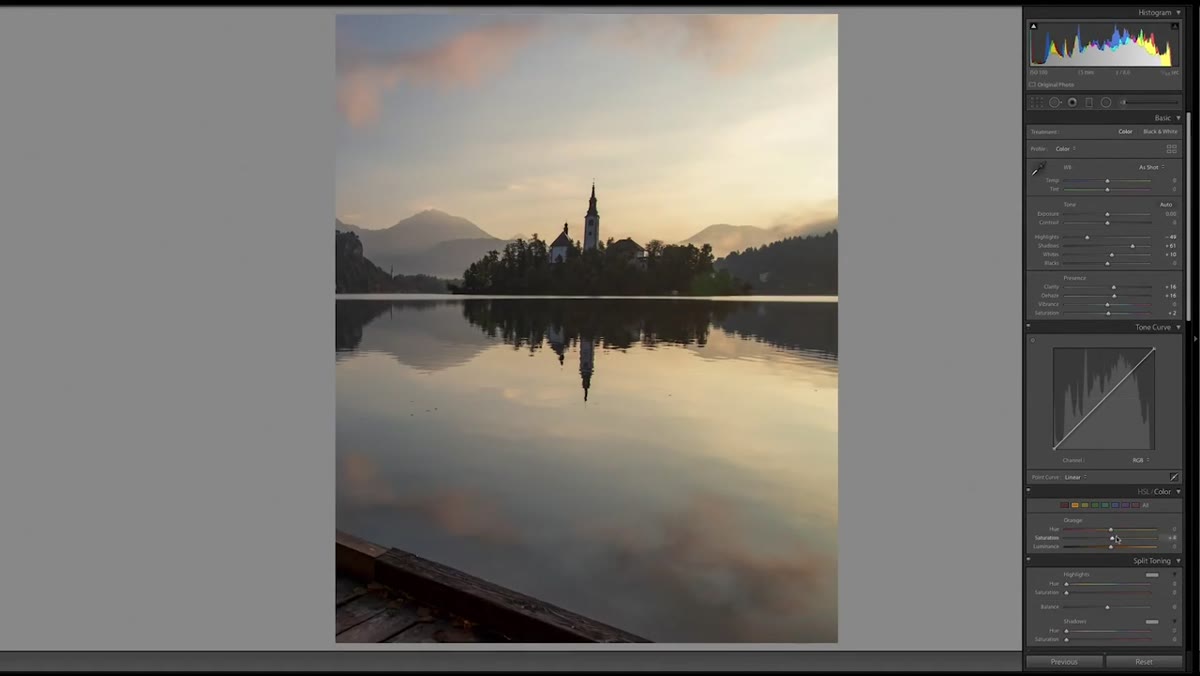
For the Lake Bled edits, McKinnon deliberately pulls toward muted, earthy tones and avoids anything that feels punchy or commercial. He describes wanting the image to feel like a painting you’d see in a museum, something calm and quiet. To get there, he keeps colors soft, introduces a slight green shift for a vintage film quality, and resists boosting saturation even though the blues in the water could handle it.
Color and tone sliders adjusted toward muted, earthy tones
For the Lake Bled edits, McKinnon deliberately pulls toward muted, earthy tones and avoids anything that feels punchy or commercial. He describes wanting the image to feel like a painting you’d see in a museum, something calm and quiet. To get there, he keeps colors soft, introduces a slight green shift for a vintage film quality, and resists boosting saturation even though the blues in the water could handle it.
The practical lesson here is to decide on a mood before you reach for a slider. Are you going warm and intimate, or cool and cinematic? Muted and timeless, or vivid and immediate? For travel photography especially, the edit should match what it felt like to be there, not what the scene would look like in a tourism brochure. Choosing your emotional direction first prevents you from chasing random combinations of adjustments that end up nowhere.
Step 4: Use Clarity and Contrast Sparingly as Finishing Moves
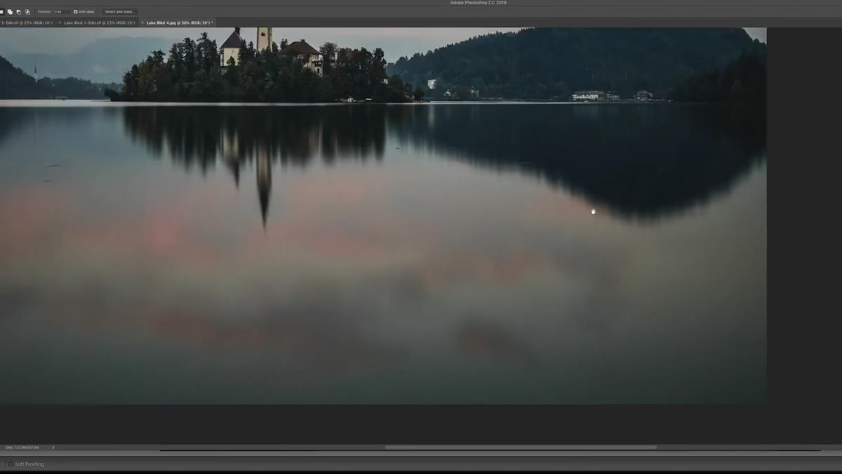 Clarity and contrast sliders receiving small, deliberate adjustments
Once the color direction is set, McKinnon adds a small pump of clarity and a touch of contrast. He’s not dragging sliders to extremes. He’s using these tools to give the image a little more definition without making it feel processed. The reflections in the water benefit from added clarity because the detail is genuinely there in the file. He’s not manufacturing texture. He’s revealing it.
Clarity and contrast sliders receiving small, deliberate adjustments
Once the color direction is set, McKinnon adds a small pump of clarity and a touch of contrast. He’s not dragging sliders to extremes. He’s using these tools to give the image a little more definition without making it feel processed. The reflections in the water benefit from added clarity because the detail is genuinely there in the file. He’s not manufacturing texture. He’s revealing it.
Think of clarity and contrast as seasoning, not ingredients. A little brings things to life. Too much and the image starts to look HDR, over-sharpened, and exhausting to look at. If you add clarity and suddenly every texture looks like it has a halo, you’ve gone too far. Dial it back until it looks like the photo just got a good night’s sleep.
Step 5: Add Film Grain to Unify the Edit
 Grain added in the Detail panel to soften the digital look
Across the Lake Bled photos, McKinnon adds grain. Not heavy, distracting grain, but enough to soften the overly clean digital look and tie the muted color treatment together. This is a move that a lot of beginners skip because it feels counterintuitive. Why would you add noise to a clean image?
Grain added in the Detail panel to soften the digital look
Across the Lake Bled photos, McKinnon adds grain. Not heavy, distracting grain, but enough to soften the overly clean digital look and tie the muted color treatment together. This is a move that a lot of beginners skip because it feels counterintuitive. Why would you add noise to a clean image?
The reason is that grain creates visual cohesion. When you’ve shifted colors and pulled contrast, the image can start to feel like it has two identities: the original capture and the edit. A consistent layer of fine grain smooths over that seam. Keep it subtle. In Lightroom, I usually stay between 15 and 25 on the grain amount with a size around 25 and roughness around 50, adjusting by feel until it looks like it was always meant to be there.
Step 6: Know When to Take It Into Photoshop
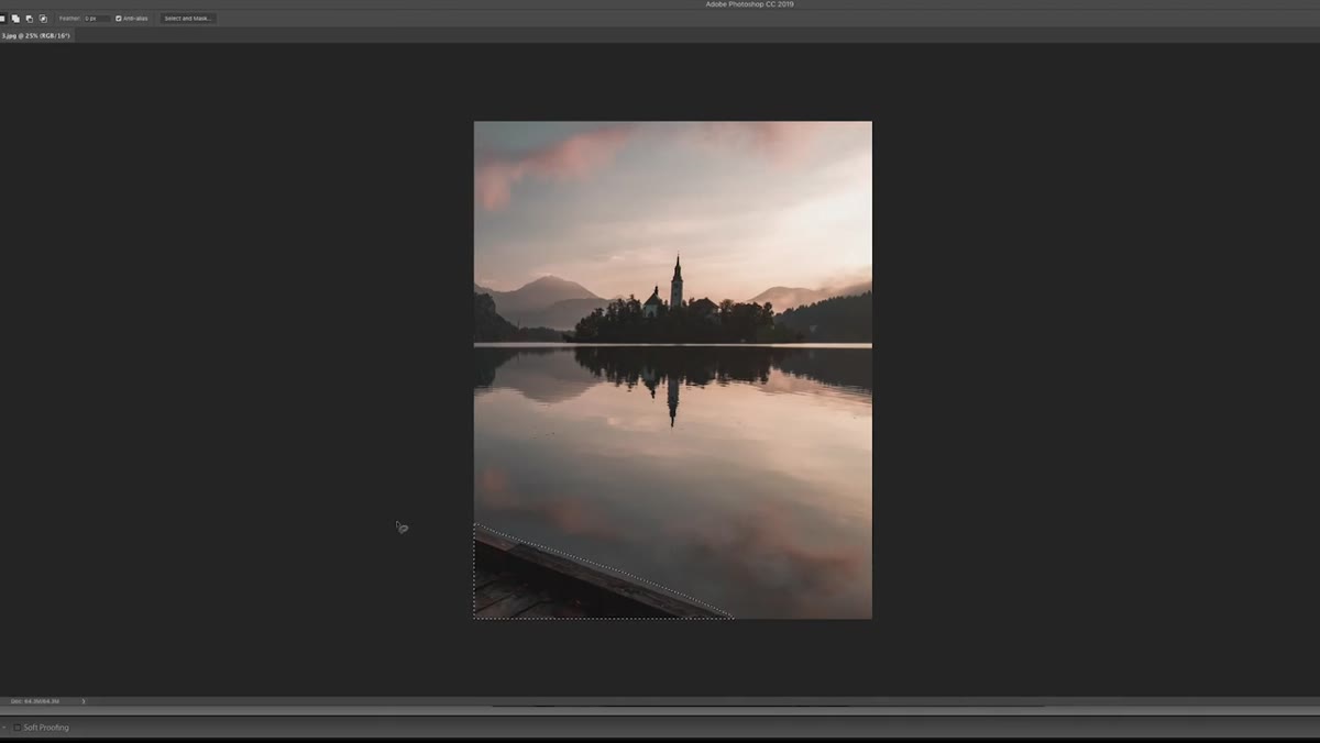 Discussing Content-Aware Fill removal of remaining dock corner
McKinnon flags the remaining corner of the dock as something Lightroom can’t fully address, and mentions moving it into Photoshop for Content-Aware Fill and clone stamping. This is a practical workflow call, not a workaround. Some distractions are structural. They’re in the frame, they’re in focus, and no crop will remove them cleanly. That’s what Photoshop’s healing tools are built for.
Discussing Content-Aware Fill removal of remaining dock corner
McKinnon flags the remaining corner of the dock as something Lightroom can’t fully address, and mentions moving it into Photoshop for Content-Aware Fill and clone stamping. This is a practical workflow call, not a workaround. Some distractions are structural. They’re in the frame, they’re in focus, and no crop will remove them cleanly. That’s what Photoshop’s healing tools are built for.
If you’re not comfortable in Photoshop yet, the healing brush and Content-Aware Fill are worth learning specifically for this scenario: something small and distracting near the edge of the frame that’s pulling the viewer’s eye for the wrong reasons. It takes ten minutes to learn the basics and it will change how confident you feel about including environmental elements in your composition.
What I’d Add From My Own Experience
One thing the tutorial doesn’t linger on, but that I think deserves more attention, is the value of editing JPEGs as a constraint. McKinnon mentions that Rory sent JPEGs instead of RAW files and notes that it limits how hard you can push the edit before the image degrades. What I’ve found is that occasionally editing JPEGs on purpose is a great exercise. It forces restraint. You can’t recover a blown highlight, so you stop trying to fix everything and start working with what’s there. I started doing this with my phone shots after my most-liked Instagram photo turned out to be one I’d taken and edited entirely on my phone. The discipline you build from limited files transfers directly back to how you edit your RAW files. You stop overcorrecting and start listening to what the image is already telling you.
The single biggest takeaway from this tutorial is that editing well-exposed, already-beautiful photos requires a different mindset than rescue editing. Your job is to make a creative choice about mood and then execute it without overriding what the photo already does naturally. Decide the feeling first. Serve the scene. Stop before you’ve done too much.
Watch McKinnon work through all five photos here: Watch the full tutorial on YouTube
Comments
Leave a Comment