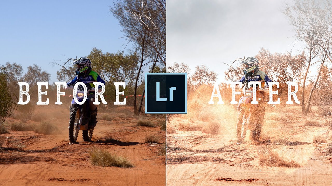
Every time I come back from a trip with a memory card full of RAW files, I face the same problem: the photos are technically fine, but they don’t feel like the place. The Grand Canyon shot looks flat and blue instead of warm and dusty. The landmark photo is cluttered or blown out. The sky is a blank nothing when I remember it being dramatic. These aren’t problems with my camera settings. They’re problems I have to solve in post.
In this Peter McKinnon tutorial, episode five of his ongoing “Editing YOUR Photos” series, McKinnon works through community-submitted shots in real time, and the edits he makes are refreshingly grounded. No heavy-handed presets, no dramatic transformations for their own sake. What he’s doing is matching the mood of the image to the reality of the place, and watching him think out loud about that process is genuinely useful. Watch the full tutorial on YouTube and follow along with the breakdown below.
He also opens with something worth holding onto: his edits reflect his style, not some objective truth about what a photo should look like. I remind myself of that every time I’m second-guessing a color choice at midnight.
Step 1: Read the Scene Before You Touch a Slider
 Peter describing the layered composition of the Grand Canyon photo
Before McKinnon adjusts a single setting on the Grand Canyon photo, he talks about what makes the composition work. There’s a foreground, a mid-ground (the river), and a background that just keeps going. He calls it “stacking” and he’s right to notice it before he edits, because strong composition tells you what the edit needs to do. The layers are already there. Your job is to make each one readable.
Peter describing the layered composition of the Grand Canyon photo
Before McKinnon adjusts a single setting on the Grand Canyon photo, he talks about what makes the composition work. There’s a foreground, a mid-ground (the river), and a background that just keeps going. He calls it “stacking” and he’s right to notice it before he edits, because strong composition tells you what the edit needs to do. The layers are already there. Your job is to make each one readable.
When I sit down with a travel photo, I try to do this first. Where is the viewer’s eye supposed to go? What’s competing with that? The answers shape every tonal decision that follows. If you start pushing sliders without answering those questions, you’re just decorating, not editing.
Step 2: Warm the Image to Match the Location’s Identity
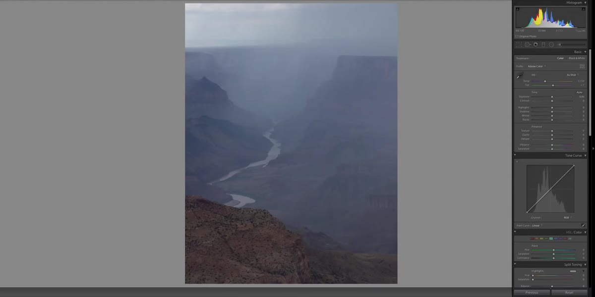 Adjusting white balance/temperature slider in Lightroom toward warmer tones
The Grand Canyon photo came in with a cool, slightly bluish cast - understandable given the overcast storm conditions when it was shot. But McKinnon’s instinct is immediate: Arizona, desert, heat. He pulls the temperature slider toward the warm end to bring the image closer to how that place actually feels rather than how the camera recorded it.
Adjusting white balance/temperature slider in Lightroom toward warmer tones
The Grand Canyon photo came in with a cool, slightly bluish cast - understandable given the overcast storm conditions when it was shot. But McKinnon’s instinct is immediate: Arizona, desert, heat. He pulls the temperature slider toward the warm end to bring the image closer to how that place actually feels rather than how the camera recorded it.
This is a move I use constantly on travel work. Your camera’s white balance is just a starting point. A cool RAW file from a warm location isn’t “accurate” - it’s just what the sensor captured under specific light. Pushing warmth on a desert shot or pulling it back on a misty coastal image is about emotional accuracy, not technical correction. Start subtle. McKinnon notes he didn’t push the warmth too hard here, because the haze in the background still needed to read as atmospheric.
Step 3: Use Dehaze to Recover Detail Lost to Atmospheric Haze
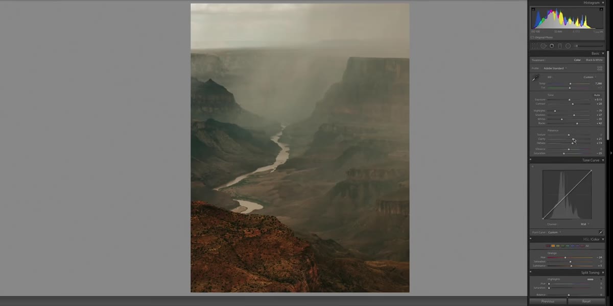 Dehaze slider being applied to the Grand Canyon background
Right alongside the warmth adjustment, McKinnon applies dehaze to lift the murkiness out of the background. In Lightroom, the dehaze slider (found under the Effects panel, or in Lens Corrections depending on your version) adds contrast and saturation selectively in areas where haze is washing out detail. On this Grand Canyon shot, it pulls the canyon walls and cloud formations back into view without nuking the foreground.
Dehaze slider being applied to the Grand Canyon background
Right alongside the warmth adjustment, McKinnon applies dehaze to lift the murkiness out of the background. In Lightroom, the dehaze slider (found under the Effects panel, or in Lens Corrections depending on your version) adds contrast and saturation selectively in areas where haze is washing out detail. On this Grand Canyon shot, it pulls the canyon walls and cloud formations back into view without nuking the foreground.
One thing to watch: dehaze can get aggressive quickly. If your subject starts to look crunchy or oversaturated, you’ve gone too far. McKinnon keeps it measured here because the haze is part of the story - a storm was rolling in. He’s not trying to make it look like a clear day. He’s trying to let the viewer see into the distance without losing the atmosphere.
Step 4: Straighten and Crop with Intention
 Cropping and straightening the Grand Canyon image in Lightroom
After the tonal work, McKinnon straightens the horizon and brings the crop in slightly. It’s a quick step, but it matters. A slightly tilted horizon reads as a mistake even when it’s subtle, and a tighter crop can remove visual noise from the edges without losing the composition’s depth.
Cropping and straightening the Grand Canyon image in Lightroom
After the tonal work, McKinnon straightens the horizon and brings the crop in slightly. It’s a quick step, but it matters. A slightly tilted horizon reads as a mistake even when it’s subtle, and a tighter crop can remove visual noise from the edges without losing the composition’s depth.
Before you finalize any crop, check all four corners. That’s the habit that saves you from publishing a shot with a distracting branch or a blown-out edge you didn’t notice. On the Grand Canyon image, the edit is minimal because the original framing was already strong. Sometimes the best crop is almost no crop at all.
Step 5: Brighten to Reveal the Subject
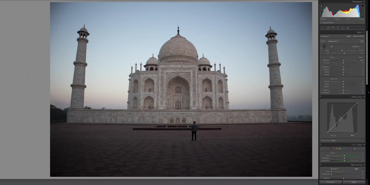 Exposure and highlights being lifted on the Taj Mahal image
Moving to the Taj Mahal photo, shot at 3:30 a.m. with no other tourists present, McKinnon’s first priority is visibility. The building is there, but it’s competing with low-light murkiness. He lifts the exposure to let the architecture breathe. The point of this photo is that someone had the Taj Mahal completely to themselves - and if you can’t clearly see the Taj Mahal, that story disappears.
Exposure and highlights being lifted on the Taj Mahal image
Moving to the Taj Mahal photo, shot at 3:30 a.m. with no other tourists present, McKinnon’s first priority is visibility. The building is there, but it’s competing with low-light murkiness. He lifts the exposure to let the architecture breathe. The point of this photo is that someone had the Taj Mahal completely to themselves - and if you can’t clearly see the Taj Mahal, that story disappears.
Lifting exposure on a low-light shot can blow out highlights fast, so work with the highlights slider alongside the exposure dial. Bring the exposure up, then pull highlights back down to recover any sky or bright surface detail you’ve clipped. You’re trying to expand the tonal range, not just flood the whole frame with light.
Step 6: Consider Sky Replacement When the Sky Doesn’t Serve the Story
 Sky replacement being applied to the Taj Mahal shot in Photoshop or Lightroom
McKinnon is upfront here: sky replacement is a polarizing tool, and he’s not interested in pretending otherwise. On the Taj Mahal image, there’s a gradient of color near the horizon that suggests the sky had potential, but the upper portion is flat. He replaces it with something more dramatic to give the grand architecture the backdrop it deserves.
Sky replacement being applied to the Taj Mahal shot in Photoshop or Lightroom
McKinnon is upfront here: sky replacement is a polarizing tool, and he’s not interested in pretending otherwise. On the Taj Mahal image, there’s a gradient of color near the horizon that suggests the sky had potential, but the upper portion is flat. He replaces it with something more dramatic to give the grand architecture the backdrop it deserves.
Sky replacement in Lightroom (and more precisely in Photoshop) has gotten genuinely good at masking around complex edges like domes and spires. The key is keeping the replacement sky consistent with the light in your scene. If your light is coming from the left and your replacement sky has sunset tones from the right, it will look wrong even if viewers can’t articulate why. McKinnon matches tone and direction, which is what separates a convincing replacement from an obvious one. Use it thoughtfully. Don’t use it to rescue every boring sky by default.
One Thing I’d Add: Decide Your Edit’s Intention Before You Open the File
I’ve started writing one sentence in my notes app before I open a file in Lightroom. Something like: “This should feel golden-hour warm, slightly faded, nostalgic.” It sounds a little precious, but it stops me from chasing random adjustments without a destination. McKinnon is doing this intuitively in real time - “I think Grand Canyon, I think warm” - but when you’re newer to editing, making that intention explicit helps you stop when you’ve actually arrived.
The best travel edits I’ve made weren’t the most technically complex ones. They were the ones where I knew what I was going for before I started.
The single biggest thing McKinnon models in this tutorial isn’t any specific slider value - it’s the habit of reading the photo’s story before touching anything. Ask what the image is trying to say, then edit toward that. Technique follows intention.
Watch the full tutorial on YouTube to see McKinnon work through these edits in real time, including additional photos not covered here.
Comments (1)
I tried this on a client project yesterday and the results were way better than expected.
Leave a Comment