Every Sunday morning I take a photo walk around Seattle. Rain, sun, fog, it doesn’t matter. I come home with a card full of raw files, and here’s the thing I’ve noticed after years of doing this: taking the photo is only half the work. The edit is where you decide what the image actually says. That’s the part most beginners skip over or rush through, and it’s the part that separates a forgettable snapshot from something worth sharing.
That’s why I keep coming back to a specific kind of tutorial: one where an experienced photographer edits images they’ve never seen before, with no prep time and no cherry-picked settings. In Watch the full tutorial on YouTube, Peter McKinnon does exactly that. He put out an Instagram story asking followers to send raw files, received over 8,000 emails in under 24 hours, and then sat down to edit nine of them on camera. What you get is an honest look at how a working creative photographer thinks through problems in real time, not a polished demo of a perfect image.
What struck me most watching this was how often Peter explained why he made a choice before he made it. He wasn’t just moving sliders. He was reading the image, asking what it needed, and editing toward a specific feeling. That’s the skill worth learning.
Step 1: Choose the Stronger Frame Before You Touch Any Settings
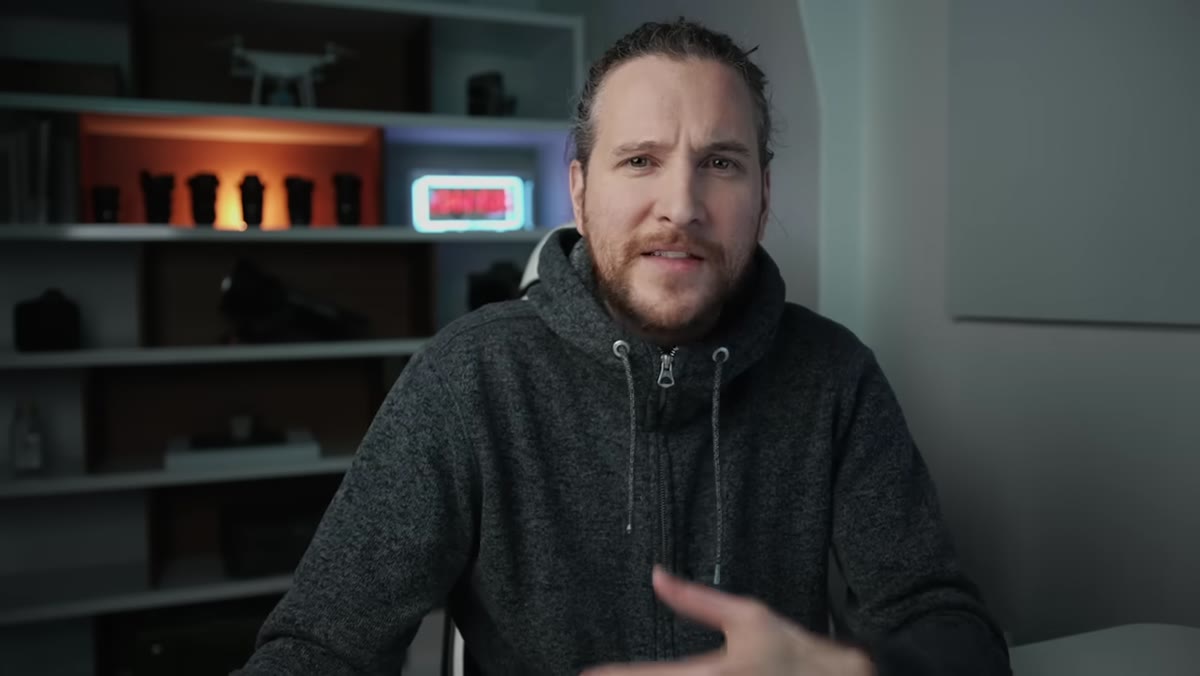 Peter selecting the hiking portrait over the landscape shot
When Peter receives two images from the same photographer, a landscape shot of a lake and a portrait of the photographer standing in front of it, he picks the portrait first. His reasoning is immediate and practical: a subject anchors the image. The landscape alone, he notes, gives too much visual weight to the foreground water without enough sky or distant mountains to balance it. There’s nothing wrong with the frame technically. It just doesn’t have enough to hold attention.
Peter selecting the hiking portrait over the landscape shot
When Peter receives two images from the same photographer, a landscape shot of a lake and a portrait of the photographer standing in front of it, he picks the portrait first. His reasoning is immediate and practical: a subject anchors the image. The landscape alone, he notes, gives too much visual weight to the foreground water without enough sky or distant mountains to balance it. There’s nothing wrong with the frame technically. It just doesn’t have enough to hold attention.
Before you open Lightroom or Photoshop, look at what you actually shot. If you have two frames of the same scene, choose the one with stronger compositional logic. A great edit cannot save a weak frame. A strong frame makes every edit easier.
Step 2: Set Your Crop Early and Commit to It
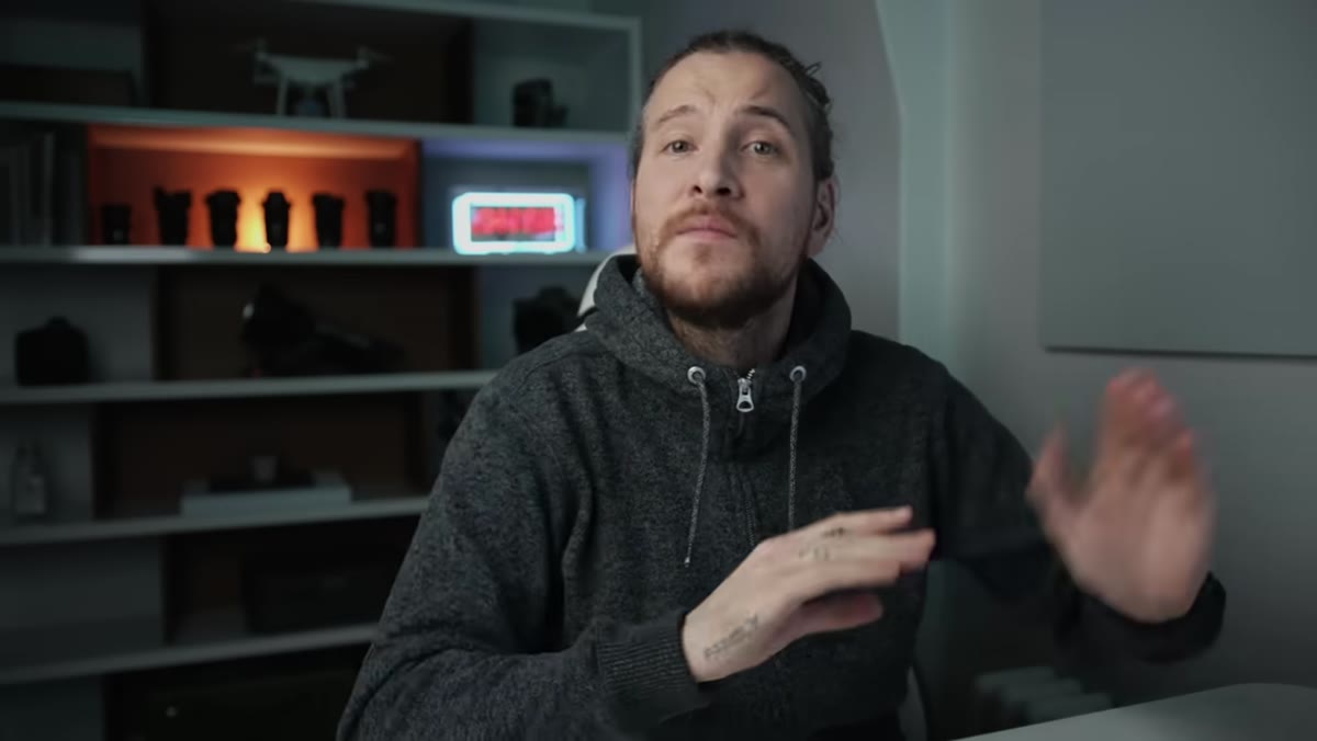 Cropping the image to a 4x5 aspect ratio in Lightroom
Peter crops most of the images in this video to a 4x5 ratio, the vertical format that performs best on Instagram and most social feeds. He makes this decision early in the edit, not at the end. That’s intentional. When you know the crop, you know what parts of the image the viewer will actually see, so every tonal and color adjustment you make is targeted to the right area.
Cropping the image to a 4x5 aspect ratio in Lightroom
Peter crops most of the images in this video to a 4x5 ratio, the vertical format that performs best on Instagram and most social feeds. He makes this decision early in the edit, not at the end. That’s intentional. When you know the crop, you know what parts of the image the viewer will actually see, so every tonal and color adjustment you make is targeted to the right area.
Get into the habit of deciding your output format before you start adjusting. If you’re editing for print, a square, or a phone screen, each one changes which parts of the composition matter most. Crop first, then edit what remains.
Step 3: Use HSL Sliders to Fix Colors That Feel “Off”
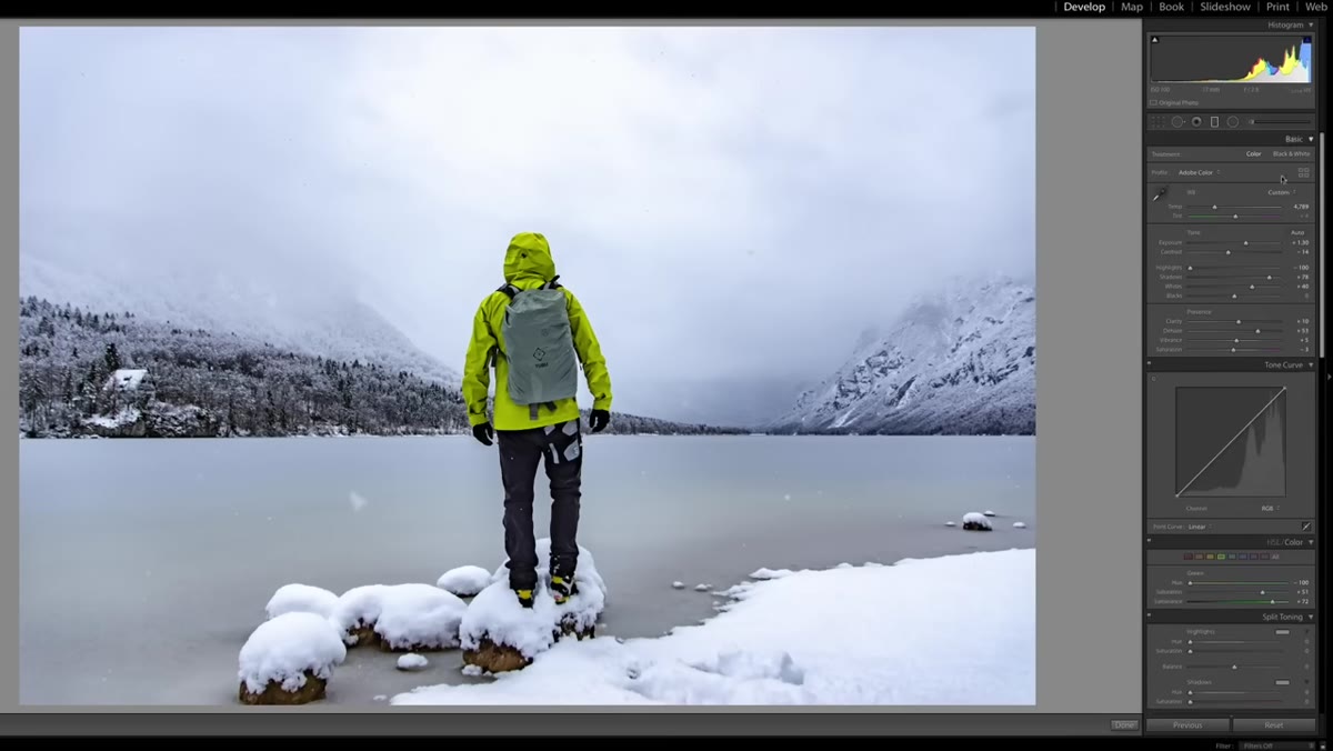
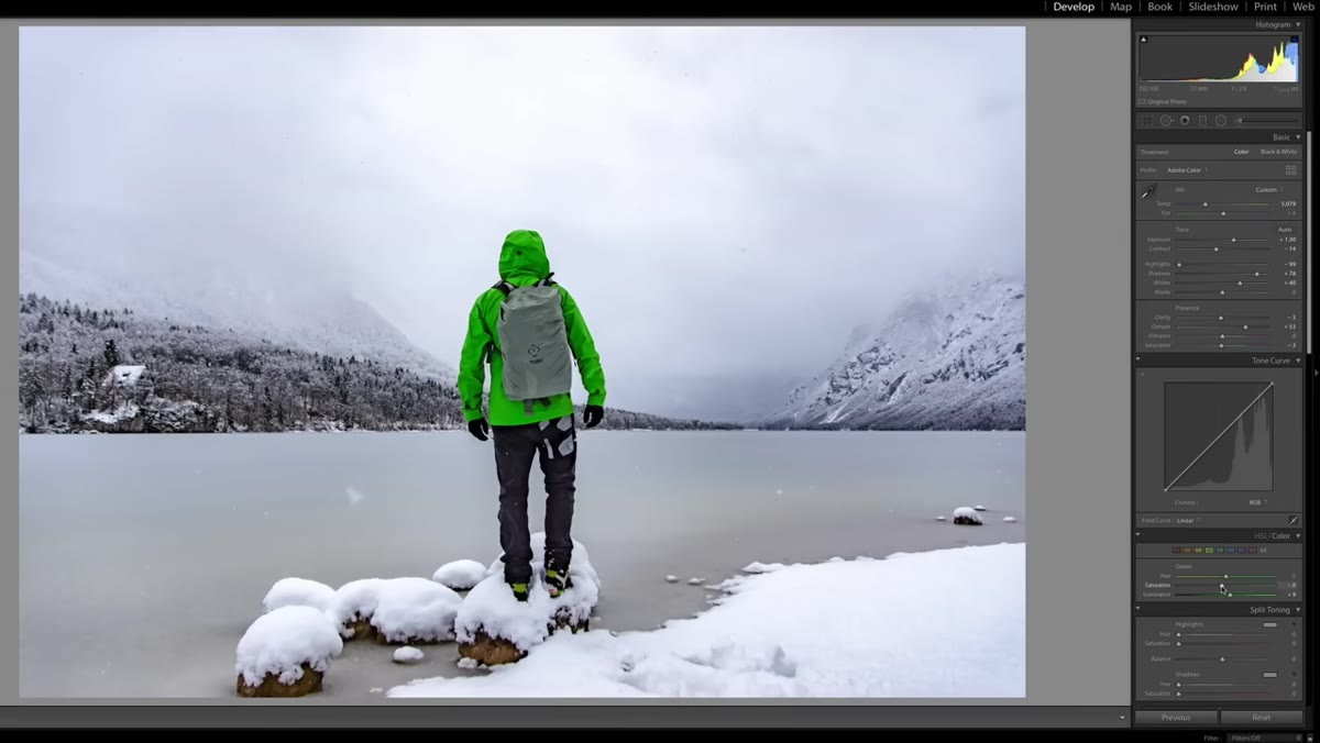 Adjusting HSL color sliders to shift jacket from green to yellow
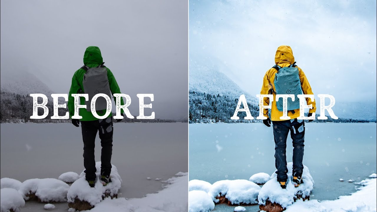
One of the most practical moves in this video is when Peter changes the color of the subject’s jacket from green to yellow. The green wasn’t wrong technically, but against a snowy, cool-toned background it created a visual conflict that pulled the mood sideways. By going into the HSL (Hue, Saturation, Luminance) panel and targeting the green channel, he shifted the jacket to yellow, which reads as warmer and more intentional against the cold whites and blues of the scene.
Adjusting HSL color sliders to shift jacket from green to yellow
One of the most practical moves in this video is when Peter changes the color of the subject’s jacket from green to yellow. The green wasn’t wrong technically, but against a snowy, cool-toned background it created a visual conflict that pulled the mood sideways. By going into the HSL (Hue, Saturation, Luminance) panel and targeting the green channel, he shifted the jacket to yellow, which reads as warmer and more intentional against the cold whites and blues of the scene.
This is a technique worth practicing on your own portraits and travel shots. The HSL panel lets you target individual colors without affecting the whole image. If a jacket, a leaf, or a storefront sign is throwing off your color harmony, that’s where you go. Adjust hue to change the actual color, saturation to make it richer or more muted, and luminance to lighten or darken just that color.
Step 4: Apply Lens Corrections to Clean Up the Edges
 Enabling lens correction to remove vignetting and distortion
Peter turns on lens corrections to deal with the optical quirks introduced by the camera lens, things like edge vignetting, barrel distortion, and chromatic aberration. These are especially noticeable in wide-angle shots where the horizon curves slightly or the corners of the frame darken.
Enabling lens correction to remove vignetting and distortion
Peter turns on lens corrections to deal with the optical quirks introduced by the camera lens, things like edge vignetting, barrel distortion, and chromatic aberration. These are especially noticeable in wide-angle shots where the horizon curves slightly or the corners of the frame darken.
In Lightroom, this is a one-click fix in the Lens Corrections panel. Check “Enable Profile Corrections” and Lightroom will pull the correction profile for your specific lens. It won’t make a dramatic visible difference on every image, but on wide landscapes and architecture shots, it removes a layer of distortion that would otherwise make your final edit feel slightly off without anyone being able to say why.
Step 5: Add Subtle Environmental Details to Strengthen the Story
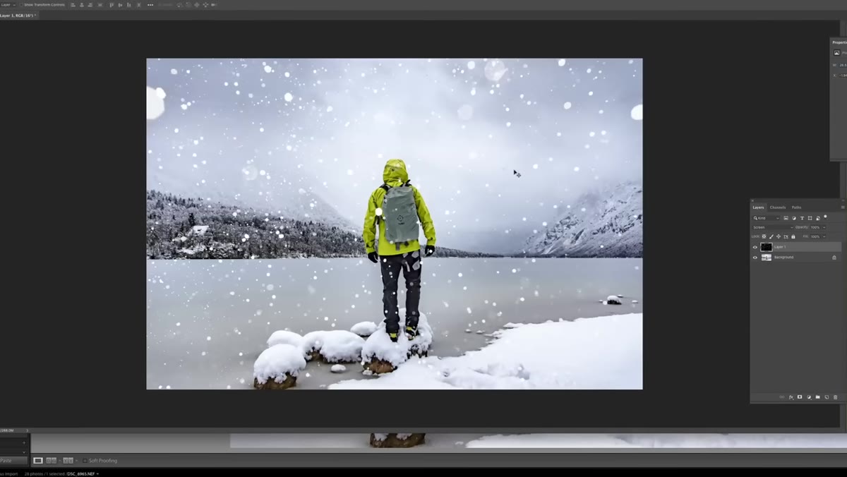 Adding a light snow overlay with reduced opacity
Here’s a creative move that beginners rarely consider. Because the original raw file was shot during a snowfall, Peter adds a very light snow overlay in post to bring back some of what was there when the shutter clicked. He keeps the opacity low, avoids any motion blur, and lets it read as atmosphere rather than special effect.
Adding a light snow overlay with reduced opacity
Here’s a creative move that beginners rarely consider. Because the original raw file was shot during a snowfall, Peter adds a very light snow overlay in post to bring back some of what was there when the shutter clicked. He keeps the opacity low, avoids any motion blur, and lets it read as atmosphere rather than special effect.
This works because it’s true to the scene. He’s not inventing weather that wasn’t there. He’s restoring something the camera’s exposure and settings slightly flattened out. When you’re editing images from a specific environment, ask yourself what the raw file is underplaying. Fog, golden light, falling leaves, these are all things that compress when the camera processes them. A subtle overlay or a targeted adjustment can bring that feeling back.
What I’d Add from My Own Experience
Peter edits quickly and intuitively, which is genuinely useful to watch, but there’s one habit I’d add that has improved my own workflow: label the mood before you touch the first slider. I mean literally type a word into the image notes field in Lightroom, something like “cold,” “golden,” “melancholy,” “clean.” That single word becomes your filter for every decision after it. Does this adjustment serve that mood? If it doesn’t, undo it.
I started doing this after spending an entire vacation chasing a waterfall shot at blue hour and realizing at home that all my edits were fighting each other because I’d never decided what I actually wanted the image to feel like. The technique was fine. The intention was missing. Once I added that step, my consistency across a whole shoot improved dramatically.
The biggest takeaway from Peter’s tutorial is this: editing is interpretation, not correction. You’re not fixing the photo. You’re finishing it. Every slider you move should serve a feeling you’ve already decided on.
Watch the full tutorial on YouTube to see Peter work through all nine images in real time. Watching someone reason through an unfamiliar raw file is one of the fastest ways to develop your own editing instincts.
Comments (1)
This is the kind of content that keeps me coming back.
Leave a Comment