
If you’ve ever had to shoot something bigger than a cereal box for a client, you already know the tutorials aren’t exactly lining up to help you. Most of the product photography content out there covers small objects on a tabletop with a couple of speedlights. Clean, tidy, easy to find. But the moment a client asks you to photograph a sofa, a dining set, or a king-sized bed frame, you’re mostly on your own.
That’s exactly what drew me to this Sean Tucker tutorial. Watch the full tutorial on YouTube - it’s part two of his large product photography series, and this episode lives entirely inside Lightroom. He covers how to bring your images in from the shoot, correct color across every frame at once, select only the keepers, and export a clean, cut-out image that’s ready for an e-commerce product page. What he’s built here is a repeatable, efficient workflow, and once you run through it a few times, it genuinely starts to feel fast.
The reason this matters to me practically: I picked up a furniture client last year and spent way too long fumbling through an inconsistent editing process. Every image looked slightly different in tone. The whites weren’t matching. I was fixing things one by one. A structured workflow like this one would have saved me hours. Here’s how it works.
Step 1: Import Everything into Lightroom and Get Your Bearings
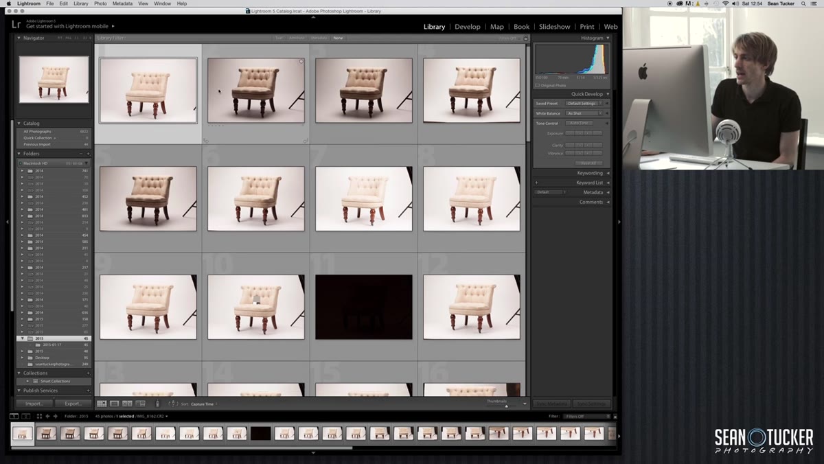 Lightroom library panel showing all imported product images
Once your images are imported into Lightroom, switch to the Library module and take stock of what you have. You’ll likely see a mix of lighting tests, gray card frames, and actual product shots all sitting together in the same import. Don’t worry about sorting them yet. The first priority is finding the frame where you photographed your gray card, because that’s what drives the entire color correction step that comes next.
Lightroom library panel showing all imported product images
Once your images are imported into Lightroom, switch to the Library module and take stock of what you have. You’ll likely see a mix of lighting tests, gray card frames, and actual product shots all sitting together in the same import. Don’t worry about sorting them yet. The first priority is finding the frame where you photographed your gray card, because that’s what drives the entire color correction step that comes next.
Scroll through your thumbnails and mentally tag the gray card image. Tucker shot his alongside the product specifically for this moment in post. If you didn’t shoot a gray card during your session, this is a good reminder to add one to your kit before the next shoot. A physical gray card costs almost nothing and makes this entire workflow significantly more accurate.
Step 2: Set White Balance from the Gray Card
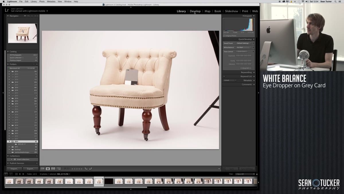 Develop module with eyedropper tool hovering over gray card
Switch the selected gray card image into the Develop module using the tabs across the top of Lightroom. From there, grab the white balance selector, which looks like an eyedropper, from the Basic panel on the right side. Click it directly onto the gray card in your image.
Develop module with eyedropper tool hovering over gray card
Switch the selected gray card image into the Develop module using the tabs across the top of Lightroom. From there, grab the white balance selector, which looks like an eyedropper, from the Basic panel on the right side. Click it directly onto the gray card in your image.
What happens next is often surprising, especially the first time you do it. The image shifts noticeably, sometimes dramatically. Tucker’s example pulled a heavy yellow cast out of the frame, one that wasn’t obviously visible during the shoot but was absolutely there in the file. This is exactly why you shoot a gray card. Your eyes adapt to mixed light on set. The camera records what’s actually there. The gray card gives Lightroom a reference point to neutralize the cast and render color accurately.
Step 3: Sync White Balance Across All Images
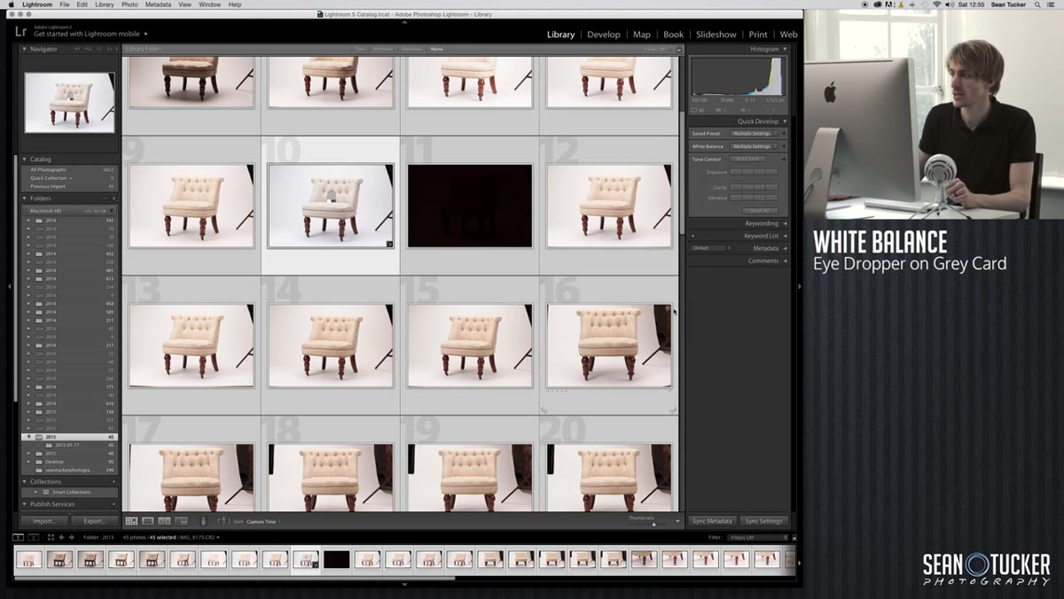 Lightroom sync settings dialog with White Balance checked
Jump back to the Library module and select all of your images at once using Command-A on Mac or Control-A on PC. Then look at the bottom of the screen for the “Sync Settings” button. Click it, choose “Check None” to clear everything, and then manually check only “White Balance” and “Process Version.” Hit Synchronize.
Lightroom sync settings dialog with White Balance checked
Jump back to the Library module and select all of your images at once using Command-A on Mac or Control-A on PC. Then look at the bottom of the screen for the “Sync Settings” button. Click it, choose “Check None” to clear everything, and then manually check only “White Balance” and “Process Version.” Hit Synchronize.
Lightroom will now apply the exact same color correction you made on the gray card frame to every single image in the import. You’ll see the thumbnails shift one by one down the strip. This is the move that makes a multi-image product shoot look cohesive. Without it, you’re manually adjusting white balance on each frame, which is tedious and still likely to leave subtle inconsistencies between shots.
Step 4: Cull Your Selects
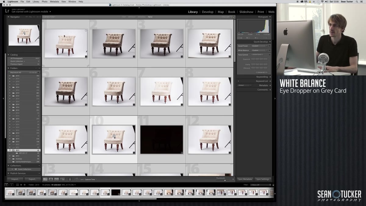 Lightroom library grid view with arrow key navigation between frames
With color corrected across the board, now you can actually evaluate your images fairly. Use your arrow keys to move through the frames one by one in the Library module. You’re looking for the actual product shots, the ones with good light, sharp focus, and the angles your client needs. Skip the black test frames, the lighting setup shots, and any exposures you used just to check a setting.
Lightroom library grid view with arrow key navigation between frames
With color corrected across the board, now you can actually evaluate your images fairly. Use your arrow keys to move through the frames one by one in the Library module. You’re looking for the actual product shots, the ones with good light, sharp focus, and the angles your client needs. Skip the black test frames, the lighting setup shots, and any exposures you used just to check a setting.
If your thumbnails are too small to judge properly, use the size slider in the bottom right corner of the Library grid to make them larger. Tucker keeps this step quick because he already knows roughly what he shot. The more familiar you are with your own shoot, the faster this goes. Flag your selects with the P key or use star ratings, whatever your personal Lightroom system is. The goal is to isolate only the images you’re going to take all the way through the workflow.
A Note on Shooting to Match This Workflow
I want to add something here that Tucker touches on in the broader series but is worth underlining for anyone approaching this workflow cold: the cleaner your capture, the less work this process requires. That sounds obvious, but it has specific implications for large product photography.
When I photographed that furniture client, I hadn’t lit the background consistently from shot to shot. I thought I could fix it in post. I could, but it took much longer than it should have, and the results were less clean than if I’d taken another twenty minutes on set to even out the background lights. Tucker’s whole workflow assumes you came in with a reasonably well-lit white background and controlled ambient light. If you’re watching part two before part one, go back and start at the beginning. The editing workflow here is efficient because the lighting work was done properly first.
Also, if you’re doing this for a client who offers multiple colorways of the same product, Tucker covers recoloring in part three of the series. That’s worth knowing before you commit to your shot list. If you can lock down one perfect base image with clean light and a proper cutout, you can use it as the foundation for every color variation, which saves an enormous amount of time and keeps the product imagery visually consistent across the site.
The single most valuable thing in this workflow is the gray card step combined with the sync. Done right, it collapses what could be hours of individual image corrections into about thirty seconds of work. Get that right and the rest of the edit becomes much more manageable.
Watch the full tutorial on YouTube to see Tucker walk through the export and cutout steps that follow this Lightroom workflow, including how he brings a drop shadow back into the final image to give the product a sense of grounded, natural weight on the white background.
Comments (1)
This should be required reading for anyone starting out.
Leave a Comment