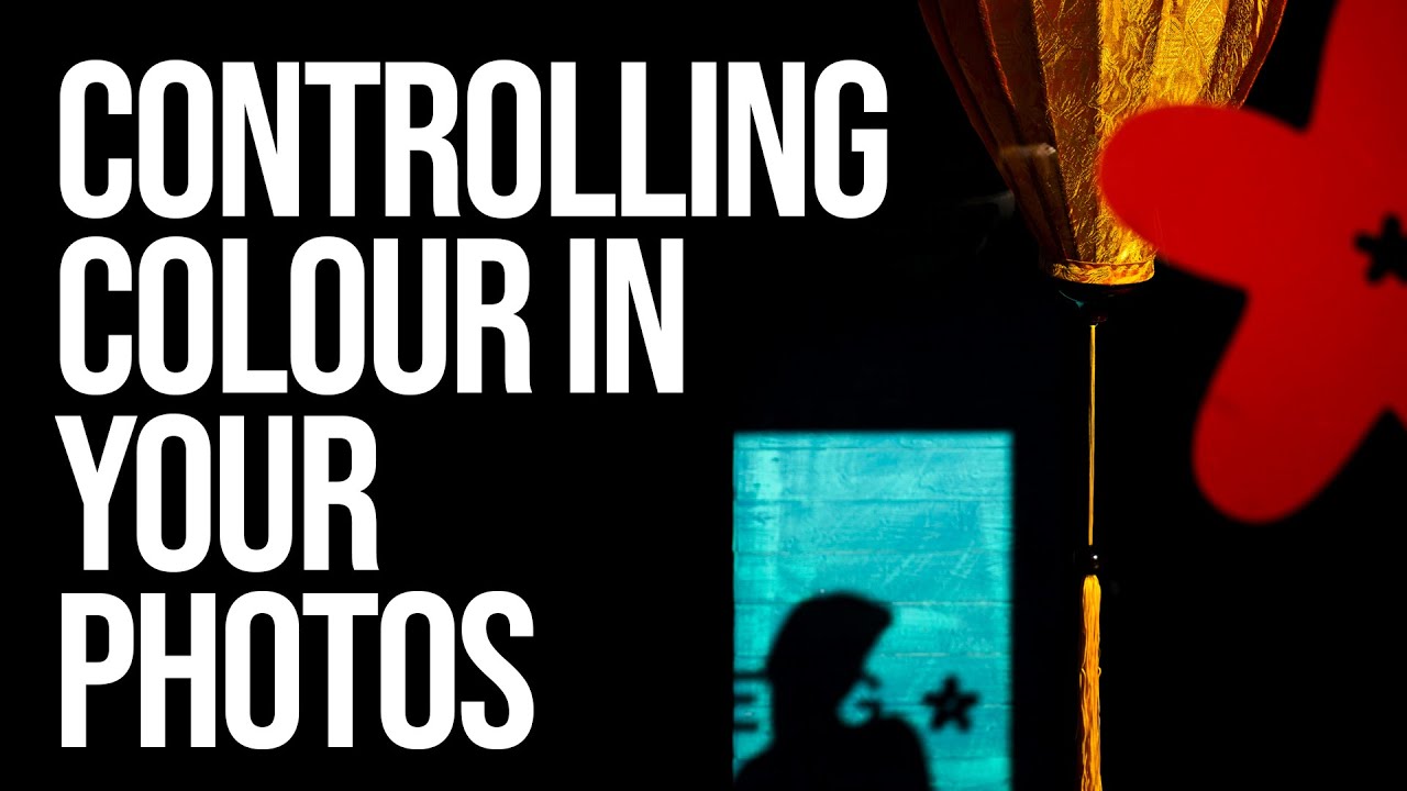
Every Sunday I do a photo walk through my neighborhood in Seattle. Rain, shine, 6am fog — it happens. And one thing I started noticing, especially when I’d get home and pull images into Lightroom, was that my shots felt scattered. Not technically wrong, just… unfocused in terms of mood. The colors were all over the place, and the images didn’t feel like they were telling a single story. They felt like a report. A document. Not a feeling.
That’s the problem this tutorial cracked open for me. In this Sean Tucker tutorial on controlling color through Hue, Saturation, and Luminance, Watch the full tutorial on YouTube, Tucker makes a point early on that stuck with me: cinema looks cinematic not because it’s accurate, but because it’s intentional. Film sets are dressed. Wardrobe is chosen. Colors are curated to create a feeling. And when we edit our photos the same way, reducing and directing the color palette rather than just correcting it, we move from reportage into storytelling. That shift changed how I approach every edit.
The tool he focuses on is the HSL panel, which stands for Hue, Saturation, and Luminance. You almost certainly have it already in Lightroom, Lightroom Mobile, or most comparable editing software. The goal is not to dump a preset on your image and call it a day. Tucker is refreshingly direct about presets: they’re a decent starting point, but learning to control the final 20 percent yourself is actually most of the journey. Here’s how to do it.
Step 1: Understand What HSL Actually Controls
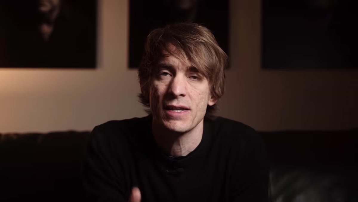
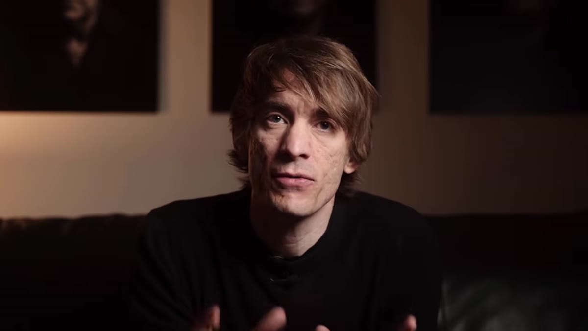
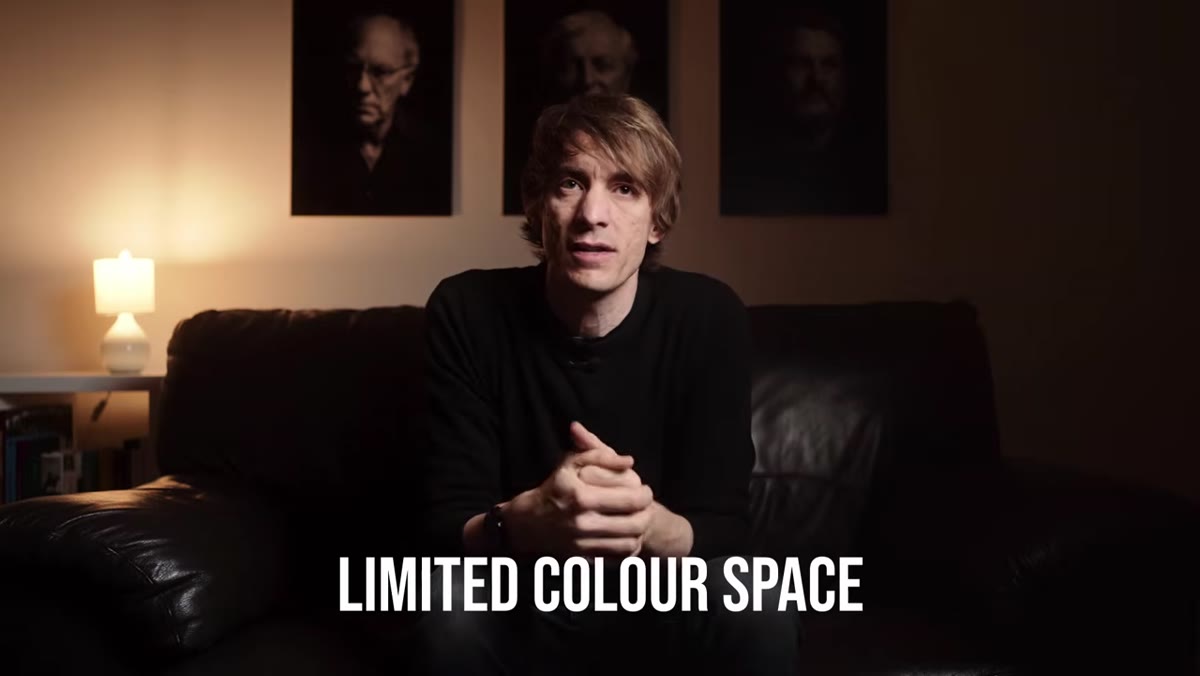 Tucker explaining limited color palette and cinematic look
Before you touch a single slider, it helps to know what each axis does. Hue shifts a color toward a neighboring color on the wheel. Saturation controls how vivid or muted that color appears. Luminance controls how light or dark that specific color looks, independent of the others. So if the green foliage in your shot is too yellow, you use Hue to pull it back toward a truer green. If it’s screaming, you pull Saturation down. If it’s muddying the shadows, you adjust Luminance to lift or drop just that tone. Each channel is surgical. That’s the point.
Tucker explaining limited color palette and cinematic look
Before you touch a single slider, it helps to know what each axis does. Hue shifts a color toward a neighboring color on the wheel. Saturation controls how vivid or muted that color appears. Luminance controls how light or dark that specific color looks, independent of the others. So if the green foliage in your shot is too yellow, you use Hue to pull it back toward a truer green. If it’s screaming, you pull Saturation down. If it’s muddying the shadows, you adjust Luminance to lift or drop just that tone. Each channel is surgical. That’s the point.
Step 2: Identify the Colors That Are Doing Work in Your Image
 Scene showing multiple colors represented naturally in camera
Before reaching for sliders, look at your image and ask which colors are actually serving the story and which ones are competing with it. A portrait with warm skin tones might have a distracting teal shirt in the background. A travel shot of golden-hour architecture might have a garbage truck’s orange logo pulling your eye away from the facade. You don’t need to remove these colors entirely, but you do need to decide whether they’re earning their place. Make a quick mental list: what colors do I want to feature, and what do I want to quiet down?
Scene showing multiple colors represented naturally in camera
Before reaching for sliders, look at your image and ask which colors are actually serving the story and which ones are competing with it. A portrait with warm skin tones might have a distracting teal shirt in the background. A travel shot of golden-hour architecture might have a garbage truck’s orange logo pulling your eye away from the facade. You don’t need to remove these colors entirely, but you do need to decide whether they’re earning their place. Make a quick mental list: what colors do I want to feature, and what do I want to quiet down?
Step 3: Use the Hue Sliders to Shift Colors Toward Your Palette
 Color grading on a cinematic set, controlled color choices shown
Once you know what you’re working with, open the HSL panel and go to the Hue tab. This is where you start pushing colors into a more deliberate relationship with each other. A common cinematic move is to push greens slightly toward teal and yellows slightly toward orange or gold. This creates a warm-cool contrast that reads as moody and cohesive. Don’t go wild here. Small adjustments, maybe 5 to 15 points in most cases, are usually enough. If you can see exactly what you did, you probably overdid it.
Color grading on a cinematic set, controlled color choices shown
Once you know what you’re working with, open the HSL panel and go to the Hue tab. This is where you start pushing colors into a more deliberate relationship with each other. A common cinematic move is to push greens slightly toward teal and yellows slightly toward orange or gold. This creates a warm-cool contrast that reads as moody and cohesive. Don’t go wild here. Small adjustments, maybe 5 to 15 points in most cases, are usually enough. If you can see exactly what you did, you probably overdid it.
Step 4: Reduce Saturation on Colors That Compete
 Lightroom HSL panel open, saturation sliders visible
Jump over to the Saturation tab and deliberately pull down any colors that are fighting for attention. This is where you actually build a limited palette. If your image is warm and golden, you might pull down the blues and greens slightly so they become more neutral and the warm tones have nowhere to compete with. You’re not removing those colors entirely, you’re just turning their volume down so the featured colors can lead. I do this on almost every edit now, even when I’m not going for a dramatic look. A slightly desaturated competing color is almost always less distracting than a fully saturated one.
Lightroom HSL panel open, saturation sliders visible
Jump over to the Saturation tab and deliberately pull down any colors that are fighting for attention. This is where you actually build a limited palette. If your image is warm and golden, you might pull down the blues and greens slightly so they become more neutral and the warm tones have nowhere to compete with. You’re not removing those colors entirely, you’re just turning their volume down so the featured colors can lead. I do this on almost every edit now, even when I’m not going for a dramatic look. A slightly desaturated competing color is almost always less distracting than a fully saturated one.
Step 5: Shape the Mood With Luminance
 Neutral camera sensor showing colors equally represented
Luminance is the slider most people ignore, and it’s one of the most powerful. Dropping the Luminance on a color darkens only that color, which means you can sink greens into shadow territory without touching your blacks or shadows slider. Lifting Luminance on a skin tone range like orange or yellow can make a subject’s face feel more luminous without adding any warmth. For a moody, cinematic look, try dropping the Luminance on blues and greens while keeping your warm tones lifted. This creates depth and separation in the image using color alone, not just contrast.
Neutral camera sensor showing colors equally represented
Luminance is the slider most people ignore, and it’s one of the most powerful. Dropping the Luminance on a color darkens only that color, which means you can sink greens into shadow territory without touching your blacks or shadows slider. Lifting Luminance on a skin tone range like orange or yellow can make a subject’s face feel more luminous without adding any warmth. For a moody, cinematic look, try dropping the Luminance on blues and greens while keeping your warm tones lifted. This creates depth and separation in the image using color alone, not just contrast.
Step 6: Work the Target Selector for Precision
 HSL panel with target/selector tool icon highlighted
Most editing software, including Lightroom, gives you a target selector tool in the HSL panel. It looks like a small circle with a dot. Click it, hover over a specific color in your image, and drag up or down. The software automatically adjusts whichever sliders correspond to that exact pixel’s color. This is far more accurate than guessing which slider controls the slightly-teal-but-also-kind-of-blue shadow in the corner. I use this constantly when working with complex outdoor shots where the greens are pulling from three or four different slider ranges at once.
HSL panel with target/selector tool icon highlighted
Most editing software, including Lightroom, gives you a target selector tool in the HSL panel. It looks like a small circle with a dot. Click it, hover over a specific color in your image, and drag up or down. The software automatically adjusts whichever sliders correspond to that exact pixel’s color. This is far more accurate than guessing which slider controls the slightly-teal-but-also-kind-of-blue shadow in the corner. I use this constantly when working with complex outdoor shots where the greens are pulling from three or four different slider ranges at once.
A Note From My Own Editing Practice
The thing Tucker doesn’t spell out explicitly, but that I’ve discovered through a lot of Sunday walks and late-night editing sessions, is that HSL work is most effective after you’ve locked in your exposure and white balance. If you’re still wrestling with whether the image is too warm or too bright, the color palette isn’t going to cooperate. Get the foundation solid first, then go into HSL as a creative decision, not a corrective one.
I’d also add that the best way to develop an eye for this is to reverse-engineer images you admire. Pull a film still or a photograph you love into Lightroom and ask yourself: what colors are featured here? What’s been muted? Then try to recreate that mood on one of your own shots using only the HSL sliders. I used to do this with my VSCO presets before I realized I didn’t need them anymore. You learn faster by studying something specific than by reading a dozen articles about theory. This article included.
The single most important thing to take from Tucker’s tutorial is this: a limited, deliberate color palette is what makes an image feel cinematic rather than accidental. The HSL panel is how you build that palette in post, one color channel at a time. It takes practice, but it’s a learnable skill that will make every preset you’ve ever bought feel like training wheels you no longer need.
Watch the full tutorial on YouTube to see Sean Tucker walk through these concepts with live examples. It’s well worth your time.
Comments
Leave a Comment