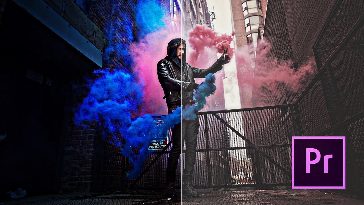
I used to hand over footage to clients and feel that quiet little dread of knowing it looked flat. The exposure was fine, the focus was sharp, but something was missing. It had no mood. No weight to it. It looked like a recording, not a film. If you’ve ever felt that gap between what your camera captures and what you actually envisioned, color correction is the bridge. Not the complicated, months-of-practice kind either. The kind that takes ten minutes and transforms a clip from “documentary rough cut” to something that feels intentional.
In this Peter McKinnon tutorial, he walks through his complete color grading workflow in Adobe Premiere Pro, from raw clip to something polished and punchy. Watch the full tutorial on YouTube before or after reading this, depending on how you learn. What I want to do here is break it down into concrete steps you can follow without pausing and rewinding every thirty seconds.
The workflow centers entirely on Premiere Pro’s built-in Lumetri Color panel. No third-party plugins required. No LUT packs you need to buy first. Just the tools already sitting inside the software you probably already use.
Step 1: Bring Your Clip Into the Timeline and Clean Up Audio
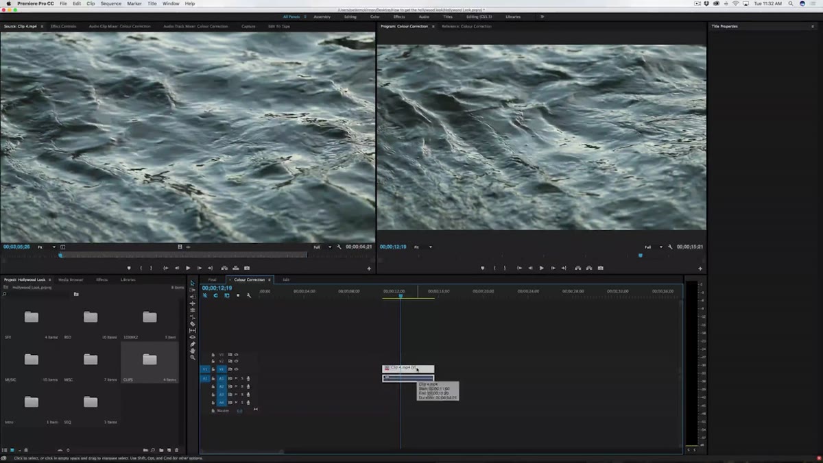 Raw clip being dragged into the Premiere Pro timeline
Before touching a single color slider, get your clip seated properly in the timeline. Set your in and out points to define the length you want, then drag it in. One small thing Peter does that I’ve started doing too: he immediately unlinks and deletes the audio track if it has no usable sound. Use Command-L on Mac to unlink audio and video, then delete the audio layer. It sounds minor, but working with a clean timeline means you’re only looking at what actually matters. No phantom waveforms cluttering your view.
Step 2: Open the Lumetri Color Panel
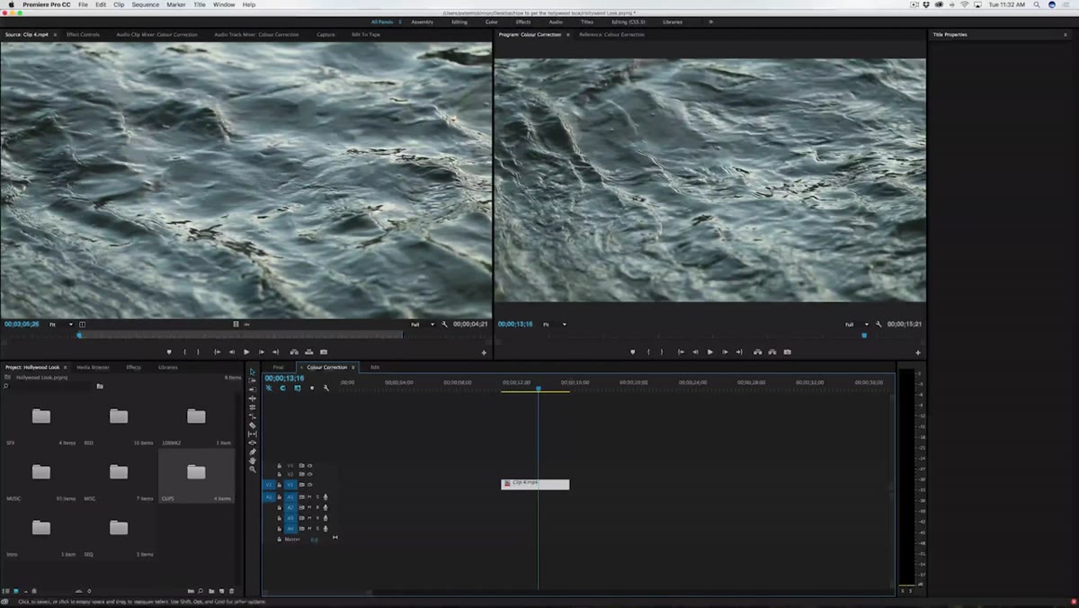 Lumetri Color panel opening from the Window menu
Go to Window in the top menu bar and select Lumetri Color. A panel will open on the right side of your workspace with a full set of controls: Basic Correction, Creative, Curves, Color Wheels, and more. For this workflow, Basic Correction is where most of the action happens. That tab gives you sliders for exposure, contrast, highlights, shadows, whites, blacks, and color temperature. Think of it as the foundation layer. You set the tone here before anything else.
Step 3: Dial In Exposure and Deepen the Blacks
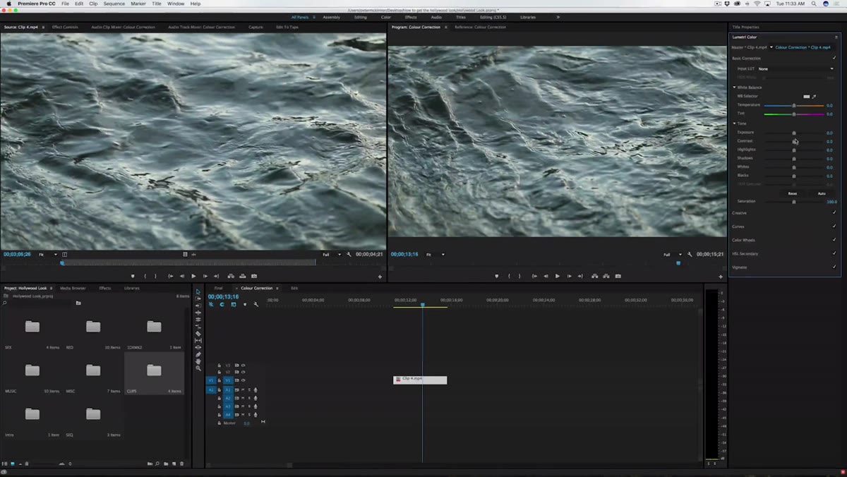 Exposure and Blacks sliders being pulled down in Lumetri Color
Peter’s signature look is high contrast and dramatic. Deep shadows, strong blacks, highlights that still punch through. To get there, start by pulling the Exposure slider down slightly to bring the overall brightness under control. Then drop the Blacks slider further. This is what gives footage that rich, grounded look instead of the milky, washed-out feel you get from footage that hasn’t been touched. How far you go depends on your clip. A dark forest scene can handle more than a bright outdoor shot. Watch your highlights as you work. You want texture, not just darkness.
Step 4: Adjust Color Temperature for Mood
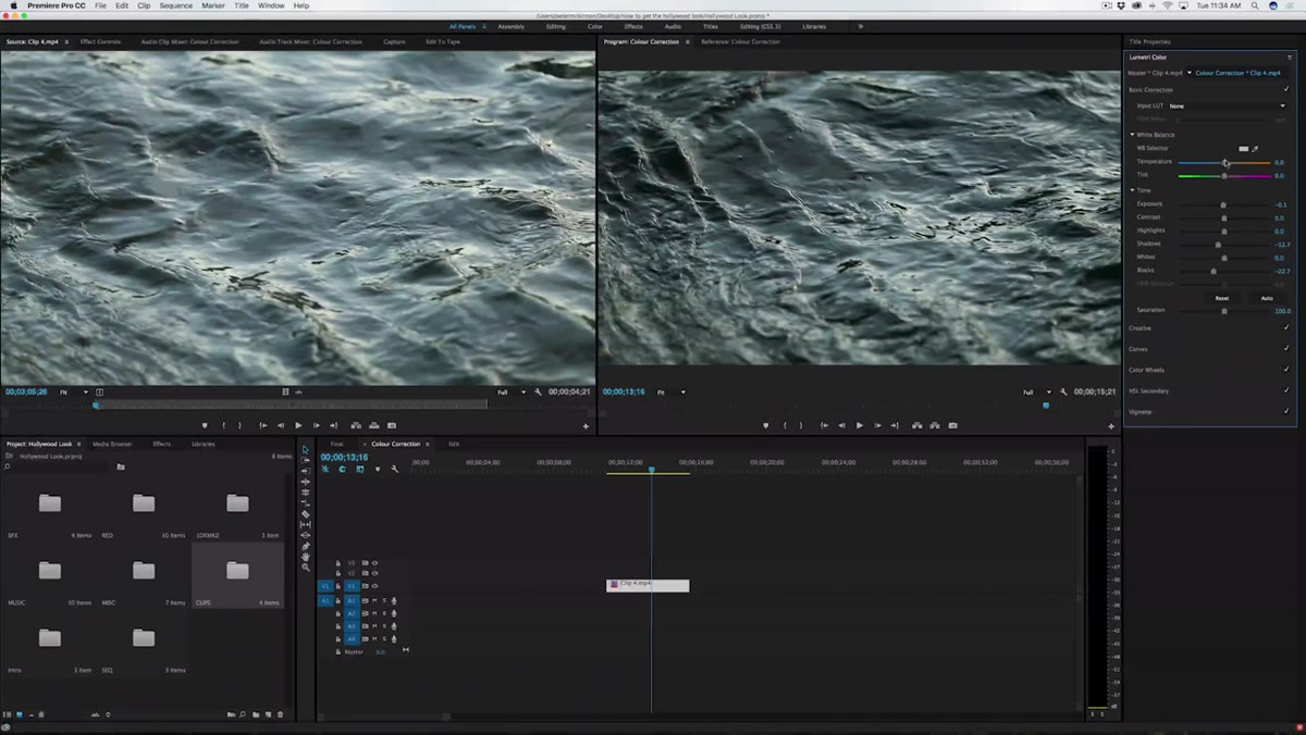 Temperature slider being dragged left toward blue tones
The Temperature slider controls the warm-to-cool balance of your footage. Slide right and your image picks up amber and orange tones, which reads as late afternoon or golden hour. Slide left and the image cools into blue tones, which feels colder, earlier in the day, more clinical or tense. Peter pulls his temperature slightly left for the river clip to give it a moody, cold look. This is one of the fastest ways to establish an emotional tone without doing anything complicated. If you’re shooting in a green forest and want it to feel like a thriller rather than a nature documentary, a slight cool shift does a lot of the work.
Step 5: Refine Shadows and Highlights Together
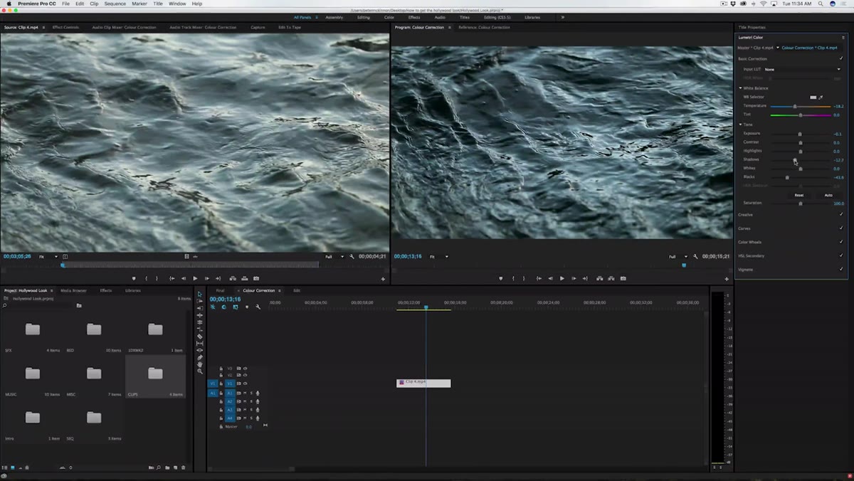 Shadows and Highlights sliders being fine-tuned in Lumetri Basic Correction
Once your temperature and blacks are set, go back and balance the Shadows and Highlights sliders against each other. The goal is controlled contrast, not flat darkness. Peter brings the shadows in a bit further while making sure the highlights are still visible and bright. For the river footage, those sparkles of light on the water are important. They sell the depth of the image. If you crush everything, you lose those details and the shot starts to feel heavy rather than dramatic. The balance point is different for every clip, but the rule of thumb is: shadows should feel deep, highlights should still feel alive.
Step 6: Compare Before and After, and Avoid Overkill
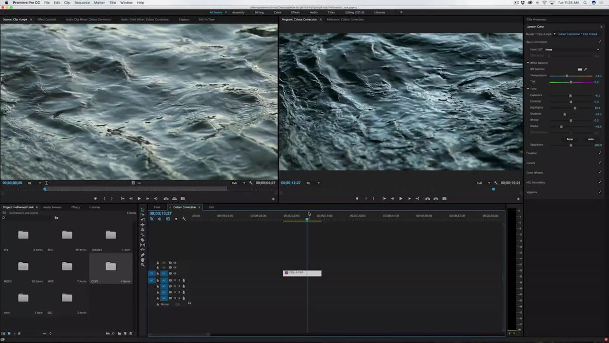 Split screen before and after comparison in Premiere Pro viewer
Premiere lets you toggle between your original and graded clip in the viewer so you can compare them side by side. Use this constantly. It’s easy to get tunnel vision when you’re deep in the sliders and lose track of how far you’ve actually moved from the source footage. Peter’s reminder here is a good one: going too far is its own problem. Over-graded footage looks processed rather than cinematic. You want the viewer to feel something, not to notice that the footage was edited. If the grade is the first thing someone mentions, it’s probably too heavy.
Step 7: Understand and Use LUTs as a Starting Point
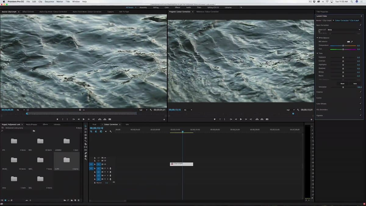 LUT dropdown being shown in the Basic Correction tab
LUTs, short for Look Up Tables, are essentially color presets that apply a specific grade to your footage instantly. Inside the Basic Correction tab in Lumetri Color, there’s a dropdown at the top where you can browse and apply any LUT you’ve downloaded. Many cinematographers and colorists sell or give away LUTs built from their own workflows, so if you love a specific visual style, there’s a good chance a LUT exists for it. Peter mentions them as a shortcut, not a replacement for learning the sliders yourself. Use a LUT to get in the ballpark, then adjust from there. Relying on them without understanding what they’re doing under the hood will only get you so far.
What I Do Differently: Work on Adjustment Layers
One thing the tutorial doesn’t get into, but that changed my workflow completely, is applying Lumetri Color to an adjustment layer instead of directly to each clip. Create a new adjustment layer from the Project panel, place it on a track above your clips, and apply your grade there. If you’re working with a sequence of clips that were all shot in the same light on the same day, this means you adjust once and every clip underneath updates automatically. When a client asks you to shift the whole sequence warmer, you change one layer instead of thirty individual clips. It’s the kind of workflow decision that feels small until the first time you need to do a revision at 11pm.
The single most important thing Peter demonstrates here isn’t a specific slider value. It’s the habit of knowing what you want before you start. He describes his own aesthetic as contrasty and punchy, and every adjustment he makes serves that goal. Before you open Lumetri Color on your next project, spend thirty seconds deciding what the footage should feel like. Cold or warm? Heavy or airy? That answer guides every choice after it.
Watch the full tutorial on YouTube to see Peter’s hands-on walkthrough with the actual clips he grades from start to finish.
Comments
Leave a Comment