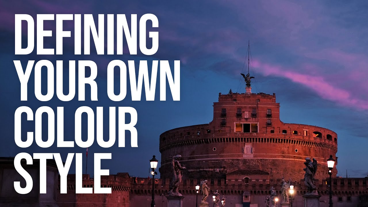
Every Sunday morning I do a photo walk around Seattle. Rain, shine, fog off the water — doesn’t matter. And for years, when I’d come home and open Lightroom, I’d edit each session like it was its own little world. Warm and golden one week, cool and moody the next, high contrast the week after that. Individually, the images looked fine. Together, they looked like four different photographers had taken them.
That problem didn’t have a name for me until I watched Sean Tucker talk about color consistency and style. In this Sean Tucker tutorial on color editing, he unpacks not just the mechanics of color grading but the philosophy behind developing a look that runs like a thread through everything you shoot. Tucker opens with a personal admission that floored me: he’s partially colorblind. And yet he’s one of the most visually consistent photographers working today. His argument is that consistency isn’t about having perfect eyes. It’s about being intentional, aware, and systematic. That reframing changed how I approach every edit.
What follows is a breakdown of the core techniques and thinking from that tutorial, structured so you can apply them in your own editing workflow right now.
Step 1: Understand Why Consistency Is the Real Goal
 Tucker explaining the visual thread running through a portfolio
Before you touch a single slider, Tucker makes the case that color grading isn’t about making one photo pop. It’s about building a recognizable visual identity across your entire body of work. He points out that when you scroll through a professional photographer’s Instagram or website, there’s a cohesive feel. Every image could plausibly live next to every other image. That coherence signals control, and control is what clients are actually hiring.
Tucker explaining the visual thread running through a portfolio
Before you touch a single slider, Tucker makes the case that color grading isn’t about making one photo pop. It’s about building a recognizable visual identity across your entire body of work. He points out that when you scroll through a professional photographer’s Instagram or website, there’s a cohesive feel. Every image could plausibly live next to every other image. That coherence signals control, and control is what clients are actually hiring.
Ask yourself: if someone saw ten of your recent photos side by side, would they look like they came from the same photographer? If the answer is “maybe not,” that’s the problem color grading solves. Not fixing individual images. Creating a consistent language.
Step 2: Look to Cinema for Color Inspiration
 Tucker referencing film stills and cinematic color palettes
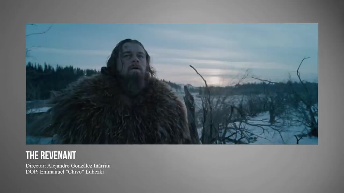
Tucker’s biggest unlock didn’t come from studying other photographers. It came from watching movies with the sound off and paying attention to how colorists use tone to build mood. Cinema gives you permission to be more deliberate with color than you might think is “allowed” in photography, and it shows you how to sustain a palette across a long piece of work rather than just one frame.
Tucker referencing film stills and cinematic color palettes
Tucker’s biggest unlock didn’t come from studying other photographers. It came from watching movies with the sound off and paying attention to how colorists use tone to build mood. Cinema gives you permission to be more deliberate with color than you might think is “allowed” in photography, and it shows you how to sustain a palette across a long piece of work rather than just one frame.
Start doing this yourself. Pick a film with a strong visual identity and pause on five or six frames throughout. Notice which tones repeat. Notice what they do to the shadows specifically. Then ask whether any of that palette maps onto the mood you want for your own photography. You’re not copying. You’re training your eye.
Step 3: Decide on Your Palette Before You Edit
 Tucker outlining the deliberate choice of a consistent color palette
This is the step most photographers skip. Tucker is clear that you need to decide what colors you want to be associated with your work before you open an image and start dragging sliders. Without that north star, you’re just reacting to each photo individually, and that’s how you end up with an inconsistent portfolio.
Tucker outlining the deliberate choice of a consistent color palette
This is the step most photographers skip. Tucker is clear that you need to decide what colors you want to be associated with your work before you open an image and start dragging sliders. Without that north star, you’re just reacting to each photo individually, and that’s how you end up with an inconsistent portfolio.
Write it down if you have to. Three to five words that describe the color feel you’re going for. Warm skin tones with muted greens. Cool blues with lifted shadows. Dusty, sun-faded pastels. Whatever fits your subject matter and your eye. That description becomes your editorial filter for every decision you make in post.
Step 4: Work Your Tone Curve for Mood
 Tucker adjusting tone curve with visible shadow lift
Tucker spends real time on the tone curve because it’s where mood lives. The most common cinematic move is lifting the shadows slightly off pure black. Instead of crushing your darkest tones to zero, bring that lower anchor point up just a little. It creates a softer, more filmic feel and stops images from feeling harsh or over-processed.
Tucker adjusting tone curve with visible shadow lift
Tucker spends real time on the tone curve because it’s where mood lives. The most common cinematic move is lifting the shadows slightly off pure black. Instead of crushing your darkest tones to zero, bring that lower anchor point up just a little. It creates a softer, more filmic feel and stops images from feeling harsh or over-processed.
In Lightroom, go to the Point Curve under the Tone Curve panel. Click the bottom-left anchor point and drag it upward slightly, maybe to a 10-15 output value. That’s it. It’s a small move with a big visual payoff. Pair it with a gentle S-curve for contrast and you’ve got the foundation of a cinematic look without touching the color sliders yet.
Step 5: Use the HSL Panel to Shape Individual Colors
 Tucker working in the HSL panel adjusting hue and saturation per channel
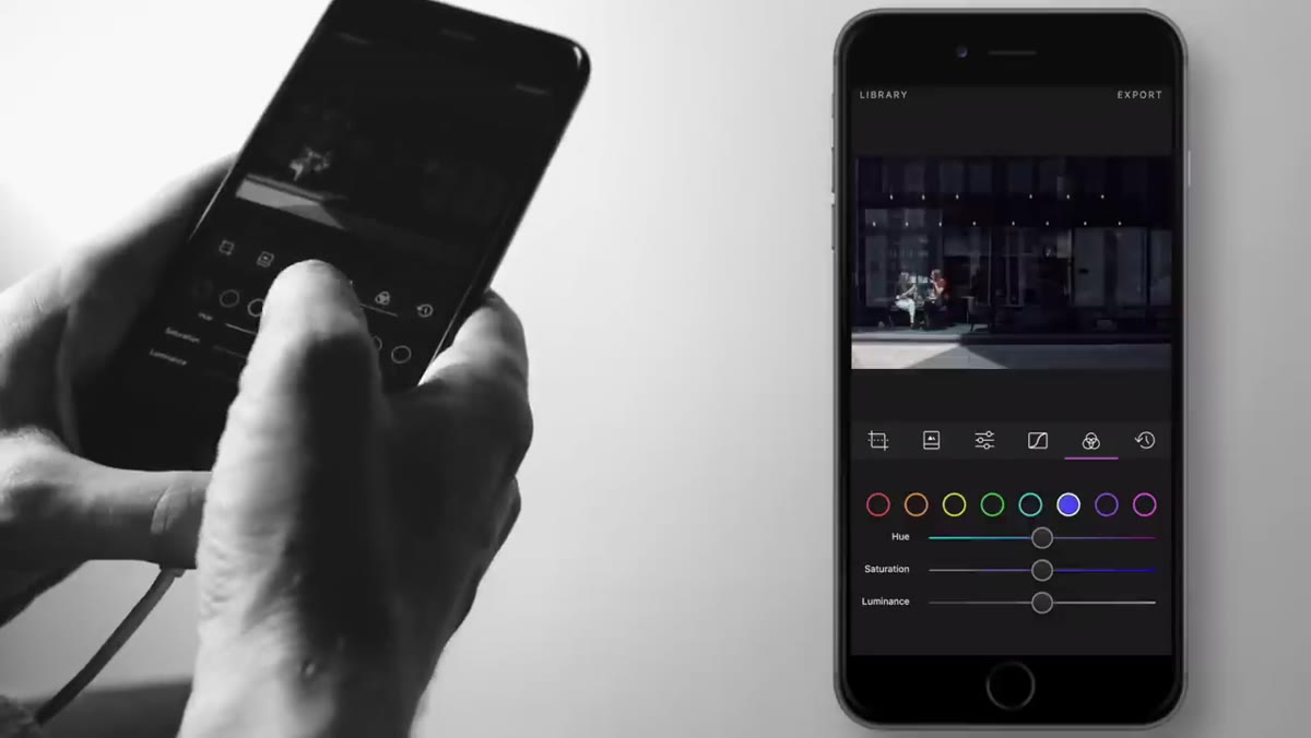
Once your tonal foundation is set, Tucker moves into the HSL (Hue, Saturation, Luminance) panel to make color-specific adjustments. This is where you can, for example, push skin tones warmer by shifting the orange hue slider, or calm down a distracting background by desaturating the greens.
Tucker working in the HSL panel adjusting hue and saturation per channel
Once your tonal foundation is set, Tucker moves into the HSL (Hue, Saturation, Luminance) panel to make color-specific adjustments. This is where you can, for example, push skin tones warmer by shifting the orange hue slider, or calm down a distracting background by desaturating the greens.
Work through each relevant color channel deliberately. For portrait work, orange and red control skin. For landscapes or travel, aqua, green, and blue dominate. Don’t move sliders just because you can. Move them because they serve the palette you defined in Step 3. Luminance is especially underused: raising the luminance on oranges brightens skin naturally without blowing out highlights.
Step 6: Use Color Grading (Split Toning) to Unify the Image
 Tucker adding color to shadows and highlights via the color grading panel
The Color Grading panel (formerly Split Toning) is Tucker’s tool for stitching an image together with a consistent color cast. Adding a warm tone to the highlights and a slightly cooler or more neutral tone to the shadows creates depth and cohesion at the same time.
Tucker adding color to shadows and highlights via the color grading panel
The Color Grading panel (formerly Split Toning) is Tucker’s tool for stitching an image together with a consistent color cast. Adding a warm tone to the highlights and a slightly cooler or more neutral tone to the shadows creates depth and cohesion at the same time.
Keep these moves subtle. In the Highlights wheel, nudge toward a warm amber. In the Shadows wheel, try a slight teal or blue push. The complementary relationship between warm highlights and cool shadows is the engine behind most “filmic” looks you admire. Blend strength matters: start at 50 and adjust from there. The goal is to feel it more than see it.
Step 7: Save Your Look as a Preset and Apply It Consistently
 Tucker saving settings as a custom preset in Lightroom
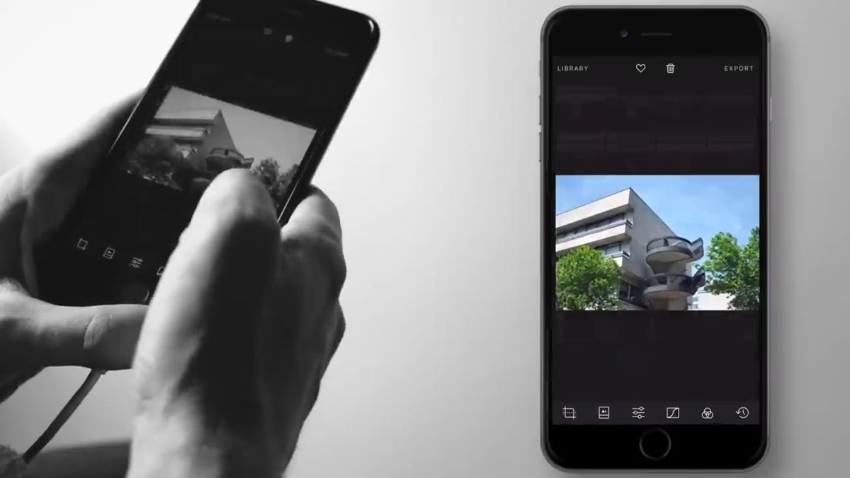
Once you’ve built a grade you’re happy with, save it as a preset. Tucker is direct about this: presets aren’t shortcuts for lazy editors. They’re anchors for consistent style. The preset gets you 80% of the way there on any new image, and the remaining 20% is the image-specific tweaking you’ll always need to do anyway.
Tucker saving settings as a custom preset in Lightroom
Once you’ve built a grade you’re happy with, save it as a preset. Tucker is direct about this: presets aren’t shortcuts for lazy editors. They’re anchors for consistent style. The preset gets you 80% of the way there on any new image, and the remaining 20% is the image-specific tweaking you’ll always need to do anyway.
In Lightroom, right-click in the Presets panel and choose “Create Preset.” Include your tone curve, HSL settings, and color grading. Exclude exposure and white balance since those will differ per image. Name it something meaningful to you. Now apply it to your next ten edits and see how much faster and more cohesive your workflow becomes.
My Own Caveat: Presets Need Seasons
I’ve been using a core preset for about two years now, and the one thing Tucker’s tutorial doesn’t cover – because it’s a style question, not a technical one – is that your palette will evolve. My current look is cooler and more muted than it was when I first built my preset. That’s fine. Revisit your foundation preset every six months or so and ask whether it still reflects where your eye is going.
Also: test your grade on different subject types before committing. A palette that looks beautiful on street photography can look sickly on food shots or flat on portraits. I have three variations of my base preset now, one for travel, one for portraits, one for everything else. They all feel like the same photographer. They just breathe differently.
The single most important thing Tucker teaches here is this: color grading is not about fixing photos. It’s about making a decision about who you are as a photographer and then executing that decision consistently enough that your work becomes recognizable. That’s the difference between editing and having a style.
Watch the full tutorial on YouTube to see Tucker walk through his actual Lightroom settings and hear him talk through the cinema connection in more depth. It’s worth the full watch.
Comments
Leave a Comment