
One of the hardest things to do as a photographer is look at your own work honestly. I spent years thinking a sharp image with decent exposure was a job well done. It wasn’t until I started putting my photos in front of other people, and watching how they reacted, that I realized technical correctness and emotional impact are two completely different things. A critique session forces that gap wide open, and that’s exactly why I think they’re one of the most underrated learning tools available to us.
In this Peter McKinnon tutorial, he reviews a batch of community photos submitted under a themed photo assignment called “The New Normal.” Watch the full tutorial on YouTube before or after reading this breakdown. What makes the video worth your time isn’t just seeing which photos he picks. It’s understanding why he picks them, and how you can apply that same evaluative lens to your own shooting and editing decisions. I’ve pulled out the key lessons and turned them into a process you can actually use.
Step 1: Start With a Theme That Has Depth
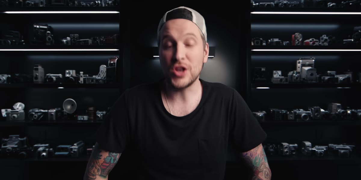 McKinnon introducing the “New Normal” photo assignment theme
Before a single photo gets taken, the assignment theme does a lot of work. McKinnon explains that a theme with real depth creates productive difficulty. When every image in a hashtag is immediately arresting, that’s fun but not particularly challenging to evaluate. The more layered the theme, the more a photographer has to think, and the more the resulting images reveal about how that person sees the world.
If you’re running your own photo assignments or creative projects, resist themes that are too literal. “Coffee” is easy. “Rituals” is harder. “The weight of small habits” forces actual creative thinking. Deeper themes tend to surface more honest, personal images, which are almost always more interesting to look at.
Step 2: Look for Story Before You Look for Technique
 McKinnon evaluating a photo of a dog at a window
The first image McKinnon reviews is a dog pressed against a window, clearly wanting to go outside. It’s not a technically complex photo. But it communicates something immediately and emotionally. He responds to it because it tells a story without needing a caption to explain it.
This is the habit to build: when you’re reviewing your own images, ask what story the photo tells in the first three seconds. If you’re reaching for an explanation, the image may not be doing enough on its own. The best storytelling photos make you feel something before your brain fully processes what you’re looking at.
Step 3: Study Composition as a Tool for Separation and Structure
 McKinnon reviewing the black and white Porsche composition photo
McKinnon pauses on a black and white street photo where sunlight divides a wall cleanly between two windows, with a masked figure walking through. He calls it a “monster composition,” and he’s right. The light does the compositional work of separating planes and guiding the eye. Nothing in that frame is accidental.
When you’re out shooting, train yourself to notice how light creates separation. Hard directional light cuts shapes apart. Soft diffused light blends them together. Neither is better, but each tells a different kind of story. Before you press the shutter, ask yourself where the eye is supposed to land first and whether the light is helping or fighting that intention.
Step 4: Read the Whole Frame, Including the Edges and Background
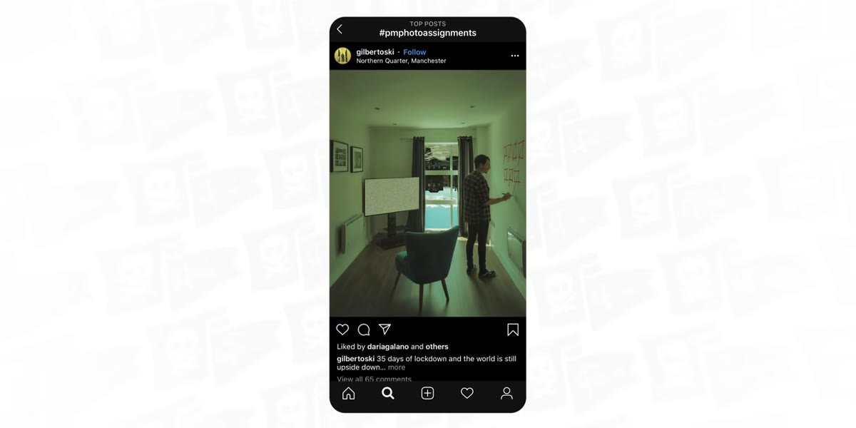 McKinnon pointing out the upside-down globe detail in the window
This step is the one that separates careful photographers from everyone else. McKinnon reviews a photo of someone marking off days on a wall during lockdown. The caption references the world being upside down. He admits he missed the detail on his first pass: through the window behind the subject, a globe is visible, turned upside down. That single detail transforms the image from a record of quarantine into a layered, intentional statement.
Before you finalize any shot, scan the full frame deliberately. Corners, backgrounds, foreground edges. What’s in there that you didn’t consciously put there? Sometimes those accidental elements ruin a photo. But sometimes, if you’re paying attention, they elevate it into something you couldn’t have planned.
Step 5: Let Context Carry the Meaning
 McKinnon discussing the drive-through coffee photo with gloved hands
The final image McKinnon highlights is simple: a gloved hand passing a coffee through a drive-through window. Pre-2020, that image would have read as strange or clinical. In its specific moment, it becomes a quiet document of how much changed in a short time. McKinnon’s point is that context doesn’t just support an image. Sometimes context IS the image.
This applies beyond documentary or news photography. When you’re shooting in a specific place, at a specific time, in a specific cultural moment, those conditions are part of your creative material. Don’t treat them as background noise. Ask how you can use the context of your shoot to make the image mean more than what’s literally in the frame.
Step 6: Use Hashtag or Portfolio Reviews as a Learning Loop
 McKinnon scrolling through the photo assignment hashtag submissions
McKinnon describes the process of combing through the hashtag submissions as genuinely difficult when the theme has depth. There are a lot of images to sort through, and not all of them are technically strong. But the evaluation process itself is the lesson. Looking at 50 photos with a critical eye teaches you things about your own work that no tutorial can.
Set up your own version of this. Submit your photos to critique groups, photography forums, or themed challenges. Then review the other submissions the same way McKinnon does: not just looking for what’s pretty, but asking which images tell a clear story, which compositions create visual structure, and which details reward a second look. You will see your own tendencies reflected in the work of others, and that’s where real growth happens.
What I’d Add: The Benefit of Constraints You Didn’t Choose
I’ve been running a weekly photo walk every Sunday morning for a few years now, and one of the things I’ve learned is that self-imposed themes feel very different from externally set ones. When someone else names the theme, you can’t fully control the creative problem. You have to adapt your vision to a concept that wasn’t yours to begin with. That tension is productive.
The images McKinnon highlights aren’t the most technically polished in the batch. They’re the ones where a photographer clearly wrestled with the concept and then made a specific decision about how to answer it visually. That wrestling is visible in the final image, and it’s what makes the photo worth looking at twice.
If you’re not already participating in themed photo challenges, that’s the change I’d make first. Not because winning matters, but because the constraint forces you to ask harder questions before you ever raise the camera.
The single most important thing McKinnon’s critique process demonstrates is this: a great photograph earns a second look. Technical quality gets you the first glance. Story, detail, and intention are what make someone stop and actually see what you made.
Watch the full tutorial on YouTube and pay attention to what McKinnon skips past just as much as what he stops on. The contrast between the two is a masterclass in photo editing instincts.
Comments
Leave a Comment