I’ve spent more Sunday mornings than I can count walking around Seattle with my camera, shooting in decent light and thinking the color in my images looked pretty good. Then I’d get home, open Lightroom, and spend forty-five minutes randomly nudging sliders around until I landed somewhere I could live with. It wasn’t a workflow. It was a guessing game. What I was missing wasn’t more tools. Lightroom already has over a hundred sliders, and more than half of them are color-related. What I was missing was a system.
In this Mark Denney tutorial, Watch the full tutorial on YouTube, Mark walks through a color editing process that changed how I approach every single edit. The core idea is deceptively simple: instead of tweaking colors by feel, you use a deliberate sequence to set a foundation, push everything to an extreme, correct it, and then rebuild individual colors from scratch. It sounds counterintuitive, but once you try it, the logic becomes obvious.
The walkthrough below follows Mark’s process closely. Every step is something you can apply in Lightroom right now, on any photo.
Step 1: Set Your White Balance with the Eyedropper Tool
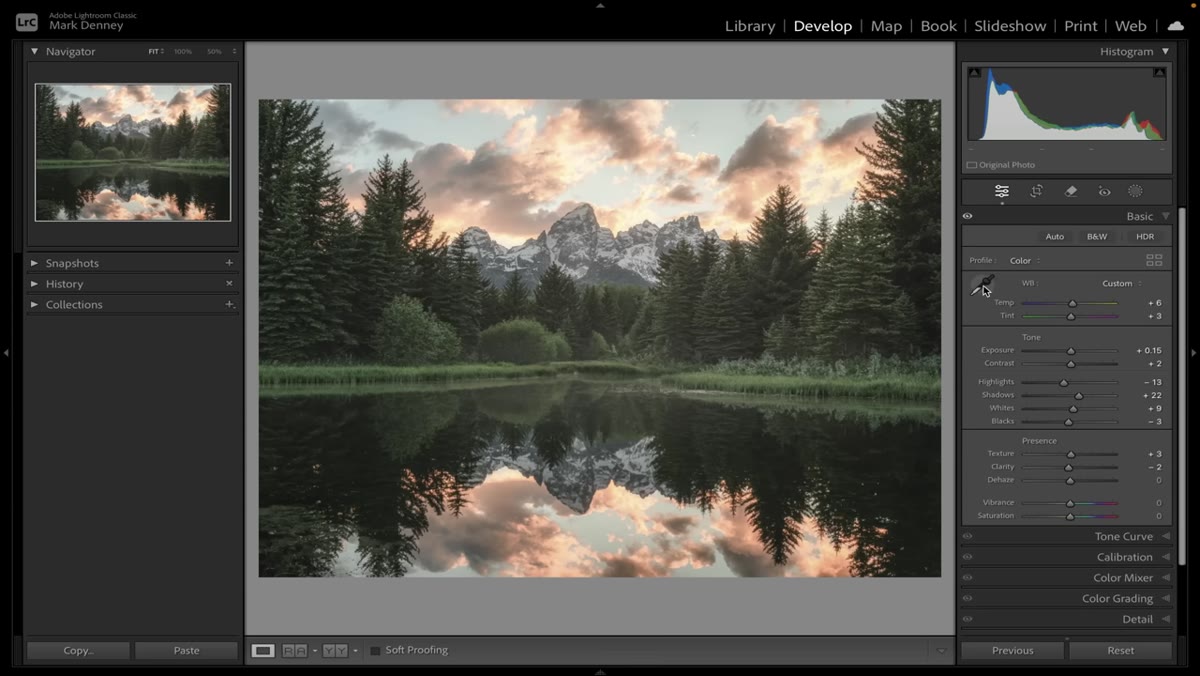 Eyedropper tool sampling a neutral area of the photo
Open the Basic panel and grab the White Balance Selector (the eyedropper icon). Click on the most neutral area of your image, meaning something that should be a true gray or white with no color cast. A patch of overcast sky, a gray rock, concrete, or even a shadowed area on snow all work well. Lightroom will sample that pixel and adjust the temperature and tint sliders to neutralize any cast. The adjustment is often subtle, and that’s fine. You’re not looking for drama here. You’re building a clean starting point.
Eyedropper tool sampling a neutral area of the photo
Open the Basic panel and grab the White Balance Selector (the eyedropper icon). Click on the most neutral area of your image, meaning something that should be a true gray or white with no color cast. A patch of overcast sky, a gray rock, concrete, or even a shadowed area on snow all work well. Lightroom will sample that pixel and adjust the temperature and tint sliders to neutralize any cast. The adjustment is often subtle, and that’s fine. You’re not looking for drama here. You’re building a clean starting point.
Step 2: Crank Vibrance and Saturation to 100 to Audit Your White Balance
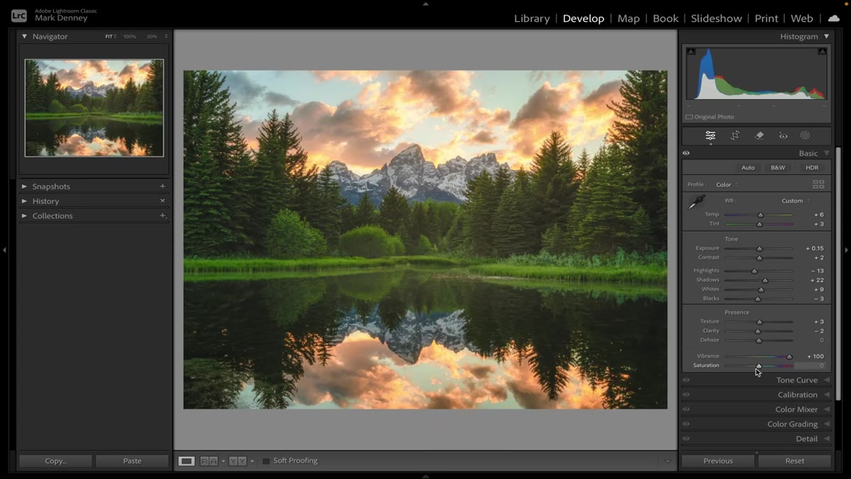 Vibrance and Saturation both set to +100
This is the part that feels weird the first time but immediately makes sense. After setting your white balance, push both Vibrance and Saturation all the way to +100. Your photo will look absolutely unhinged. That’s the point. At maximum saturation, color temperature imbalances become impossible to ignore. If the warm tones are bulldozing the cool ones, or the blues are running cold and aggressive, you’ll see it instantly.
Vibrance and Saturation both set to +100
This is the part that feels weird the first time but immediately makes sense. After setting your white balance, push both Vibrance and Saturation all the way to +100. Your photo will look absolutely unhinged. That’s the point. At maximum saturation, color temperature imbalances become impossible to ignore. If the warm tones are bulldozing the cool ones, or the blues are running cold and aggressive, you’ll see it instantly.
Use this exaggerated view to fine-tune your Temperature slider until the warm and cool tones feel balanced to your eye. There’s no objectively correct white balance. It’s a creative choice. But this method gives you a much clearer visual signal than squinting at a normal-looking image and hoping for the best. Once you’re satisfied, drop both Vibrance and Saturation back to zero before moving on.
Step 3: Use the Calibration Panel to Boost Primary Colors
 Camera Calibration panel open with Blue Primary Hue slider being raised
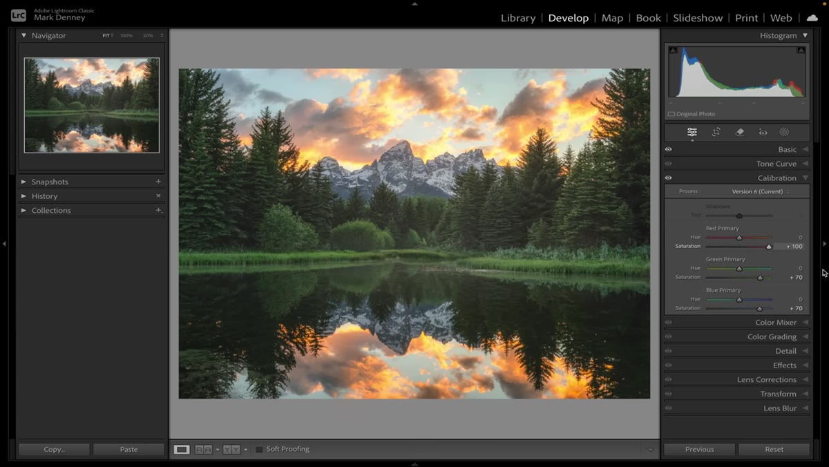
Close the Basic panel and scroll all the way down to the Camera Calibration panel (sometimes labeled just “Calibration” depending on your version). This panel is genuinely underused, and Mark treats it as a core part of his color work rather than an afterthought.
Camera Calibration panel open with Blue Primary Hue slider being raised
Close the Basic panel and scroll all the way down to the Camera Calibration panel (sometimes labeled just “Calibration” depending on your version). This panel is genuinely underused, and Mark treats it as a core part of his color work rather than an afterthought.
Start at the bottom with the Blue Primary slider and bring the Hue up meaningfully. Not a little nudge. A real push. Move up to the Green Primary and do the same. Then the Red Primary, which is especially striking on photos with warm light like sunrise or golden hour scenes. You’re aiming for each color to feel like it’s just tipping into “too much.” The image will look overdone at this stage. Resist the urge to pull back now. The next steps bring it all back under control through intentional color-by-color adjustment.
Step 4: Open the HSL Panel and Desaturate Every Color Channel to Zero
 HSL panel with all Saturation sliders pulled to zero
Navigate to the HSL panel and click the Saturation tab. Now drag every single color slider, all eight of them (Red, Orange, Yellow, Green, Aqua, Blue, Purple, Magenta), all the way down to -100. Your photo should now look like a flat, slightly toned grayscale image. This is your blank canvas. You’ve stripped out all color information so you can reintroduce only what you actually want, at the exact intensity you want it.
HSL panel with all Saturation sliders pulled to zero
Navigate to the HSL panel and click the Saturation tab. Now drag every single color slider, all eight of them (Red, Orange, Yellow, Green, Aqua, Blue, Purple, Magenta), all the way down to -100. Your photo should now look like a flat, slightly toned grayscale image. This is your blank canvas. You’ve stripped out all color information so you can reintroduce only what you actually want, at the exact intensity you want it.
This step is what separates the workflow from generic slider pushing. You’re not asking “how do I fix this color?” You’re asking “which colors do I actually want in this image, and how much of each?”
Step 5: Reintroduce Colors One at a Time
 Slowly bringing individual HSL Saturation sliders back up one at a time
Starting with whichever color is most important to your image, slowly bring each Saturation slider back up from -100 toward zero or above. Don’t just restore everything to where it was. This is the moment where you make actual creative decisions. Maybe the blues in your sky come up to +20 before they feel right. Maybe the oranges in warm foliage need to sit at -30 to keep them from going muddy. Bring each color in deliberately and stop when it contributes to the image without fighting everything around it.
Slowly bringing individual HSL Saturation sliders back up one at a time
Starting with whichever color is most important to your image, slowly bring each Saturation slider back up from -100 toward zero or above. Don’t just restore everything to where it was. This is the moment where you make actual creative decisions. Maybe the blues in your sky come up to +20 before they feel right. Maybe the oranges in warm foliage need to sit at -30 to keep them from going muddy. Bring each color in deliberately and stop when it contributes to the image without fighting everything around it.
Once you’ve set Saturation for each channel, you can use the Hue sliders in the same HSL panel to shift individual colors toward warmer or cooler variations, and the Luminance sliders to control how bright or dark each color reads. Hue and Luminance adjustments at this stage are where a lot of the personality in an edit comes from.
One Thing I’d Add: Don’t Skip the Before/After Check
After going through this entire process, I always do a full before/after comparison using the backslash key in Lightroom. When you’ve been staring at an image this closely, your eyes adapt and you lose perspective. The before/after view resets that. More often than not, I find I’ve pushed one channel a little too far, and it’s obvious the second I see it against the original.
I’d also suggest doing this workflow on a photo that already has colors you love, before trying it on a problem image. Running it on something that feels “already good” shows you exactly what each step is doing and builds the muscle memory without the pressure of fixing something broken.
The most important idea in this entire process is that you are working in sequence, not at random. White balance sets the foundation. Maxing out saturation exposes imbalances you’d otherwise miss. Calibration adds richness to the raw color data. Stripping and rebuilding HSL forces you to make intentional decisions about every color in your frame instead of guessing. Each step feeds the next.
It took me a few practice rounds before this felt natural, but now it’s the first thing I reach for on any edit where the color feels off but I can’t quite say why.
Watch the full tutorial on YouTube to see Mark walk through this on his Grand Tetons photos. Watching him make real-time adjustments and explain what he’s seeing in each step is worth your time, especially when he gets into the Calibration panel.
Comments
Leave a Comment