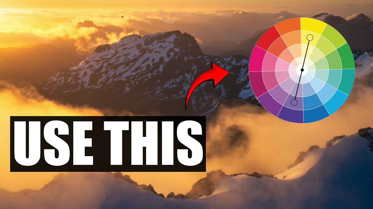
For years, my go-to move when processing a golden hour shot was to drag the temperature slider to the right and call it warm. The problem? Warming up a whole image also warms up your shadows, and suddenly you lose that beautiful contrast between the glowing light and the cool, moody dark areas that made you hit the shutter in the first place. Everything just looks… orange. Flat in a different way than it started.
This is exactly the problem that William Patino’s tutorial on color grading tackles head-on. Watch the full tutorial on YouTube to see him work through a real landscape image from start to finish. His approach uses the Color Grading panel in either Adobe Camera Raw or Lightroom (they’re functionally identical for this purpose) to target specific tonal ranges independently, so your highlights can be warm and golden while your shadows stay genuinely cool and blue. That separation is what gives a landscape photo the kind of depth that makes someone stop scrolling.
What follows is a step-by-step breakdown of his technique, written so you can follow along in your own software without needing to pause and rewind.
Step 1: Open the Color Grading Panel
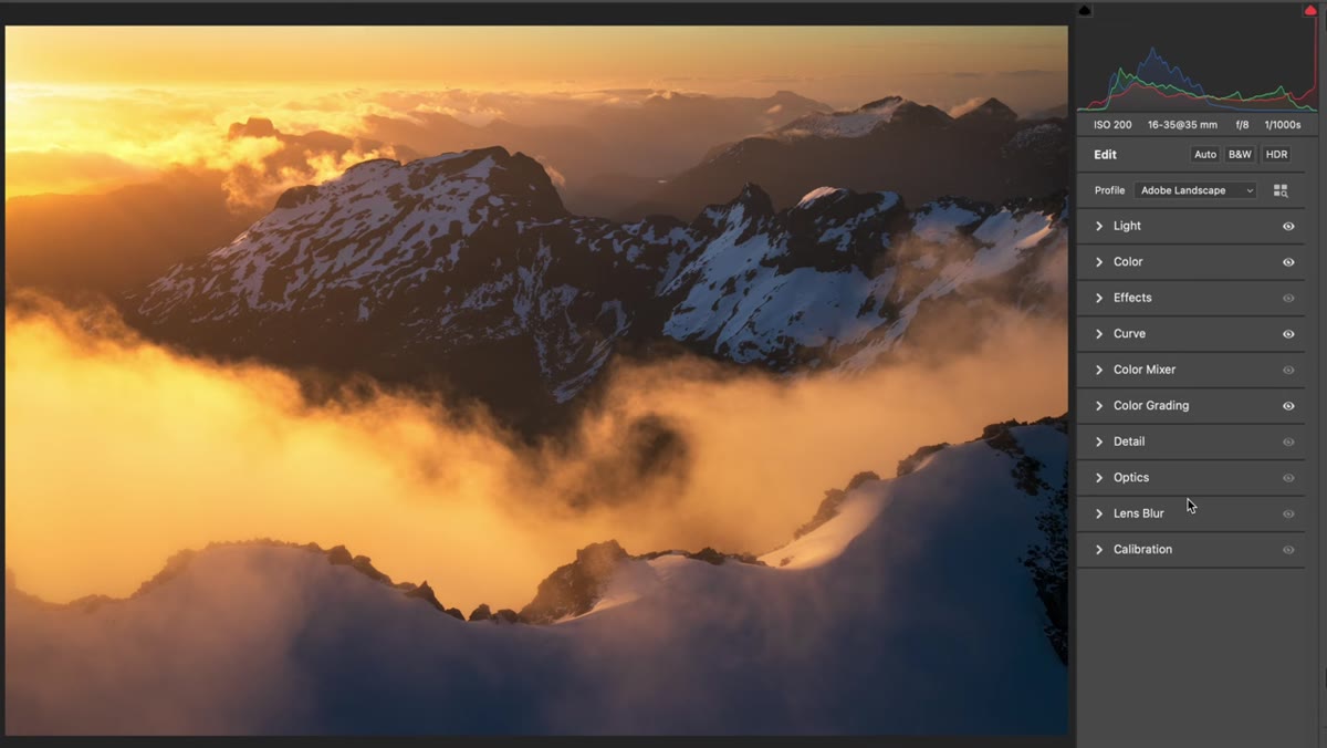 Color Grading tab open inside Adobe Camera Raw
In Adobe Camera Raw, look for the Color Grading tab in the right-hand panel. In Lightroom Classic, it lives under the Develop module, and you’ll find it in the panel list between HSL/Color and Detail. If you’ve never opened it before, you’ll see three color wheels labeled Highlights, Midtones, and Shadows, plus a small Blending and Balance slider set at the bottom. The outer ring of each wheel controls hue, and the inner circle controls saturation. This is where all the work happens.
Color Grading tab open inside Adobe Camera Raw
In Adobe Camera Raw, look for the Color Grading tab in the right-hand panel. In Lightroom Classic, it lives under the Develop module, and you’ll find it in the panel list between HSL/Color and Detail. If you’ve never opened it before, you’ll see three color wheels labeled Highlights, Midtones, and Shadows, plus a small Blending and Balance slider set at the bottom. The outer ring of each wheel controls hue, and the inner circle controls saturation. This is where all the work happens.
Step 2: Choose Your Highlight Color
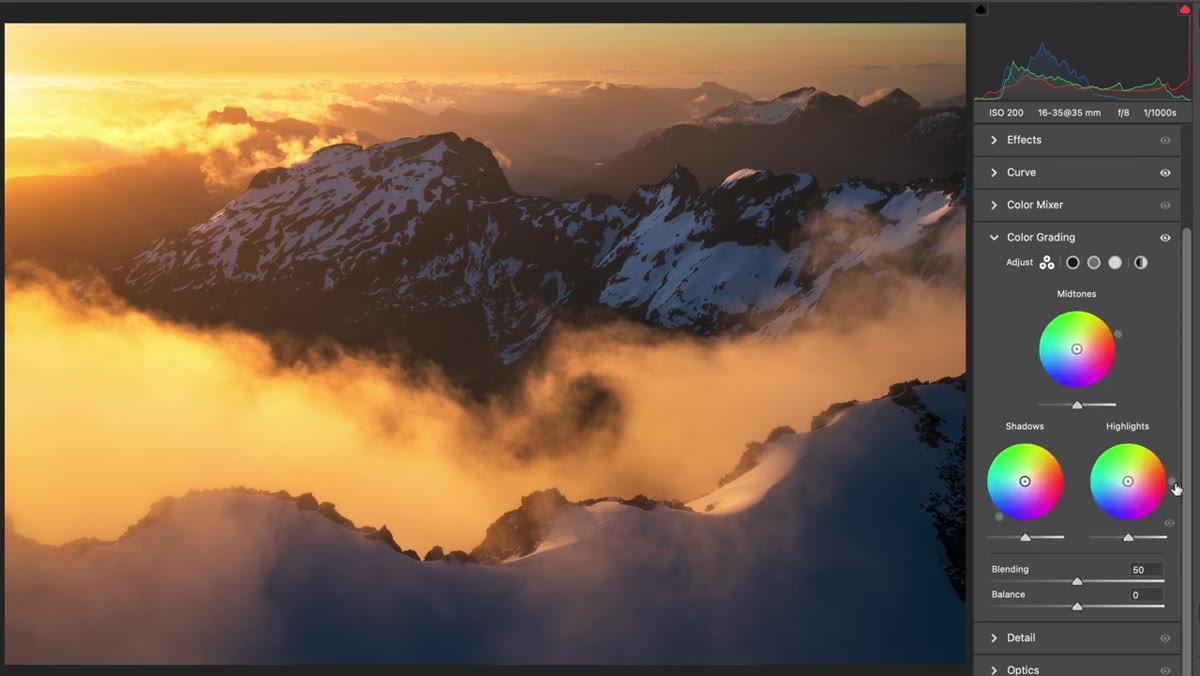 Highlight wheel with hue moved toward orange range
Start with the Highlights wheel. Click and drag the small dot on the outer ring of the wheel to select your hue. For a golden hour image, you’re looking at the orange-to-yellow range. Patino’s advice here is to work with the colors that are already present in your file rather than forcing something unnatural. If your sky already has soft yellow tones, nudging them slightly toward orange will feel believable and cohesive. You’re not inventing a new color, you’re reinforcing one that’s already there.
Highlight wheel with hue moved toward orange range
Start with the Highlights wheel. Click and drag the small dot on the outer ring of the wheel to select your hue. For a golden hour image, you’re looking at the orange-to-yellow range. Patino’s advice here is to work with the colors that are already present in your file rather than forcing something unnatural. If your sky already has soft yellow tones, nudging them slightly toward orange will feel believable and cohesive. You’re not inventing a new color, you’re reinforcing one that’s already there.
Step 3: Apply Saturation With the Shift Key Trick
 Shift key held, black line visible, saturation being dragged outward
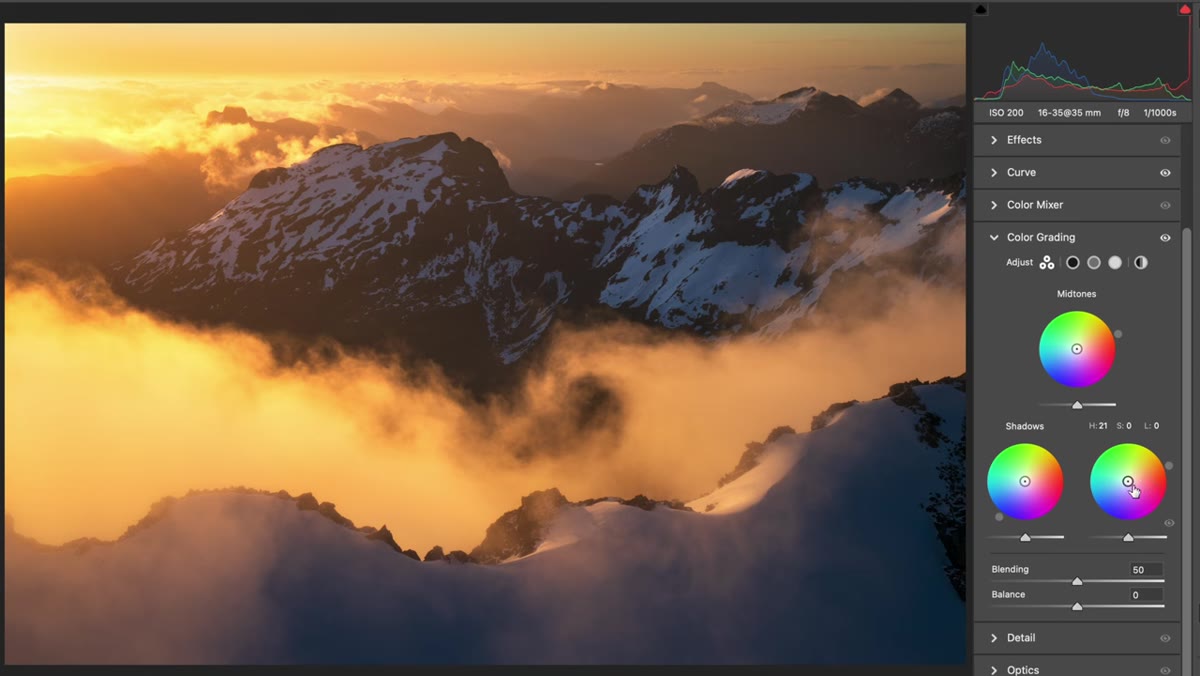
Once your hue is set, you need to actually push that color into the image by increasing saturation. Click the small circle in the center of the wheel and drag outward. Here’s the key tip from Patino that will save you a lot of frustration: hold Shift while you drag. A black line will appear on the wheel, locking your chosen hue in place so the dot doesn’t drift around as you pull outward. Without Shift, the wheel can spin as you increase saturation and land you somewhere completely different from what you intended. Drag slowly and watch your image. For highlights in a landscape, you typically don’t need to go very far before the effect is visible.
Shift key held, black line visible, saturation being dragged outward
Once your hue is set, you need to actually push that color into the image by increasing saturation. Click the small circle in the center of the wheel and drag outward. Here’s the key tip from Patino that will save you a lot of frustration: hold Shift while you drag. A black line will appear on the wheel, locking your chosen hue in place so the dot doesn’t drift around as you pull outward. Without Shift, the wheel can spin as you increase saturation and land you somewhere completely different from what you intended. Drag slowly and watch your image. For highlights in a landscape, you typically don’t need to go very far before the effect is visible.
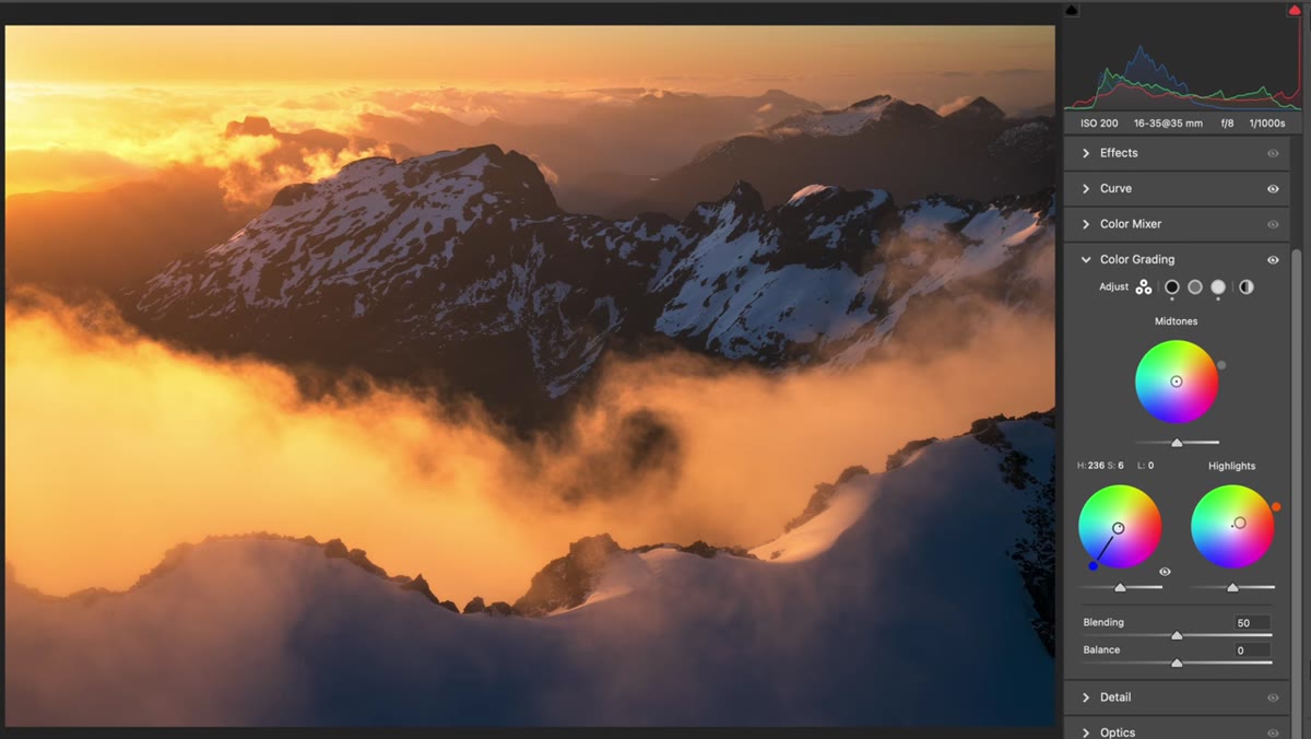
Step 4: Move to the Shadows Wheel and Select a Cool Hue
 Shadows wheel with outer ring moved into deep blue range
Now go to the Shadows wheel and rotate the outer ring into the blue family. In nature, shadowed areas during golden hour often carry a naturally cooler, bluish tone. The goal here is to lean into that rather than fight it. Patino picks a deeper blue rather than a pale or cyan tone, which gives the shadows more richness. Think of the difference between a cool gray shadow and a shadow that has actual color in it. The second one reads as depth.
Shadows wheel with outer ring moved into deep blue range
Now go to the Shadows wheel and rotate the outer ring into the blue family. In nature, shadowed areas during golden hour often carry a naturally cooler, bluish tone. The goal here is to lean into that rather than fight it. Patino picks a deeper blue rather than a pale or cyan tone, which gives the shadows more richness. Think of the difference between a cool gray shadow and a shadow that has actual color in it. The second one reads as depth.
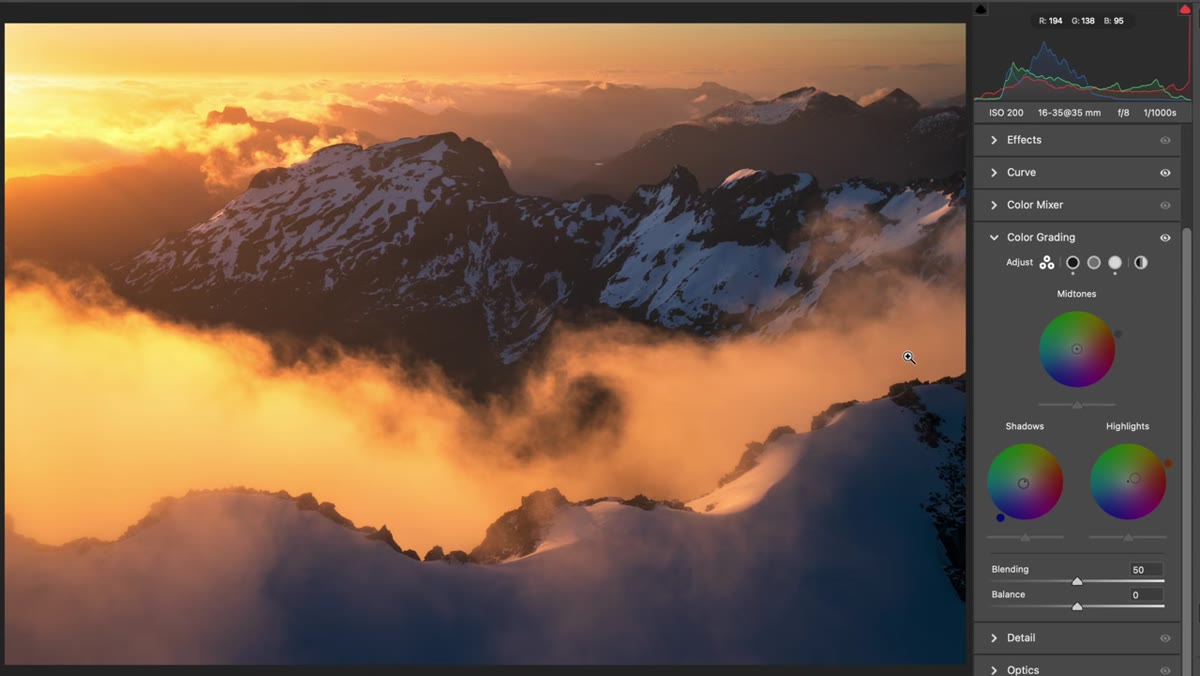
Step 5: Apply Shadow Saturation Carefully
 Shadow saturation being increased slowly, snow showing blue shift
Use the same process as Step 3, holding Shift while dragging outward from the center of the Shadows wheel. The effect will be most visible wherever shadows fall in your image. In Patino’s example, it shows up clearly on snow surfaces where the light isn’t hitting directly. This is where restraint matters most. Too much saturation in the shadows and your image will look like a filter was slapped on it. Zoom in to check your shadow areas as you drag, not just the overall composition. A little goes a long way.
Shadow saturation being increased slowly, snow showing blue shift
Use the same process as Step 3, holding Shift while dragging outward from the center of the Shadows wheel. The effect will be most visible wherever shadows fall in your image. In Patino’s example, it shows up clearly on snow surfaces where the light isn’t hitting directly. This is where restraint matters most. Too much saturation in the shadows and your image will look like a filter was slapped on it. Zoom in to check your shadow areas as you drag, not just the overall composition. A little goes a long way.
Step 6: Adjust the Midtones to Control Overall Feel
 Midtones wheel being adjusted to balance the overall image
The Midtones wheel is your balancing tool. Patino notes that midtones can go slightly warm or slightly cool depending on the image and your intent. For a landscape with strong warm highlights and cool shadows, keeping the midtones fairly neutral lets the contrast between those two do its work without everything going muddy. You can also use the Blending slider at the bottom of the panel to control how much the tonal ranges overlap. A lower blending value keeps highlights, midtones, and shadows more distinctly separated. A higher value creates smoother transitions.
Midtones wheel being adjusted to balance the overall image
The Midtones wheel is your balancing tool. Patino notes that midtones can go slightly warm or slightly cool depending on the image and your intent. For a landscape with strong warm highlights and cool shadows, keeping the midtones fairly neutral lets the contrast between those two do its work without everything going muddy. You can also use the Blending slider at the bottom of the panel to control how much the tonal ranges overlap. A lower blending value keeps highlights, midtones, and shadows more distinctly separated. A higher value creates smoother transitions.
Why This Works Better Than Just Pulling the Temperature Slider
The global temperature slider in Lightroom or Camera Raw affects every tonal range simultaneously. That’s useful for correcting a white balance problem, but it’s a blunt instrument for creative work. When I shoot sunrise in the Cascades, the most compelling thing about that light isn’t just that it’s warm. It’s that the warmth exists alongside something cooler. The color grading approach lets you maintain that contrast intentionally instead of accidentally flattening it out.
I’ve also started using this technique on travel photos that don’t have obviously dramatic light. A midday market shot with cool shadows under an awning and warm tones in the sunlit fabrics can get that same treatment. You’re not limited to landscapes or golden hour. Any image that has distinct light and shadow areas can benefit from targeted color work in the tonal ranges.
One thing worth adding: if you save your color grade as a Lightroom preset, you can test it across several images from the same shoot quickly. The specific saturation values will vary image by image, but the hue selections usually hold up across a session shot in consistent light. Build a few base presets for your common shooting conditions and adjust from there.
The biggest shift this tutorial gave me was moving away from thinking about color as one global decision and toward thinking of shadows and highlights as separate creative choices. That one change in mindset makes processed images feel less like filtered photos and more like finished work.
Watch the full tutorial on YouTube to see William Patino walk through the technique on an actual landscape file. Seeing the before and after on a real image while he adjusts the wheels in real time is worth the watch, even if you already feel comfortable with what’s covered here.
Comments
Leave a Comment