
I’ll be honest with you: some of my most-shared photos were edited entirely on my phone. Not because I planned it that way, but because I was standing somewhere beautiful, the light was perfect, and by the time I got back to my laptop the moment had already passed on everyone’s feed. Mobile editing isn’t a compromise. It’s a legitimate part of a working photographer’s toolkit, and the sooner you get comfortable with it, the more opportunities you’ll actually be able to act on.
That’s why I was genuinely happy when I sat down with this Mark Denney tutorial on Snapseed. Watch the full tutorial on YouTube - it covers the whole workflow in a clear, no-fluff way that I wish I’d had when I first started editing on my phone. Mark edits a real photo taken in Central Park, which means you’re watching actual decisions get made, not just a feature demo.
Snapseed is Google’s free editing app, available on both iOS and Android. It sits in a different category from Instagram’s built-in filters or basic brightness sliders. The tool set is serious: you get highlight and shadow control, sharpening, vignettes, perspective correction, and more. It won’t replace Lightroom for a full culling-and-editing session, but for getting a strong single image out the door from your phone? It absolutely delivers.
Step 1: Open Your Image and Get Into the Edit Panel
 App home screen with tap-anywhere prompt to open camera roll
When you open Snapseed, the interface is refreshingly minimal. Tap anywhere on the screen and it pulls up your camera roll so you can select the image you want to work on. Once your photo loads, look for the pencil icon in the bottom right corner of the screen. That’s your gateway to all the editing tools. Tap it, and you’ll see a menu appear with “Tune Image” near the top. That’s your starting point for almost every basic adjustment.
App home screen with tap-anywhere prompt to open camera roll
When you open Snapseed, the interface is refreshingly minimal. Tap anywhere on the screen and it pulls up your camera roll so you can select the image you want to work on. Once your photo loads, look for the pencil icon in the bottom right corner of the screen. That’s your gateway to all the editing tools. Tap it, and you’ll see a menu appear with “Tune Image” near the top. That’s your starting point for almost every basic adjustment.
Step 2: Adjust Brightness to Nail Your Exposure
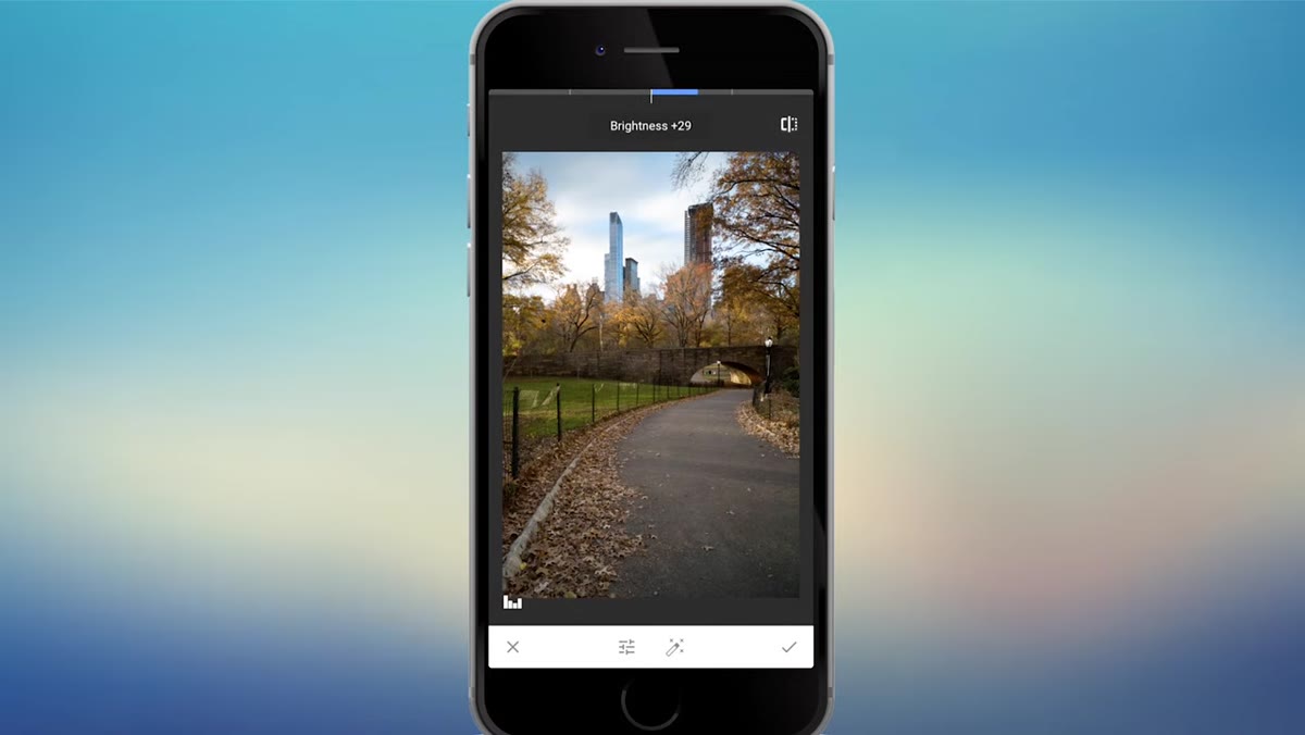 Finger sliding across underexposed Central Park photo to raise brightness
Inside the Tune Image panel, you’ll notice a small bar icon near the bottom of the screen (it sits to the left of the magic wand). Tap that to access the individual sliders. To change a specific setting, swipe up or down on the screen to select it from the list, then slide your finger left or right across the image itself to adjust the value. It feels a little unusual at first, but you’ll adapt to it fast.
Finger sliding across underexposed Central Park photo to raise brightness
Inside the Tune Image panel, you’ll notice a small bar icon near the bottom of the screen (it sits to the left of the magic wand). Tap that to access the individual sliders. To change a specific setting, swipe up or down on the screen to select it from the list, then slide your finger left or right across the image itself to adjust the value. It feels a little unusual at first, but you’ll adapt to it fast.
Start with brightness. If your photo is underexposed, which is common when you’re shooting quickly in tricky light, slide right to bring it up. Mark lifts his Central Park shot considerably here because it came out quite dark. After every adjustment, tap the icon in the top right corner to toggle a before-and-after view. It’s an important habit: it keeps you from overcorrecting without realizing it. When you’re happy with the result, tap the checkmark to confirm.
Step 3: Add Contrast to Get Rid of That Flat Look
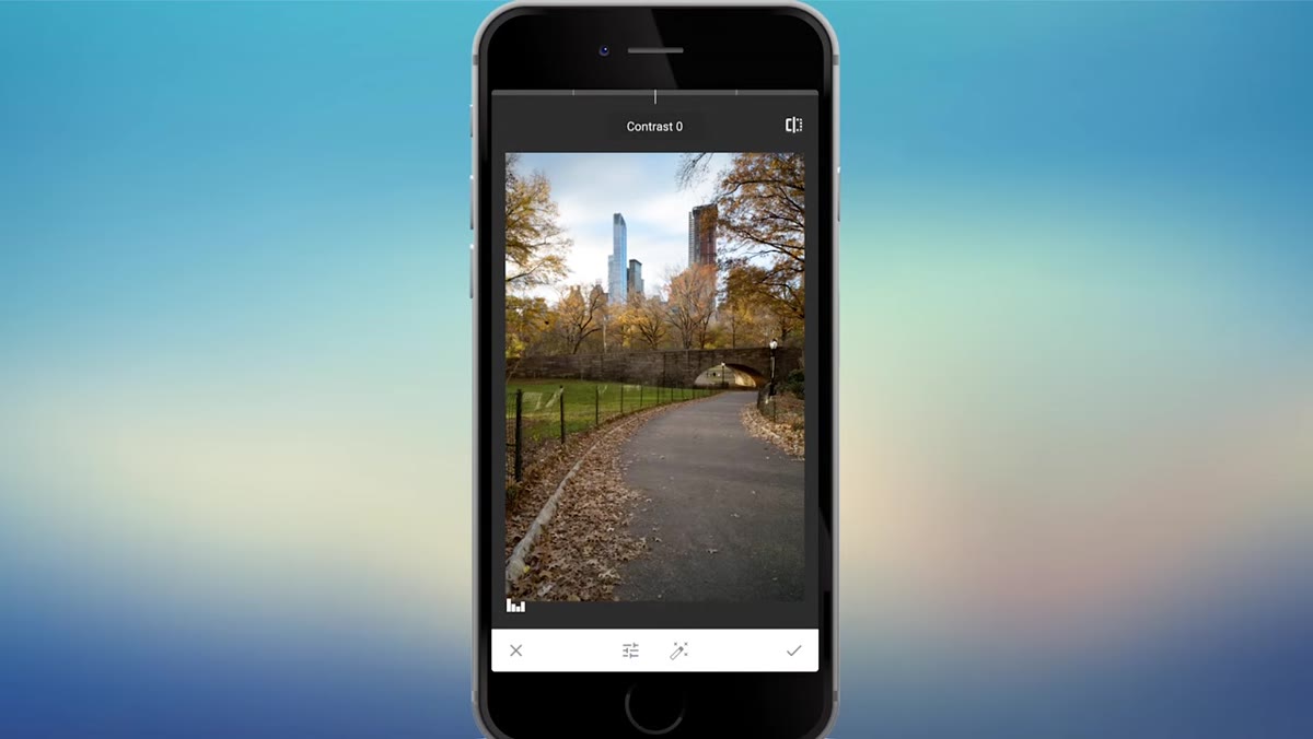 Contrast slider being applied to a visually flat image
A bright photo isn’t necessarily a good photo. If it still looks washed out or lifeless after you fix the exposure, contrast is your next move. Go back to the pencil icon, re-enter Tune Image, open the bar menu again, and scroll to Contrast. Sliding right will deepen your shadows and make your highlights pop, which brings visual weight back to the image. Boost it until the photo feels alive rather than murky, then check before-and-after before confirming. One thing Mark points out here that I completely agree with: the magic wand icon in that same toolbar will auto-apply a batch of quick adjustments if you’re in a rush and don’t want to go slider by slider. It’s not as precise, but it’s not bad for a one-tap fix.
Contrast slider being applied to a visually flat image
A bright photo isn’t necessarily a good photo. If it still looks washed out or lifeless after you fix the exposure, contrast is your next move. Go back to the pencil icon, re-enter Tune Image, open the bar menu again, and scroll to Contrast. Sliding right will deepen your shadows and make your highlights pop, which brings visual weight back to the image. Boost it until the photo feels alive rather than murky, then check before-and-after before confirming. One thing Mark points out here that I completely agree with: the magic wand icon in that same toolbar will auto-apply a batch of quick adjustments if you’re in a rush and don’t want to go slider by slider. It’s not as precise, but it’s not bad for a one-tap fix.
Step 4: Boost Saturation to Bring Color Forward
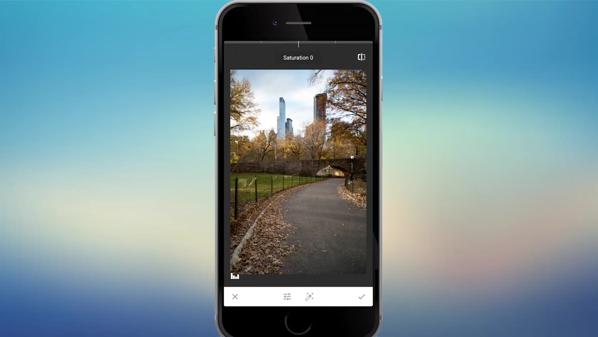 Saturation being increased on fall foliage in Central Park
This step is particularly satisfying on photos with strong natural color. Mark is editing a fall foliage shot, so bumping the saturation makes an immediate and dramatic difference. Scroll to Saturation in the same Tune Image bar menu and slide right. The goal isn’t to make it look like a cartoon. You want the colors to read as rich and vivid, the way they actually felt when you were standing there. Check your before-and-after to make sure you haven’t pushed the reds or oranges into neon territory. A moderate lift is usually more than enough.
Saturation being increased on fall foliage in Central Park
This step is particularly satisfying on photos with strong natural color. Mark is editing a fall foliage shot, so bumping the saturation makes an immediate and dramatic difference. Scroll to Saturation in the same Tune Image bar menu and slide right. The goal isn’t to make it look like a cartoon. You want the colors to read as rich and vivid, the way they actually felt when you were standing there. Check your before-and-after to make sure you haven’t pushed the reds or oranges into neon territory. A moderate lift is usually more than enough.
Step 5: Pull Down Highlights to Recover Sky and Cloud Detail
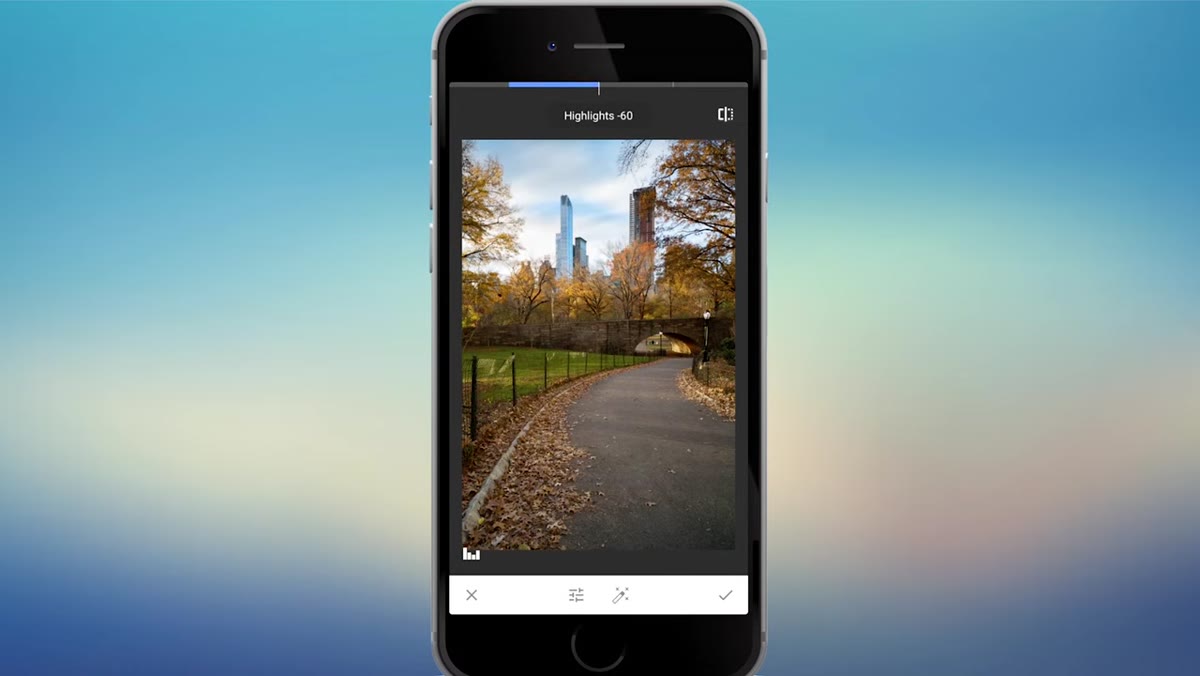 Highlights slider being lowered to recover cloudy sky texture
Bright skies are one of the most common problem areas in outdoor photography, and mobile cameras struggle with this more than DSLRs do. If your clouds are blowing out or your sky looks like a blank white sheet, dropping the highlights can recover a surprising amount of detail. In Tune Image, scroll to Highlights and slide left. Mark does this to bring back the wispy texture in the clouds of his long-exposure shot, and the before-and-after difference is genuinely striking. Don’t be shy about dropping them fairly far down. The sky can usually handle a heavier pull than you’d expect.
Highlights slider being lowered to recover cloudy sky texture
Bright skies are one of the most common problem areas in outdoor photography, and mobile cameras struggle with this more than DSLRs do. If your clouds are blowing out or your sky looks like a blank white sheet, dropping the highlights can recover a surprising amount of detail. In Tune Image, scroll to Highlights and slide left. Mark does this to bring back the wispy texture in the clouds of his long-exposure shot, and the before-and-after difference is genuinely striking. Don’t be shy about dropping them fairly far down. The sky can usually handle a heavier pull than you’d expect.
Step 6: Fine-Tune the Color Temperature
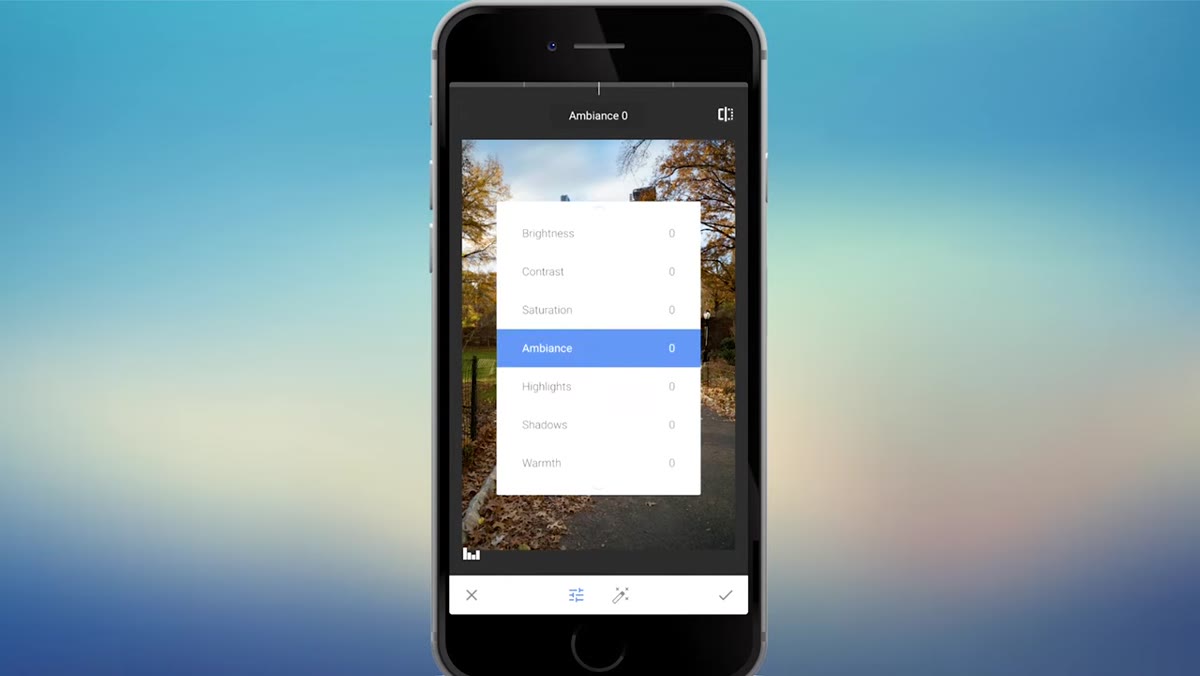 Warmth slider being nudged slightly cooler on fall scene
Color temperature affects the mood of a photo more than most beginners realize. Warmer tones feel cozy and golden. Cooler tones feel crisp, clean, or a little melancholy. In Snapseed’s Tune Image panel, the control is labeled Warmth. Mark pulls his fall photo slightly cooler to make it feel more like a brisk autumn day rather than a warm summer afternoon. The adjustment is subtle, just a small nudge to the left, but that’s the point. Temperature shifts work best when the viewer doesn’t consciously notice them.
Warmth slider being nudged slightly cooler on fall scene
Color temperature affects the mood of a photo more than most beginners realize. Warmer tones feel cozy and golden. Cooler tones feel crisp, clean, or a little melancholy. In Snapseed’s Tune Image panel, the control is labeled Warmth. Mark pulls his fall photo slightly cooler to make it feel more like a brisk autumn day rather than a warm summer afternoon. The adjustment is subtle, just a small nudge to the left, but that’s the point. Temperature shifts work best when the viewer doesn’t consciously notice them.
Step 7: Sharpen the Image and Add a Vignette
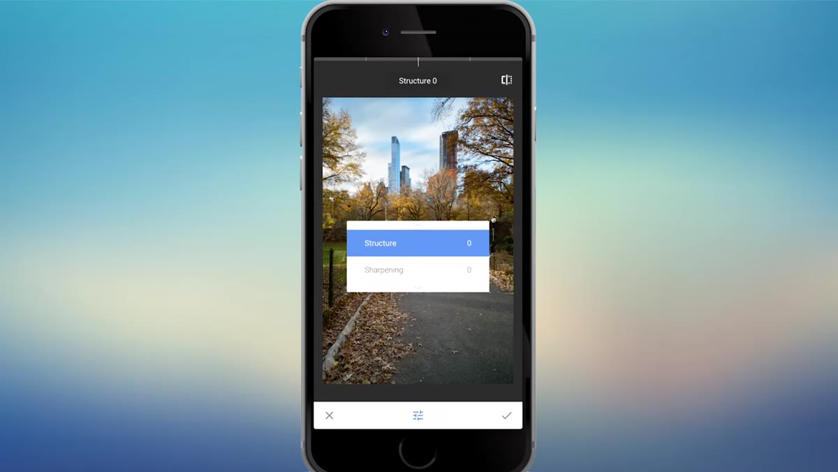 Sharpening being applied in the Details panel, pencil menu visible
From the main pencil menu, go to Details and select Sharpening. Slide right to add crispness to the edges in your photo. You don’t need a heavy hand here. On a mobile photo, a little sharpening goes a long way, and over-sharpening creates a crunchy, artificial look that’s hard to un-see once you notice it.
Sharpening being applied in the Details panel, pencil menu visible
From the main pencil menu, go to Details and select Sharpening. Slide right to add crispness to the edges in your photo. You don’t need a heavy hand here. On a mobile photo, a little sharpening goes a long way, and over-sharpening creates a crunchy, artificial look that’s hard to un-see once you notice it.
For a finishing touch, go back to the pencil menu and select Vignette. This tool darkens the edges of the frame and subtly pulls the viewer’s eye toward the center. You can move the center point around to position the brightest part of the vignette wherever your subject lives. It’s one of those adjustments that’s almost invisible when done well, but you definitely notice when it’s missing.
One Thing I’d Add From My Own Practice
The workflow Mark demonstrates works beautifully for landscape and travel photos, but I’ve found it equally useful for portraits shot on the go. The one tool he doesn’t dig into here is the Selective tool in the main pencil menu, which lets you pin an adjustment to a specific area of the photo rather than applying it globally. If your subject is perfectly lit but the background is too bright, that’s your fix. Pair that selective control with the Tune Image adjustments above and you have a surprisingly powerful editing toolkit sitting in your pocket at all times.
The single most important thing this tutorial reinforced for me: don’t skip the before-and-after toggle after every adjustment. It sounds like a small habit, but it’s the thing that keeps your edits grounded in reality instead of gradually spiraling into over-processed territory. Check it every time. Your future self will thank you.
Watch the full tutorial on YouTube to see Mark walk through the entire edit in real time. Watching the gestures and the image transform live makes the tool navigation click much faster than reading about it alone.
Comments
Leave a Comment