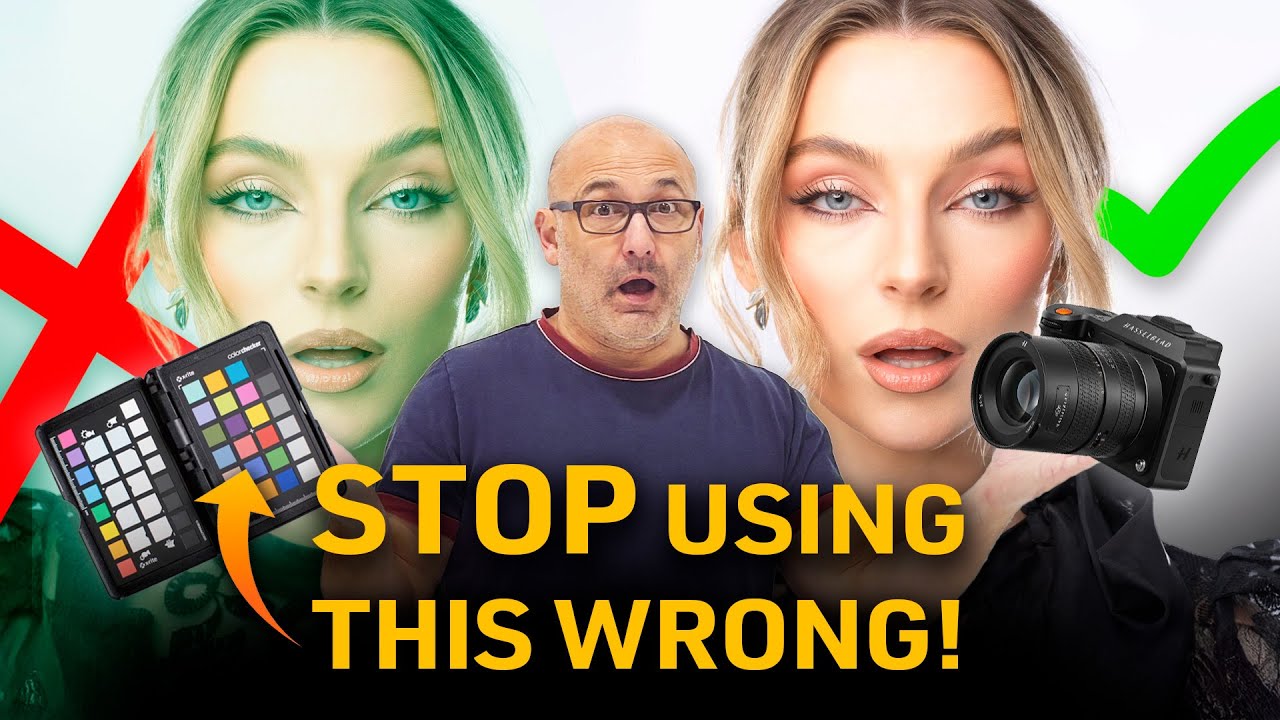
Every few months, someone in a photography forum posts a photo that looks slightly off — the skin tones are too warm, the product colors don’t match what the client sells online, or a whole shoot has that greenish cast from a mixed-light situation. And almost every reply in the thread says the same thing: “You should’ve used a color checker.”
I used to nod along to that advice. Then I actually dug into how color checkers work, and more importantly, when they’re worth your time versus when they’re just adding friction to your workflow. In this Visual Education tutorial on color checkers and accurate color, the instructor walks through the full range of color calibration tools available, explains what they actually do in practice, and makes a case that most photographers are either overusing them or misunderstanding their purpose entirely. After watching it, I reorganized how I think about color accuracy completely.
The honest takeaway: color checkers are a tool with a specific job, and that job is narrower than the marketing suggests. Here’s how to understand what they do and when to reach for one.
Step 1: Know What You’re Actually Looking At
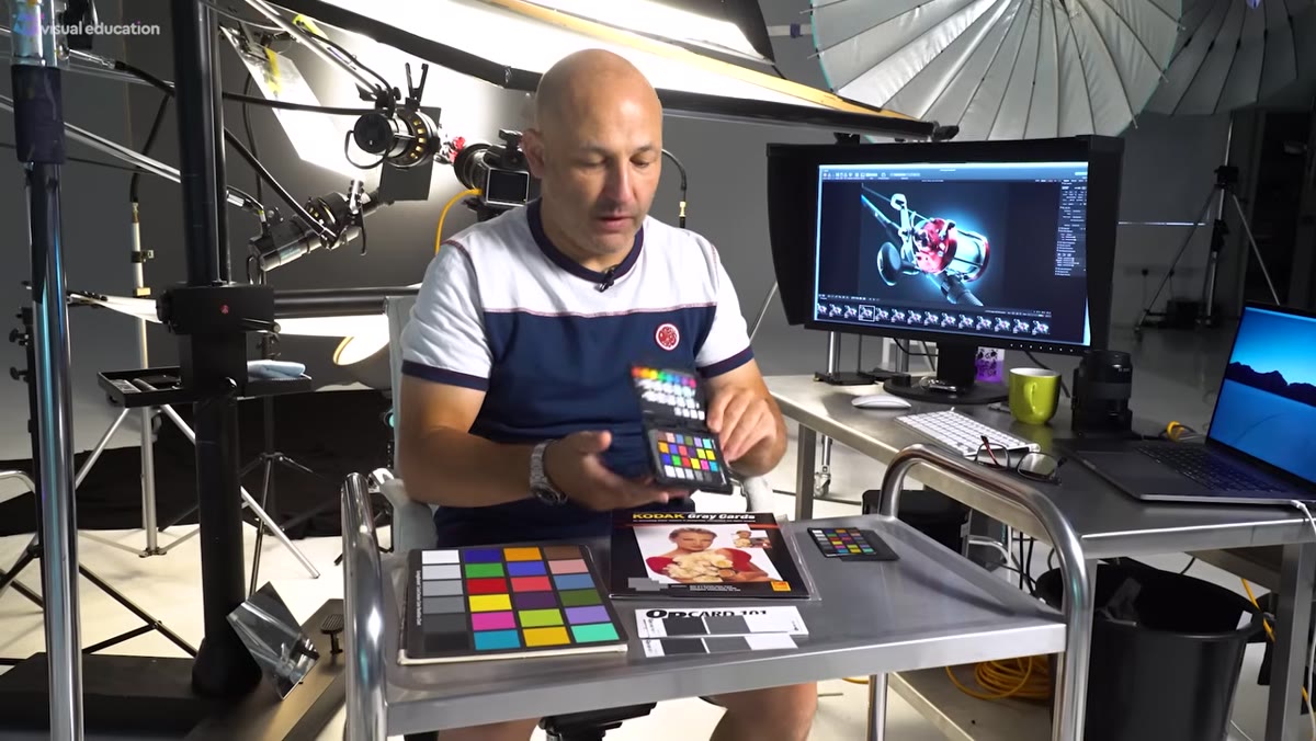 Host displaying X-Rite Color Checker Passport in folded hard case
The X-Rite Color Checker Passport is the name you’ll hear most often, and for good reason. It’s the closest thing photography has to an industry standard for color reference cards. The passport version folds into a hard protective case, which matters more than you might think. Inside you get the full X-Rite color palette — a grid of precisely calibrated color swatches — plus a couple of larger gray cards that are especially useful for product photographers who need to prop something neutral inside a shot.
The hard case is not just nice packaging. Color cards fade over time. They pick up fingerprints and dust. Once that happens, the reference values they were printed with are no longer accurate, and you’re calibrating to bad data. Protecting the card is protecting the calibration.
Step 2: Understand the Other Options on the Market
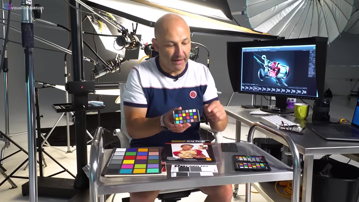 Host holding up simplified Q card grayscale swatch card
The passport version isn’t your only option, and depending on your workflow, it might not even be the right one. The X-Rite Mini is the same core swatch set without the hard case — just a sleeve. It’s significantly cheaper and does the same color work, but you need to be careful with storage. Beyond that, there are simpler tools: grayscale-only cards like the Q card, which give you a neutral reference without the full color palette. For video work, larger checker cards are common. And older tools like the Kodak 18% gray card are still floating around in a lot of kit bags.
One thing worth knowing: if you’ve had any of these cards sitting unprotected for years, they may no longer be reliable. The tutorial mentions a Gretag Macbeth checker that’s been around for a decade. At that age, any fading would mean you’re chasing inaccurate reference values. If you’re not sure about the age or condition of a card you own, it’s worth replacing it before trusting your color work to it.
Step 3: Stop Believing the Hype About Camera Recalibration
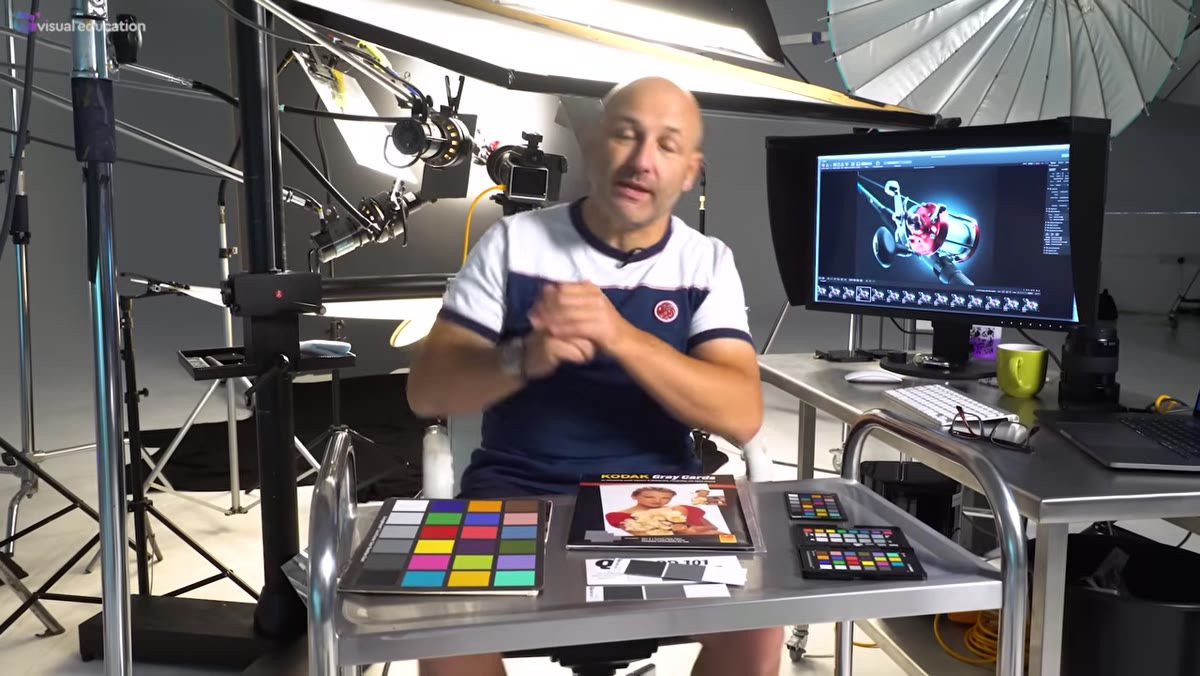 Host explaining color checker use while gesturing toward camera setup
Here’s where the tutorial gets genuinely useful, and a little contrary. A lot of content out there suggests you should photograph your color checker in every new setup, then use that image to recalibrate your camera’s color profile before you shoot. The idea sounds logical. In practice, for most photography, it’s overcomplicated and doesn’t deliver the results people expect.
Cameras from reputable manufacturers already ship with color science baked in. A Hasselblad, for example, has a carefully developed color system that photographers generally don’t want to override. Running a custom calibration on top of that in every new lighting situation isn’t refining your color — it’s layering complexity onto a system that was already doing its job. Unless you have a specific, documented reason to deviate from your camera’s native profile, the recalibration workflow is more process than payoff.
Step 4: Learn the One Situation Where Recalibration Genuinely Earns Its Place
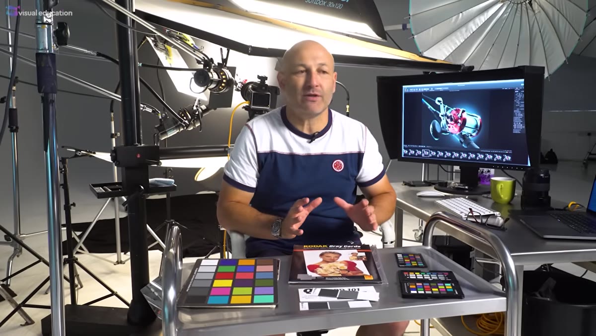 Host describing artwork reproduction photography scenario
There is a real use case for full color checker calibration, and it’s specific: artwork reproduction. If you’re photographing paintings, prints, or historical documents where color accuracy has legal, archival, or commercial stakes, then the color checker workflow is not optional — it’s essential.
The approach in that context involves placing the color checker card at multiple points across the painting’s surface: each corner and the center. This lets you verify that your lighting is truly even across the whole flat field, and gives you reference points for any post-processing corrections. When a museum or archive is depending on your files to represent what a painting actually looks like, the extra steps are completely justified.
Step 5: Understand Why Multi-Light Setups Break the Color Checker Logic
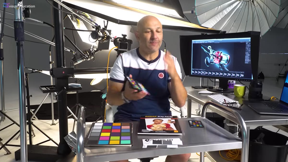 Host demonstrating how different lights hit card from different angles
This is the part of the tutorial that clicked everything into place for me. The reason full recalibration rarely makes sense for portrait, model, or product photography comes down to how studio lighting actually works. In almost every professional setup, you’re running more than one light. A key light, a fill, maybe a hair light or rim light. Each one of those sources has a slightly different color temperature, even if they’re all nominally “daylight balanced.”
When you hold a color checker card up and photograph it, you’re capturing the combined effect of whatever light is hitting the card at that angle, at that moment. Tilt the card slightly and you’re picking up a different ratio of your lights. Move it across the scene and the mix changes again. There’s no single card position that accurately represents the color behavior across your whole shooting environment. The reference image you create is a snapshot of one specific, unrepeatable lighting condition — which makes it a shaky foundation for calibrating your entire shoot.
My Take: The Gray Card Is Still Earning Its Place
I want to push back on abandoning color reference tools entirely, because I still reach for a simple gray card more than any other calibration tool. It won’t give you the full color palette data of a passport checker, but dropping an 18% gray card into your first test shot and using it to set a custom white balance in-camera takes about thirty seconds. I’ve rescued outdoor shoots this way when the light was doing something complicated between open shade and direct sun hitting the same frame. It’s not glamorous, and it’s definitely not the elaborate profile-matching workflow you’ll see in some tutorials. But it’s consistent, fast, and works across every camera I’ve ever used. Sometimes I prove the same point with my phone camera just to watch people’s faces.
The single most important thing this tutorial communicates: color checkers are reference tools, not magic fixes. Used correctly in the right situation, they’re invaluable. Used as a reflexive step in every shoot because someone online said you should, they add process without improving your photos. Know your lights, trust your camera’s native color science, and save the full calibration workflow for the work that actually demands it.
Watch the full tutorial on YouTube to see the tool comparisons and lighting demonstrations in action.
Comments
Leave a Comment