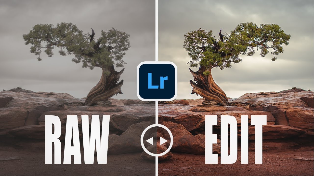
Post-processing is the part of landscape photography that nobody warns you about. You spend months learning to read light, nail your exposure, and find compositions that actually hold together. Then you get home, open Lightroom, and suddenly you’re guessing at every slider. I spent an embarrassing amount of time early on convinced that my edits looked cinematic and professional, only to look back at them a year later and cringe.
What helped me most wasn’t another “how to use Lightroom” overview. It was someone showing me the specific, repeatable mistakes that beginners make. That’s exactly what landscape photographer Mark Denney does in this tutorial. Watch the full tutorial on YouTube before or after reading through this breakdown. Either way, you’ll come out with a much cleaner editing checklist.
Denney built this video around mistakes he actually made himself, which makes it land differently than advice from someone who seems to have always known what they were doing. Here’s a step-by-step walkthrough of what he covers, with enough detail that you can follow along directly in Lightroom.
Step 1: Pull Back Your Vignette
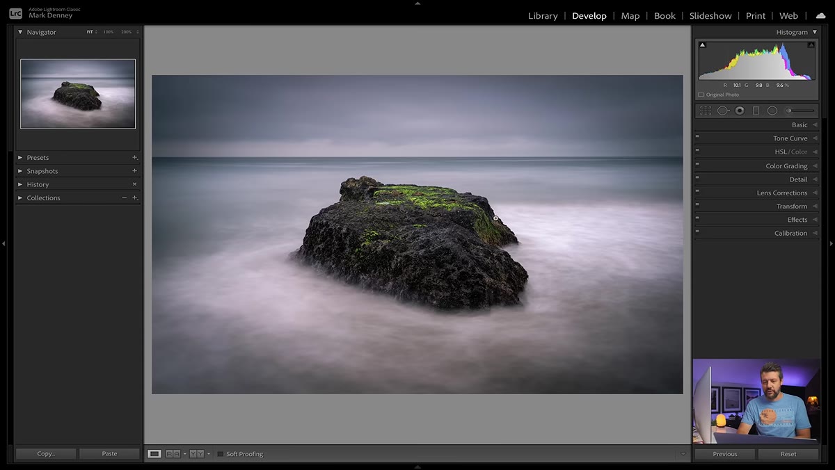 Vignette slider pulled far left creating heavy darkened corners
Denney calls this one “tunnel vision,” and the name is perfect. A vignette is meant to do one quiet thing: nudge the viewer’s eye toward the center of the frame. When you apply it too heavily, the corners go so dark that the image literally looks like you’re peering through a tunnel. It stops reading as a photograph and starts reading as an over-edited file.
The fix isn’t to stop using vignettes. It’s to use them at a strength you can barely see at normal view. Denney keeps his post-crop vignette value between -5 and -15 in Lightroom’s Effects panel. A good test: shrink the image down to thumbnail size. If the darkened corners are obvious at that scale, dial it back until they almost disappear. The vignette should be felt, not seen.
Step 2: Stop Relying Only on the Saturation Slider
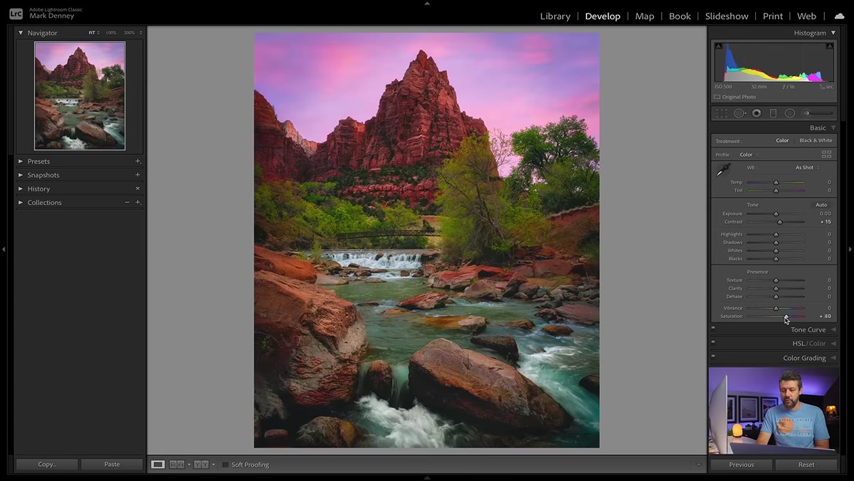 Saturation slider at negative 100 rendering image fully black and white
This was my personal worst habit for the first two years of editing. When a photo felt flat, I dragged Saturation up. The result always looked a little wrong, and I couldn’t figure out why. Denney explains the reason clearly: Saturation affects every color in the image by exactly the same amount. Push it too far and your image looks artificially punchy in a way that feels unnatural.
Vibrance is the smarter starting point. It boosts the more muted, undersaturated colors in your image while leaving the already-saturated tones mostly alone. The result is a richer look that doesn’t blow out your skin tones or turn your golden-hour sky into a neon sign. Use Vibrance as your primary color lift, and treat Saturation as a fine-tuning tool afterward, if you use it at all.
Step 3: Use the HSL Panel for Targeted Color Work
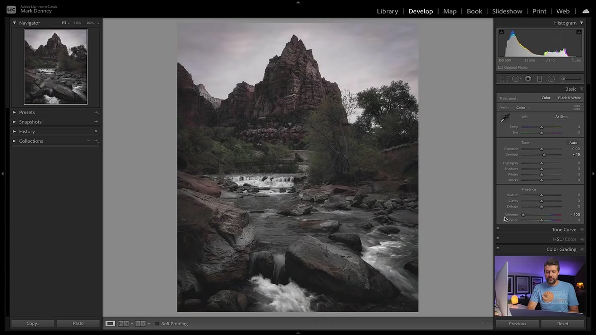 HSL panel open with individual color Hue Saturation Luminance sliders visible
Once you understand that Vibrance and Saturation are broad tools, you’re ready to do more targeted color work. The HSL panel (Hue, Saturation, Luminance) in Lightroom lets you adjust individual colors independently. You can shift the specific hue of your greens, increase only the saturation in your blues, or brighten the luminance of your oranges without touching anything else.
For landscape work this is especially useful. The difference between a sky that feels alive and one that looks processed often comes down to pulling the blue luminance down just slightly, or shifting the green hue toward yellow to get more warmth in the foliage. These are small moves, but they create color relationships that feel intentional rather than slapped on.
Step 4: Avoid Over-Sharpening Skies and Smooth Surfaces
 Detail panel open showing sharpening masking slider in use
Sharpening is one of those tools that feels like it can only help. More detail, more clarity, sharper image. Except when you apply global sharpening to a landscape photo, you’re sharpening everything equally, including cloud gradients and water surfaces that are supposed to be smooth. The result is an image that looks grainy and over-processed in areas that should feel calm.
Denney recommends using the Masking slider in Lightroom’s Detail panel to constrain sharpening to only the edges and textures in your image. Hold Alt (Windows) or Option (Mac) while dragging the Masking slider and the preview will switch to black and white, showing you exactly where the sharpening is being applied. White areas get sharpened. Black areas don’t. Bring the slider up until the sky and water go black, so the sharpening lands only where it actually helps.
Step 5: Watch Your Highlight and Shadow Recovery
 Histogram showing clipped highlights being pulled back with Highlights slider
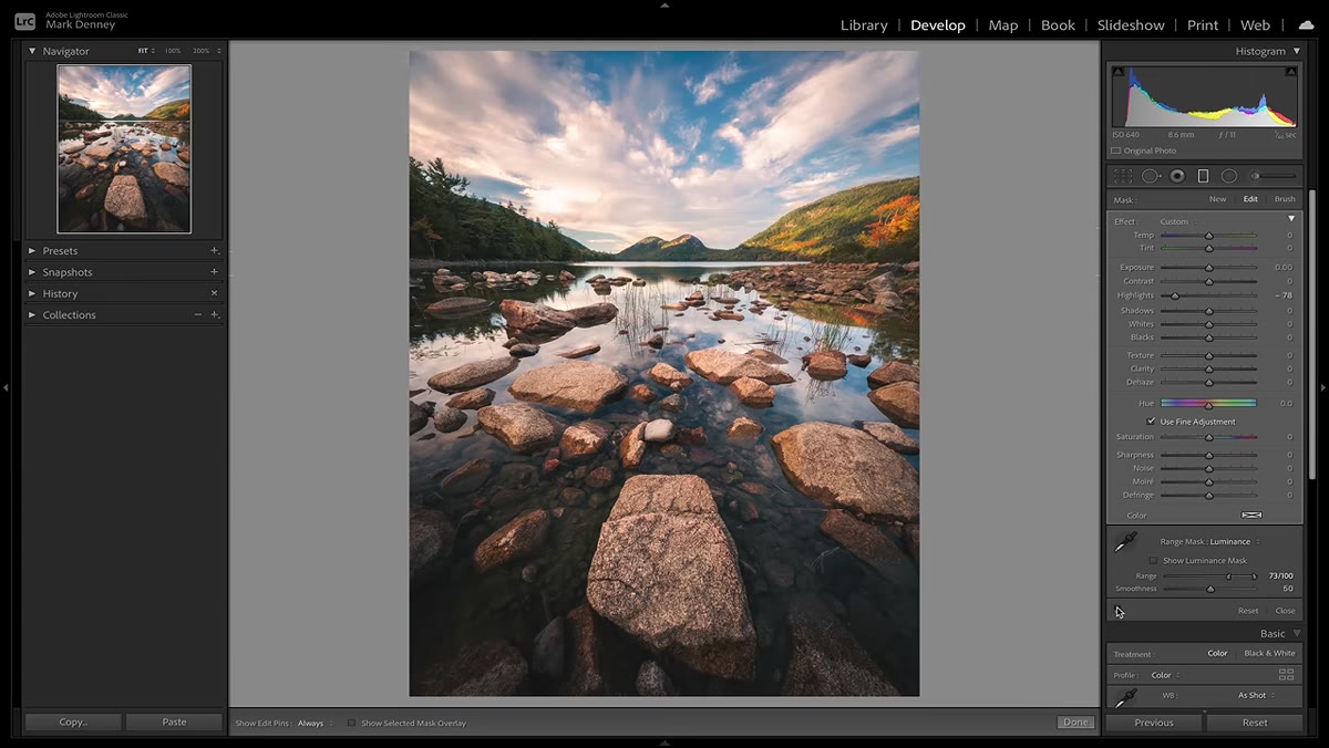
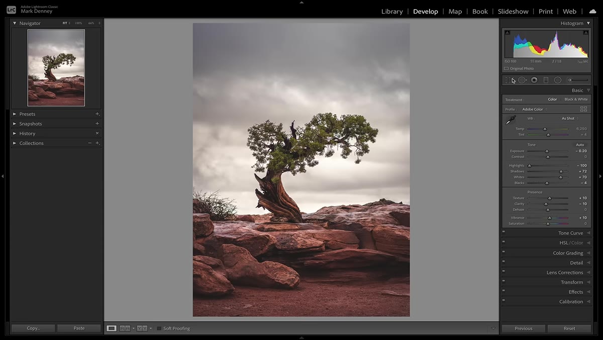
Recovering blown highlights and crushed shadows is a genuinely useful move. It’s also one of the easiest to overdo. Beginners often drag Highlights all the way to -100 and Shadows all the way to +100 by default, regardless of what the image actually needs. The result looks flat and HDR-ish, with that slightly unreal gray quality that signals heavy-handed processing immediately.
The goal is to recover detail where it was actually lost, not to even out every tonal difference in the frame. Check your histogram. If nothing is clipping on either end, you may not need aggressive recovery at all. Work with intention here, nudge highlights down until detail reappears, and stop before the tones go muddy.
Step 6: Don’t Skip a Local Adjustment Pass
 Graduated filter applied to sky darkening upper portion of landscape image
Global adjustments get you most of the way there. A local adjustment pass is what separates a good edit from a great one. Tools like the Graduated Filter, Radial Filter, and Adjustment Brush let you treat the sky and foreground differently, which is almost always necessary in landscape photography because they’re lit differently and need different treatment.
A common move is adding a graduated filter over the sky to bring down highlights and add a touch of cool tone, while leaving the warmer foreground untouched. This matches how the light actually behaves in a scene and makes the image feel grounded rather than uniformly processed. Once you build this into your standard workflow it becomes second nature.
One More Thing I’d Add
Denney covers these mistakes from a technical standpoint, and every piece of advice is sound. What I’d layer on top, especially for beginners, is to build in a “day later” review step. I edit the image, close Lightroom, and look at it again the next morning before I call it done. What looked subtle the night before sometimes looks heavy-handed in fresh light. Your eyes adjust to the edit as you’re making it, so the tunnel vision and over-saturation mistakes are genuinely hard to catch in the moment. Distance helps.
The single most important takeaway here is this: restraint is a skill. Every one of these mistakes comes from applying a tool too aggressively, and the fix for every single one of them is to use less. Vignettes, saturation, sharpening, recovery - all of them work better when they’re invisible. Your edit should make the photo feel more like what you experienced on location, not more like an edit.
Watch the full tutorial on YouTube to see Denney walk through each of these on actual landscape images. Watching the before-and-after comparisons in real time makes the differences much clearer than any description can.
Comments
Leave a Comment